Manicure Monday: Kickass Glitter Accents and Blue

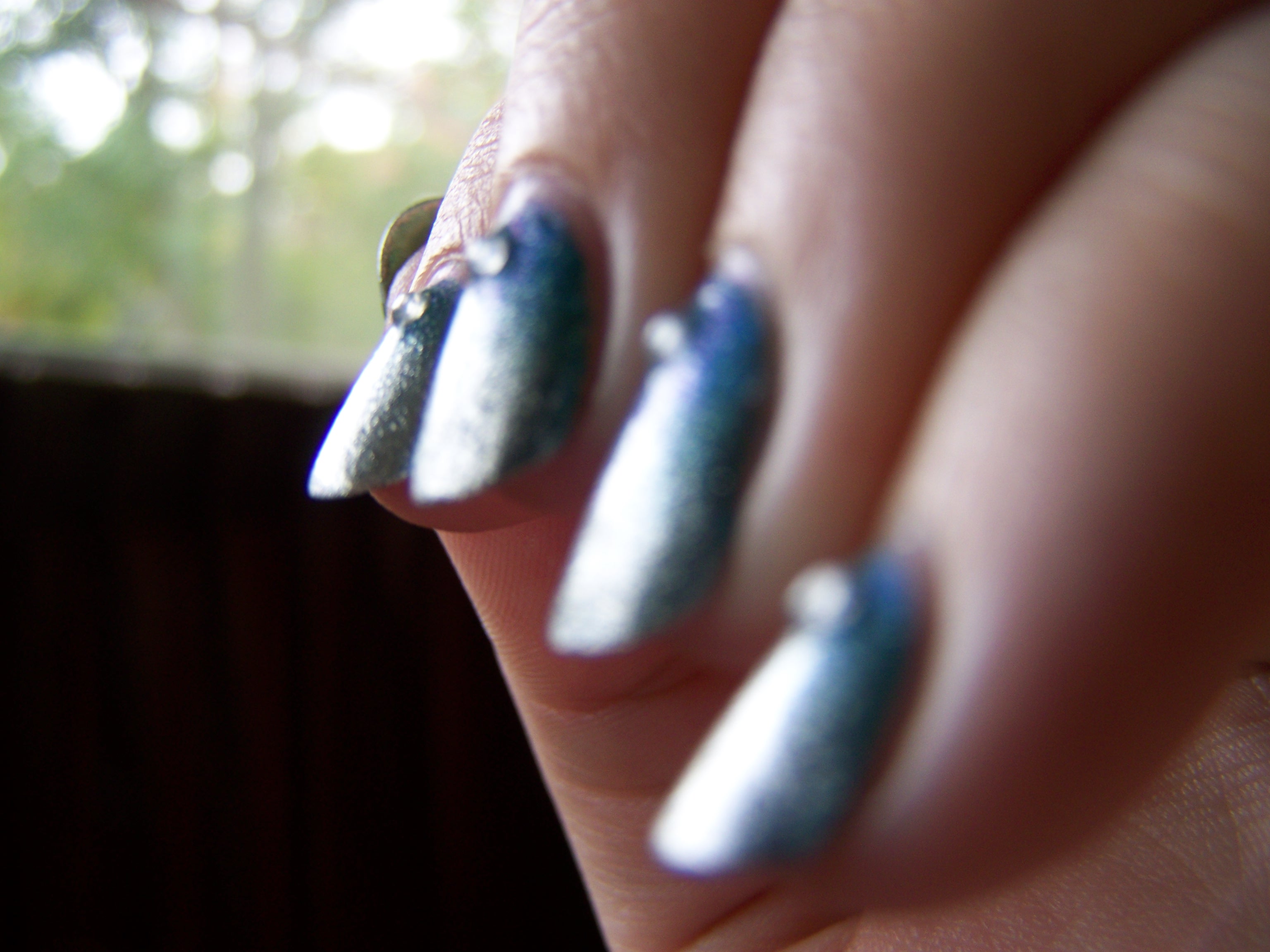
Today’s manicure is one of my favorites. I haven’t had a favorite in a really long time now.

100_2674

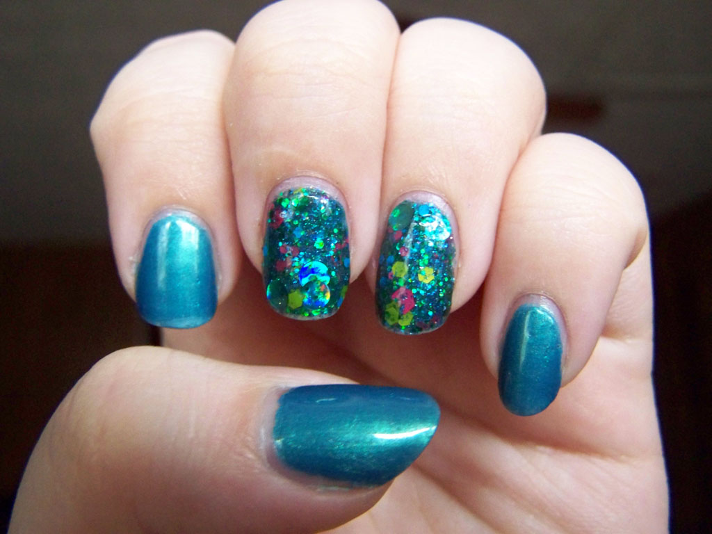
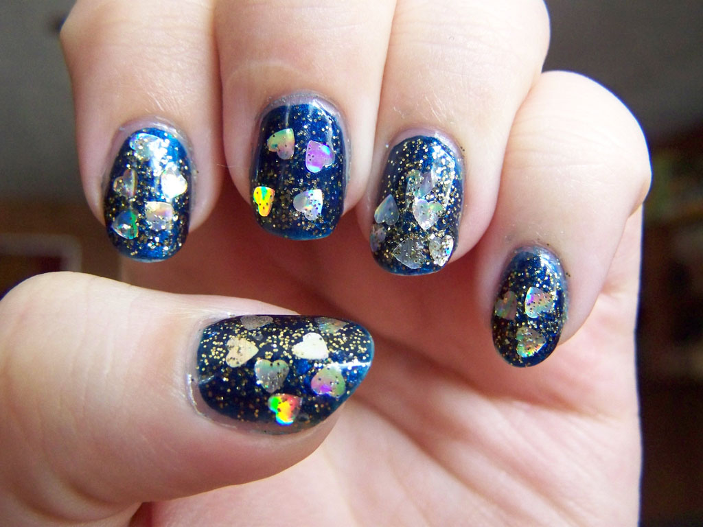
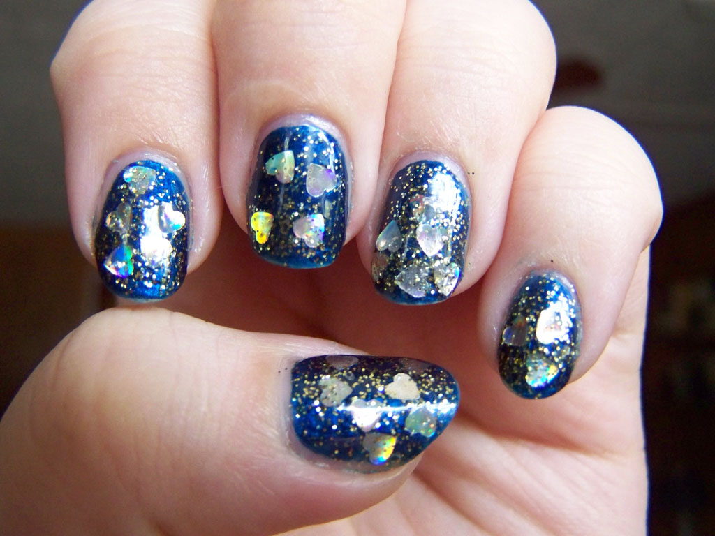
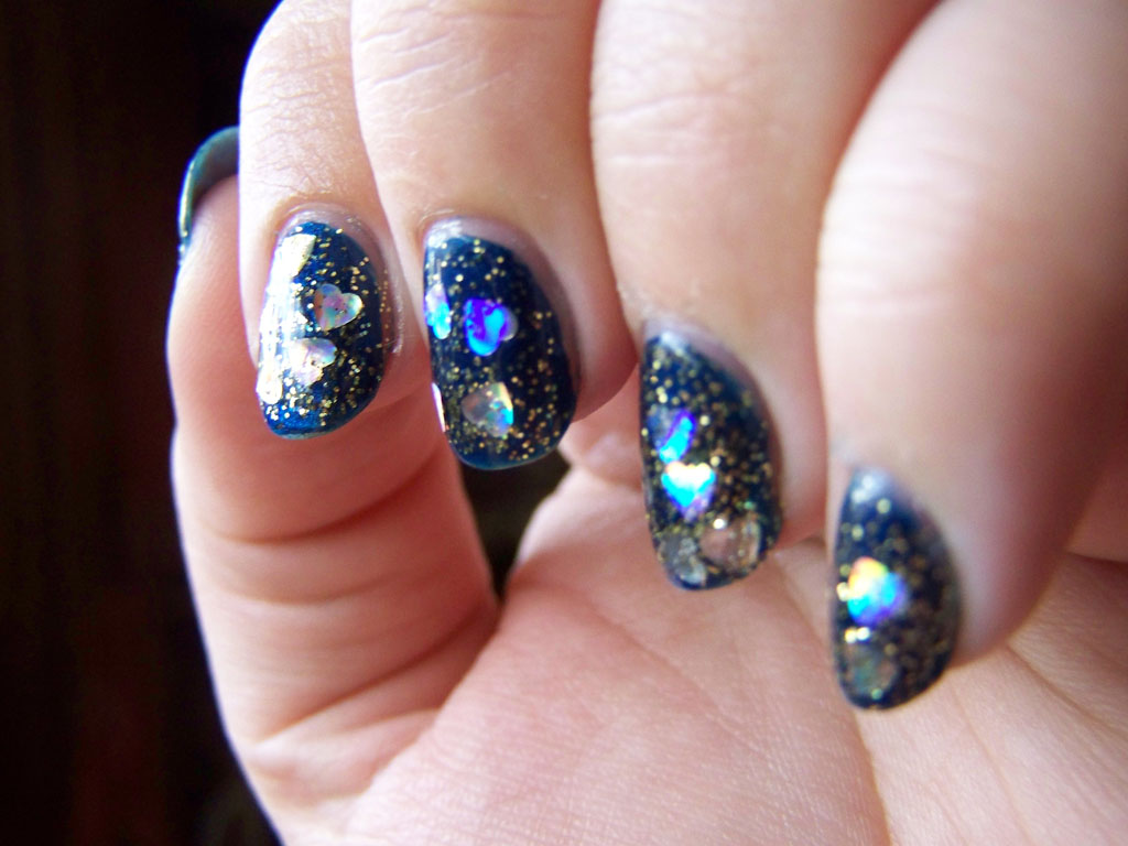
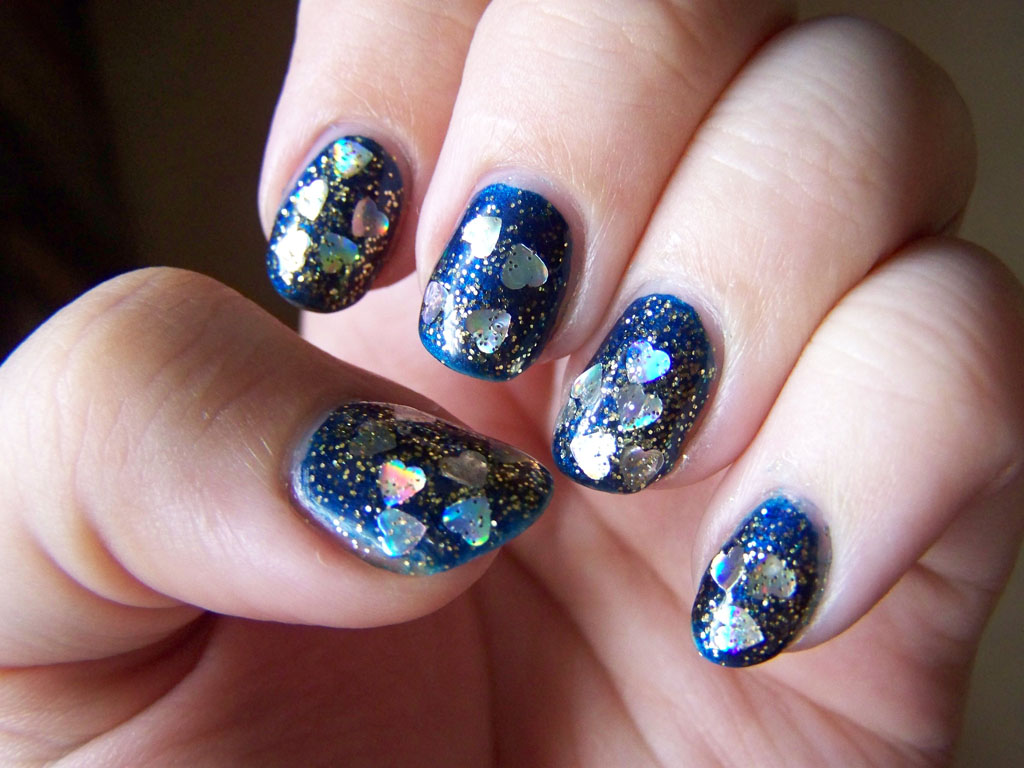
My two colors this week are Sephora by OPI’s Skinny Jeans and Digital Nails’s Wibbly Wobbly. I really love how it came out. I thought the nails without the glitter would be too plain, but the colors actually work really well and I don’t feel like the rest of my nails are too plain. This is a fantastic match. Something else I worried about was the glitter going on too thick and making the nails fat. That didn’t happen the way it did with this glitter. I brushed the glitter on instead of dabbing it, so maybe that made a difference. I could have just Wibbly Wobbly as a glitter topper,  but I really wanted that multi-layered glitter look. I’m pleased as hell with how it turned out.

Sephora by OPI's Skinny Jeans, Digital Nails's Wibbly Wobbly

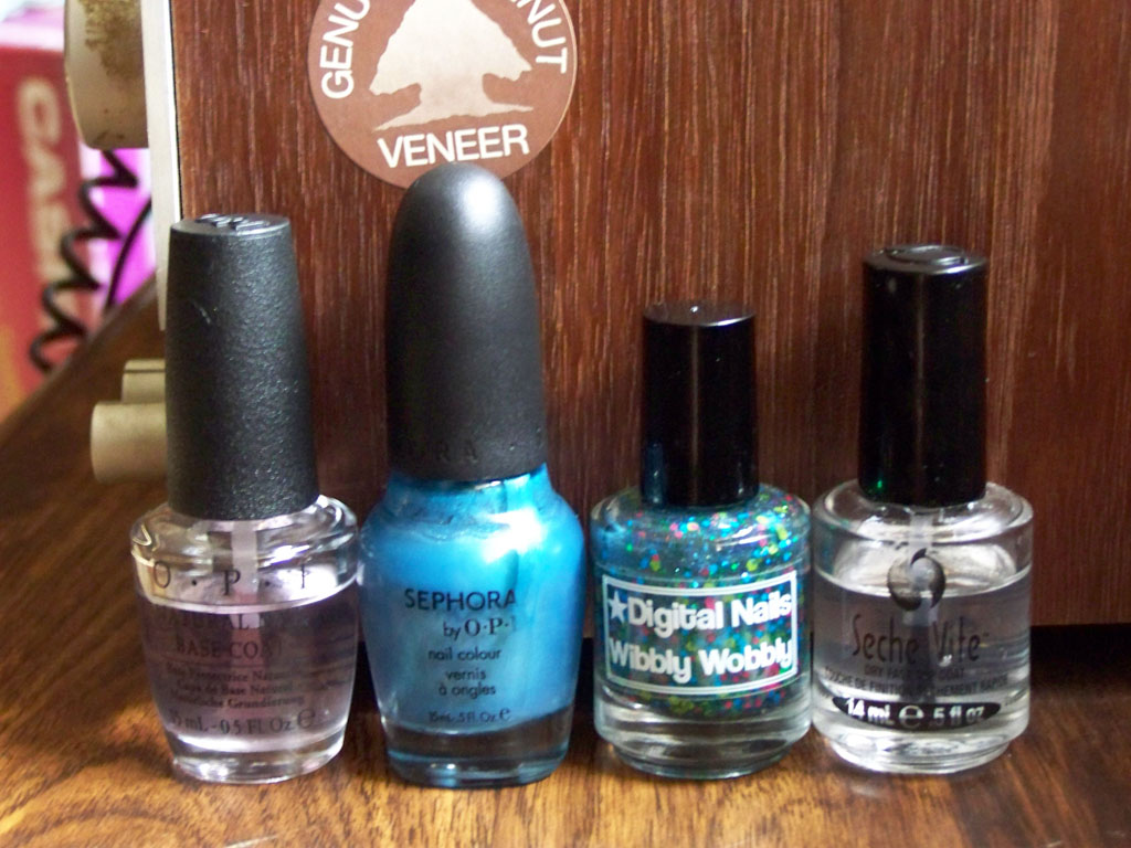
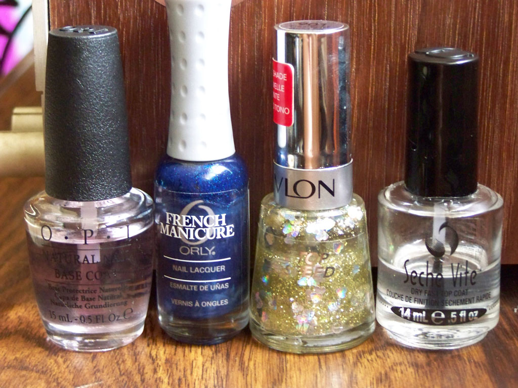
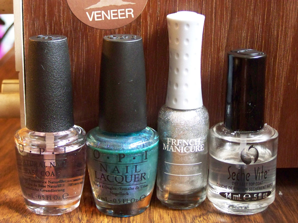
Sephora by OPI’s Skinny Jeans, Digital Nails’s Wibbly Wobbly

So, a little something about Wibbly Wobbly: I think it’s the polish that sold me on indies. I saw a Reddit post with Wibbly Wobbly over black, and I’d never seen anything like it before: all those different glitters, the huge dot glitters… I needed it. I went to buy it immediately after, but I reigned myself in somehow, even though there was like one bottle left and it seemed like destiny. I couldn’t bring myself to pay ten dollars plus shipping for a bottle of polish. When I got a prize for being a finalist in a game design contest, all that went out the window. Ultimately, it’s this polish that led to my delightful indie polish problem.

Manicure Monday: Red Crackle over Blue

There isn’t much to say about this manicure that I didn’t say the last time I used a crackle top coat. I got a very cool, very unpredictable, very 2009 manicure.

100_2657

The red stained my cuticles.

I’ll say a word to Dianna, the blue base I used. Usually Julep polishes have varying degrees of quality, and I’m happy to report this is one of the better ones. It was nearly opaque in the first coat.

Julep's Dianna, Nicole by OPI's Red Texture

Julep’s Dianna, Nicole by OPI’s Red Texture

I used to think solid creme colors were boring. If it didn’t have shimmer or glitter, I wasn’t interested. I suppose less is more with them, and that’s a cliche that never quite found itself into my practical life advice files. There’s something about bold, shiny nails without anything to distract from the color. Maybe someday I’ll try it.

Manicure Monday: Hearts of Gold Over Blue

I waited until the coffee kicked in to start this entry. Best coffee is best best best coffee best.

Note the blue cuticle on the middle finger. I had a hell of a time getting my cuticles clean.

Note the blue cuticle on the middle finger. I had a hell of a time getting my cuticles clean.

This week I faced two challenges: having a polish that stained my cuticles to hell, and trying to get large glitter out of a bottle. My blue polish, Orly’s Witch’s Blue, is a beautiful jewel color. It’s dark and mysterious and dramatic. I knew the holo gold hearts in Revlon’s Hearts of Gold would stand out nicely against it. What I didn’t count on, though, was the fine gold glitter overpowering the background color, or the haphazard way the hearts landed. I did manipulate them a little with a toothpick, but mostly wherever they are is where they landed. Also, I really had to work for these hearts. A little further down, you’ll see that the Revlon bottle is about a third of the way empty. Yeah. I wasted a good bit of it just trying to get the hearts out.

I went back and traced my cuticles after I took that first photo. It's better now.

I went back and traced my cuticles after I took that first photo. It’s better now.

I love the colors in the hearts, though. Holo glitter is beautiful! I just keep looking at my nails and fanning them back and forth to watch the rainbow.

Rainbow!

Rainbow!


100_2643

Not the rainbow.

Not the rainbow.

Orly's Witch's Blue, Revlon's Hearts of Gold FX

Orly’s Witch’s Blue, Revlon’s Hearts of Gold FX

They’re kinda messy, kinda sloppy, but I’m into it.

Manicure Monday: Blue and Silver Gradient

This week I have two fantastic polishes and a beautiful shiny gradient.If it wasn’t so gross and cold and overcast outside, these nails would be absolutely blinding.

100_2616

I started with two coats of OPI’s Austin-tatious Turquoise. It’s a bottle I’ve had for a few years now, acquired in that legendary Ulta haul where I had a ton of reward points and left the store with like ten bottles of OPI. I don’t know, the bottle count changes each time I remember it. It’s like a fishing story. Unfortunately, I had a lot of problems with this color. The first coat was thin and uneven; the second did not cover or improve anything. I was only able to gain opacity when I started sponging it on to create the gradient. I was really disappointed by it, because it’s beautiful in the bottle. It takes a lot of work to get it to look good on my nails.

This is me trying to demonstrate the duochromatic properties of Austin-tatious Turquoise. It almost worked.

This is me trying to demonstrate the duochromatic properties of Austin-tatious Turquoise. It almost worked.

Shine is the total opposite. Opaque in two coats, it makes this gradient reflective and, well, shiny. There isn’t a better name for this polish. I liked the silver so much, I added a rhinestone to each nail to add more. Overkill? Probably. Pretty? Totally!

OPI's Austin-Tatious Turquoise, Orly's Shine

OPI’s Austin-Tatious Turquoise, Orly’s Shine