Manicure Monday: Vesper

It’s Manicure Monday again, and I’m excited because it’s a wacie.com first: textured polish! I’ve been buying these up like mad, but this is the first time I’ve ever featured one on the blog. This is OPI’s Liquid Sand in Vesper; I’m wearing three coats of it without topcoat.

IMG_56602

IMG_56632

IMG_56762

Vesper is a deep plum polish with black grainy glitter. You can’t see much of the purple, except around the edges of the nails. The first coat presented more purple, but multiple coats makes it harder to see. It dries with a coarse, gritty texture, as is intended. It sparkles a bit more in lower lighting; in the studio, it just kind of looks like spray-on truck bed liner. I couldn’t capture that in the studio. I probably could have in the sunlight, but I was late taking pictures today and it was pretty dusky by the time I got outside.

IMG_56852

IMG_56892

IMG_56952

IMG_56972

This isn’t to say I don’t like this polish, because I do. Nothing says summer fun like a plum, right? However, it’s not my favorite Liquid Sand. My favorites are still the ones with more emphasis on the glitter than on the texture. In any case, it’s a cool look, and I’m not sure if textured polishes are passe yet, but I’m happy to finally get around to reviewing one.

Swatch Saturday: American Apparel’s Neon Coral

Swatch Saturday is right on time this week! We’re on the second bottle of my most recent American Apparel haul. This is called Neon Coral, though I think it’s really more of an orange. It’s the perfect polish to wear today, too; it’s 97 degrees outside and this polish looks the way the weather feels. I’m wearing three coats of Neon Coral with one coat of Seche Vite. As with last week, the pinky and ring finger nails have two coats of white polish under the color.

IMG_56052

IMG_56102

IMG_56172

I am really into these neons! I am so glad I bought all the ones I didn’t have. The formula is a bit thin, but is still easy to work with and covers well. The color payoff is huge, even without the use of white polish. It’s so bright, my fingers look instantly tanner. It’s delicious. These neons absolutely cannot be beat.

IMG_56222

IMG_56312

IMG_56392

IMG_56452

I find it interesting that the use of white polish makes such a small, almost undetectable, difference. I’ll continue to do this with the rest of the neon polishes, just to see if it really is unnecessary. It seems like this was always the disadvantage to neon polishes; the colors are beautiful, but they don’t cover and require white polish. If all six of these manage to break that trend, I will be incredibly pleased.

Wacie Wednesday on Friday: Andromeda

My Wacie Nail Co. swatch this week is late and I apologize. I actually wanted to hold onto the pink and glitter nails I did on Monday for a while longer, but then they chipped Wednesday night. I put this polish on Thursday between World Cup matches, but I couldn’t do any photography until this afternoon. The tips are worn, but this is still a nice-looking polish. This is Andromeda from Wacie Nail Company, shown here at three coats with one coat of Seche Vite.

IMG_55562

IMG_55622

IMG_55642

IMG_55702

Andromeda is a black jelly with fine rainbow iridescent glitter. It’s a pretty simple in composition; there’s only one glitter variety in here, but look at what it does. There are so many colors here, so complex and dynamic, and yet it’s all the same glitter. It’s very less-is-more, which as you know, is an ideal I almost, almost want to embrace.

IMG_55732

IMG_55782

IMG_55852

IMG_55912

You can see the difference in the colors very well in the sunlight photos below. This is crazy in the sunshine; you can see every speck of glitter on every nail. It’s insane.

IMG_55942

IMG_56012

Also, it was cloudy as crap when I went outside to take these photos; the sun came out just for me. I love when that happens! Either I am the sun, or the universe just wants my skin to char, I’m not sure.


Manicure Monday: Sweet Pink and Bold Glitter

Manicure Monday is good this week. Everything I love is here: pink, glitter, shine; I couldn’t hate this if I wanted to. For this manicure, I’m wearing two coats of Julep’s Carrie with two coats of China Glaze’s Razzle Me Dazzle Me on my accent nails. All nails are topped with one coat of Seche Vite.

IMG_55132

IMG_55182

Carrie is a sweet candy pink creme. It’sa really nice polish, though I wish I’d gone with three coats instead of two. Consistent with my Julep experience, the first coat was streaky and thin, and while the second coat did a lot to even out the color, there are still some bald spots. Other than that, I like it a lot. I have no other complaints than the coverage.

IMG_55232

IMG_55302

IMG_55312

Razzle Me Dazzle Me is a graffiti-style glitter from China Glaze, filled with various shapes and sizes of black and pink glitters. At first, I didn’t notice the pink glitters were pink; they appear silver at first look, but are much rosier and smokier than silver. In any case, they give off a ton of shine. The black glitters are much more prominent, obviously, so much so that it overpowers the base color. I didn’t plan to use two coats of glitter, but the first coat was kind of lopsided, and I wanted to even it out. Mission accomplished, I guess.

IMG_55482

This is an outdoor shot. It was cloudy out there, so I didn't get many good shots, but I wanted to show you this one because of how shiny the glitter is. See how it looks green? I was standing in front of a tree.

This is an outdoor shot. It was cloudy out there, so I didn’t get many good shots, but I wanted to show you this one because of how shiny the glitter is. See how it looks green? I was standing in front of a tree. And in the other photos where it looks gold? That’s my yellow shirt.

I love this manicure. I don’t wear pink polish often enough.

Swatch Saturday: American Apparel’s Neon Red

This week, I’m taking a break from swatching my Blue-Eyed Girl Lacquer collection to try a few I bought while I was on vacation. I had a habit of shopping at places just because I could; my city doesn’t have American Apparel stores, so when I saw one in Philadelphia, I had to stop in. The first time I’d ever been to one was on my birthday trip to Atlanta last year, and I bought six polishes, one of which was a gorgeous neon pink. I was so impressed with it that I swore to myself, if I ever see another American Apparel store, I’m going to grab all the rest of their neon polishes. Well, here we are. Today I’m trying Neon Red. I’m wearing three coats with one coat of Seche Vite.

IMG_54482

IMG_54522

IMG_54572

IMG_54772

Neon Red isn’t really that red; it’s more of a bold coral. It’s a beautiful color, certainly. As I did when I reviewed Neon Pink, I put down a coat of white polish, to see how much of a difference it makes. If you look closely at the middle and ring finger nails, you’ll see there’s a very slight difference in color. On my ring and pinky finger nails, I’ve got the undies coat. On the first coat, there was quite a visible difference, but as I added the next coats, the coverage built up and narrowed the gap. I wouldn’t say the white foundation wasn’t a total waste; in some lighting conditions, I can still my nail line on the no-undies nails. The white gives it a little more solidity, even if the polish doesn’t really need the pop.

IMG_54642

IMG_54682

IMG_54922

IMG_55082

I’m so happy I grabbed these. For neons, they’re pretty high-quality; you get great coverage and huge color payoff without a lot of white polish. I can’t wait to show you the rest!

Wacie Wednesday: Deep

For this Wacie Wednesday, I submit to you Deep, an emerald green jelly with gold dots and tiny iridescent glitters. I am wearing three coats with one coat of Seche Vite top coat. As usual, photos were taken in an indoor studio and outside in sunlight.

IMG_53602

IMG_53652

IMG_53752

IMG_53872

When I made this polish, I just felt like making something, and I was limited on supplies. I was between shipments, I was totally out of lacquer base and most glitters. All I had on hand was a small bottle of blue base, a bottle of yellow, and these two glitters. I thought “Why not?” and dumped a little of everything into a bottle. It was way too thick, but I liked how it looked, so when I got my next shipment of clear lacquer base, I diluted it until the formula was right (and made about five bottles in the process). In fact, because this color is so dark, I wasn’t quite sure what I was going to get until I put it on today. I even added a little more clear base just to ensure that it would be a jelly. I’d like for it to be a little squishier, but I’m pretty happy with it.

IMG_53882

IMG_53972

IMG_54042

IMG_54162

Because the color is so dark, I’m not sure how well it layers. I’m not sure if I’m seeing three coats’ worth of glitter or just one. Also, the dot glitters are actually gold, and the color gets totally lost in the green base, even in the most recent coat. However, in the sun, you can see every speck of glitter the way it was meant to be seen. I freaking love this in the sun. It’s shiny as all get out.

IMG_54212

Outdoors, sunlight

IMG_54292

I haven’t mentioned the Wacie Nail Company launch in a while, I know. So far, everything is on track for a summer launch. I know I said spring, I know I said a lot of things. For real this time though: Wacie Nail Company is happening soon. Watch this space for updates.

Manicure Monday: Double Reverse Green on Green Gradient

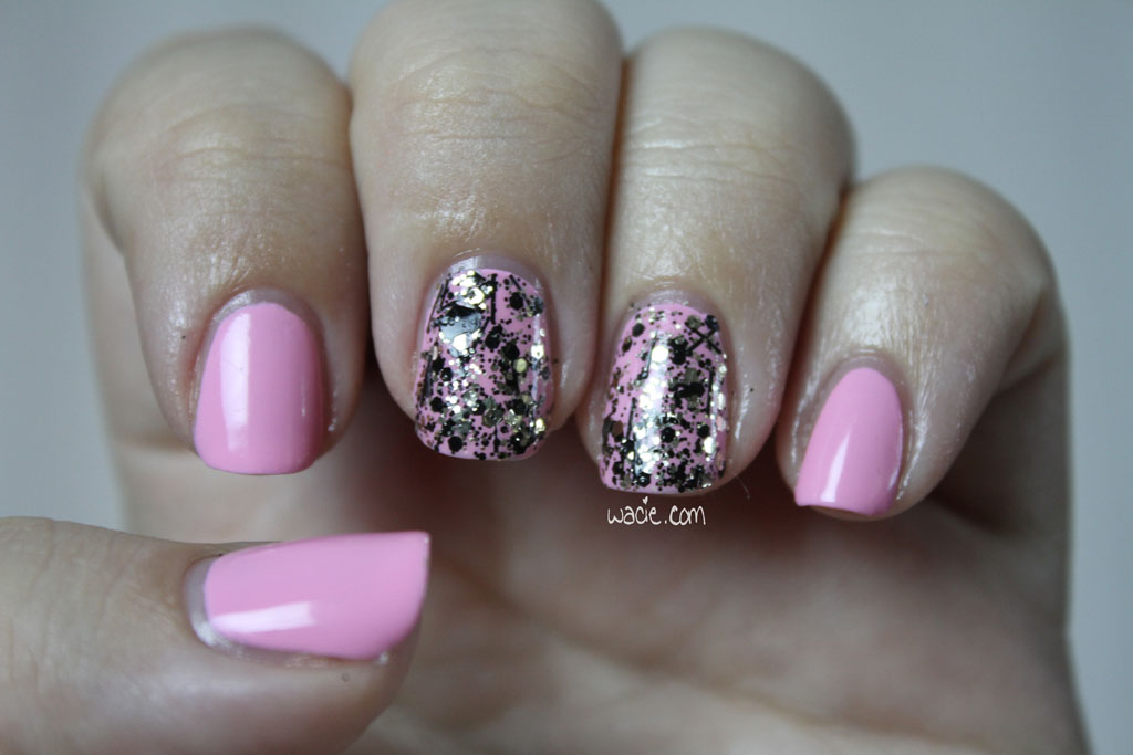
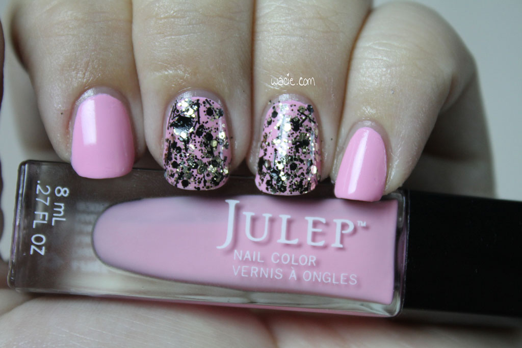
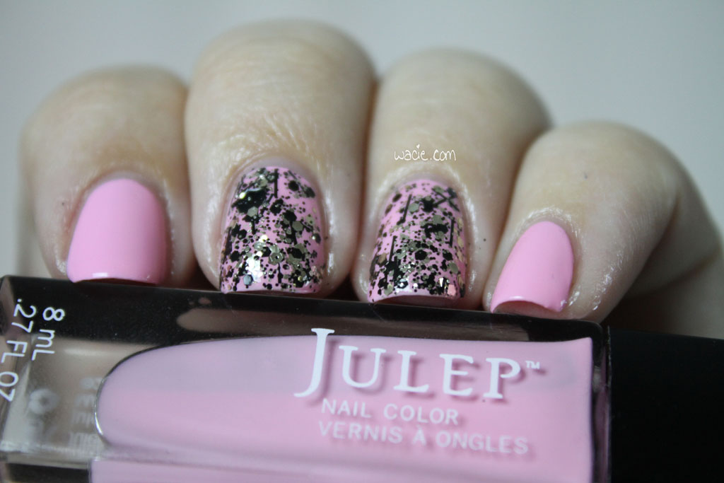
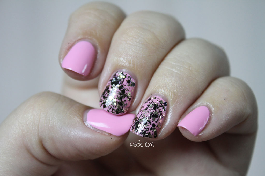
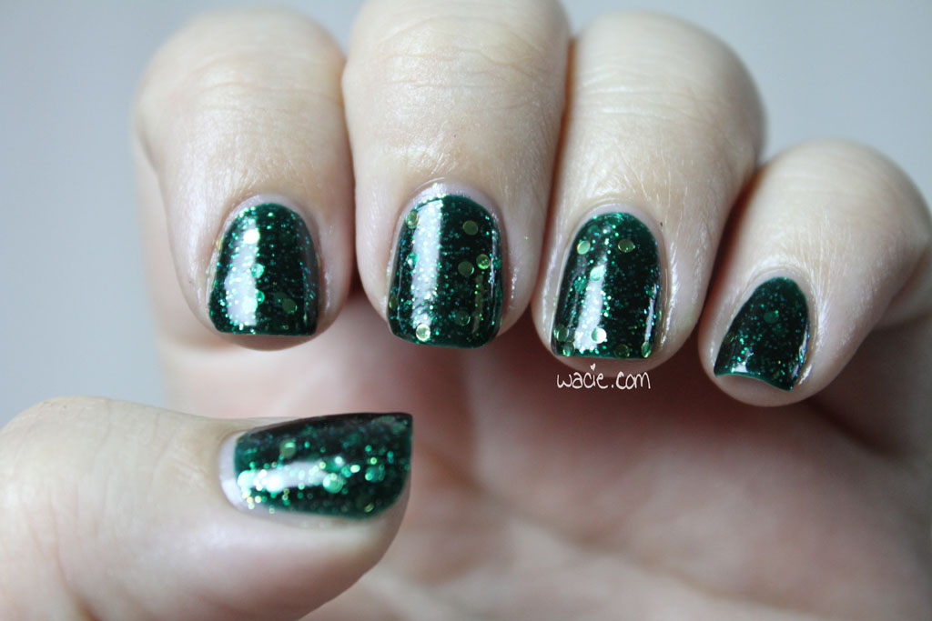
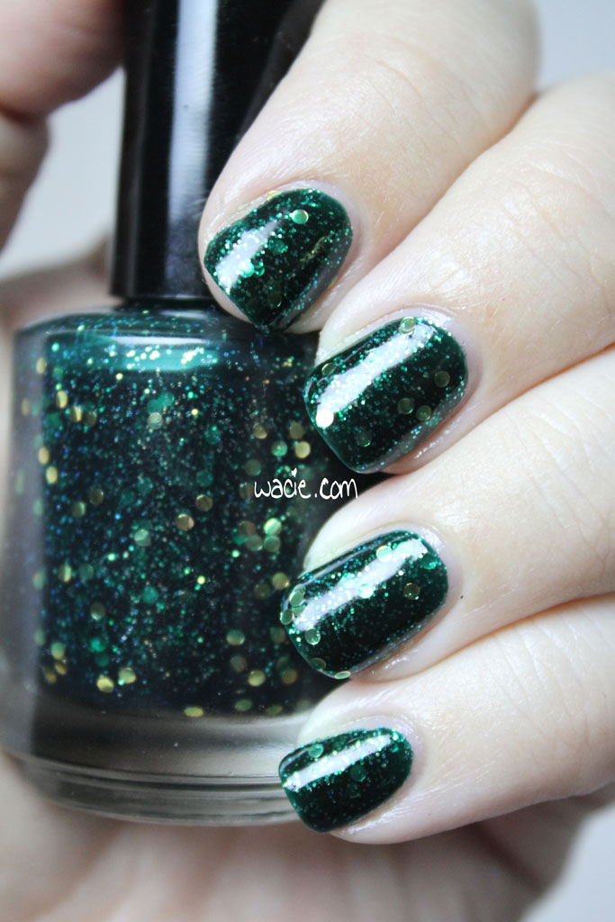
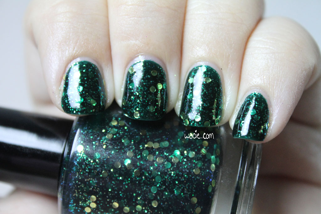
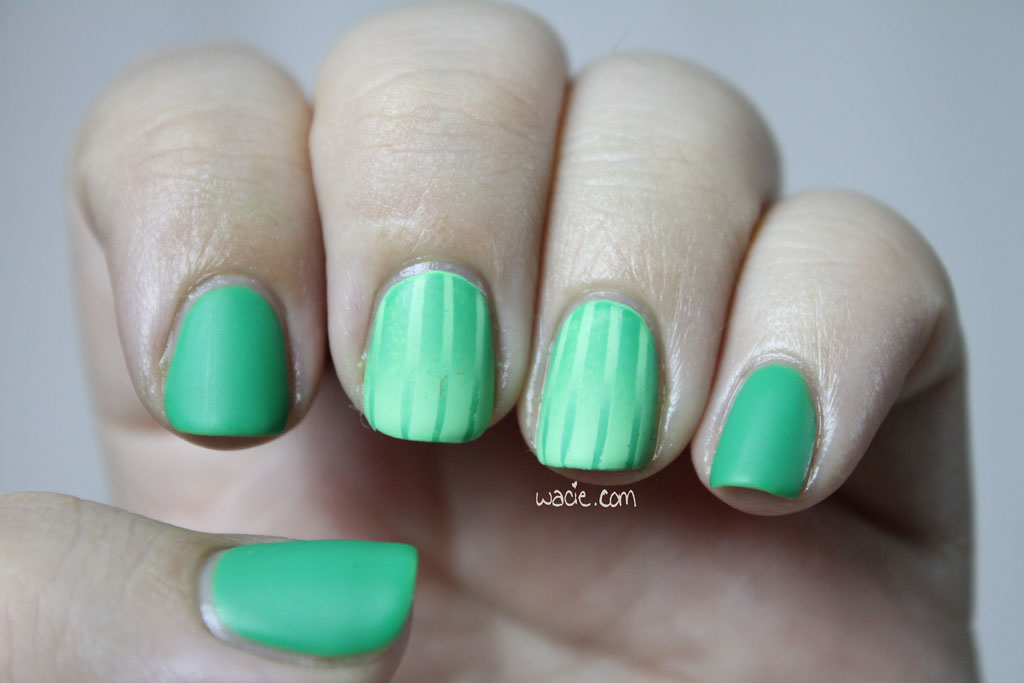
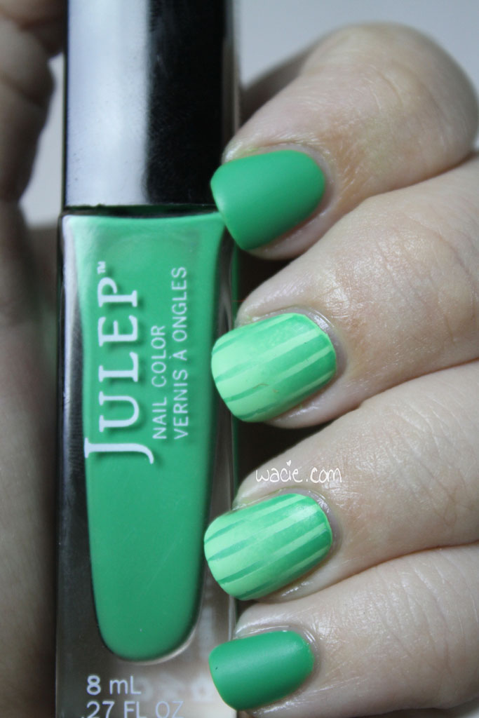
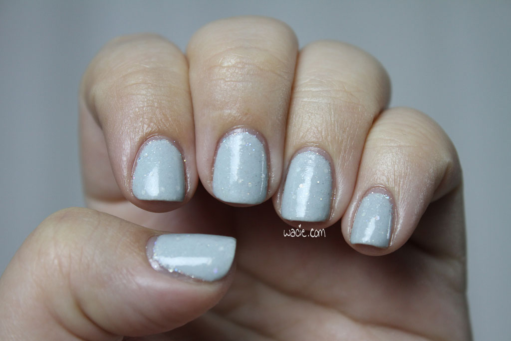
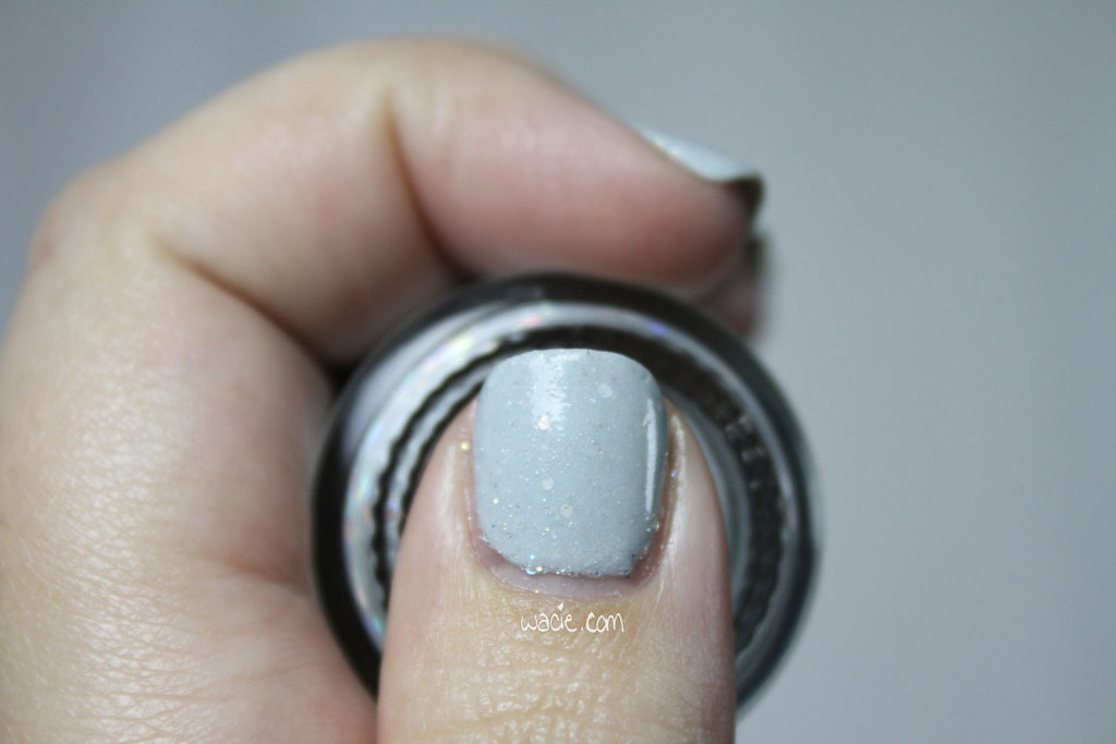
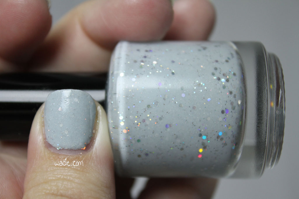
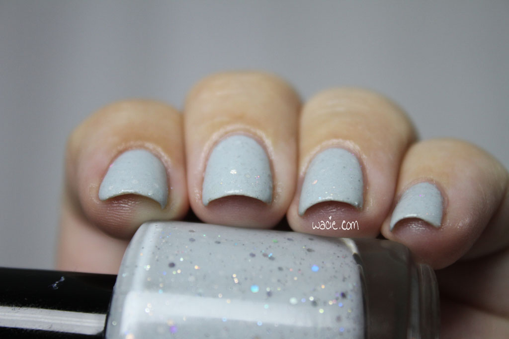
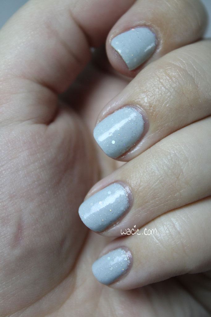
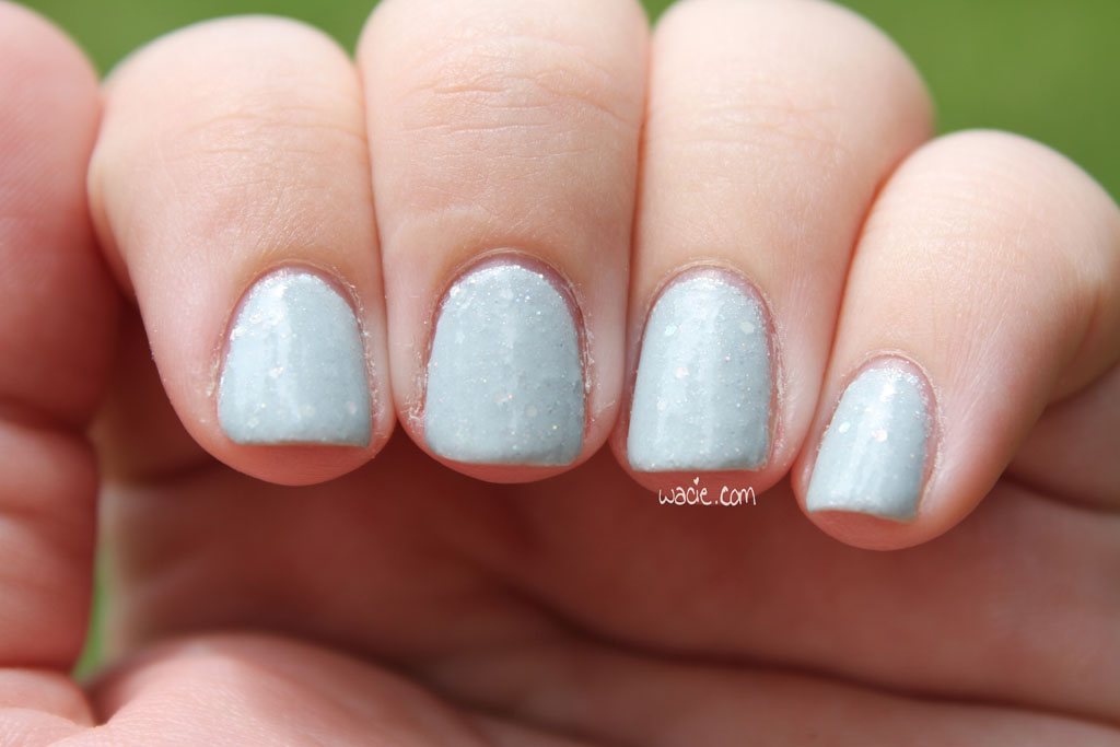
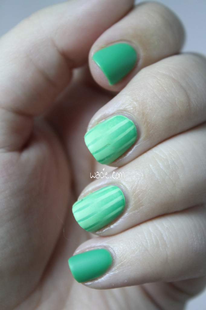
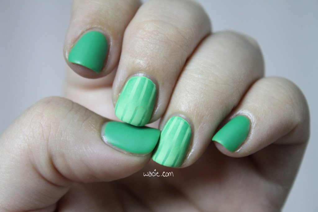
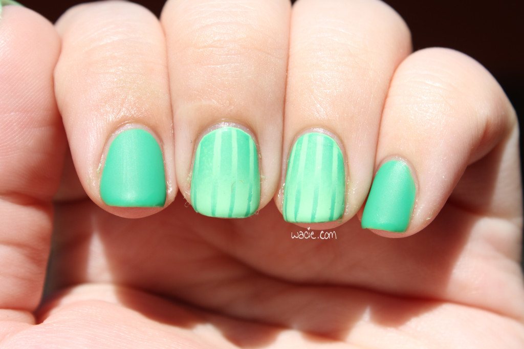
So for this Manicure Monday, I did some actual nail art instead of phoning it in with glitter. I always feel a little weird when I do a glitterless mani, like my nails are still naked somehow. This week, I did a double reverse gradient with Julep’s Payton and Color Club’s Twiggie. Payton is shown on the non-accent nails with two coats. All nails have a coat of Seche Vite top coat and Hard Candy’s Matte-ly in Love. Photos were taken indoors and outdoors.

IMG_53202

IMG_53312

IMG_53242

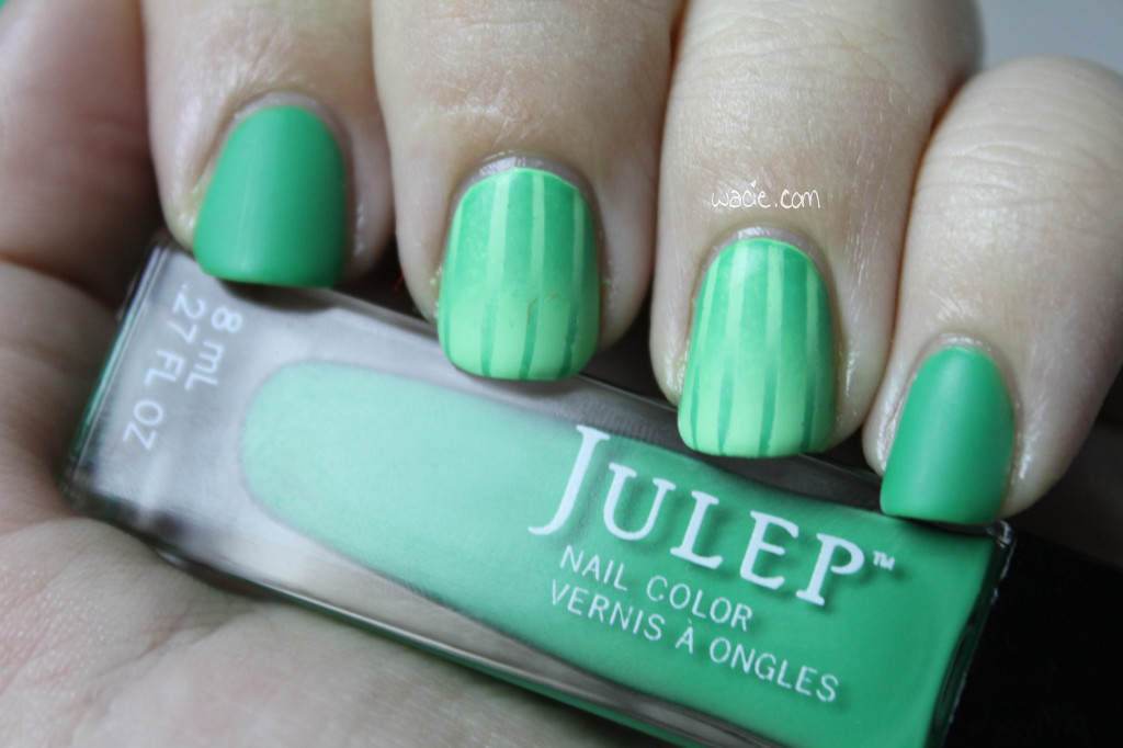
So the colors I chose this week go well together, but were still somewhat incongruous. Payton is a gorgeous kelly green creme that went on sheer with the first coat; the second coat even it out, but it was still deliciously shiny, a finish I’d expect from a jelly. Twiggie was a much more solid creme, and was opaque on its first coat. Together, Twiggie is the foundation of the gradient, and I didn’t get the opacity I expected from Payton, and the resulting gradient left me a little underwhelmed. Payton was so sheer that it didn’t cover over Twiggie as well as I thought it would. I will say this, though: I hated putting the matte coat over Payton. It was so shiny and so beautiful on its own that I felt like I was sucking the life of it by mattifying it. I really felt like I did this polish a disservice.

IMG_53402

IMG_53442

If you’re wondering how to do the double reverse gradient, it’s way simpler than it looks. Here’s the tutorial:

1. After you lay down your base colors, do a gradient the same way you usually do. For what it’s worth, I like to use eyeshadow sponge applicators instead of makeup wedges; for me, it’s more precise and makes less of a mess.

2. After your first gradient is dry, put down your striping tape as desired.

3. Do your second gradient, reversing the colors from the first gradient.

4. Peel off the tape, apply your top coat, and you’re done!
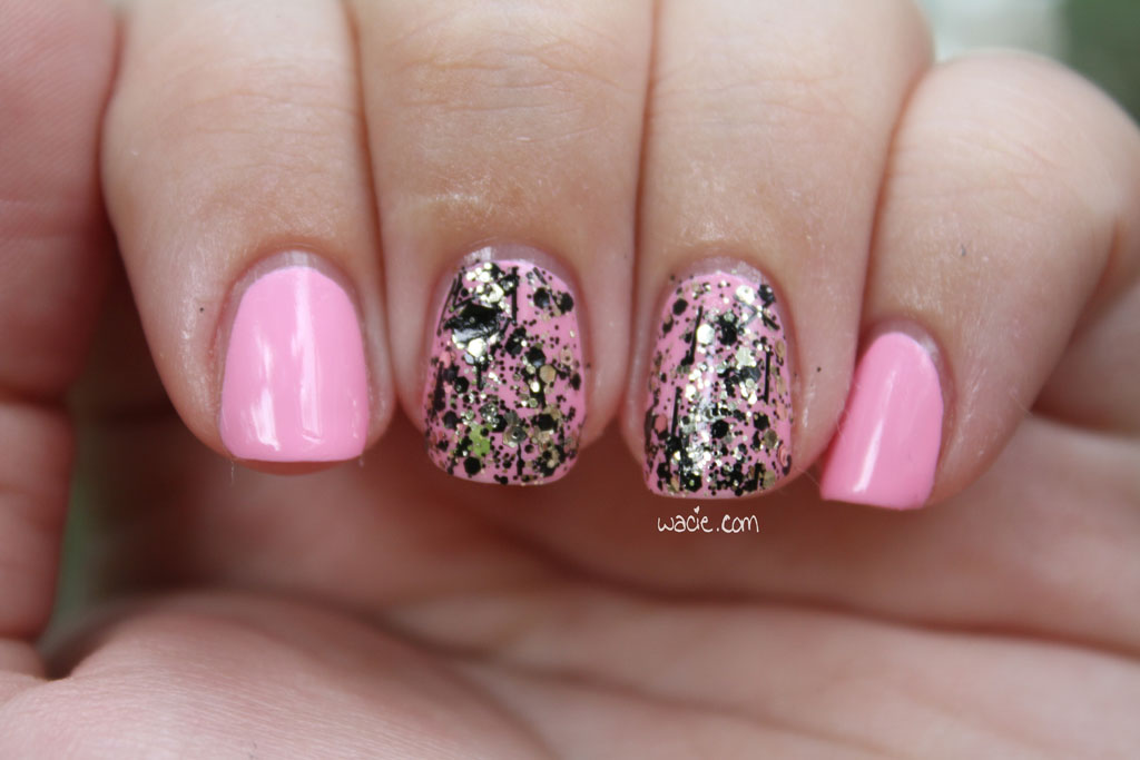
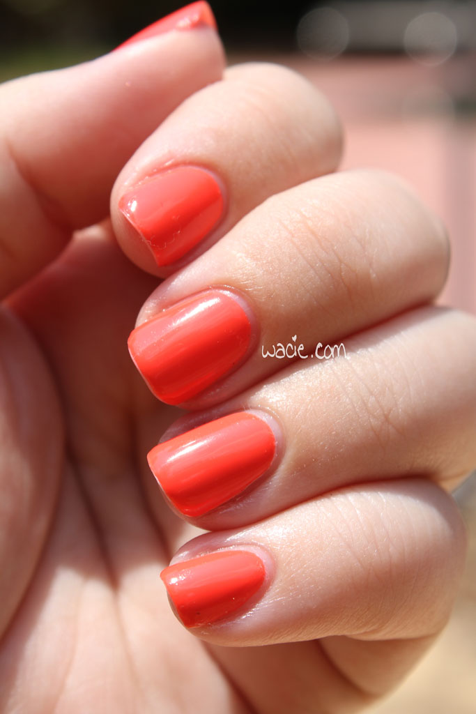
IMG_53522

Outdoors, full sun

IMG_53552

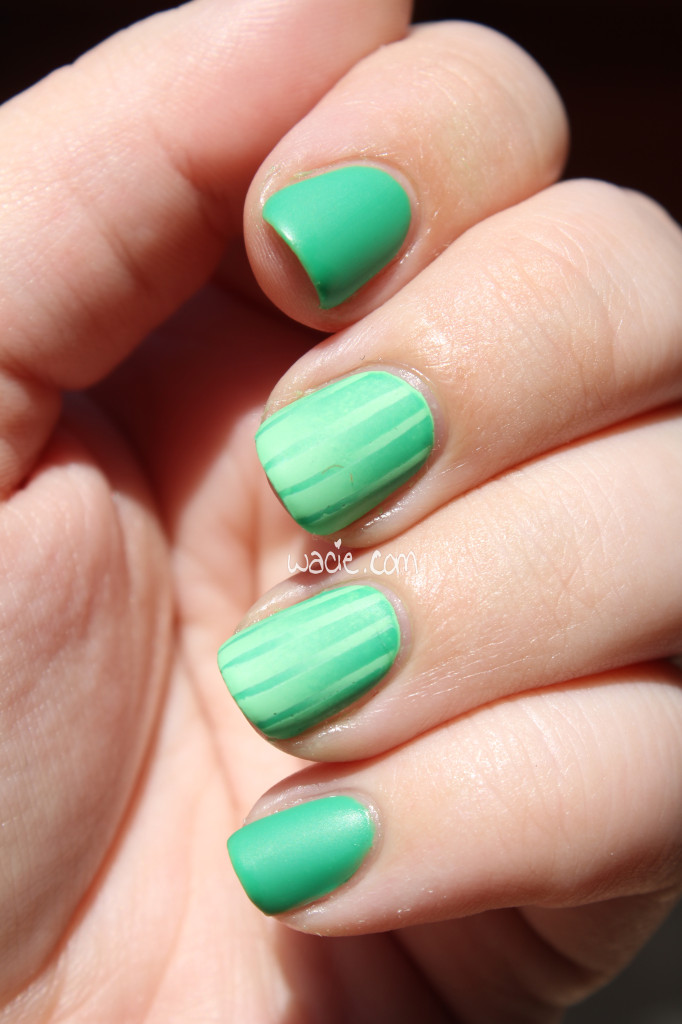
This really looked better in my head. I expected a stronger difference between the colors, but the sheerness of Payton didn’t make that possible. I also feel like I’m missing something; maybe I should have done a coat of Fairy Dust or something under Payton, just to add a little extra sparkle. On the plus side, and this was completely unintentional, it reminds me of a soccer field. I have been so caught up in watching the World Cup matches that I’ve been unable to think of much else. Despite the issues I’ve had with the polish compatibility, I love how this turned out.

PS: I have Payton on my toes as well. I love it. It’s like every toe is cosplaying as the toe from The Big Lebowski.

Swatch Saturday: Blue Eyed Girl Lacquer’s Don’t Worry, I Don’t Bite

This Saturday, I’m wearing Don’t Worry, I Don’t Bite from Blue-Eyed Girl Lacquer. This is another beauty from the Once More With Feeling collection that was released last August. It’s a gray linear holo, shown here at three coats with one coat of Seche Vite. Photos were taken indoors and outdoors.

IMG_52242

IMG_52302

IMG_52332

IMG_52402

IMG_52462

IMG_52492

IMG_52572

IMG_52632

Don’t Worry, I Don’t Bite is a gorgeous polish. It applies very easily, dries quickly, and the holo effect is vibrant and powerful, even in indoor lighting. The only thing I regret is that it’s mostly cloudy outside and my outdoor shots are not fantastic. I assure you, this is absolutely stunning in the sunlight, but right now it’s not very sunny at all. It’s disappointing.

IMG_52652

IMG_52822

IMG_52832

IMG_52922

IMG_52972

IMG_53042

IMG_53072

IMG_53132

Sorry this post is kind of short. I feel like this polish speaks for itself. Also I have soccer to watch.

Wacie Wednesday on Thursday: Purity

Wacie Wednesday is happening on Thursday today because I really struggled with whether I wanted to post it or not. I’ve been developing this color, called Purity, for quite a while now, and I’ve just never been able to get it right. I can’t get the blue jelly squishy enough, and it dulls the larger holographic glitter. I didn’t want to post it this week because it’s still not right, but I like how it looks anyway, so I’m going for it. Also, I’m in this post-vacation funk where nothing is interesting, so I’m kind of doing this just because I need something to do. This is three coats of Purity with one coat of Seche Vite.

IMG_51672

IMG_51722

IMG_51752

IMG_51782

Purity is (or is meant to be) a blue jelly with holographic silver glitters. They’re a bit hard to see in the polish; the holographic effect tends not to show up too well in the studio, and the unintended crelly effect of the blue base dulls them. As a result, it just looks like a pretty but unremarkable blue. Not to say there’s anything wrong with that, it’s beautiful color in itself and I love how it looks on me. It’s just not what I was going for. See how it looks in the bottle? That’s what I want, and I’ve been trying like hell to get it. I just can’t make it work.

IMG_51892

IMG_51962

IMG_52022

IMG_52042

It’s been cloudy and blah outside for a few days, so unfortunately, I couldn’t get any great photos in the sunlight. Sunlight usually saves my so-so glitter photos; couldn’t make that happen today. I actually took the studio shots last night, a few hours after I’d done the manicure. I took the outdoor shots this morning, but I just ended up getting great shots of sad cuticles. I’m a little embarrassed of these, actually.

Sad cuticles are sad.

Sad cuticles are sad.

Outdoors, cloudy as eff.

Outdoors, cloudy as eff.

I love Purity, and I guess I’ll be taking it back to the workshop yet again for another reformulation.

Manicure Monday: Dark Labyrinth

For Manicure Monday this week, I’m wearing something new and exciting. This is Dark Labyrinth from Digital Nails, a feast of glitter and science. I’m wearing three coats of it with one coat of Seche Vite. Dark Labyrinth is a black jelly with teal, neon pink, and lime green hexes, followed up with green stars. If you look closely, you’ll also find black circles, stars, and hexes. There’s a method to this madness, which I’ll quote directly from Digital Nails:

“The concept is that the blackness of the jelly base upon layering, will obscure the shapes of the bright colors underneath, representing all that human kind knows about our universe.”

IMG_51002

IMG_51052

IMG_51162

IMG_51082

Maybe I’m still kinda high on the last episode of Cosmos last night, but I think this is an interesting and awesome way to interpret the nature of our universe. This was derived from an even greater quote from Galileo Galilei about the importance of the language of mathematics:

“Philosophy [nature] is written in that great book which ever is before our eyes — I mean the universe — but we cannot understand it if we do not first learn the language and grasp the symbols in which it is written. The book is written in mathematical language, and the symbols are triangles, circles and other geometrical figures, without whose help it is impossible to comprehend a single word of it; without which one wanders in vain through a dark labyrinth.”

IMG_51202

IMG_51302

IMG_51322

IMG_51392

I love this polish. Even setting its concept aside, there is so much beauty in this polish. The neon colors and shapes jump right out at you, and only in certain lighting conditions can you see the darker ones. I was maybe a bit heavy-handed in my application; I’d hoped to see more of the black shapes through the jelly, but I really did obscure them quite well. I got such a great coverage that I forgot it’s a jelly base. It’s only when I see the few tiny black hexes scattered across the larger, brighter shapes I remember they’re there. This is likely true for many objects in space as well.

Outdoors, cloudy

Outdoors, cloudy

IMG_51612

I know I say this a lot, but polishes like this are the reason I came to indies. Here is a polish that’s not only gorgeous, but has something important and intelligent to say.