Manicure Monday: Barely There Glitter Gradient

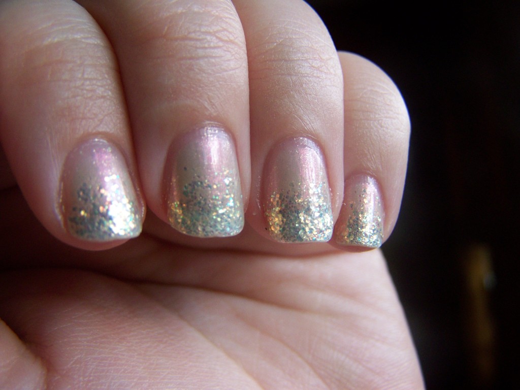
This week we have another subtle, dainty, blink-and-you’ll-miss-it manicure. These soft shades didn’t pair together as well as I thought they would, but I still like the result.
100_3073
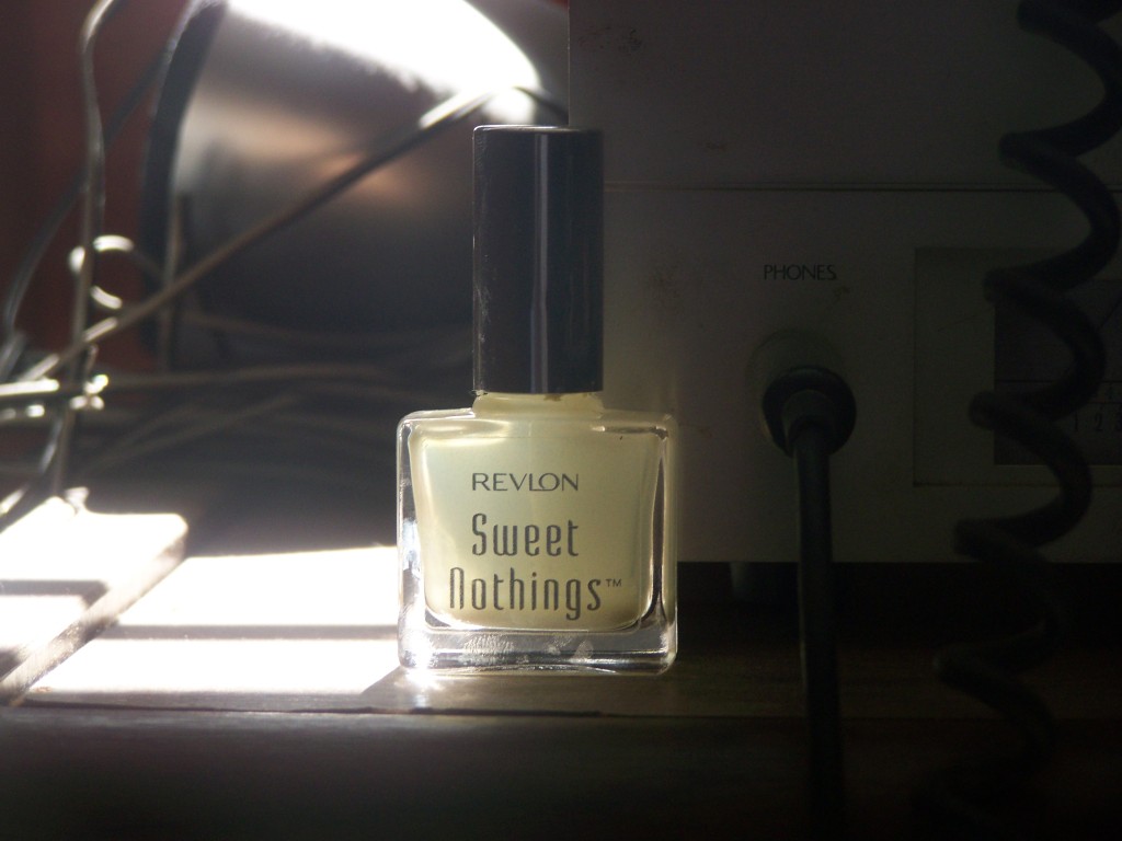
Revlon launched a little duochrome nail line called Sweet Nothings sometime around 2006 or 2007, I forget exactly when. I snapped them up when Walgreens had them on final clearance for $2 each. I’ve had these babies for a long time now, and I’ve gotten so much mileage out of them because they’re so versatile. They’re easy to wear; they look amazing worn over light colors, dark colors, or alone. There were only a few shades in this line, and sadly, I’ve already run out of one. Using the last of a discontinued product is always a hard thing for me to do.
100_3077
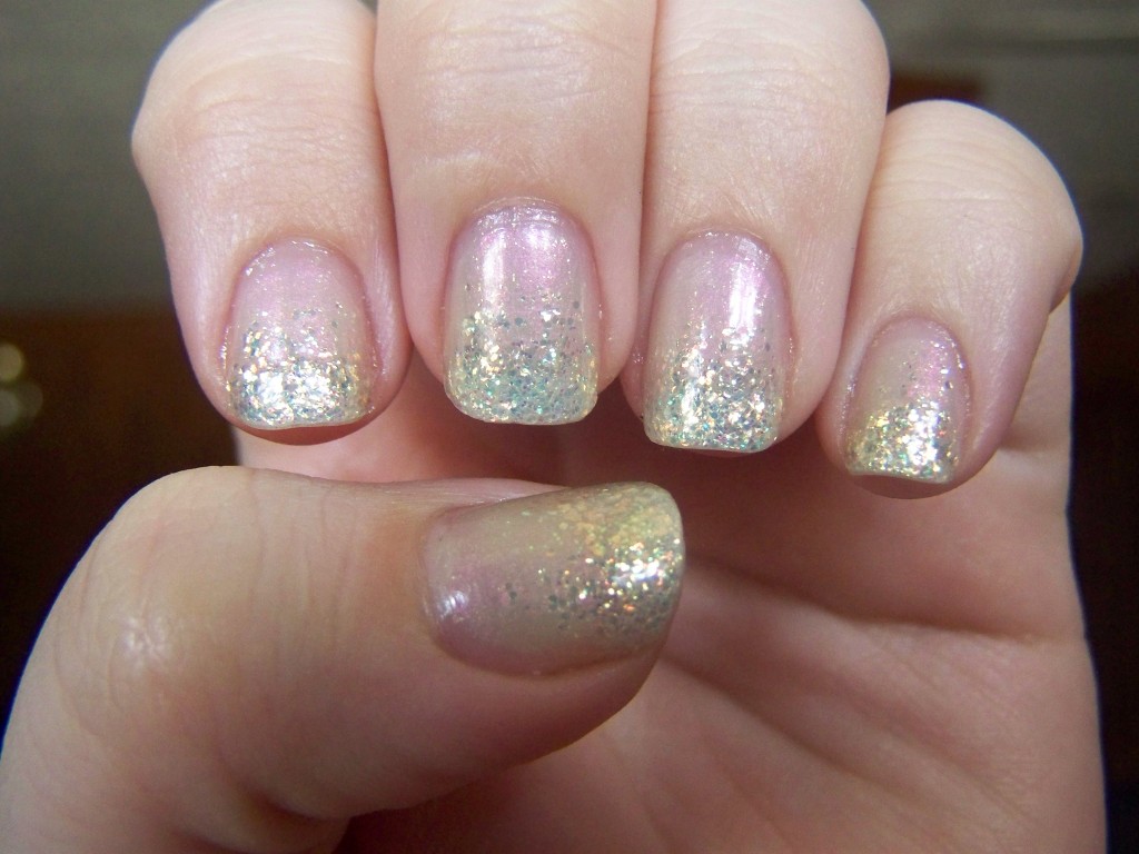
Right, so the polish. Here I’m wearing two coats of Rendez-Blue. It’s a sweet, milky blue with lots of pink shimmer. The blue would probably be more visible on a dark color; here I’m only wearing it over base coat. The pink shift is hard to capture on camera, but I think I did well enough.
100_3092
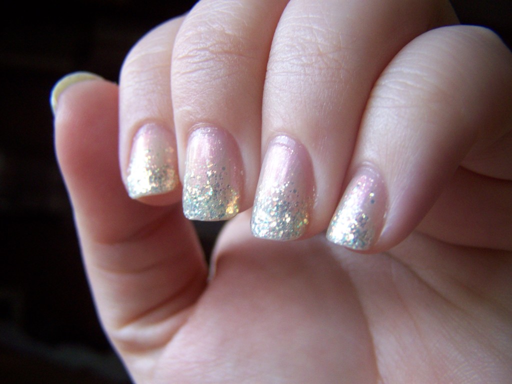
The glitter I used for the gradient is Julep’s Camille. Camille is a clear base with iridescent glitter that shifts from orange to green. The colors in the glitter are the complete opposite of Rendez-Blue, but I kind of like the contrast. I was afraid the glitter would blend in and it would just look like a bunch of nothing on my nails. Given the subtle colors, it already kind of does, but the glitter helps it stand out.

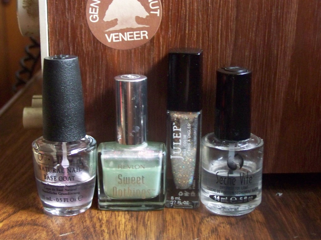
Revlon's Rendez-Blue, Julep's Camille

Revlon’s Rendez-Blue, Julep’s Camille

So, quick announcement: it turns out that wacie.com is a nail blog after all. Yeah, that wasn’t really my intention, but I felt really inspired and motivated over the weekend and decided to start my own indie polish brand, Wacie Nail Company. Yeah, I’m excited, too! Since wacie.com is already mostly about nails, I decided just to use wacie.com for my nail shop and blog, and move my writerly pursuits somewhere else. If you’re interested in reading my bad fiction and fail stories, please hop on over to my new blog. Thanks for reading!
Manicure Monday: Red and Rose Duochrome

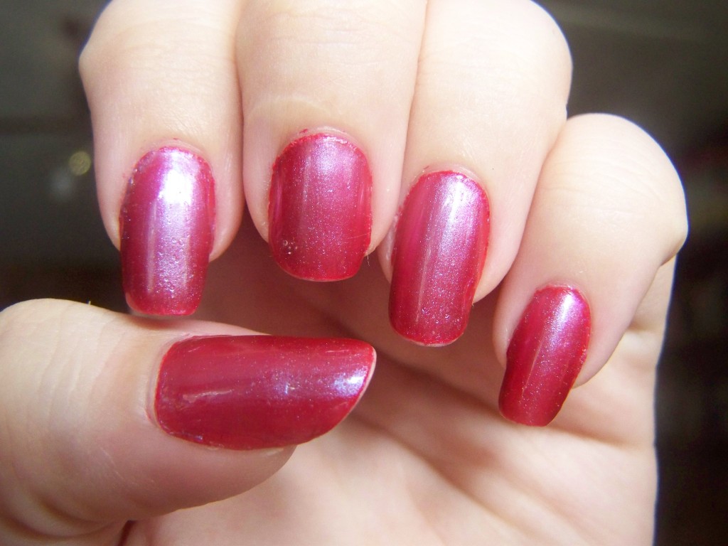
This might be kind of a departure from what I’ve been doing with my nails lately. It’s been a really long time since I had a solid color without any embellishments, and I’ll look at them and think “Hey, dots” or “I should try those decals” and then I tell myself to stop because they’re fine.

100_2138

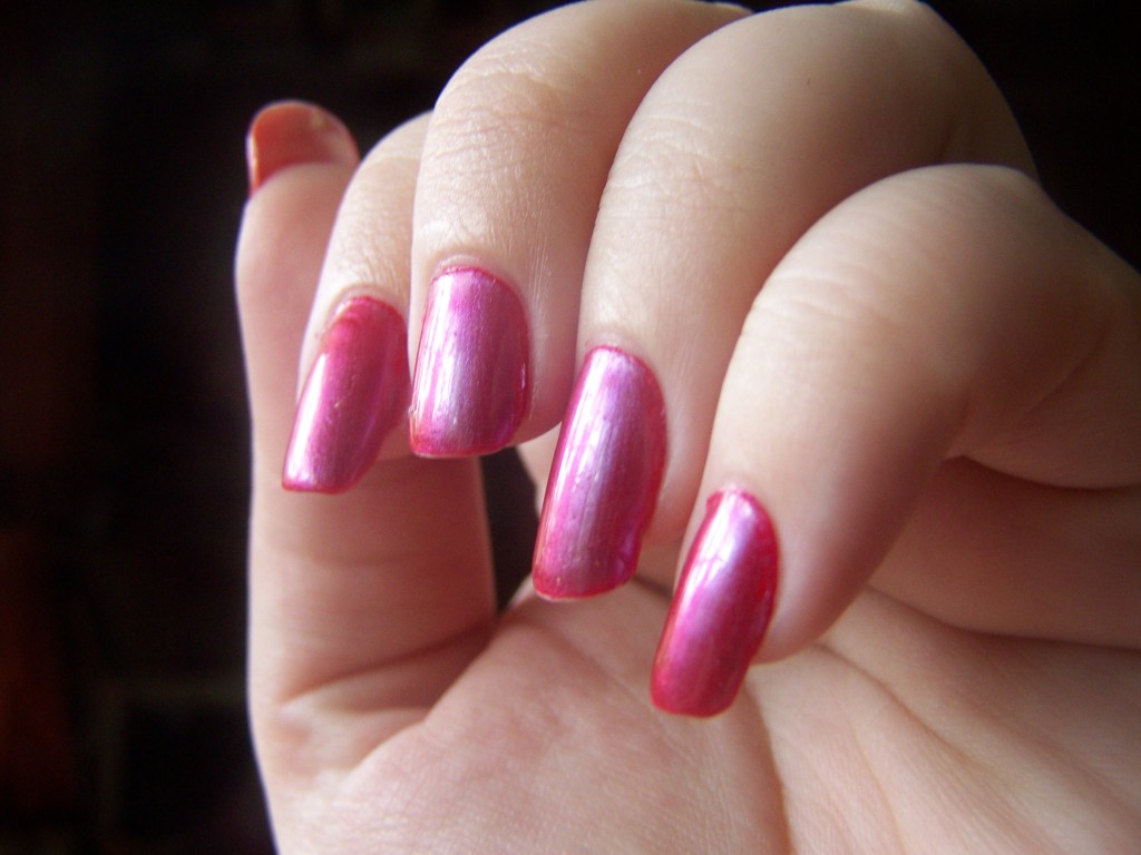
This is actually two colors, a semi-opaque red with a really tiny shimmer, and a rosy duochrome layered over it. At certain angles or lighting conditions, it shines pink, blue or lilac. On its own, it’s an odd color, but it is beautiful over this red.

You can see some of the other colors here. Kind of.

You can see some of the other colors here. Kind of.

Having red nails always reminds me of being in Rhode Island with my mother and my grandparents. My mother’s cousin, I think it was, was a nail tech and gave us manicures at least once. Actually, now that I think back on it, this was one of my earliest experiences with nail art. At some point, she gave us a manicure set, one complete with polishes, tools, fillers and fortifiers. I remember most of the colors being sheer, pretty neutrals, except for a bold red. That’s the one I went for, and even though I remember thinking that red was old and busted (blue polish was the new hotness and that was all I cared about wearing), I loved the way it looked on me. It was noticeable, attention-getting, it spoke volumes from my small nails and short fingers. Ever since then, there’s always been something about red nails that I can’t get enough of.

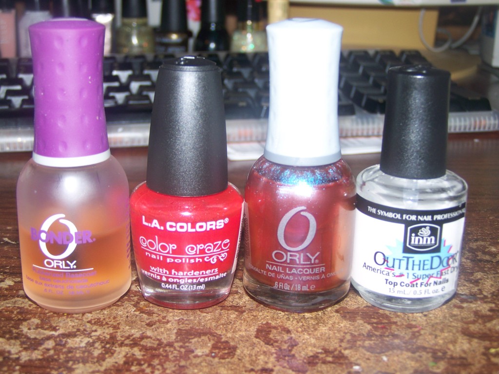
Bonder, LA Colors Animated, Orly Synchro, Out the Door

Bonder, LA Colors Animated, Orly Synchro, Out the Door

The more things change, the more they stay the same.

Manicure Monday: Nude and Gold Gradient

So my nail disaster this week was a rare event: I emptied a bottle.

100_2085

Satin Sheets.

I’d had this bottle for a while, almost ten years probably. I got the whole collection of them when Walgreens had them on sale for two dollars a bottle, once upon a time. I’d been using them occasionally ever since, just wearing them over my naked nails to give them a hint of shimmer. When I got into nail art and multiple colors, I struggled to find a way to preserve that natural, minimal look while still getting some attention. I tried to work it into this gradient, and towards the end, I didn’t have enough polish left to finish it. I had my heart set on this gradient, so I took it off and started with another color. I kind of feel like a jerk. Not only did I run out of the polish, I wasted what I had left. Sorry, Satin Sheets. You still had a good run.

100_2071

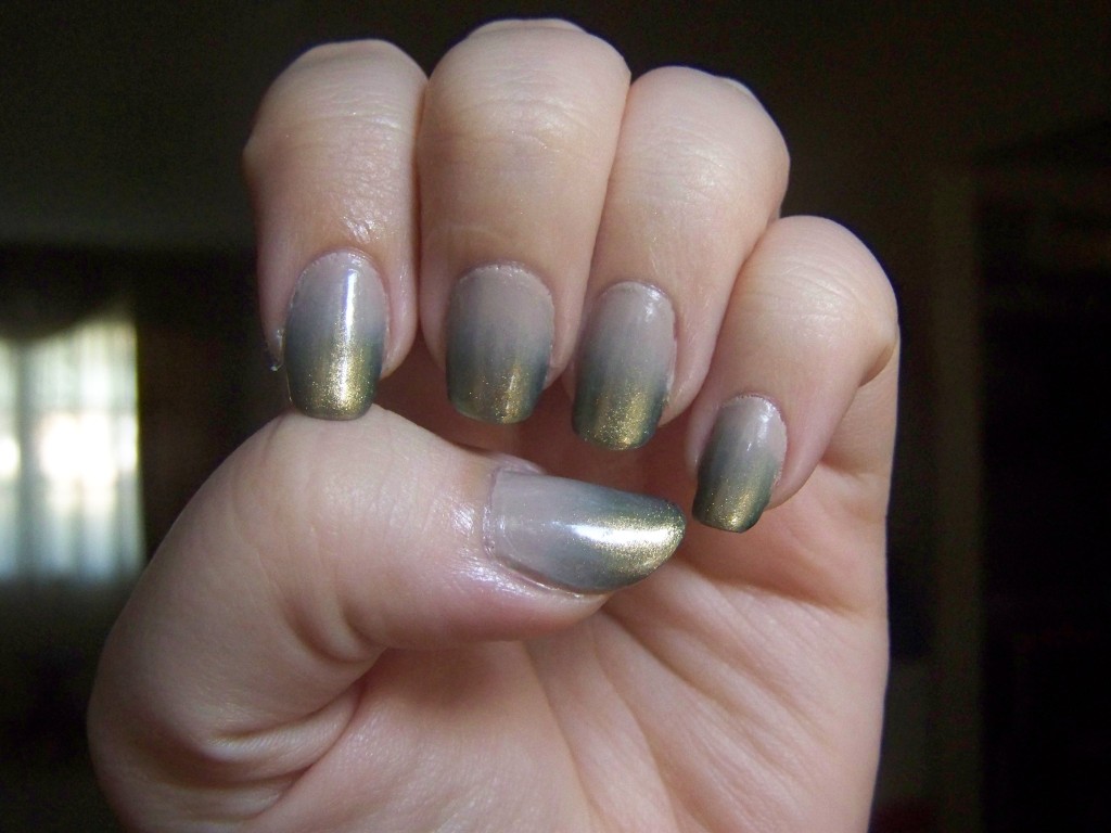
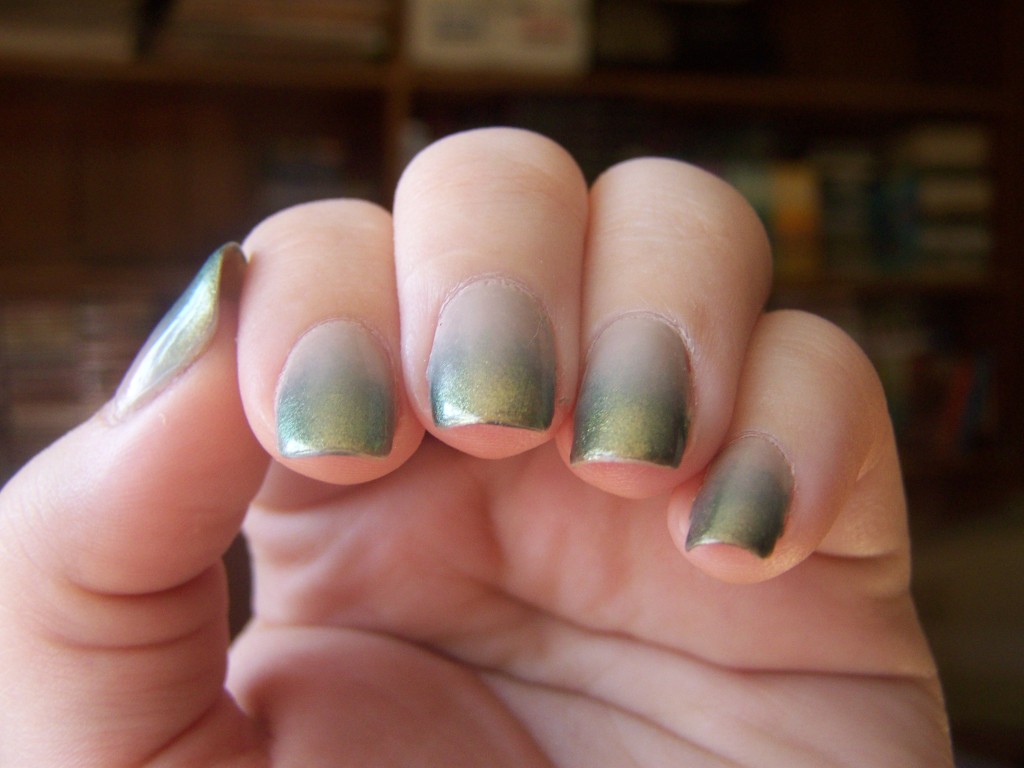
So I started over with a crème nude. I still wonder what it would have looked like with the sheer white, but I think I like what I ended up with. The first coat of Whipped was so sheer that I thought it was a jelly, but turned opaque with another couple of coats. Rare and Radiant has a lovely green color in the bottle, but appears mostly gold on the nails. It also appears I didn’t blend my pinky nail very well.

I was trying to get the green shimmer to show up. It did a little bit.

I was trying to get the green shimmer to show up. It did a little bit.

I like gradients. I like them a lot. I feel like it’s the best look I can get with minimal effort. I always manage to screw up taping, dotting is tedious and prone to mistakes, I don’t have the patience for freehanding anything. With gradients, I just dab a sponge on my nail, and that’s it. I still get to try surprising color combinations; I just don’t have to work as hard for them.

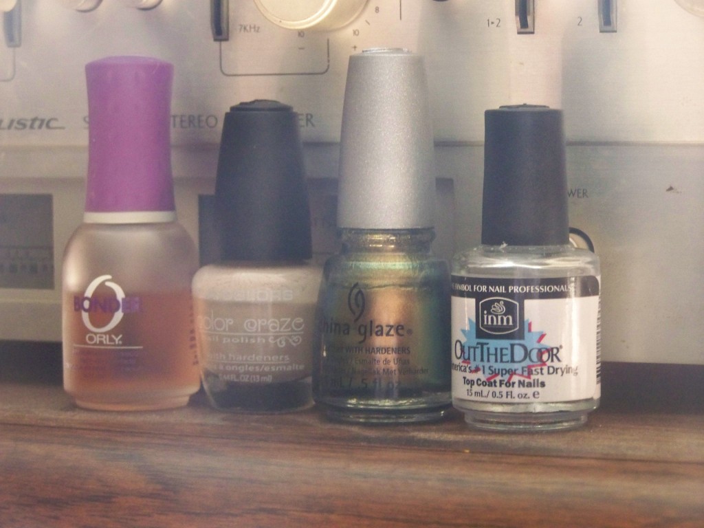
Bonder, Whipped, Rare and Radiant, Out the Door

Bonder, Whipped, Rare and Radiant, Out the Door

Now I’m off to recount my polish bottles. I was somewhere around 250 the last time I checked, but I need to make sure that’s accurate, especially now since I’m down one.