wacie.com Third Year Anniversary Post!

Happy Friday, reader! I don’t typically post on Fridays, but today is a special day: it’s the third anniversary of wacie.com! This is a huge day for us, and I couldn’t be more excited to bring you this post. It’s been quite a ride, and I’m so glad you’ve been a part of it.

On March 11, 2013, I posted my first-ever Manicure Monday post. I think I’d posted a few posts before that, but as wacie.com became more nail-oriented, I took them down and began to focus on nails exclusively. I’d been experimenting with nail art for a couple of years by the time I started the blog, and actually starting the blog helped me get better at it. My nails look and feel healthier, my application skills have gotten better, and I think the quality of the blog has improved, too. Three years is a lot of time for improvement, after all.
100_1933

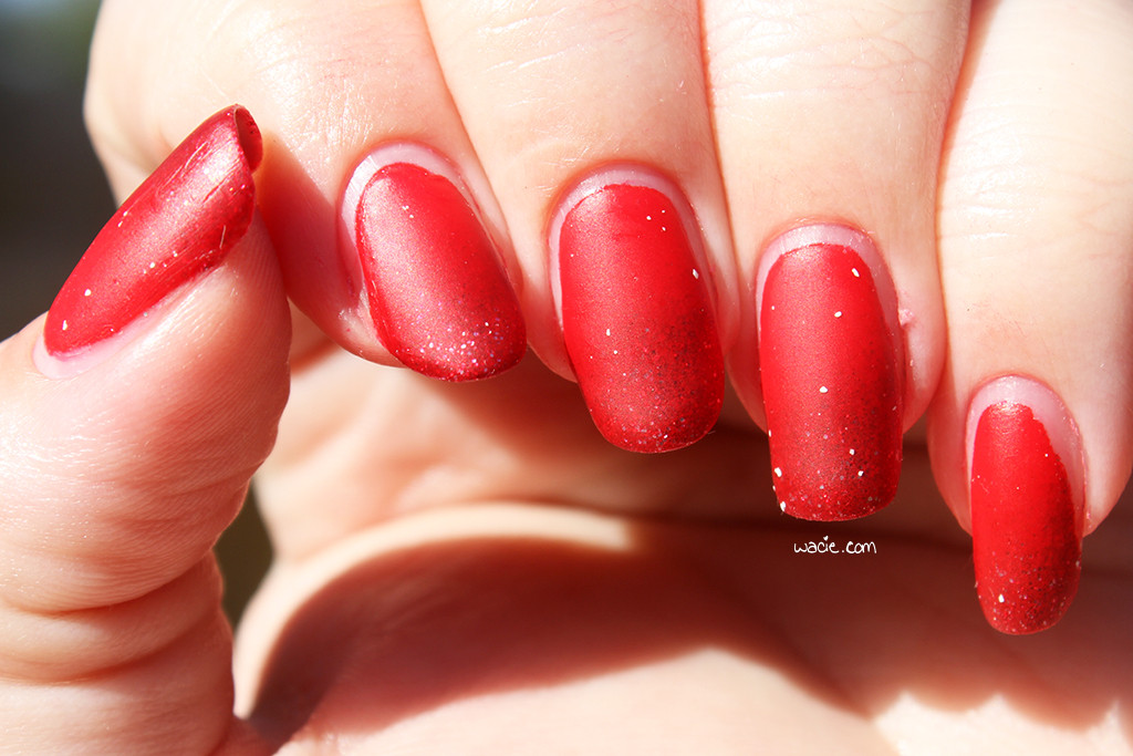
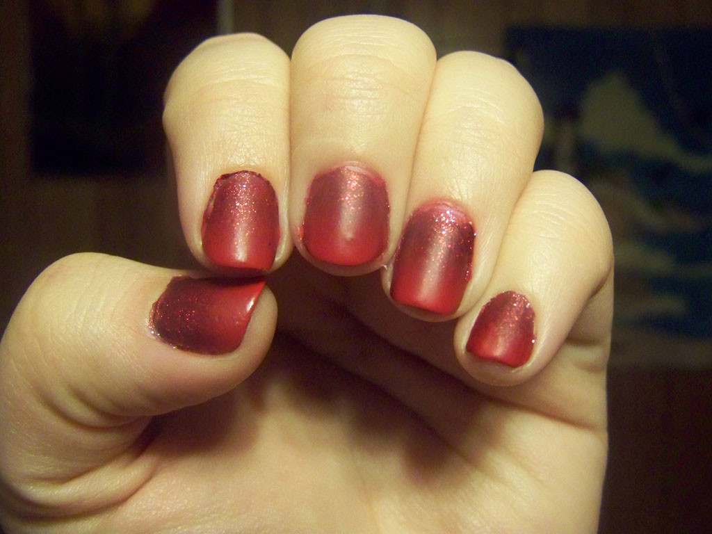
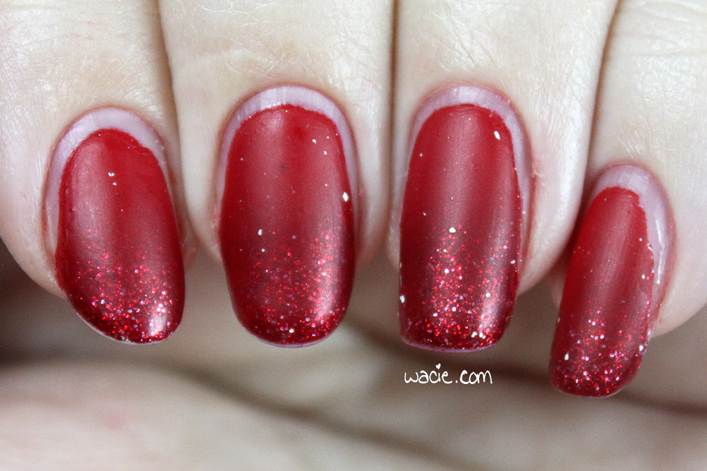
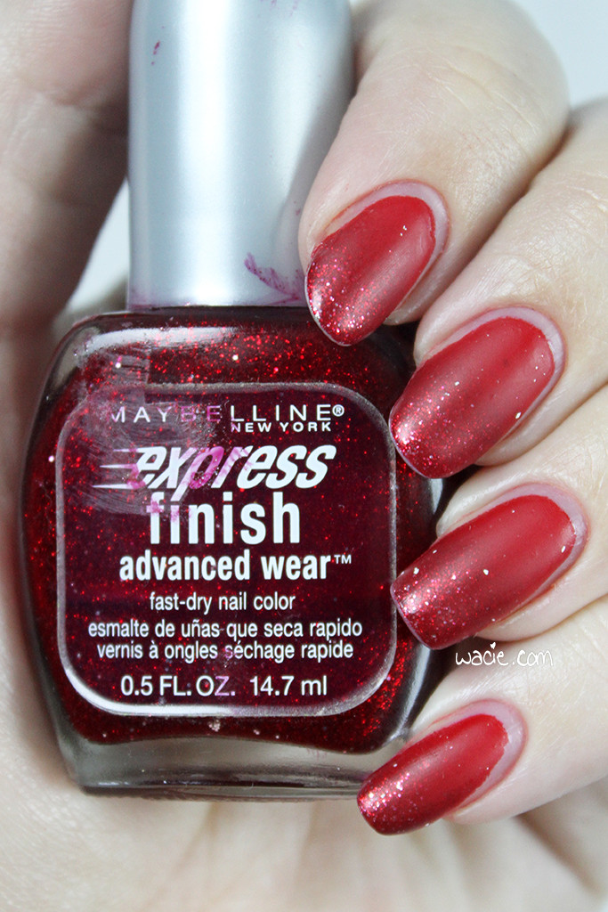
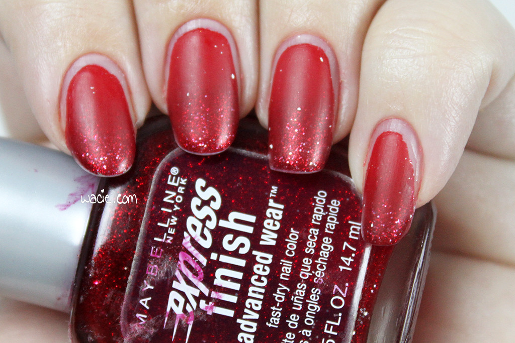
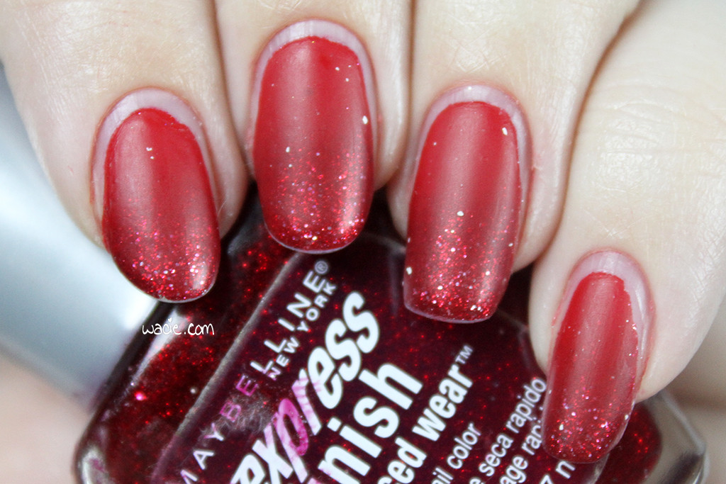
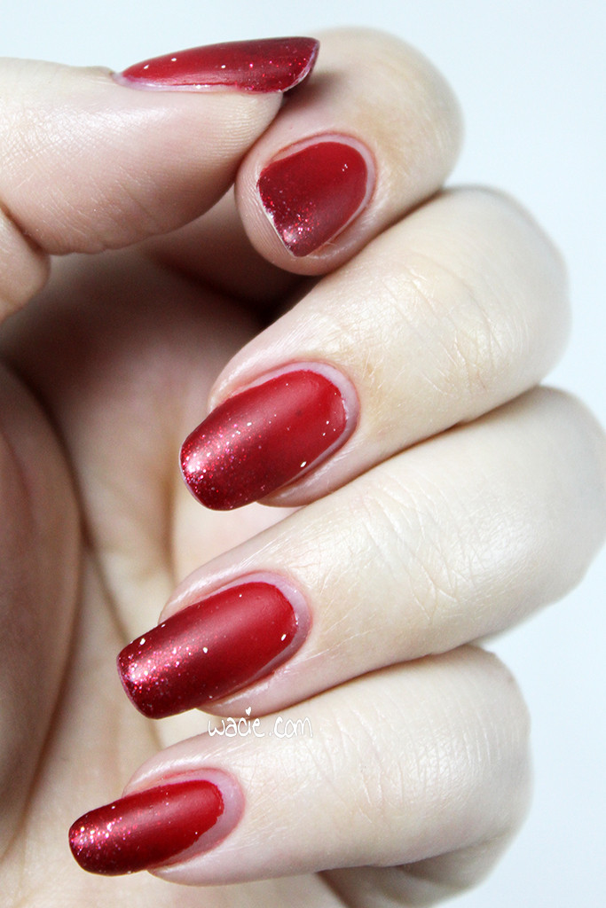
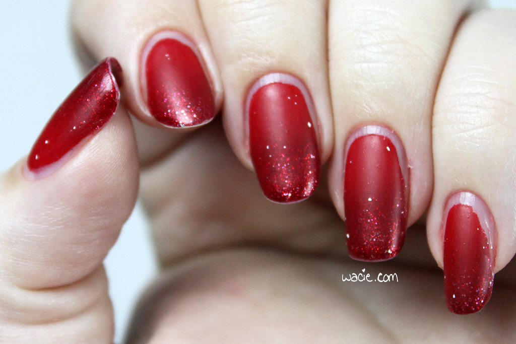
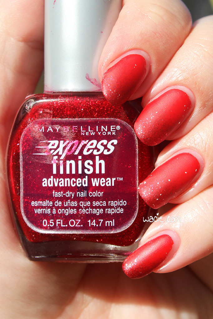
In honor of the anniversary, I’ve decided to recreate the first manicure I ever posted. Just like last time, here’s a gradient done with Disney Villains’s Cruella de Vil with a Maybelline mystery red, along with a coat of Seche Vite top coat and Ciaté’s Mattenificent matte top coat.
IMG_64792

IMG_64892

When I go back and read about the early version of this manicure, it sounds like I had a hard time with it; my mystery red was thick as molasses and cleanup was a challenge. I had just as much trouble with it this go-around. I’d thinned the mystery polish — polish thinner is something I’ve discovered since I did that manicure — but I still had trouble sponging it on. I didn’t get the contrast I got last time. I ran out of foam eyeshadow sponges I usually use for gradients and had to use the foundation blending sponges, which not only made my hands look like I’d committed a horrible crime, but made cleanup a huge ordeal. On top of that, because I did the mani from memory before I looked at the old post, I see I got the colors in the wrong order. I’m not even mad about that, because meh, close enough.
IMG_64962

IMG_65002

What really gets me is that the matte coat left those white spots on my nails again. The manicure looked great — exactly like the first time should have looked — until I applied the matte top coat. I was so frustrated and upset that I just threw it away. I hate tossing a nearly-full product, but I just can’t let it ruin any more manicures. I thought about redoing them, but decided I’d just leave it, as a sort of humble reminder of where I came from as a blogger. No matter how long I keep this blog, I’ll always have room to improve. Maybe on my fourth anniversary, I’ll finally get it right.
IMG_65062

IMG_65112

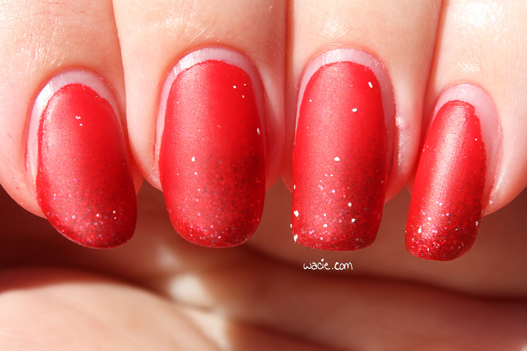
Here are some sunlight photos; it rained the last time I did this mani. In the sun, the glitter is a bit invisible, but still manages to sparkle a bit.
IMG_64442

IMG_64502

IMG_64542


On my past anniversaries, I’ve posted graphs and little data tidbits about the blog and what I’ve covered. I’m not going to do that this year, but I will share a few figures:
I’ve done 216 swatches.
Between swatches and Manicure Monday looks, I’ve worn Blue-Eyed Girl Lacquers 108 times. Essie is my most used mainsteam polish brand at 42.
Blue is my most used color.
I now own more than 1,400 bottles of polish.

Thank you so much for making it this far with me. Thank you so much for making this blog more than a hobby, but a means to cultivate friendships, foster creativity, and strengthen a community where we all can grow together. Thank you so much for being a part of the last three years.
One polish was purchased myself. The other was a gift, not sent for consideration or review.

Manicure Monday: Fun With Microglitter

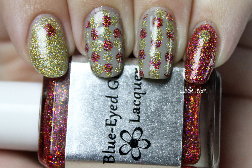
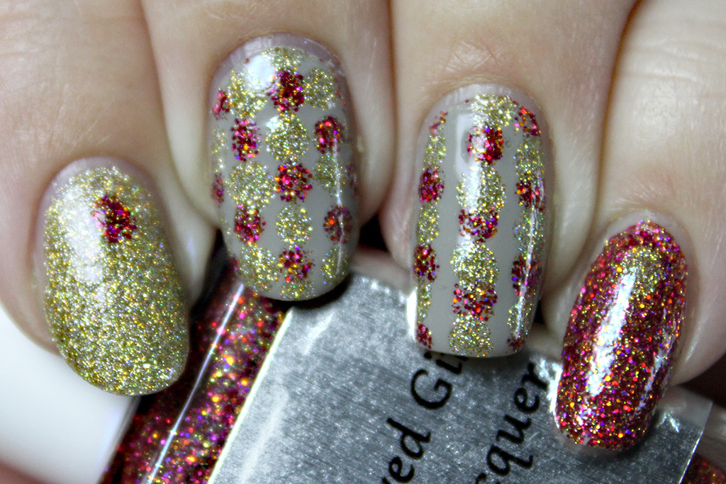
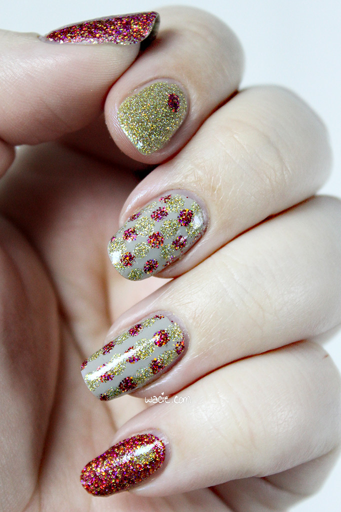
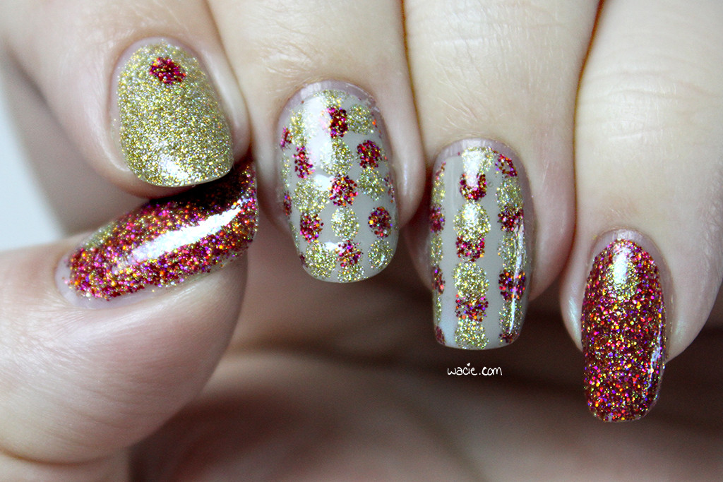
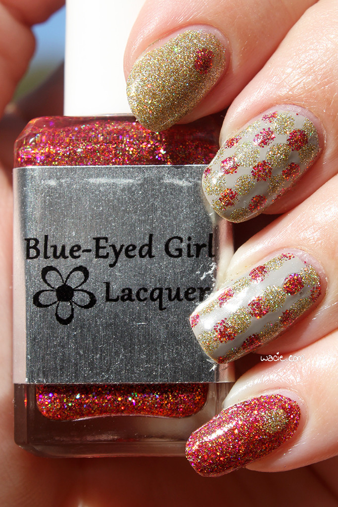
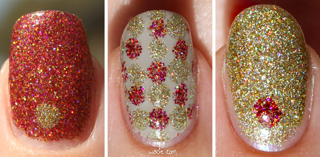
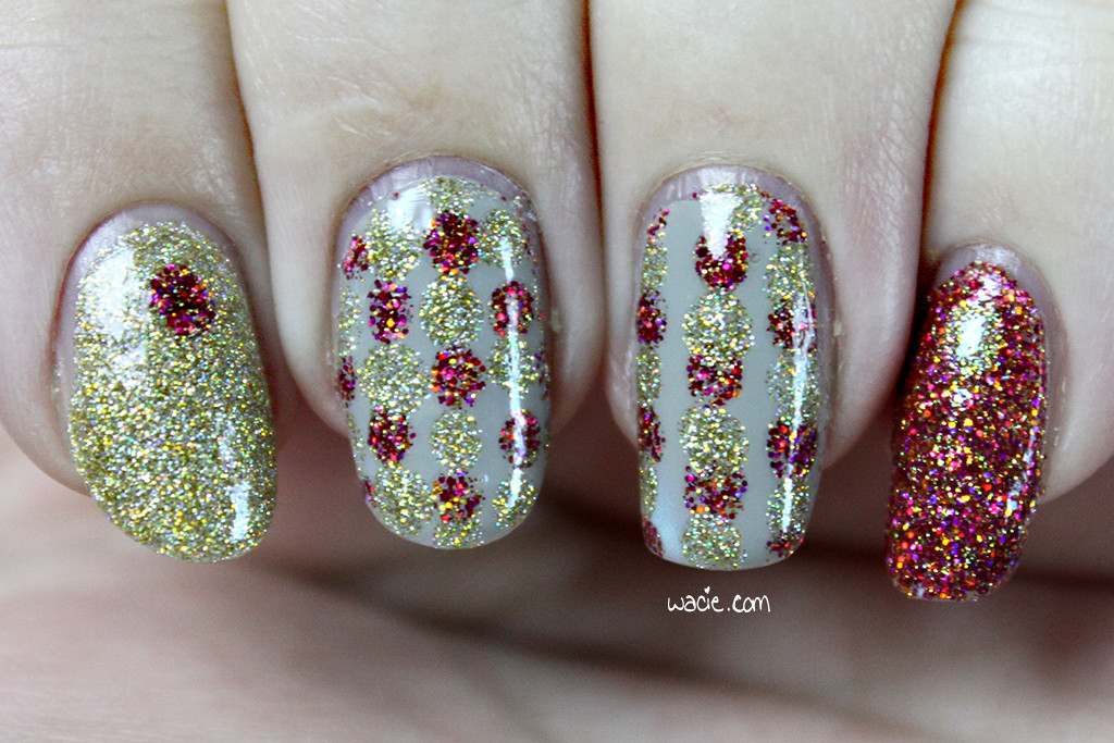
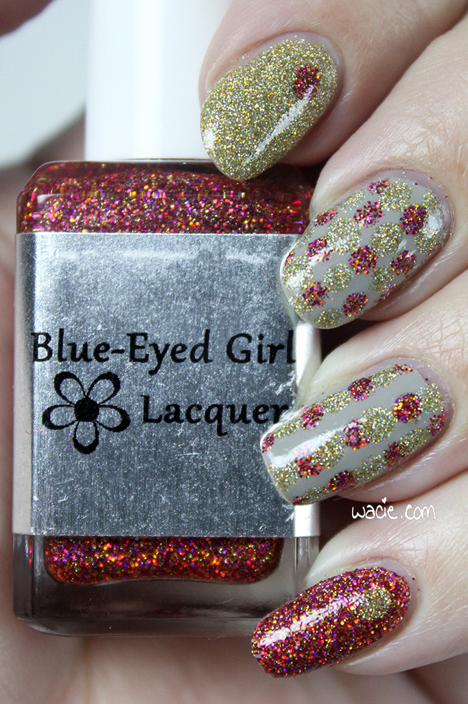
Happy Tuesday, reader! It’s still Monday somewhere, so let’s have a look at this week’s mani. For this mani, I used Blue-Eyed Girl Lacquer Prototype Summer 1.1, Wacie Nail Company‘s Opulence, and Digital Nails‘s Tauping Mechanism. All nails are topped with a coat of Seche Vite top coat.

IMG_62472

IMG_62562

I ended up pairing red and gold again. I can’t help it, they just go so well together! At first I wasn’t going to pair Summer 1.1 with anything, just because it already has so much going on. The colors are so vibrant and varied that it looks excellent on its own. When I started thinking about what nail art I would do, if any, I started looking at other options. I found Opulence in the polish box and went for it.

IMG_62612

IMG_62662

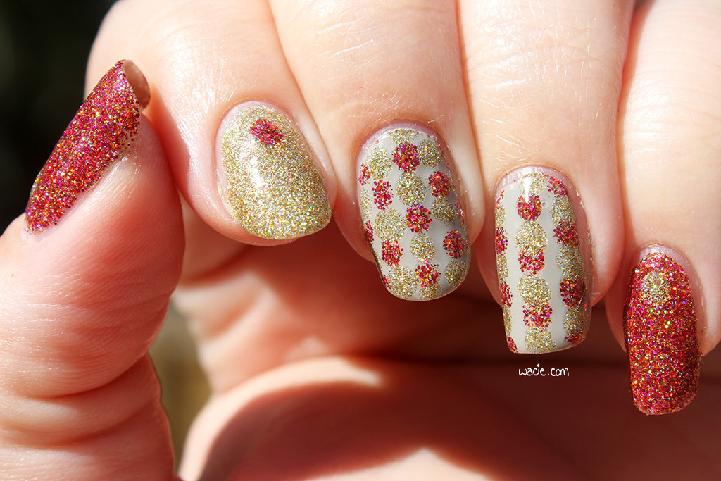
The dotting was something I explored later on. I was pleased to discover microglitters actually do dot. In these photos, because of the macro, it looks weird because you can see the individual pieces of glitter and it makes it look less like a dot. My dots didn’t really line up the way I wanted them; they’re more linear than scattered on one nail, and that kind of bugs me. Overall, though, I’m happy with how uniform and neat they are. I try to avoid dotting because I can never keep my hands steady enough, but this came out really well, all things considered.

IMG_62712

IMG_62732

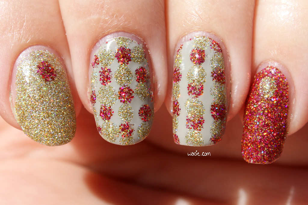
Here are some sunlight photos! You’ll see how the glitter is brighter and shines better than in the studio. Opulence looks best here, too; you can see that’s actually a gold and silver mix and not just gold alone. The glitter really comes to life in this set.

IMG_62102

IMG_62172

Tauping Mechanism was the last selection I made for this look. When I decided to do the dots, I knew I needed a nude as the base, something that would fade gently into the background and not detract from the dotting, and Tauping Mechanism does exactly that. It’s amazing for undies! It’s opaque in one coat and levels itself nicely. It’s also the only polish in this mani I hadn’t used before.

IMG_62132
Macrooo

Macrooo

BEGL Prototype Summer 1.1 was a one-off and no others were for sale; other BEGLs are for sale in their shop. Opulence will be available in the Wacie Nail Company shop shortly. Tauping Mechanism is for sale in the Digital Nails shop.

I bought these polishes myself, except for the one I made.

Swatch Sunday: P2’s Artful

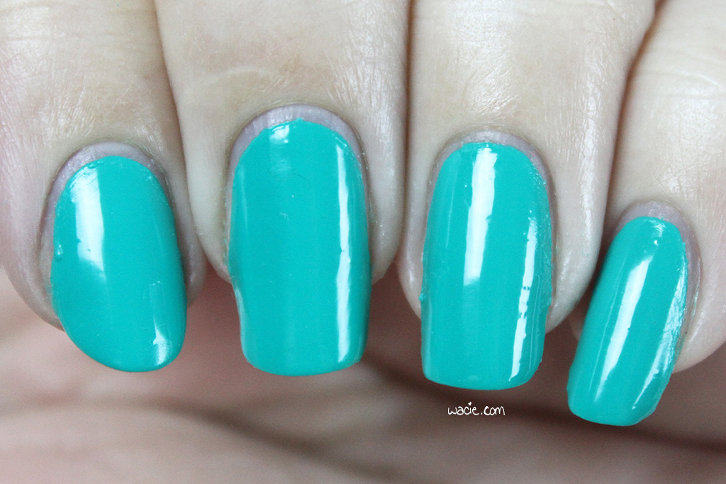
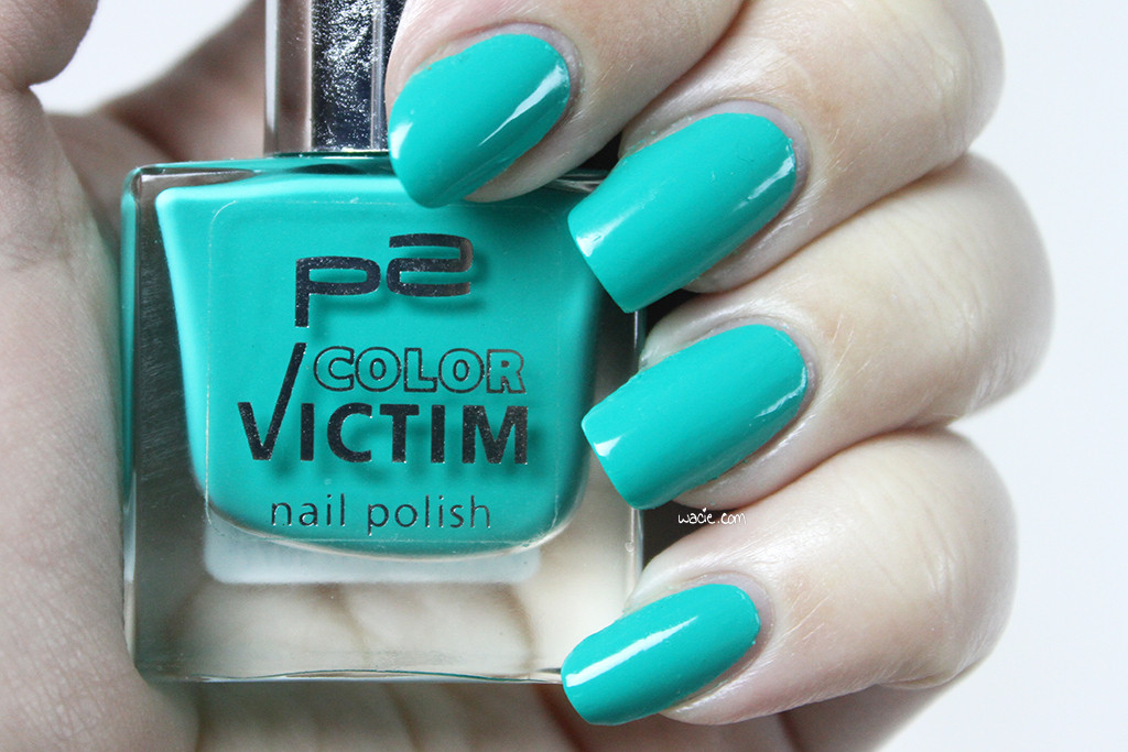
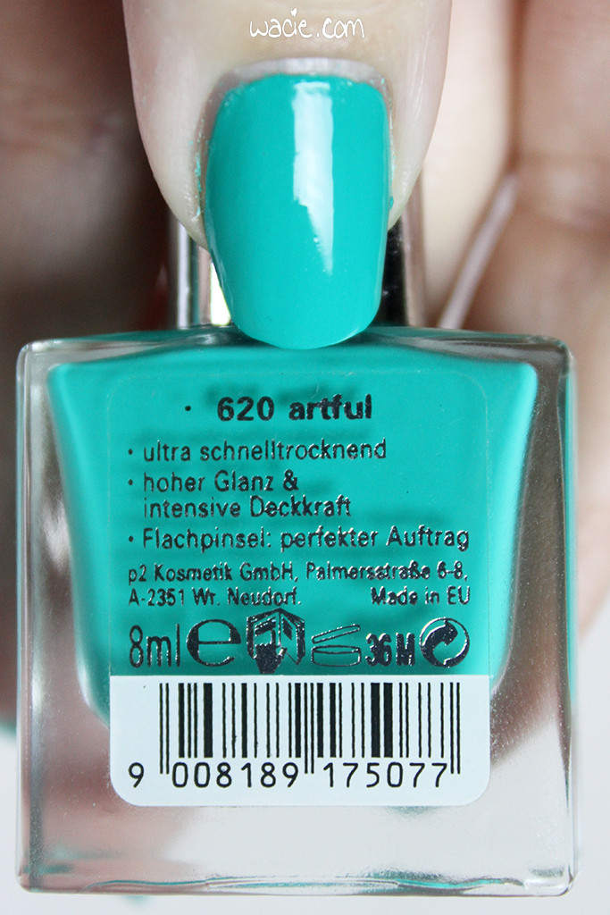
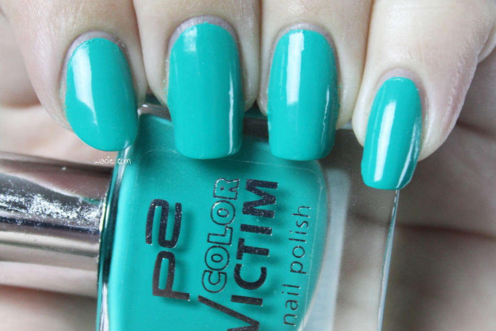
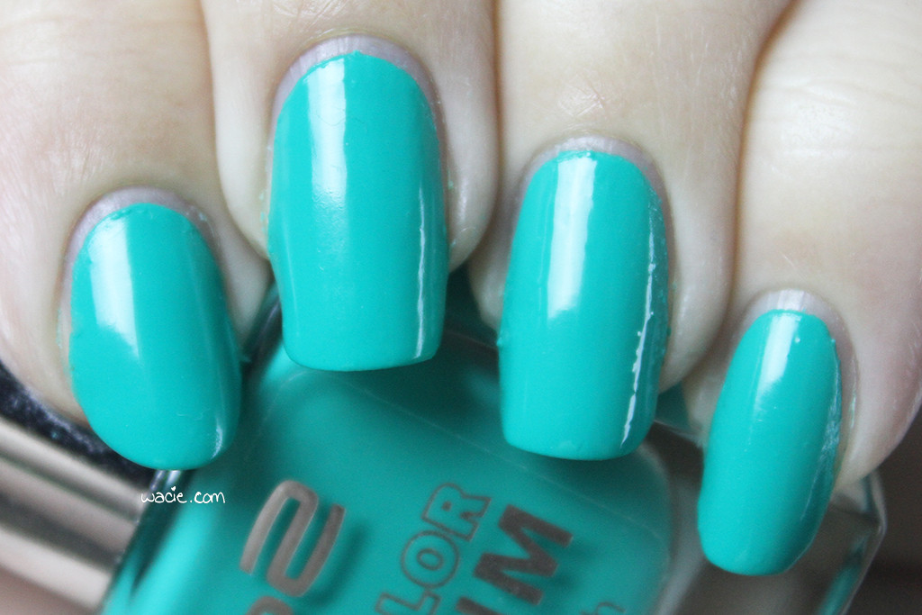
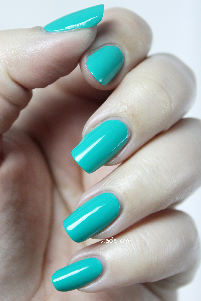
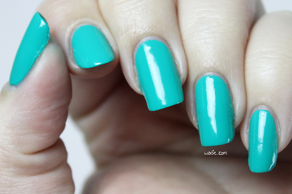
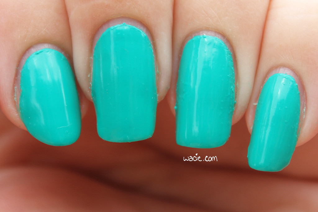
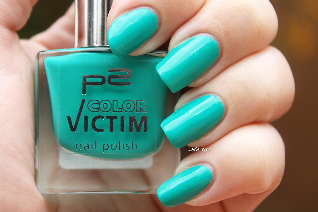
Happy Sunday! I’m happy to bring you today’s post, because I get to show you polish from Europe! I’ve worn P2’s Artful on the blog before, but that was ages ago, and you never got to see the polish on its own. Here’s Artful at three coats with one coat of Gelous gel coat.

IMG_61322

IMG_61382

IMG_61432

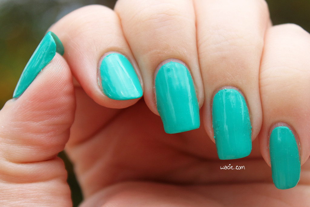
Artful is a teal creme polish. Application was easy; the polish is rich and very pigmented, giving me an almost-opaque first coat, and complete opacity in two. I remember this polish staining me the last time, so I made sure to use two coats of base coat (I use Orly Bonder) this time around. The product consistency is very good; it’s very easy to control the polish with the brush. It dries quickly and with a glossy finish; I used top coat for extra shine and protection.

IMG_61532

IMG_61582

Apart from details about the polish itself, I can’t tell you much else about it. The polish was sent to me by someone in Germany, so I don’t know where to tell you to look for it — other than Germany, obviously — but I recommend it. I don’t know if it’s a 3-free formula, or if the EU even has such a thing, but that doesn’t bother me much. Both the color and the formula are so rich and vibrant that I really wish I could get them more easily. The shade itself isn’t hugely special, but I love using polish from another country, and maybe it’s a good thing it’s not so widely found in the US; I probably wouldn’t like it so much.

IMG_61622

IMG_61642

Both indoors in the studio and outside in cloudy lighting, this polish looks a lot more turquoise than it does in real life. In real life, it’s darker and greener. Also, my cuticles got a bit stained anyway, despite my best efforts, but that tends to happen with blues and greens in general. Also, and this is likely why, I got stuck trying to clean my cuticles up with non-acetone polish remover, because it was the only thing I had in the house. It didn’t work well at all; the polish didn’t come off, it made my brush feel dry and brittle, and it has this weird cherry cough drop smell. If you see any spots that look bubbly or bumpy around the edges, that’s totally not the polish’s fault.

IMG_61822

IMG_61722

IMG_61792

Artful and other P2 polishes have to be available somewhere. If I knew, I’d tell you.

This polish was a gift. It was not sent for review or consideration.

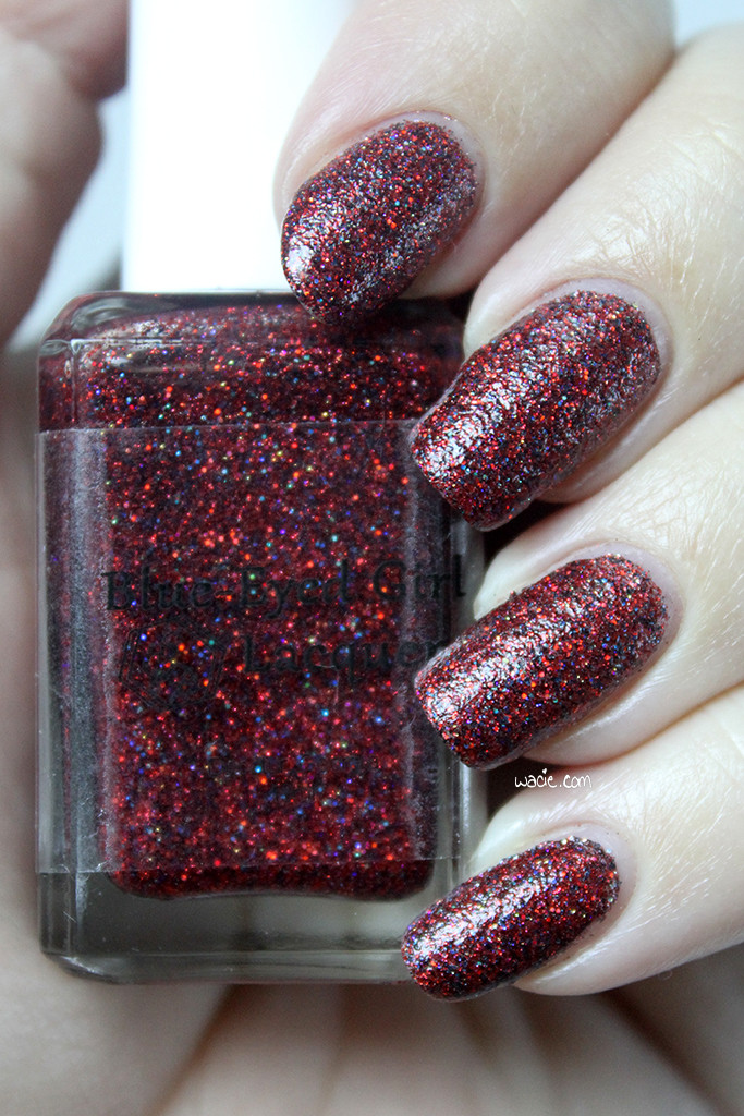
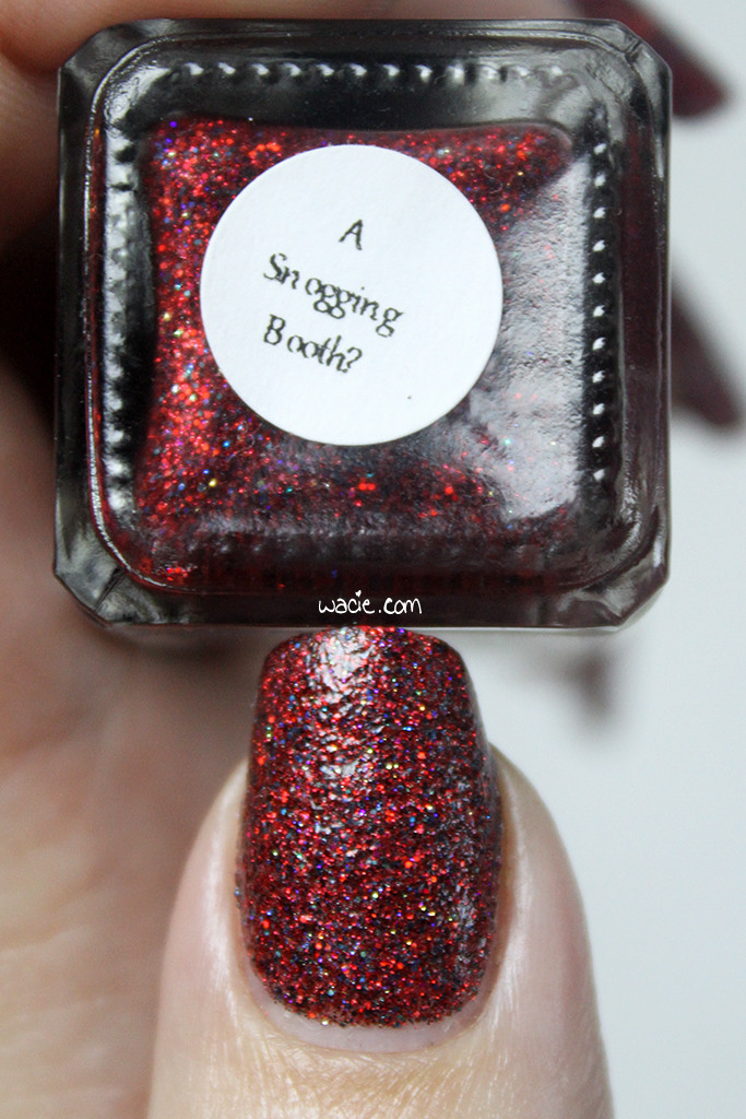
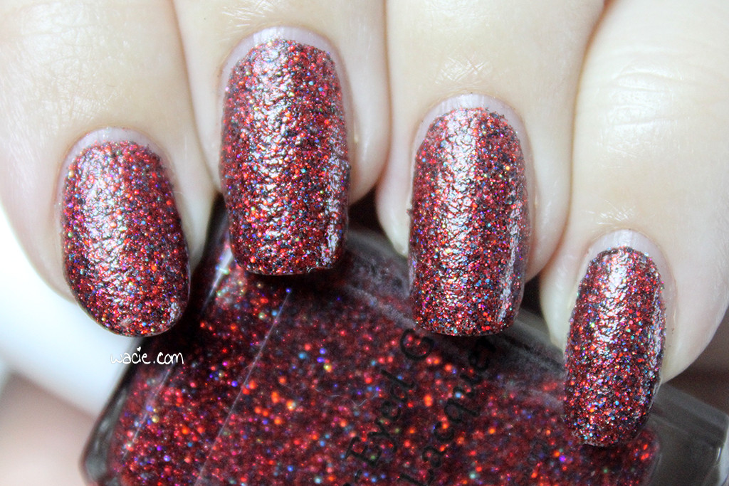
Swatch Saturday: Blue-Eyed Girl Lacquer’s A Snogging Booth?!

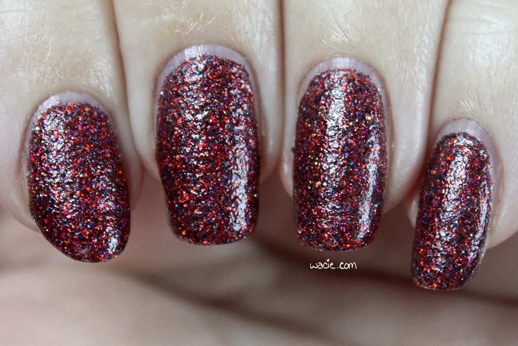
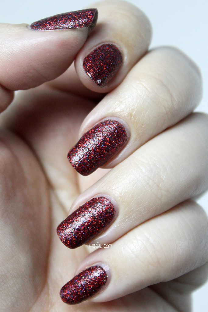
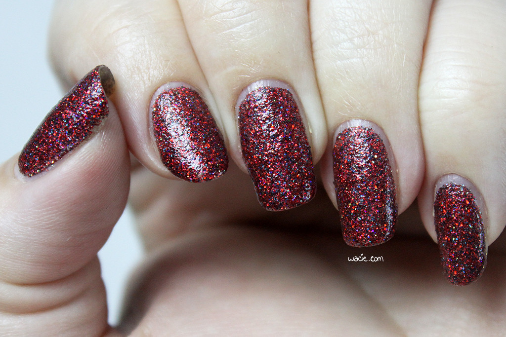
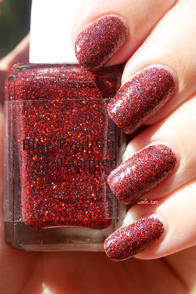
Happy Saturday, reader! This is the final polish in the first phase of Blue-Eyed Girl Lacquer‘s masive Doctor Who collection. After this one, I’ve got a couple prototypes, a couple of special editions, and a Halloween collection that’s weirdly appropriate for spring. This final(ish) polish is called A Snogging Booth?; I’m wearing three coats with one coat of Gelous gel coat.

IMG_59962

IMG_60002

IMG_60062

IMG_60112

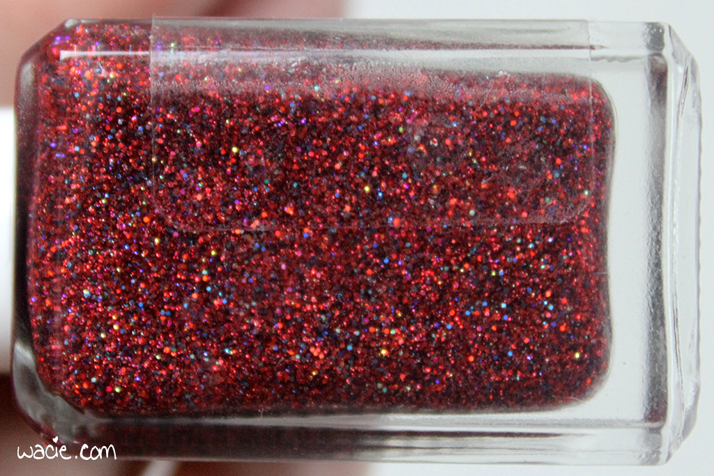
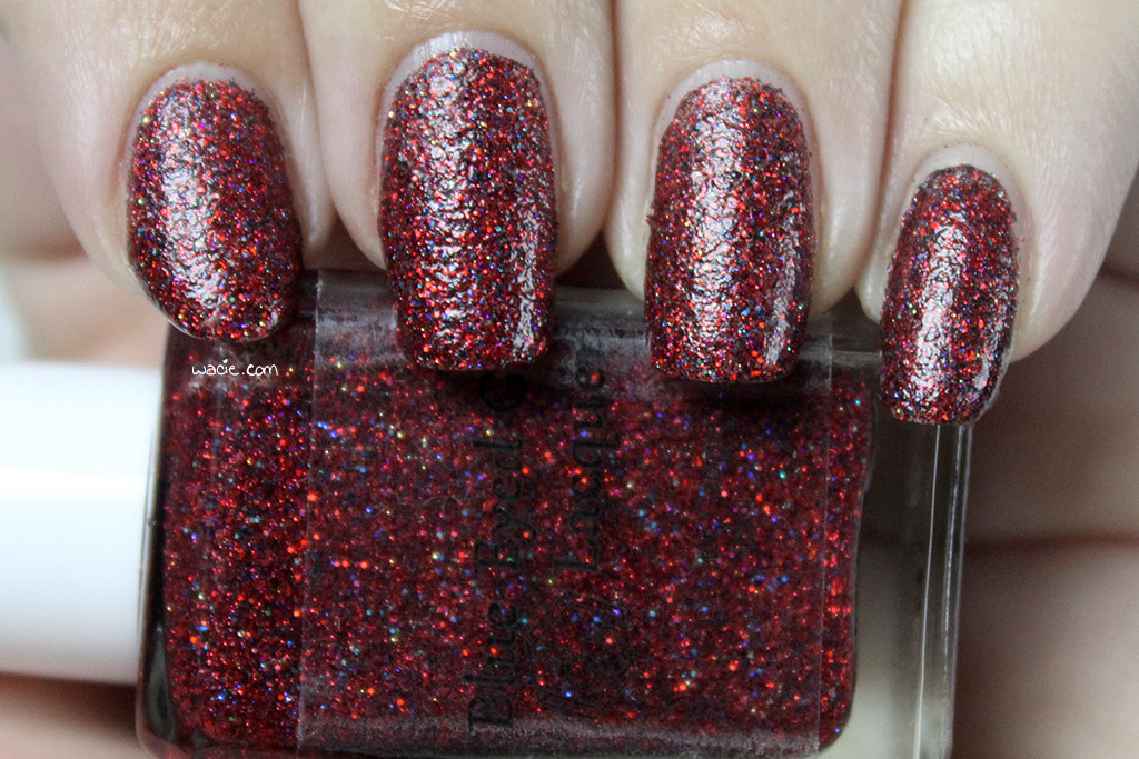
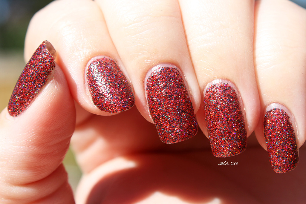
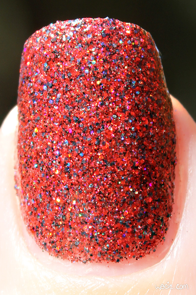
A Snogging Booth? is a clear-based microglitter polish containing shades of red and black. Application was easy, and a bit similar to the previous BEGL microglitters I’ve worn on the blog recently; the first coat didn’t cover well, but coverage builds with additional coats. It took me all three coats to achieve this level of opacity. The product consistency was thick as well, which is to be expected with the large amount of glitter in it. The polish dries quickly and with a textured glitter finish. I added top coat for smoothness; you can see where it sank in, there’s still a lot of texture left.

IMG_60172

IMG_60212

My favorite thing about this polish is the black glitter. The word that comes to mind, for me, is pepper; it adds a dark, cool, vampy element to the polish. I don’t like black glitter in everything, I think it looks weird in light jellies, but I really love it in this. The red is already gorgeous on its own, but the black makes it sultry while also grounding it. It’s a really nice combination.

IMG_60252

IMG_60312

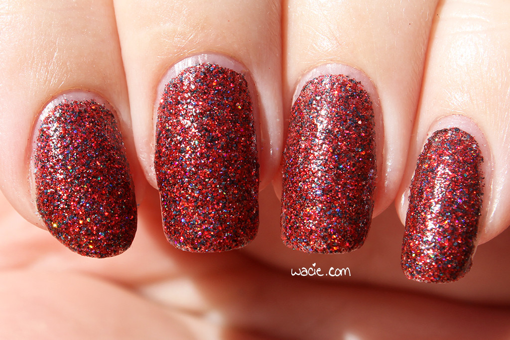
In the sun, it warms up quite a lot, and I think that’s just because things tend to look cooler and darker in the studio. The holo effect from the red glitter shows up well here, and that helps it look a bit warmer as well.

IMG_59632

IMG_59872

IMG_59722

IMG_59772

A Snogging Booth? has been discontinued by BEGL, and sadly, the last bottle sold out only recently. Other BEGL polishes are available in their shop.

I bought this polish myself.

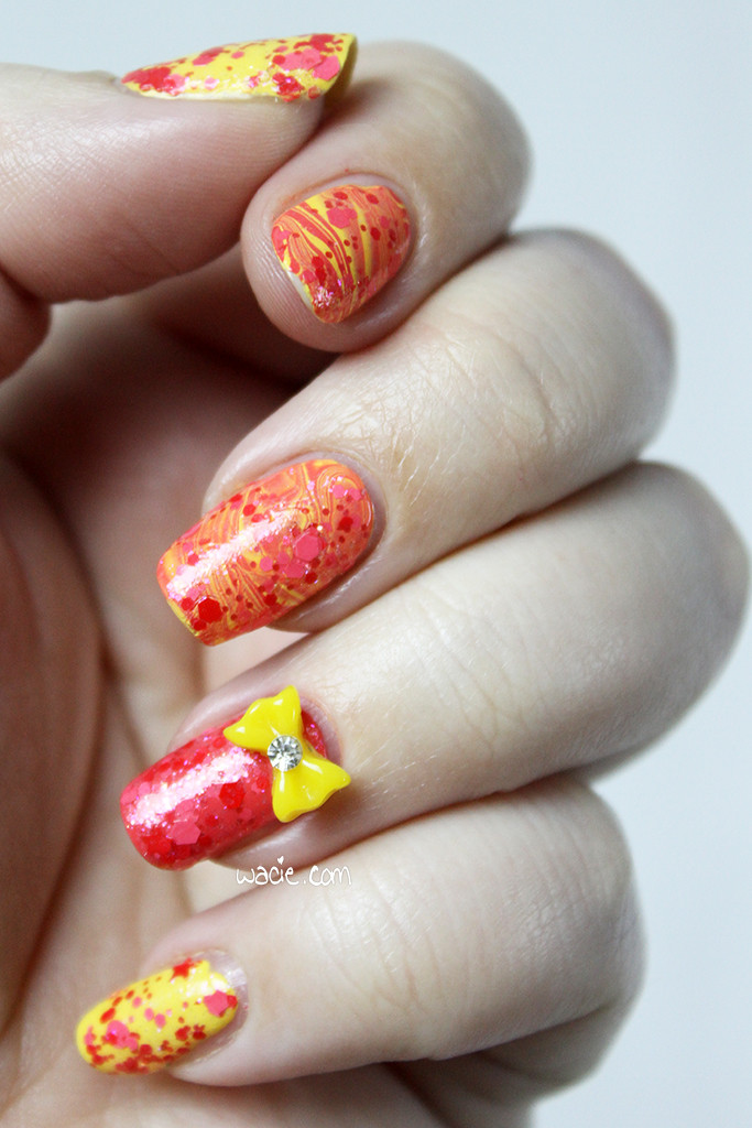
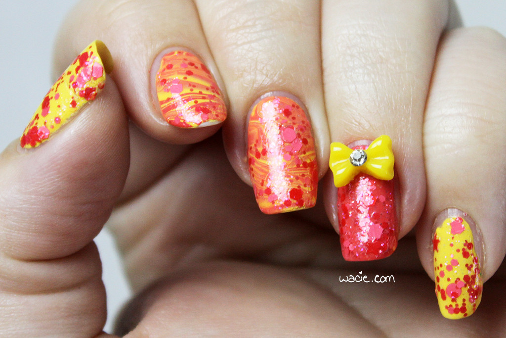
Manicure Monday: Strawberry Banana Swirl With Sprinkles

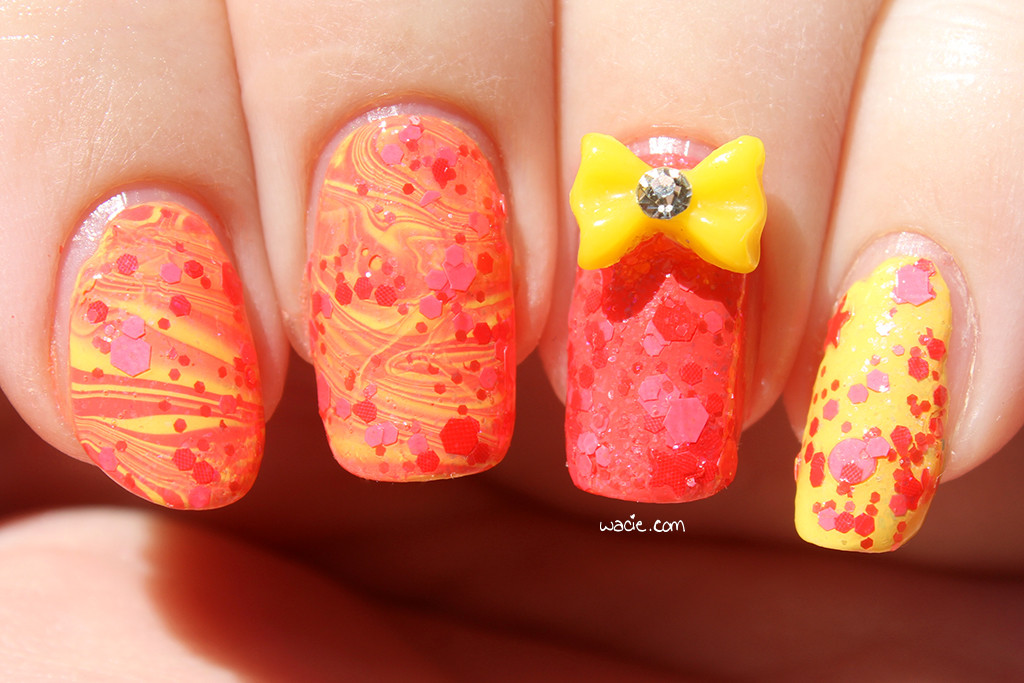
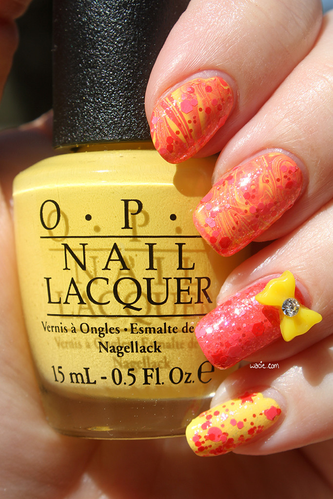
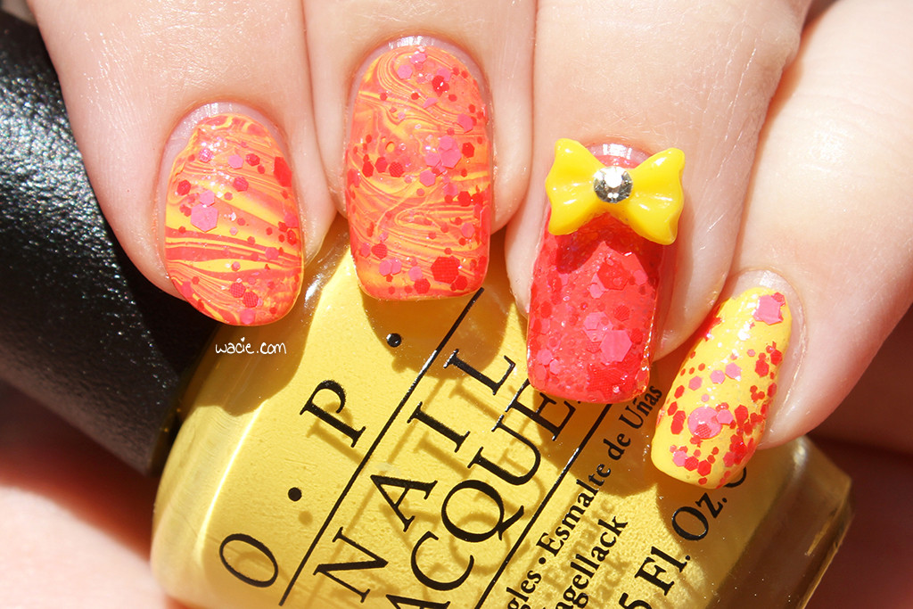
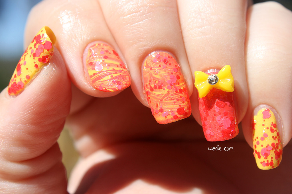
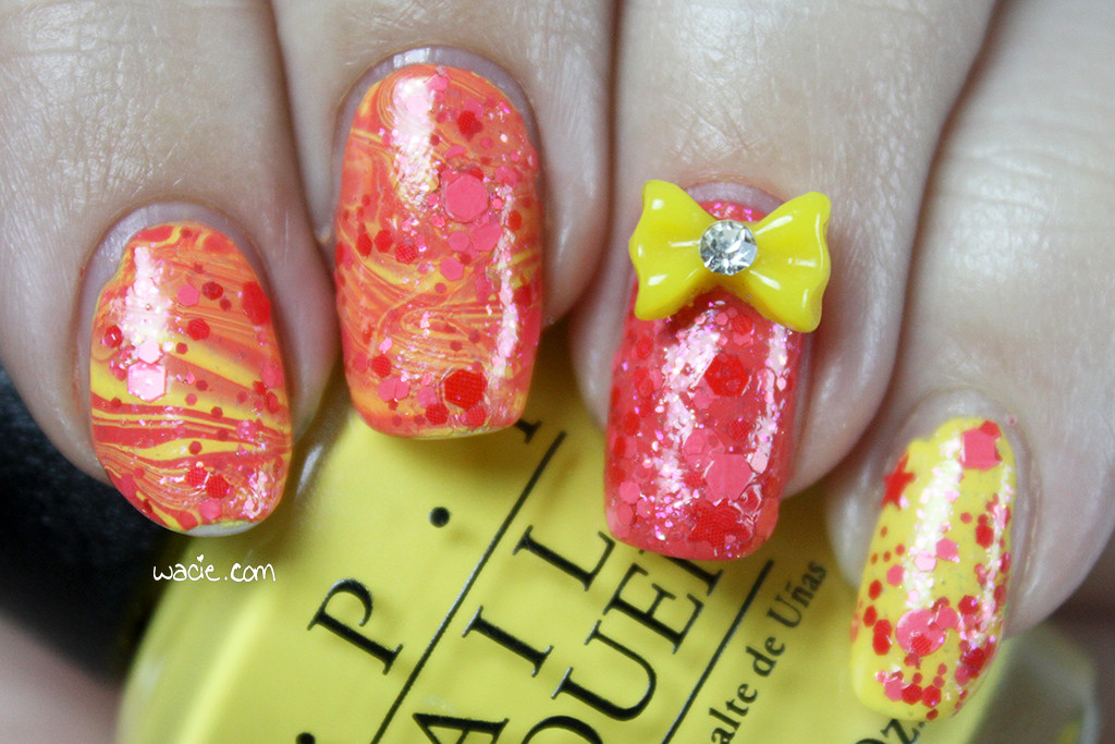
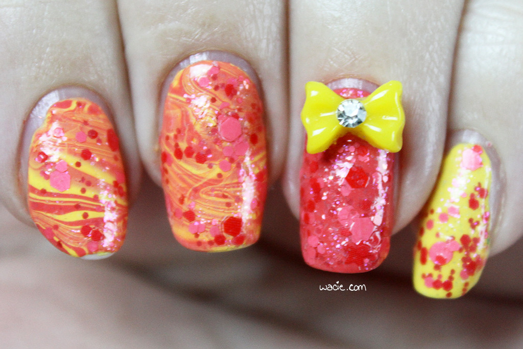
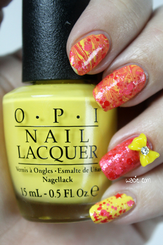
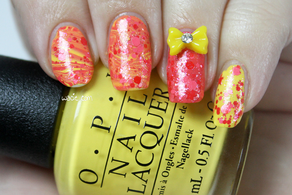
Happy Monday, reader! I did a great time doing today’s manicure, and I hope it shows! For this look, I used OPI’s I Just Can’t Cope-acabana and Live, Love, Carnaval with Blue-Eyed Girl Lacquer‘s Get Too Close to the Flame. All nails are topped with one coat of Gelous. Because of a chip that occurred in the polish between photography sets, I’ll be showing you the daylight photos first. These were taken in direct sunlight outdoors.
IMG_58882

IMG_58992

I Just Can’t Cope-acabana has been on this blog a lot lately; I’ve used it as the undies for glitters on at least three different swatches, and I’ve used it so much that it’s starting to show the fill line. Yellow can be hard to work with sometimes, what with the streaking and failure to level itself, and this is no exception, but it’s a really nice color. It’s a pretty neutral yellow and works with just about everything. I love the way it looks here with Live, Love, Carnaval; I didn’t think to pair these two until the last minute, and I like the way they look together. I mean, they should, they came from the same Brazil collection. They set each other off in just the right way, and they both marbled like a dream.

IMG_59012

IMG_58942

So let’s talk about the chip on my index finger. I have no idea what caused it, only that it appeared sometime taking the daylight photos and taking the indoor photos. I’m pretty sure it’s a problem caused by Gelous. I know it’s not really meant to be used as one, but I ran out of Seche Vite and I don’t know when I’ll be able to get another bottle. It’s incredibly frustrating, because it takes a century to dry on its own and I keep smudging it hours after I thought it was dry. I miss Seche Vite so much.
IMG_59092

IMG_59142

I’ve watermarbled before, but this is the first time I’ve tried the horizontal swirl; usually I stick to the flower or the pinwheel. I don’t think it looks too bad. I think I used too many rings, or maybe I made too many strokes in the polish, but it can be pretty tough to tell the colors in the marble apart; from far away, it just looks orange. I still like it, though.

IMG_59152

IMG_59232

Get Too Close to the Flame works so well with I Just Can’t Cope-acabana that I couldn’t not use it. It was actually the first polish I picked out for this mani, and the ideas about the pink and the watermarble came later. I kind of struggled with how to use the glitter, since I still really wanted to, and I ended up just doing one allover coat with it, even over Live, Love, Carnaval, where there isn’t much constrast and all you see is some shimmer and faint glitter shapes. It’s a fun look, I think. Over the yellow, it’s bright and cheerful, over the pink it’s mysterious, and over the marbling, the word that comes to mind for me is planetary. It reminds me of the swirls around the red spot of Jupiter. It pleases me.

IMG_59292

IMG_59332

I got I Just Can’t Cope-acabana and Live, Love, Carnaval from Sally Beauty Supply. I got Get Too Close to the Flame from the Blue-Eyed Girl Lacquer online shop; it’s been discontinued.

I bought these polishes myself.