Manicure Monday: Golden Red

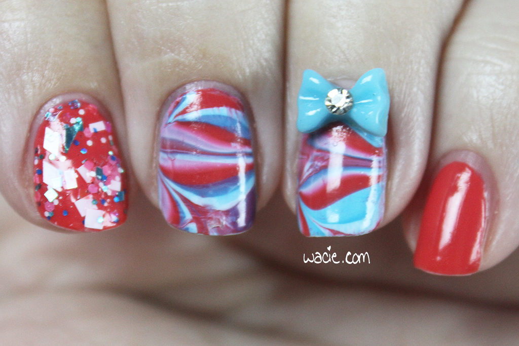
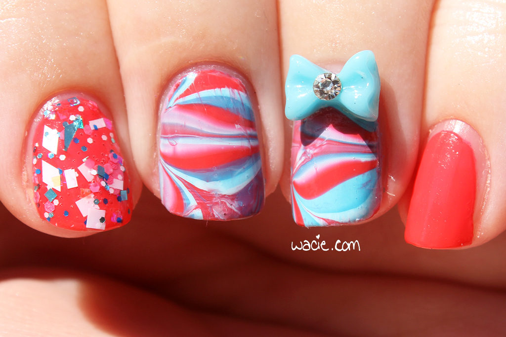
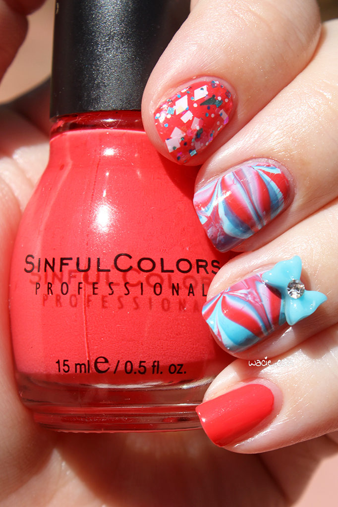
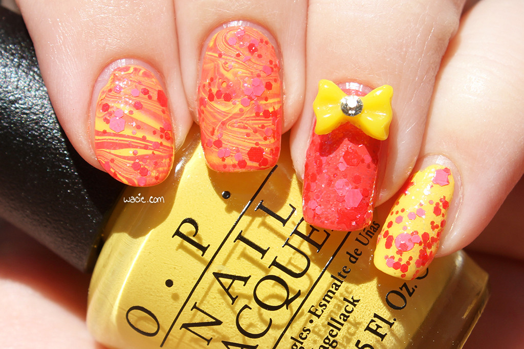
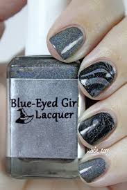
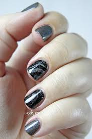
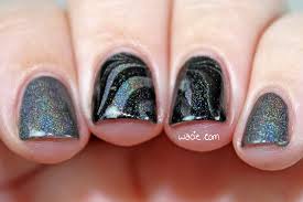
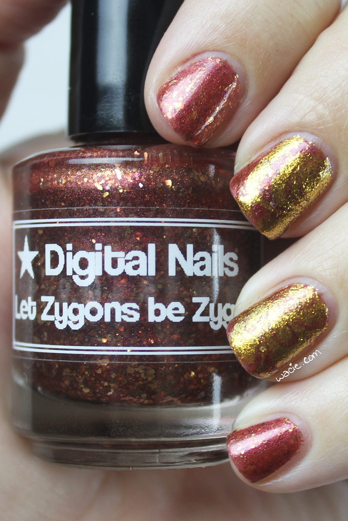
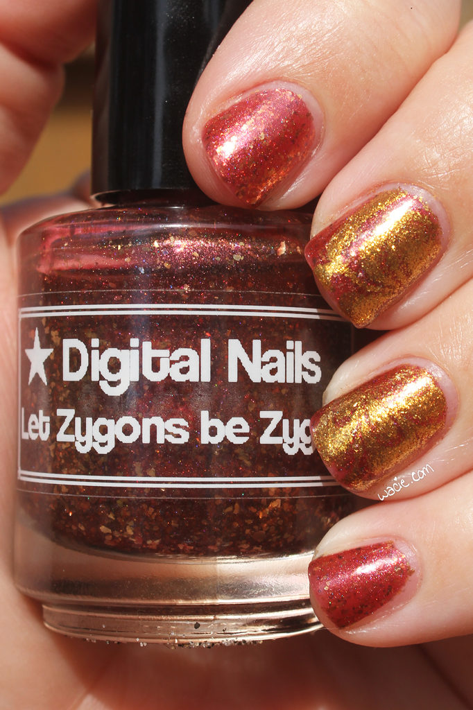
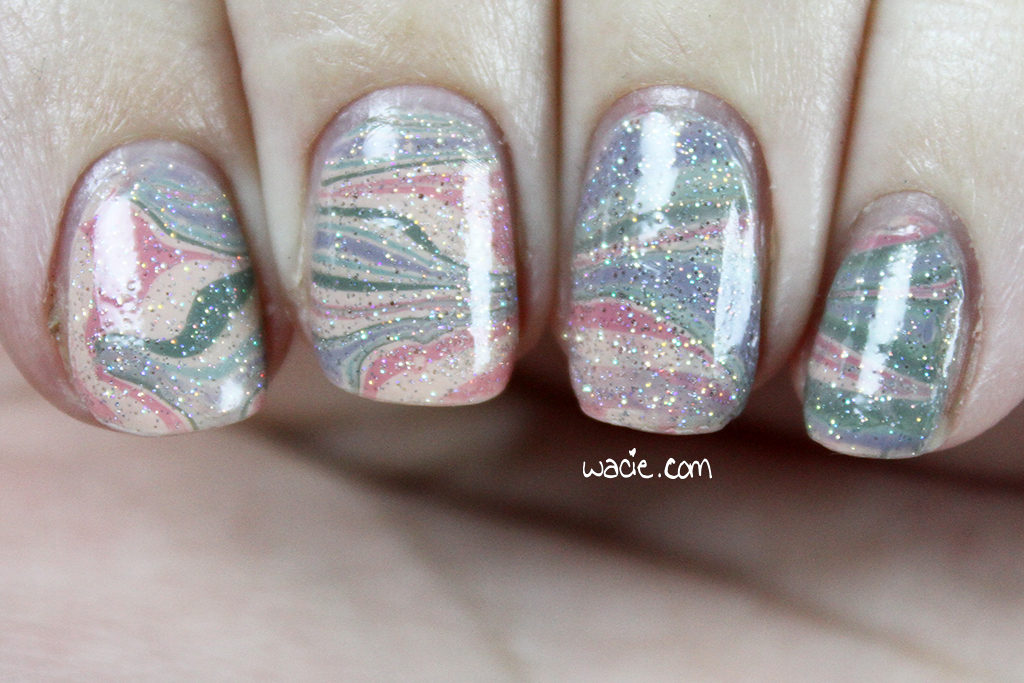
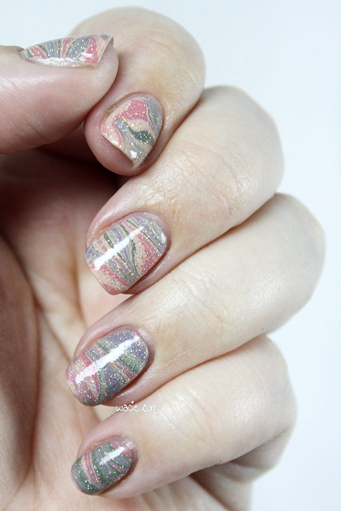
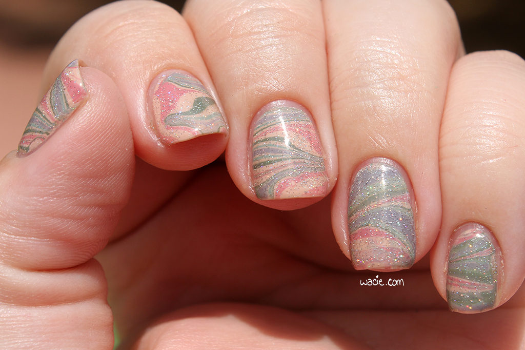
Happy Monday! Reader, you may not be surprised to see I’ve done another red and gold mani. As much as I love that particular combo, it’s starting to feel like a rut. However, since my base polish was both red and gold, I just rolled with it. I started with three coats of Digital Nails‘s Let Zygons Be Zygons, then did a watermarble with a mystery Orly gold and clear.

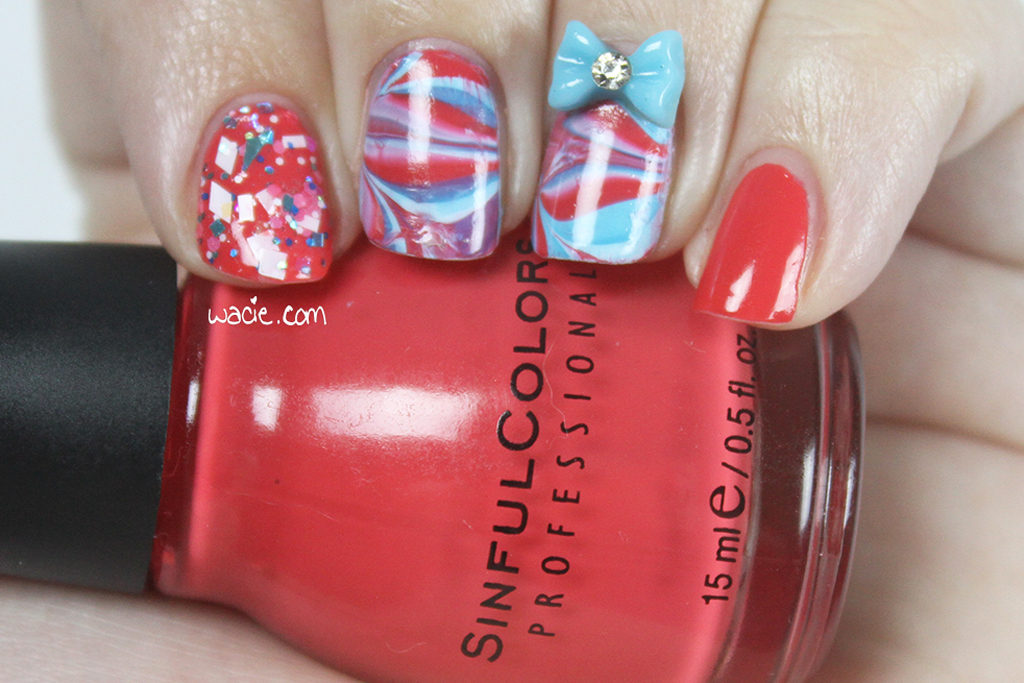
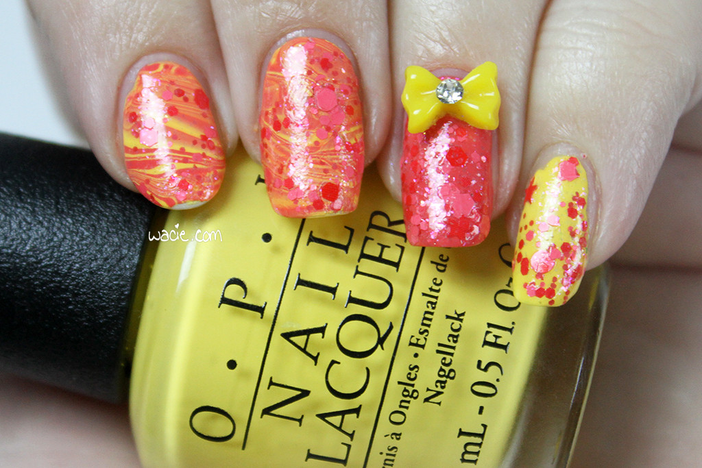
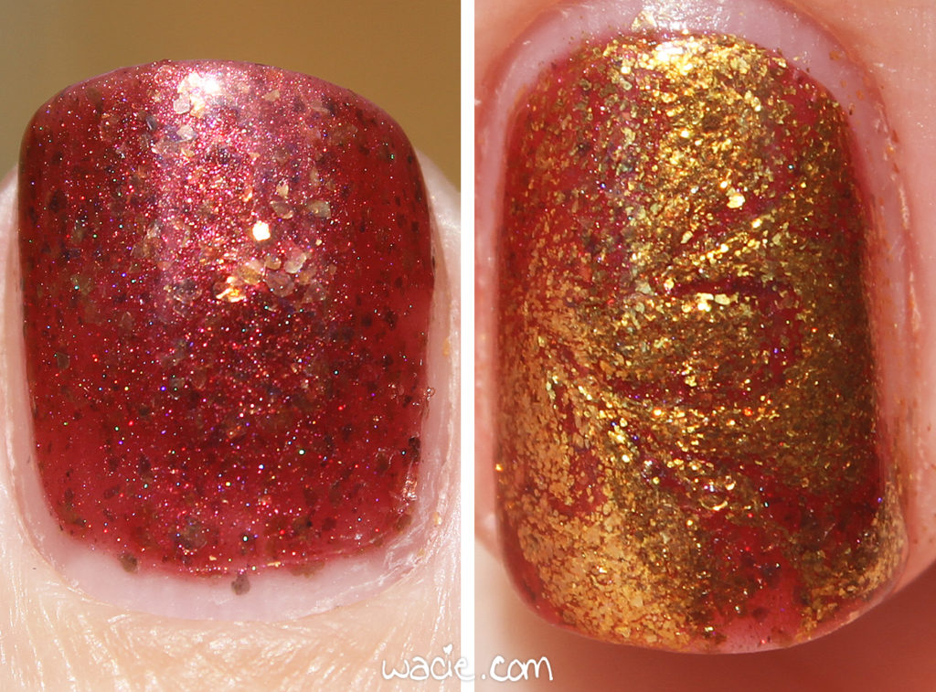
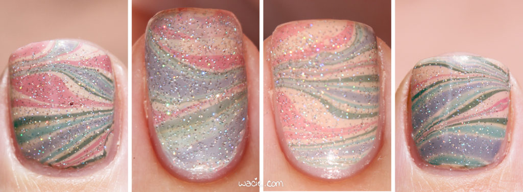
The gold is so shiny that the watermarble is pretty difficult to see. You can see the marbled lines if you look closely, but from far away, it’s a mess. I suppose the solution is just don’t choose such a blingy polish, because this totally looked better in my head. I thought about mattifying it, but I didn’t think it would help, because it’s just that shiny. I wish I could tell you what the name of it is, because you kind of need it.

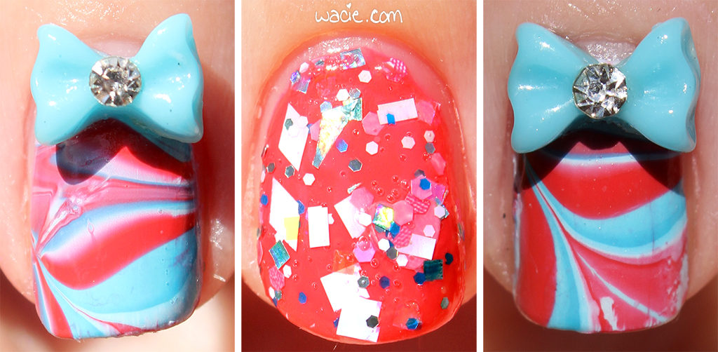
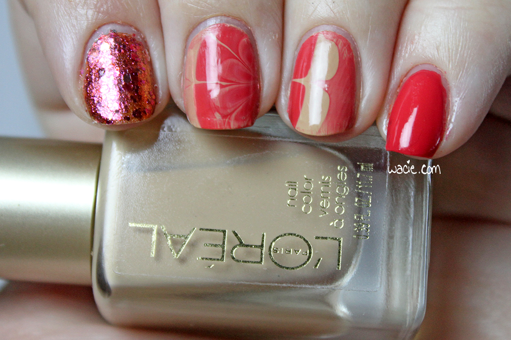
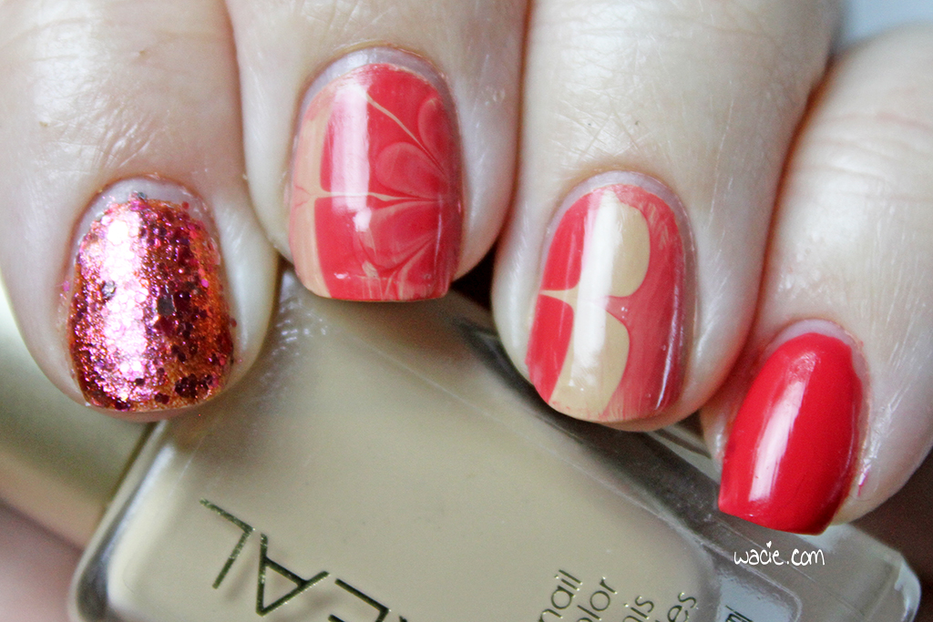
Let Zygons Be Zygons is such an awesome polish. I loved the idea of a red jelly with golden flakies, but what I didn’t know until today is that there’s just a hint of Spectraflair in it. It’s gorgeous! It looks kind of basic, but I really love it on my nails. There’s a lot going on in it. I just hope I don’t regret putting it on my toes also.

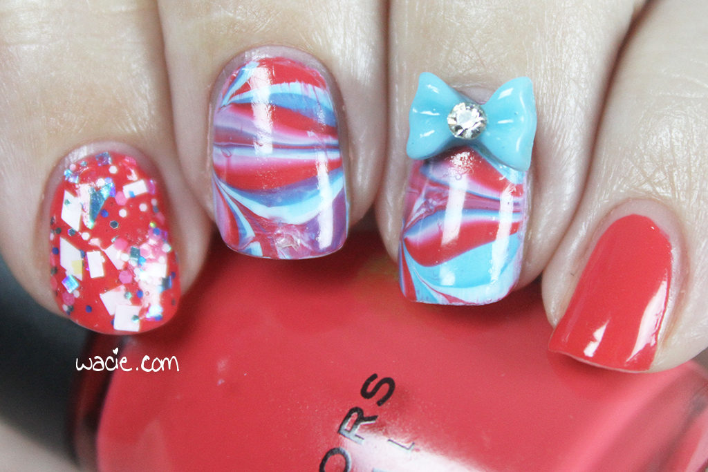
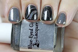
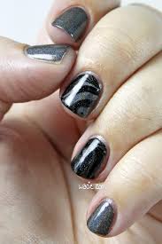
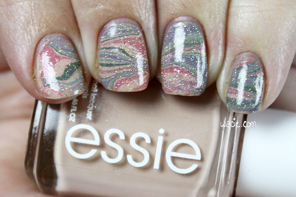
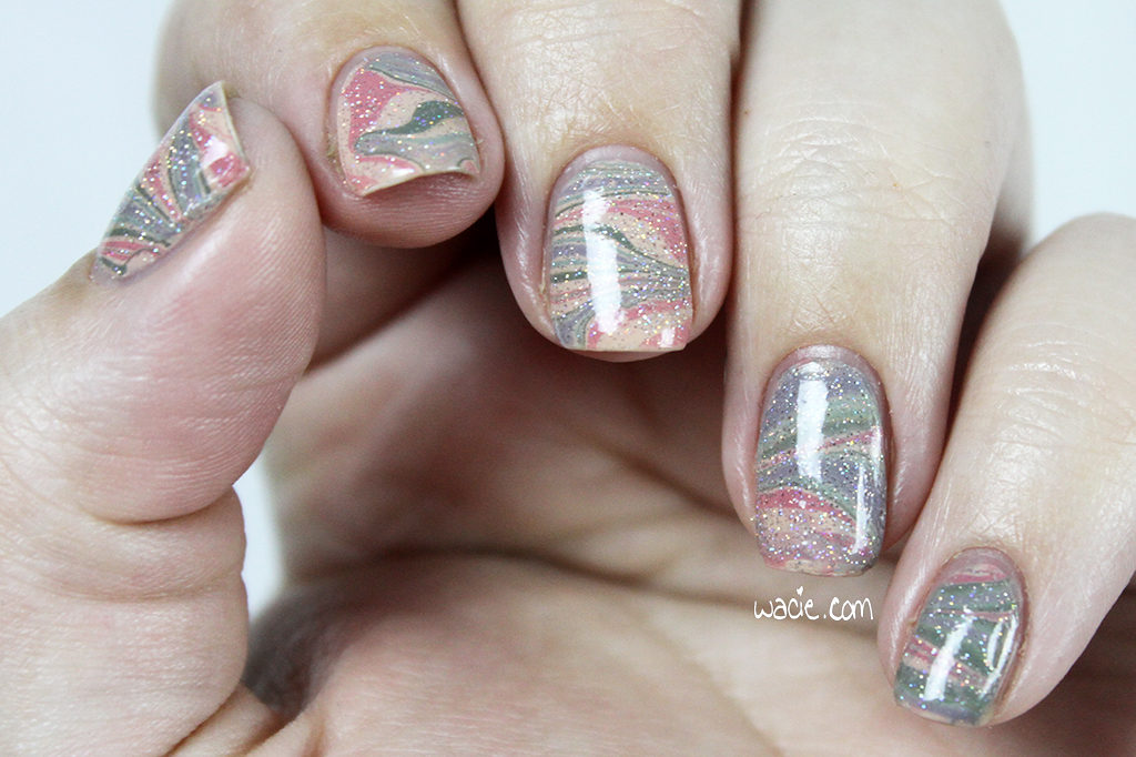
I took this one facing one of the lights directly. You can see the marble a little better here.

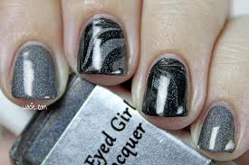
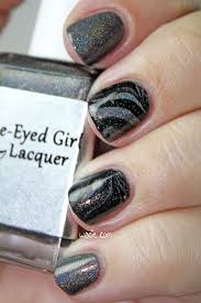
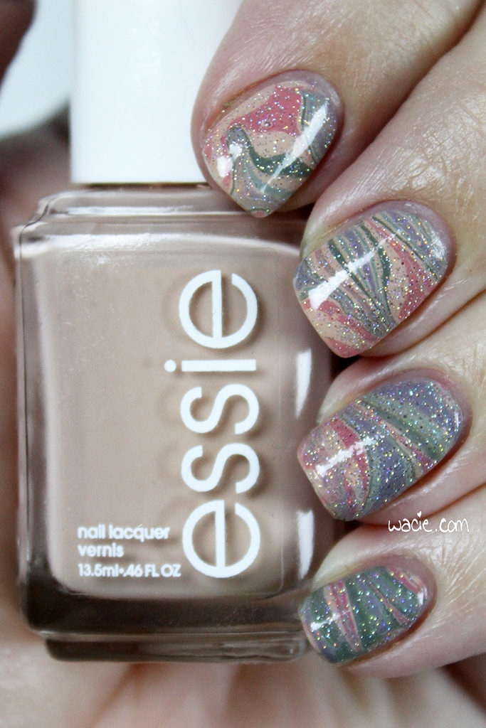
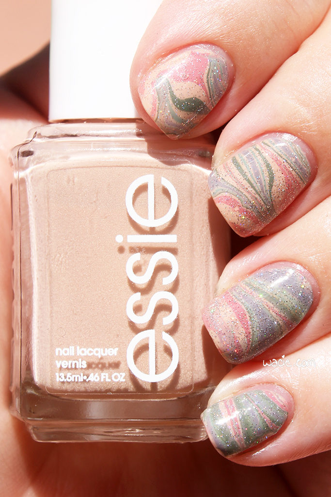
The next set of photos was taken in direct sunlight. Out here, you can see the tiny holo very well. In the macros, you can see that the Orly gold is made pretty much exclusively of gold flecks. This mani didn’t turn out the way I imagined it, but I’m glad I went for it.

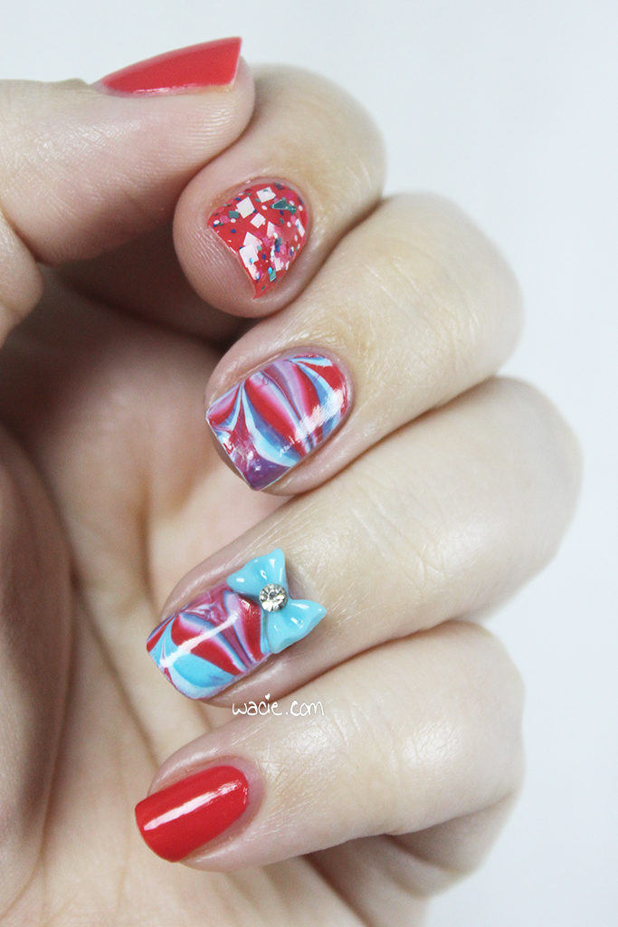
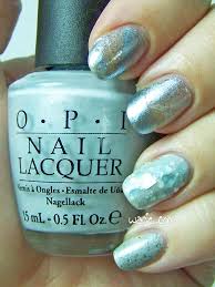
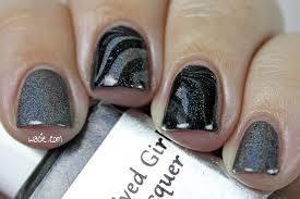
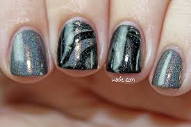
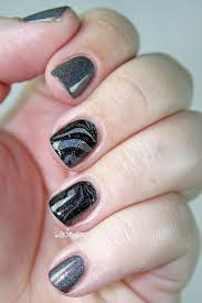
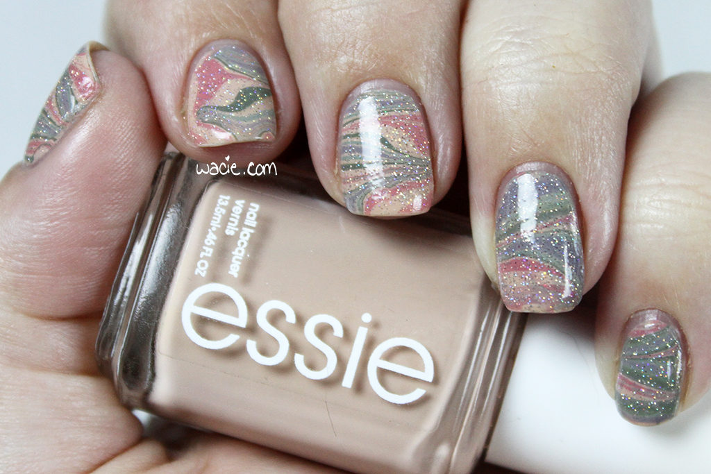
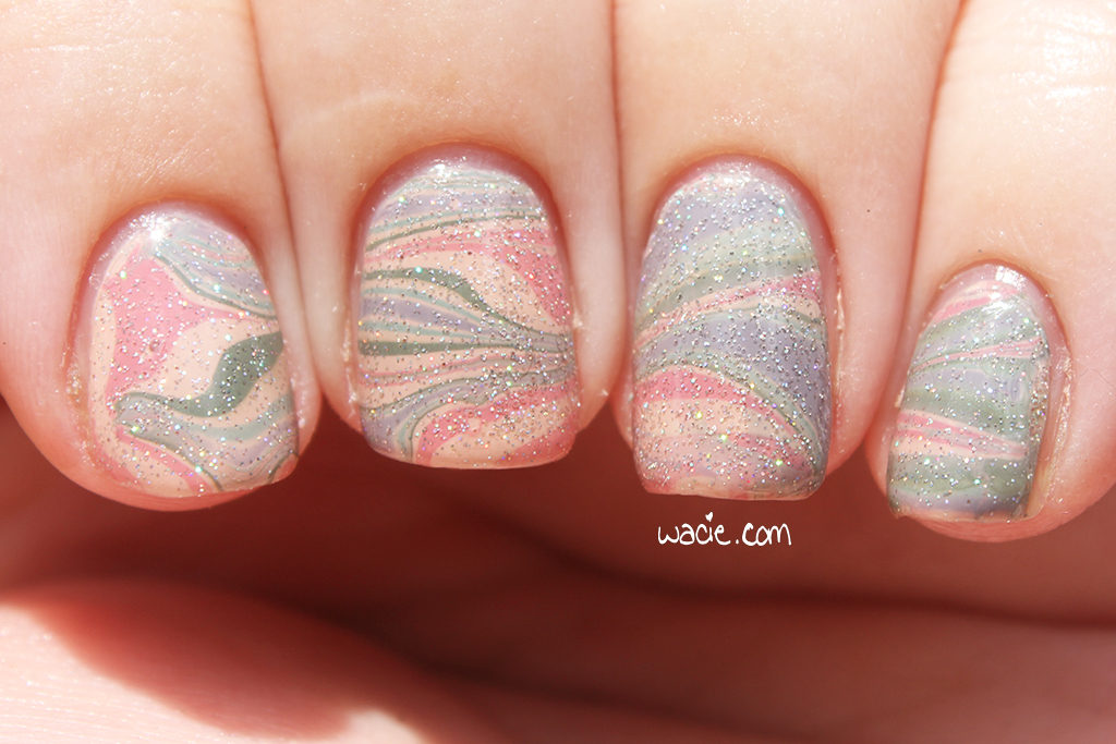
This one’s in the shade.

Let Zygons Be Zygons isn’t in stock, but other Digital Nails polishes are available in their etsy shop. You probably know where to find Orly.

I bought these polishes myself.

Guest Post for Secretary’s Nail Art

Hello reader! I hope you like guest posts, because I’ve got another one to share. Dina from Secretary’s Nail Art recently had a baby, and I got to step in and help her out. It’s look that’s a little of everything, but mostly it’s pink.

Follow the link to see more!

HPB Presents Dusty Watermarble

Welcome back, reader! Today’s post is a special Hobby Polish Bloggers link-up post! Every month a theme is selected by the group, and this month’s theme is dusty colors. The look itself is up to the blogger; as long as it adheres to the theme, it can be as simple or elaborate as the blogger wishes. I like to raise the difficulty a bit and use only untried polishes, but this month I couldn’t, because I have very few unused polishes that fit the theme. For this look, I used Essie’s Spin the Bottle, Sew Psyched, and Marathin, Zoya’s Bevin, Ciaté’s Pillow Fight, and China Glaze’s Fairy Dust.

IMG_80502

IMG_80542

As I mentioned, I don’t have a lot of colors in this dusty family, so I’m using a lot of polishes I’ve used in the past. I think Spin the Bottle and Sew Psyched were unused, but the others were probably only used once, so it’s not really a big deal. It took a lot of digging through the polish looking for the right colors; I have a lot of pastels and a lot of deep colors, but not too many in between. Marathin was actually the first polish that came to mind, and after a little bit of trial and error, I found a great combination, as well as the perfect way to wear them together.

IMG_80642

IMG_80722

Watermarbling is one of those things I want to do all the time, and yet, I rarely do. I’ve done a few marbled accent nails here and there, but it’s usually as an afterthought; when I’m planning a mani, I usually just pick a glitter topper that pairs well and that’s it. A lot of the time, I’m working with polishes that don’t seem conducive to marbling. I don’t want to use anything with fine glitters or shimmers because it may not spread well, I don’t want to use anything rare, discontinued, or expensive, and I don’t want to use anything with a really unique finish, like a holo. If I’m creating a look around a creme, I’m rarely thinking about other cremes. It’s a shame, because I love cremes; I think the glossy creme finish is the most underrated of them all, and yet I rarely take advantage of them. Even with all these beautiful creme shades and the marbling, I still had to top it with glitter. Fairy Dust counts as a dusty color, right?

IMG_80812

IMG_80882

The following photos were taken outdoors in direct sunlight. The colors are a bit washed out here, making the dusty colors look lighter and more pastel. Fairy Dust looks overwhelmed as well. On the plus side, I was able to get macros of all my favorite swirls. My ever-elusive right hand even makes an appearance.

IMG_80132

IMG_80172

IMG_80232

From left to right: Left thumb, left ring finger, left middle finger, right thumb

From left to right: Left thumb, left ring finger, left middle finger, right thumb

Essie, Zoya, Ciaté, and China Glaze are all sold in stores nationwide; mine are from Walgreens, Ulta, Sephora, and Sally Beauty Supply respectively.

Also, remember this is a group project, and there are links below to the other dusty manicures done by members of the group. Show them some love, too!

I bought these polishes myself.
 Loading InLinkz ...

Manicure Monday: Cool Raspberry Swirl With Sprinkles

Happy Monday, reader! Today’s look was done because I realized I don’t do watermarbles as often as I should. I used Sinful Colors’s Timbleberry (pink) as the base, Essie’s I’m Addicted (darker blue) and Mint Candy Apple (lighter blue) in the marble, and Blue-Eyed Girl Lacquer Prototype PCFS 1.0 as the glitter accent.

IMG_81312

IMG_81382

In a future post, you’ll read about the lack of watermarbling on the blog; basically, when I plan a mani, I’m thinking about what glitters will pair best with cremes, and other cremes are rarely considered. The fact is, I love watermarbling, and sometimes it’s just so hard to find a cool color combination, and also formulas that lend themselves to the process; nothing’s worse than discovering a polish doesn’t spread over the water and knowing I’ve wasted polish. I’d been planning to use Timbleberry for a while, and I had a Lynnderella topper set aside for it. At the last minute, I decided that I was going to watermarble instead.

IMG_81432

IMG_81462

Mint Candy Apple and I’m Addicted were chosen because they just happened to be on my desk. I have them set aside for swatching some glitter toppers in the future. I saw them alongside Timbleberry and thought “Why not?”. The final outcome looks a little like a rocket pop, and more than a little like toothpaste, but I’m really happy with how it came out. My top coat smudged it a bit, but this is barely visible in real life.

IMG_81542

IMG_81592

The glitter was the very last piece the look needed, and to me, it brings the whole thing together. I couldn’t stand the thought of not using any glitter, so I picked this one. The colors aren’t a spot-on match, but it’s pretty close. Overall, I think this ended up being a pretty cool look; you’ve got the bright-but-not-totally-neon bright pink, the cool blues, and a tiny bit of sparkle. I also lucked out having the bow be the exact same color as the blue in the mani.

Outdoor photo time! There’s no large difference among the colors here, but I got some okay macros. Try to see past the smudges. I also got a photo of a nail on my right hand; I always get the best swirls on the nails on the other side of the camera.

IMG_81022

IMG_80962

IMG_81052

mmcrswsmm

Timbleberry might be discontinued by Sinful Colors. I’m Addicted also may have been discontinued by Essie. Both brands are sold in stores nationwide. Prototype PCFS 1.0 is a Blue-Eyed Girl Lacquer one-off; other BEGL polishes are sold in their online shop. My bow charm is from Claire’s.

I bought these products myself.

Manicure Monday: Strawberry Banana Swirl With Sprinkles

Happy Monday, reader! I did a great time doing today’s manicure, and I hope it shows! For this look, I used OPI’s I Just Can’t Cope-acabana and Live, Love, Carnaval with Blue-Eyed Girl Lacquer‘s Get Too Close to the Flame. All nails are topped with one coat of Gelous. Because of a chip that occurred in the polish between photography sets, I’ll be showing you the daylight photos first. These were taken in direct sunlight outdoors.

IMG_58882

IMG_58992

I Just Can’t Cope-acabana has been on this blog a lot lately; I’ve used it as the undies for glitters on at least three different swatches, and I’ve used it so much that it’s starting to show the fill line. Yellow can be hard to work with sometimes, what with the streaking and failure to level itself, and this is no exception, but it’s a really nice color. It’s a pretty neutral yellow and works with just about everything. I love the way it looks here with Live, Love, Carnaval; I didn’t think to pair these two until the last minute, and I like the way they look together. I mean, they should, they came from the same Brazil collection. They set each other off in just the right way, and they both marbled like a dream.

IMG_59012

IMG_58942

So let’s talk about the chip on my index finger. I have no idea what caused it, only that it appeared sometime taking the daylight photos and taking the indoor photos. I’m pretty sure it’s a problem caused by Gelous. I know it’s not really meant to be used as one, but I ran out of Seche Vite and I don’t know when I’ll be able to get another bottle. It’s incredibly frustrating, because it takes a century to dry on its own and I keep smudging it hours after I thought it was dry. I miss Seche Vite so much.

IMG_59092

IMG_59142

I’ve watermarbled before, but this is the first time I’ve tried the horizontal swirl; usually I stick to the flower or the pinwheel. I don’t think it looks too bad. I think I used too many rings, or maybe I made too many strokes in the polish, but it can be pretty tough to tell the colors in the marble apart; from far away, it just looks orange. I still like it, though.

IMG_59152

IMG_59232

Get Too Close to the Flame works so well with I Just Can’t Cope-acabana that I couldn’t not use it. It was actually the first polish I picked out for this mani, and the ideas about the pink and the watermarble came later. I kind of struggled with how to use the glitter, since I still really wanted to, and I ended up just doing one allover coat with it, even over Live, Love, Carnaval, where there isn’t much constrast and all you see is some shimmer and faint glitter shapes. It’s a fun look, I think. Over the yellow, it’s bright and cheerful, over the pink it’s mysterious, and over the marbling, the word that comes to mind for me is planetary. It reminds me of the swirls around the red spot of Jupiter. It pleases me.

IMG_59292

IMG_59332

I got I Just Can’t Cope-acabana and Live, Love, Carnaval from Sally Beauty Supply. I got Get Too Close to the Flame from the Blue-Eyed Girl Lacquer online shop; it’s been discontinued.

I bought these polishes myself.

Manicure Monday: Dainty Pink Water-Marble

Happy Monday! This Manicure Monday’s secret word is dainty. We’re like baby princesses over here. My main polish in this mani is Model City‘s Fairy Godmother; I’m wearing it alone at three coats on my thumb and pinky, as well as in a watermarble with Elevation Polish‘s Hitsujiyama Park and under MAC’s Just Jewels. All nails are topped with one coat of Seche Vite top coat.

mmdpwm

mmdpwm2

Perhaps the most unique thing about this polish, as well as the most obvious, is the strong pink pearl flash. This is what really sets it apart from the other pale pinks in my collection. There’s also a hint of holo; unfortunately it’s nasty cloudy outside, so I can’t demonstrate the pretty holo effect properly.

mmdpwm3

mmdpwm4

mmdpwm5

I decided on a water-marble pretty last-minute, and it was hard choosing the right color to contrast with the pale pink. I wanted one that was still pale so as to be dainty (ahhhh!) but dark enough to contrast with what I was already using. Hitsujiyama Park is just a shade or two darker, and has about the same amount of holo and lacks the pink flash, so I went with it. In the end, I wish I’d gone with something just a tad darker, but I really like the result I got. I bet there’s a sub-species of unicorn with stripes like these. A Zebracorn, if you will.

mmdpwm6

mmdpwm7

Finally, I used some glitter. MAC’s Just Jewels is a sheer but powerful shimmery topper with some multi-colored metallic glitters mixed in. It’s a little too strong for the watermarble, but I think it pairs really nicely with Fairy Godmother. The heavy pink shimmer is just what Fairy Godmother needs.

Fairy Godmother is discontinued; you can get other Model City polishes from their shop. Hitsujiyama Park and other Elevation Polishes can be purchased from their shop. Just Jewels is discontinued; other MAC polishes can be found wherever MAC products are sold. My bow charm is from Claire’s.

I bought two of these polishes. One polish was sent for review; my opinions are not influenced in any way.

Manicure Monday: Arctic Circle Marble

Hey guys! I’ve got a few minutes to post my Labor Dabor post before it turns Tuesday. I actually had a post typed up and then my new keyboard, whose CTRL button only works if you mash it so hard your finger turns white, did not work and ate my post. We’re also stuck looking at pictures from the backup camera this week, so these photos are not up to my usual standards. For this look, I used OPI’s I Vant to Be a Lone Star, Elevation Polish‘s Pitaraq, Essie’s Blue Rhapsody, and Lynderella‘s Something Blue, all topped with one to two coats of Seche Vite top coat.

mmacm

mmacm2

For my watermarble, I used clear polish between drops of Blue Rhapsody and I Vant to Be a Lone Star. My base was two coat of Pitaraq. This was my first time doing a negative space watermarble, and I envisioned frosty silver and blue rings over the icy metallic shimmer. The marbling process, however, wasn’t as painless as it could have been. It dried on the water before I could swirl it and tore my design a little. The rings are also so wide it hides the base glitter. I still like it, but it was better in my head.

mmacm3

mmacm4

Something Blue as a glitter accent was a bit of an afterthought. I was shopping my stash, found Something Blue, and tried it over I Vant to Be a Lone Star. It was a perfect match; the silvery blues blend in beautifully. Of course, since this camera sucks, you can’t see the fine details, but the blue glitters are nearly but not quite the same color, and adds a bit of shimmer as well. I love Lynnderella polishes, even though they’re quite new to me, and it’s especially satisfying to use one I had to fight on eBay for. It was the last bottle! Shop victoriously, indeed.

mmacm5

I’ve really missed doing my weekly swatches. I bought a new battery for my main camera and I hope that fixes it. If not, I’ll have it serviced soon so I can get back to them. I have enjoyed my time, though. I’ve been wear-testing a few new Wacie Nail Company polishes, including the one I hope to release for my birthday. I’ve also been playing Dragon Age: Inquisition and I’m so absorbed in it I can barely pull myself out. Hope to see you this weekend with new swatches, and if not, see you Monday!

I bought these polishes myself.

Manicure Monday: Black Holo Marble

Hello, reader! This week’s Manicure Monday is a doozy, if I may say so myself. Blue-Eyed Girl Lacquer‘s Discontinued Limited Edition makes a beautiful watermarble and I can’t stop staring at it. The watermarble was done with Sally Hansen’s Black Out. Other nails show Discontinued Limited Edition alone at two coats. All nails are topped with Seche Vite top coat.

mmbhm

mmbhm2

I’ve swatched Discontinued Limited Edition in the past, so be sure to check out that post if you want to know the details. What I didn’t expect then was that it would work so well for watermarbling. It spreads easily and quickly, even better than the black creme polish. The Spectraflair and orange shimmers mingle with the creme, which gives an all-over holo effect. I planned to use a Spectraflair top coat and ended up not needing it. This, with Black Out’s perfect opacity and consistency, made for a painless and gorgeous watermarble.

mmbhm3

mmbhm4

mmbhm8

I hadn’t even planned the watermarble today. I was going to try my hand at galaxy nails for the first time, and I couldn’t get it right. It was terrible! I either got too much polish or not enough, got too much coverage or not enough, and just made a big mess. After three misfires, I give up and did a watermarble because it was easier. Easier! What universe is this?

mmbhm6

mmbhm5

And of course it’s pouring down rain today, because why wouldn’t it be? The holo effect is a little dull in these first few photos. I used the flash in the next few, because I really needed to show you the full holo effect. It shines right through the black marbling and I cant. stop. staring.

mmbhm7

mmbhm10

mmbhm9

mmbhm11

I’ve got to do this more often. I try not to use the polishes I love, especially when they’re as aptly-named as this one. I thought I was going to use a lot more polish, but because I only marbled two nails on each hand, I lost way less than I expected. I can’t get over how well it spread in the water, also. I want to see how other indie holos, BEGLs in particular, marble with cremes. Have I been bitten by the watermarbling bug again? Perhaps!

I bought these polishes myself.

Manicure Monday: Pink and Nude Watermarble

For the first time on this blog, I tried a water marble. I’ve actually tried some before, but circumstances kept me from finishing them. This mani didn’t turn out quite the way I imagined it, but it’s growing on me. My water marble was done with L’oreal’s Broadway Boogie and Sinful Colors’s Timbleberry. I have one nail each with Broadway Boogie, Timbleberry, and Ciate’s Love Letter. All nails are topped with one coat of Alter Ego‘s She Shines top coat.

IMG_55482

IMG_55522

At first I was just going to do a gradient with these colors, and then put the glitter on top. I’m so glad I did something different. Gradients are just so easy; they’re my fail-proof nail art look. I used to be hooked on watermarbles and did them constantly, but as I started to wear more indies, I just got used to laying down glitter and calling it a day. It feels good break away from that.

IMG_55562

IMG_55642

A quick word about the polishes I used: Broadway Boogie, a warm nude creme, really lengthens my nails. Timbleberry, a bright warm pink, is very vibrant, though faded a little in the marble. Love Letter, a shifting pink-to-orange microglitter, complements the warm and cool tones in this look.

IMG_55672

IMG_55752

I would love to do another look like this. I used to do so much nail art, and now I barely do any. I kind of miss it.

I bought these polishes myself.