Manicure Monday: Undersea Epic Glitter Gradient

The first day of fall is this week, and so the viciously bright neons and the whimsical glitter mixes are being put into storage for next year, and the dark muted colors are coming back. Well, for some people that’s happening. It’s not happening here. I’ll wear my neon orange whenever I want. I am, though, going to be using a lot of blue colors throughout the season. A lot of my recently acquired colors are blues, and I’ll be trying lots of colors I’ve never used before, ones I’ve had for a few days and ones I’ve had for a few years. I have some great things planned for this season.

100_2479

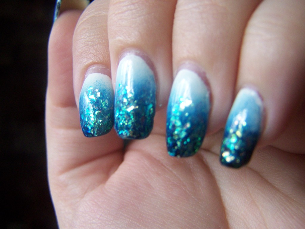
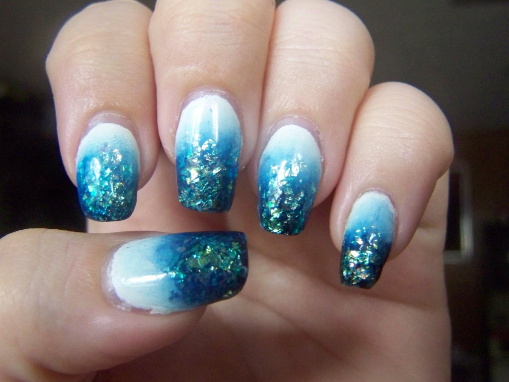
I did a similar manicure in July, and decided to try it again with different colors. I like it much better this time. The dark blue side of the Moon Candy is almost black, but over the white, it’s very blue. After putting the shredded glitter over the blue tips, I got this wonderful oceanic effect. It really makes me want to book it to the beach. I know this was meant to be a fall manicure, but as it invokes thoughts of swimming, of sunshine and water, it’s anything but appropriate for fall.

This was intentionally blurred to show the colors. Maybe.

This was intentionally blurred to show the colors. Maybe.

Of course, I encountered a few problems with this week. Something I’ve consistently had trouble with is Revlon’s double-ended polishes. I’ve had the brushes start losing bristles, I’ve had the cap break completely off, and I’ve had the polishes completely dry out. The Moon Dust I used this week was one of those. I had to thin out the glitter side once before, when I noticed the agitator ball was suspended in the middle of the polish. When I opened it to use it this week, I had the same issue. The blue was thick, stringy, goopy. The glitter was impossible to remove from the bottle. I put some thinner in it and let it sit overnight, but maybe I used too much, because it was kind of watery. I also had a hard time getting the colors to blend, and once the watery glitter was added, it kind of smeared the gradient around. I’d be mad if I didn’t like it so much.

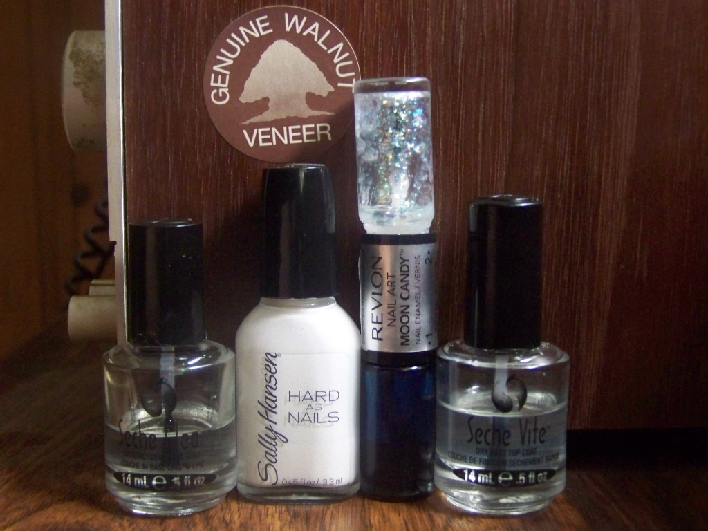
Sally Hansen's Hard to Get, Revlon's Moon Candy in Moon Dust.

Sally Hansen’s Hard to Get, Revlon’s Moon Candy in Moon Dust.

I went back to Seche Vite this week because my Digital Nails topcoat is now this strange reddish orange color, and I was afraid it would affect the white polish. I was also afraid it wouldn’t smooth out the coarse glitter as well. Hard to Get is back, too. This bottle is like a workhorse. I use it for everything, and as a result, it’s almost time for a new bottle.

So yeah, fall manicures. Bring it on.
Manicure Monday: Yellow Lattice on Grey

I ran out of Seche Vite this weekend trying to smooth down a heavy glitter manicure, and didn’t have enough of to finish this week’s mani. I had to resort to my backup, the el cheapo LA Colors top coat that takes ages to dry and can’t be applied until the lacquer itself is dry. When I woke up this morning, a couple of the nails on my right hand were dimpled and rough from being pressed into teddy bear fur, and I’d done them hours before I’d gone to bed. This stuff seriously takes until 2014 to dry.

100_2319

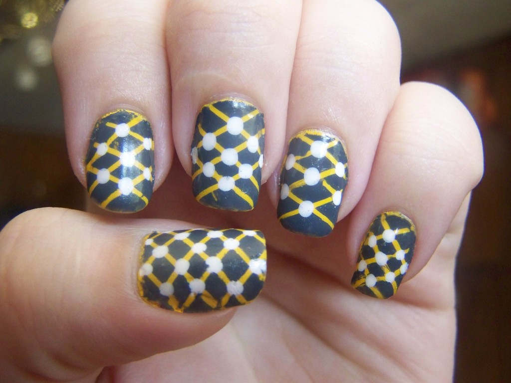
This was my first time using striping tape to make thin, clean lines. Some of the nails came out really well. On some of them, I forgot the order in which I put down the tape pieces and smudged a few of the lines. The dots, thankfully, cover most of those. On the whole, it’s kind of a mess: there are more stripes on some nails than on others; none of them are consistent. That, and with the top coat problem, I’m kind of just counting the days until I take them off.

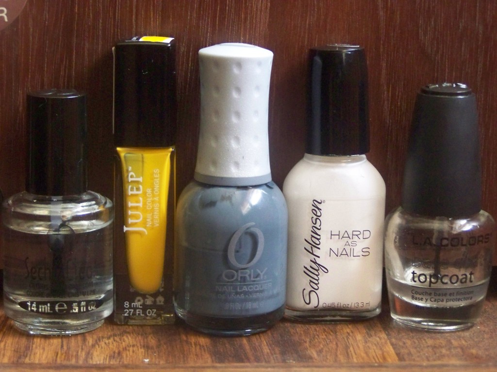
Julep's Lexie, Orly's Decoded, Sally Hansen's Hard to Get (again)

Julep’s Lexie, Orly’s Decoded, Sally Hansen’s Hard to Get (again)

Here are the colors I used this week. Lexie was a little hard to work with; even after two coats, I still had steaks and bald spots in places. Decoded is one of my favorites, though. It’s pretty much opaque in one coat, dark and mysterious. I’ll be sad when this one is empty.

Manicure Monday: Red and White Stamps

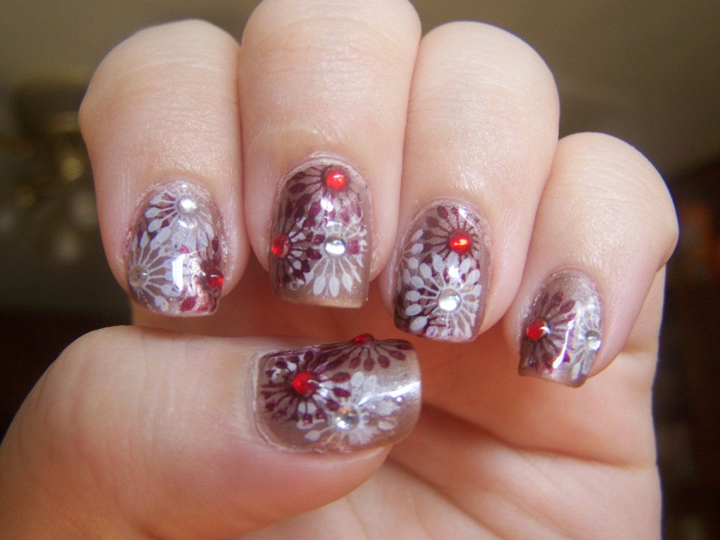
I bought a stamping kit on my latest excursion to Sally; that was like a month ago, and I’ve just gotten around to trying it out.

100_2300

The neutral base color is a color called Cashmere Crème. I got it in a thrift store probably a year ago. When I got it, the printing on the bottle was mostly intact; I have no idea what happened to it since then. I’m also not entirely sure what color this even is. It looks like a tan shimmer in the bottle, but on my nails, it looks more metallic, more silver. It’s confusing. It’s a good base color for this manicure, though.

It was kind of tough finding the right colors for the stamped designs. I’d set aside the dark red Mercury Rising to go with the Cashmere Crème before I even knew I was going to be doing this stamping design, and at first, I didn’t think it would be opaque enough to stamp with. I’m pretty pleased with how it came out. The white is Sally Hansen’s Hard to Get, my workhorse white color.

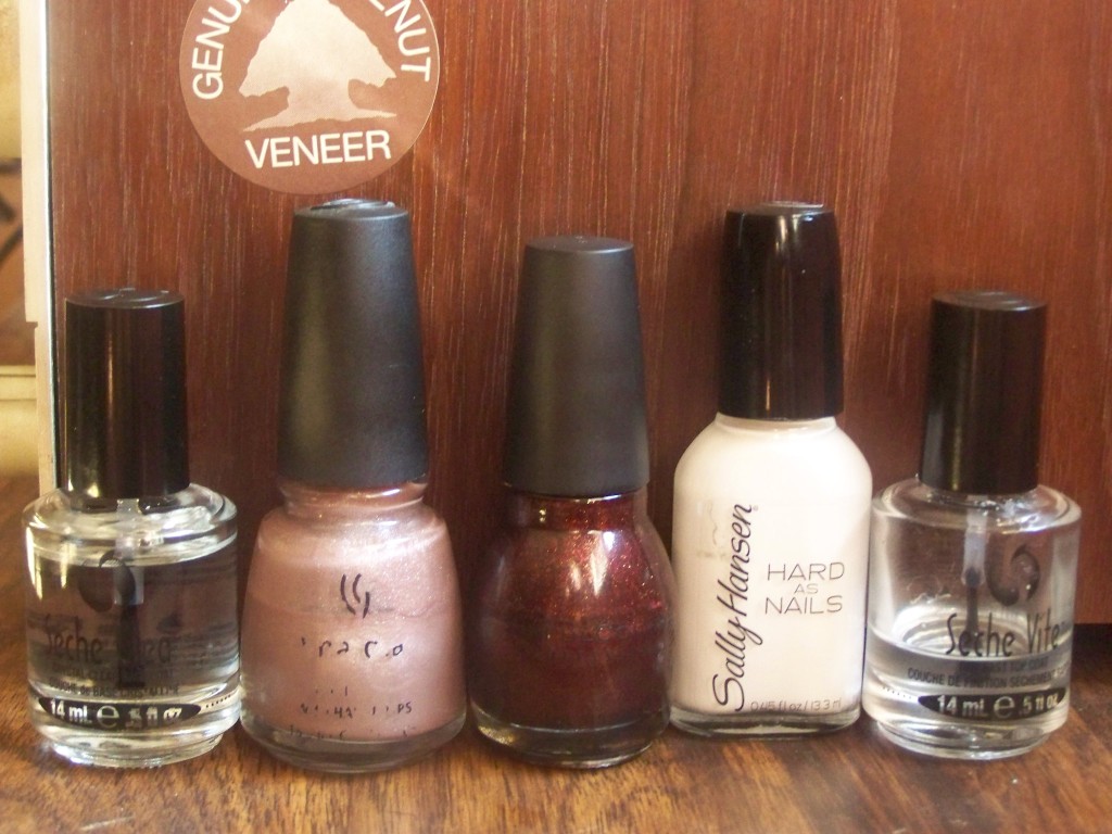
China Glaze Cashmere Creme, Sinful Colors Mercury Rising, Sally Hansen Hard to Get

China Glaze Cashmere Creme, Sinful Colors Mercury Rising, Sally Hansen Hard to Get

Then I got the rhinestones out. I tried doing them just on my thumb and ring finger as accents, but then the rest of the nails looked plain, so I added a few here and there, alternating the colors on each finger. Then I got tired of seeing ones that didn’t have a rhinestone and I ended up with more than I planned, and some in odd places, like on the sides or at the very tips.

For a first try at stamping, I’m happy with it.

Manicure Monday: French Pink and White Gradient

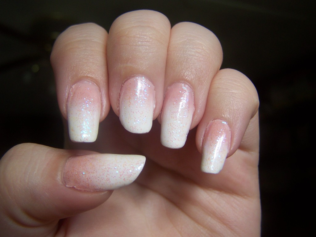
So this is my idea of a professional manicure. I’m going on a business trip to Boston, and I wanted a manicure that was office-friendly without giving up glitter. Here I am, having my cake and eating it too.

100_2196

It looked different in my head, but I’m pretty happy with the result. From a distance, it looks like the traditional French manicure, and the glitter is hardly noticeable. I tried to be professional while still being myself, but I may have done better than I thought.

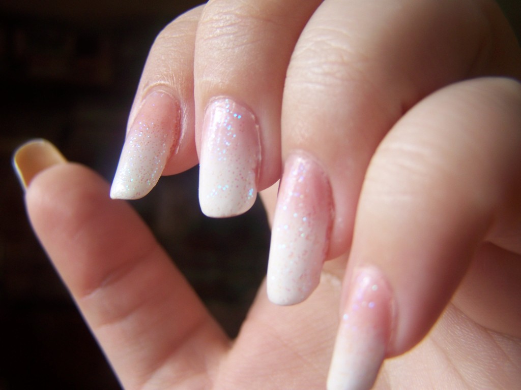
Another angle for glitter.

Another angle for glitter.

I still can’t get over how long my nails are.

Julep's Emmanuelle, Sally Hansen's Hard to Get, Sinful Colors' Pearl Harbor

Julep’s Emmanuelle, Sally Hansen’s Hard to Get, Sinful Colors’ Pearl Harbor

That Julep polish was full when I started.

Manicure Monday: Green and Yellow Color Blocking

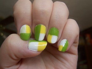
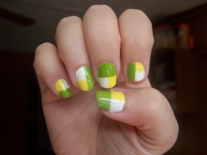
I have an inner perfectionist, believe it or not. It never cares about anything important; it’s never concerned with how clean my house is. My inner perfectionist is kind of a slob. No, my inner perfectionist only notices the flaws in trivial things, things that no one else will ever notice. My manicures are one of those things. I know that a manicure can look great without being totally perfect. My inner perfectionist does not. My inner perfectionist hates this manicure.

Left hand.

Right hand, because it's a little different.Left hand on the top, right hand on the bottom.
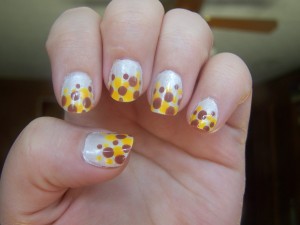
I got the idea from this Chalkboard Nails tutorial. I needed an idea that would allow me to use warm, bright colors, but wasn’t too complex or time-consuming. I added to it, rotating the design instead of alternating the colors. In theory, it’s a fantastic idea. In practice, with sloppy taping and thick, goopy polish, I just made a mess. I started with the white base, which took three coats until it was finally opaque, and then I added the yellow, then the green, which is old and thick and tough to work with. I think my bottle of Seche Vite is starting to thicken up as well, because I kept getting really thick, uneven coats of it. Between the green color and the topcoat, they’re a little bumpy in places.

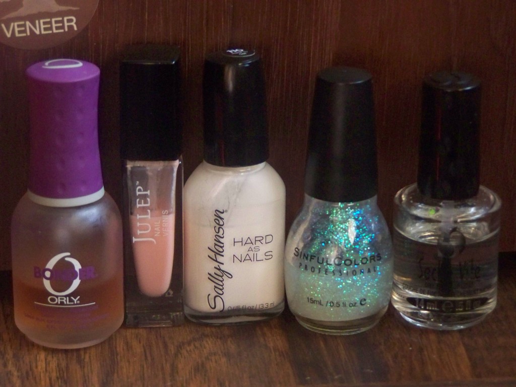
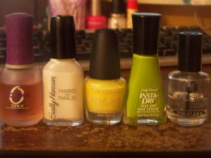
What I used: Orly Bonder, Hard to Get, Daisy, Lickety-Split Lime, Seche Vite

What I used: Orly Bonder, Hard to Get, Daisy, Lickety-Split Lime, Seche Vite

I keep telling myself it’s not that bad, but I can’t stop hoping they’ll chip off soon so I can redo them (which means they’ll stay on all week).

Manicure Monday: White, Brown, and Orange Dot Gradient

After last week’s accidental Italian food manicure, I knew one thing was true. I probably couldn’t do much worse than pizza nails, and if I did, I would really have to screw up for that to happen. I was in a tricky spot, though. After seeing many of the nail artists on Reddit doing designs with dots, I wanted to try one. I wanted this magnificent waterfall of polka dots cascading down my little nails. After searching for tutorials, I found a tutorial from Chalkboard Nails and followed it as well as I could.  It’s not quite there, but it’s not bad for my first attempt.

100_1981

It kind of looks like animal spots, now that I think of it.

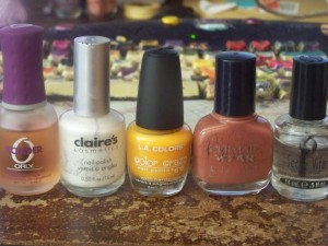
These are some of the saddest looking bottles of polish I have. The Claire’s polish doesn’t have a name, but it’s chunky and thick and even though there’s some light glitter in the bottle that doesn’t apply well to the nail, making it bumpy and coarse instead. The old Maybelline polish was an outlet store find about eight years ago; I can’t believe I even still have it. Wait, yes, I can, because I use everything until I lose it. The orange/yellow LA Colors is part of my paint your nails so you don’t go crazy shopping binge. It’s kind of watery, kind of uneven, but it looks nice against the white. I was worried it wouldn’t show up well at all.

100_1983

I always feel weird using Orly and Seche Vite with these old and cheap polishes. It’s having Dom Perignon with my Big Mac. Earlier manicures with that white polish were never successful; it would always slough off in flakes like dandruff by the second or third day. Of course, that was before I discovered that there was a purpose for top coat after all.