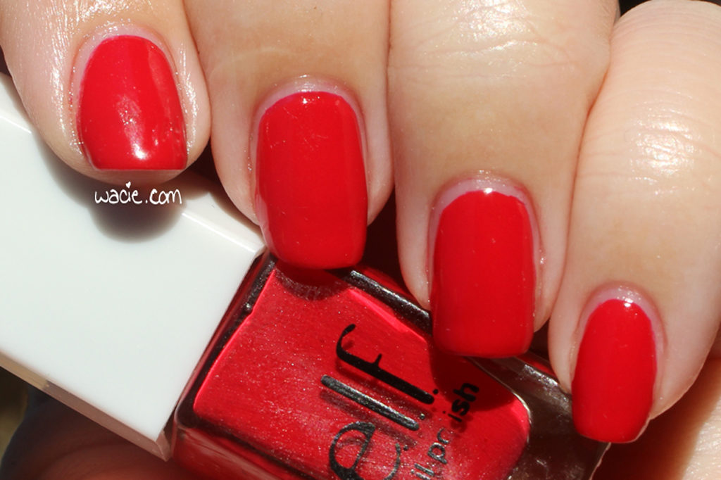
Welcome back! Today’s swatch is a pretty basic one. Everyone knows I love a red creme, and even though this is one you can’t get anymore, it’s a good one to have. This is e.l.f.’s Smokin Hot; I’m wearing three coats with one coat of Seche Vite.
Smokin Hot is, as I mentioned, a red creme. Application was good; the product consistency was on the thicker side, but I believe this is due to the age of the bottle, as well as previous uses. I forget if I thinned it out or not, but it still applied well. I had full opacity by two coats, but I always like to go for three. The polish dried with a glossy finish; I used top coat for protection and shine.
This is a polish I probably didn’t even need to swatch. As with most red cremes, what you see in the bottle is what you get on your nails. I can’t complain about this polish at all.
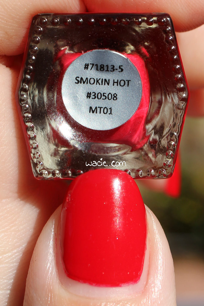
This polish was released in a Disney Villains themed set, which has since been discontinued.
Right, so during the month of November, I was insanely busy with starting a new job, starting a volunteer job leading writing groups for National Novel Writing Month, actually writing a novel for National Novel Writing Month, and cooking a Thanksgiving dinner for nine people. Now that novels are finished and Thanksgiving is over, I’ve finally got the time to share the swatches I’ve been collecting.
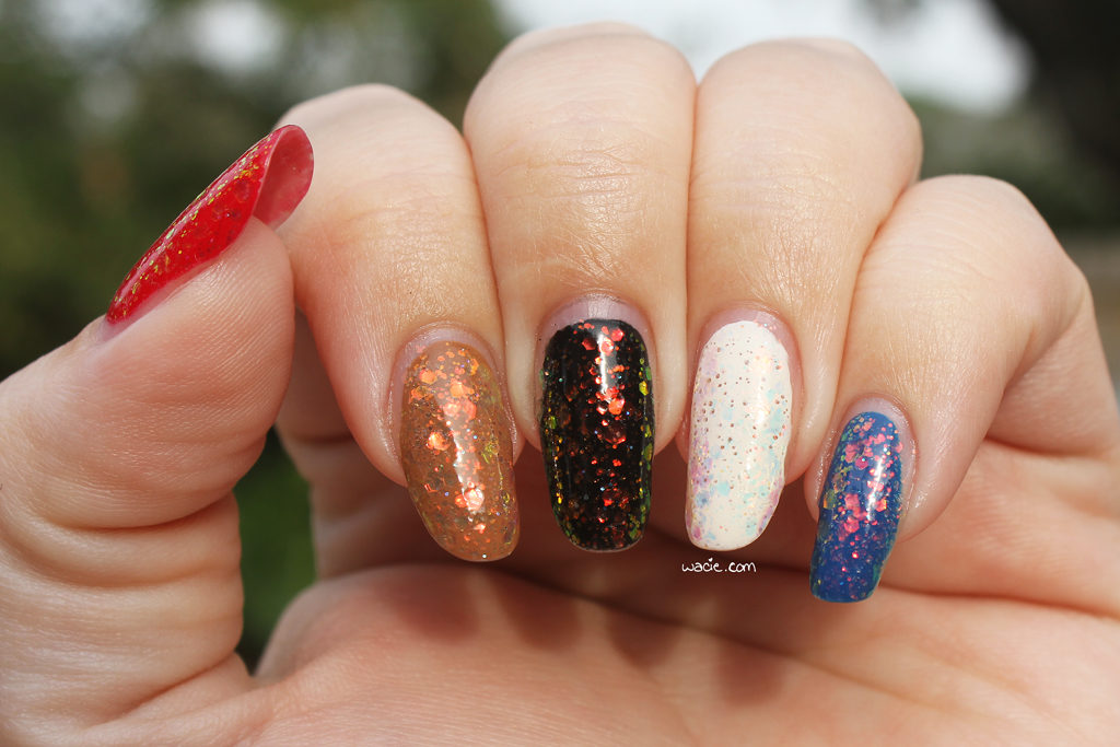
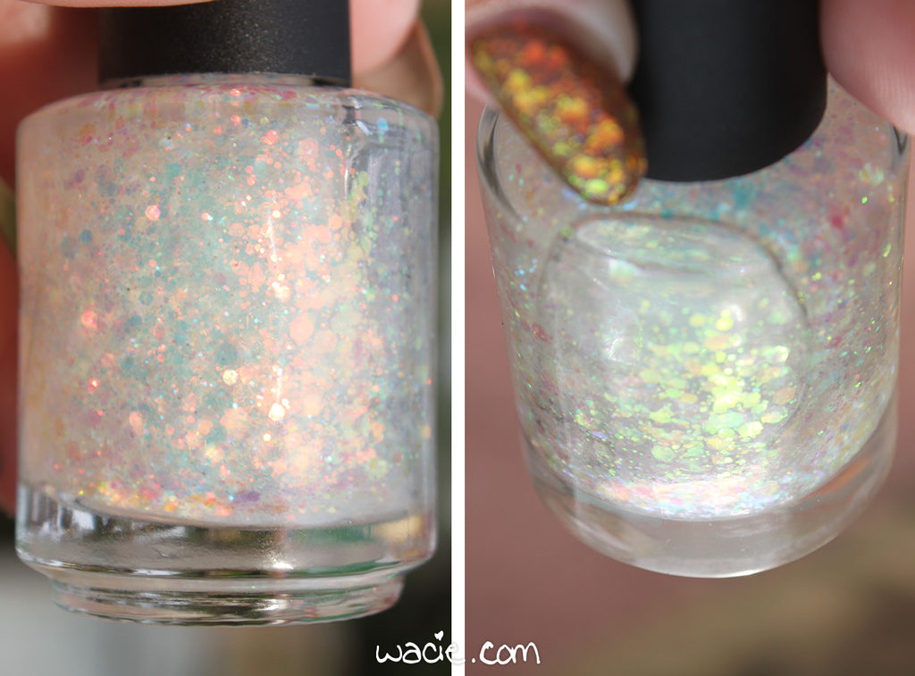
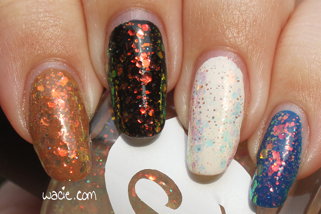
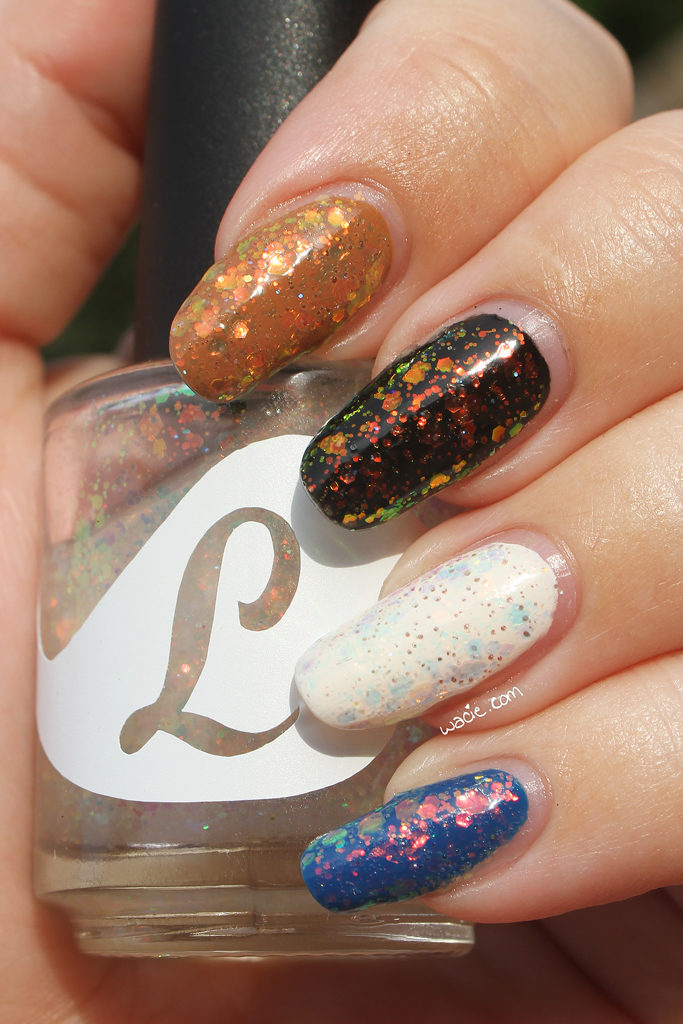
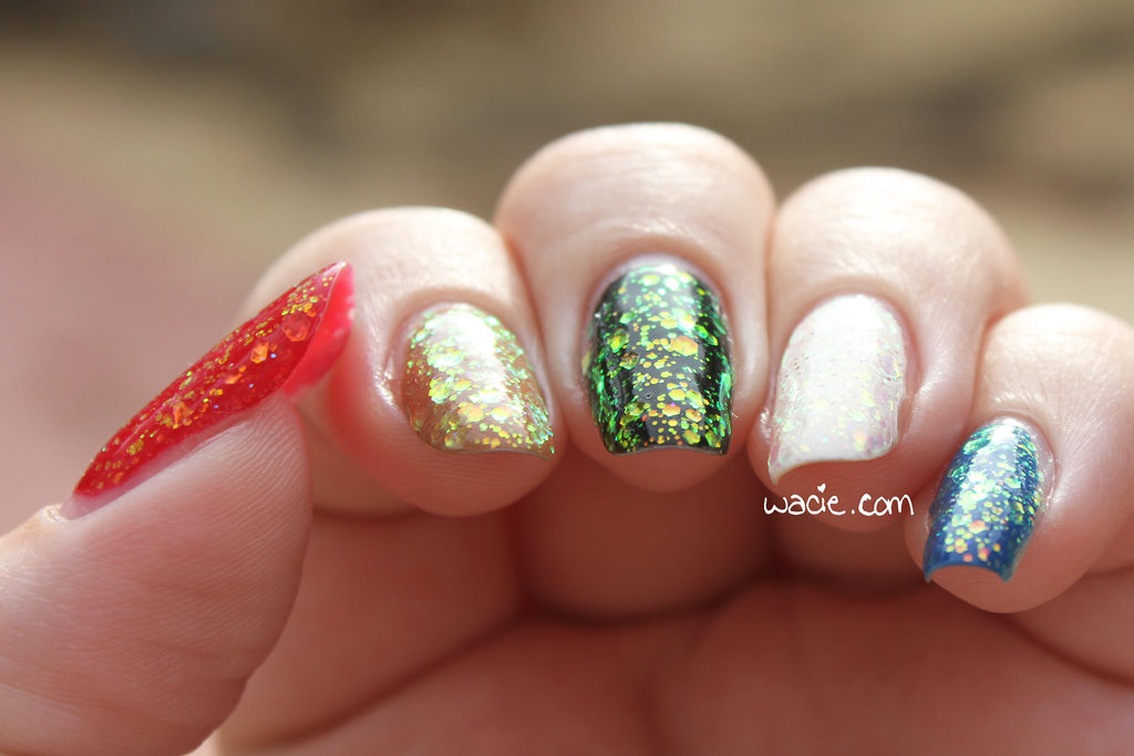
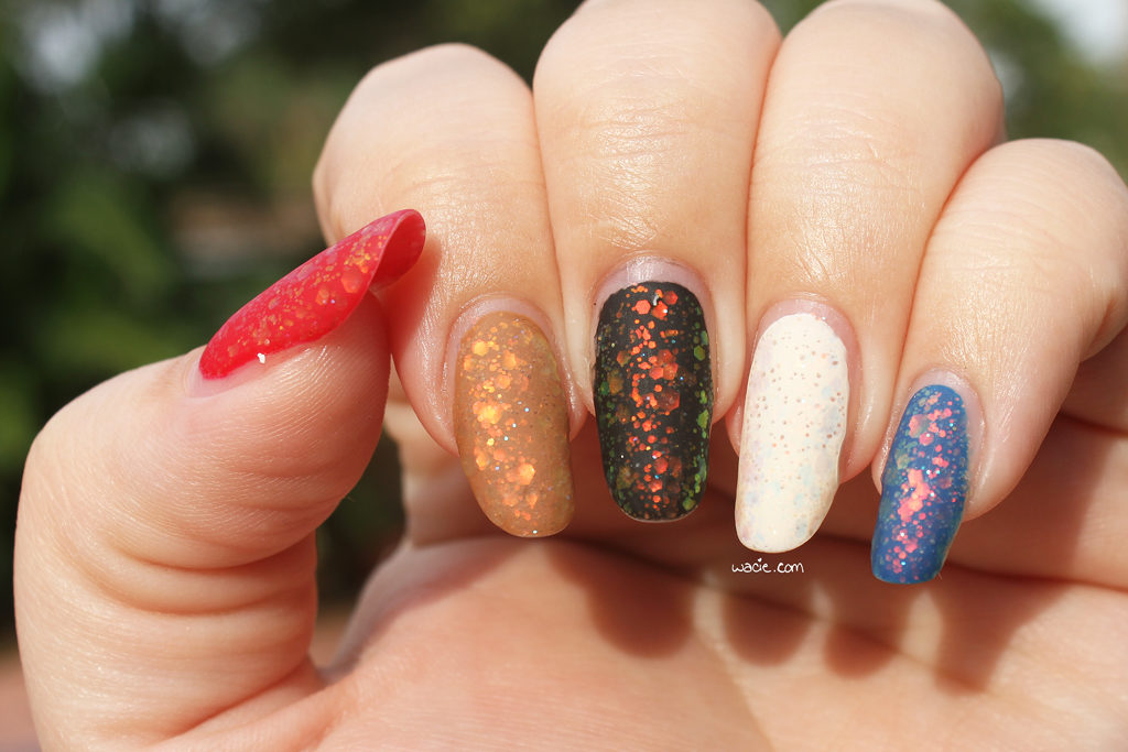
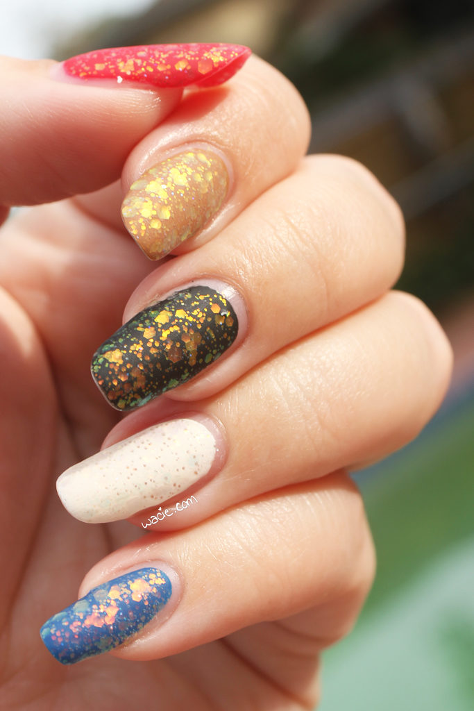
This first one is It’s Fall Over Me from Bluebird Lacquer; I’m wearing two coats over e.l.f.’s Smoking Hot (red), Butter London’s Tea and Toast (tan), Sally Hansen’s Black Out (black), China Glaze’s White on White (white), and Blue-Eyed Girl Lacquer‘s Lighthouse on the Lake (blue), topped with Seche Vite and Essie’s Matte About You matte top coat.
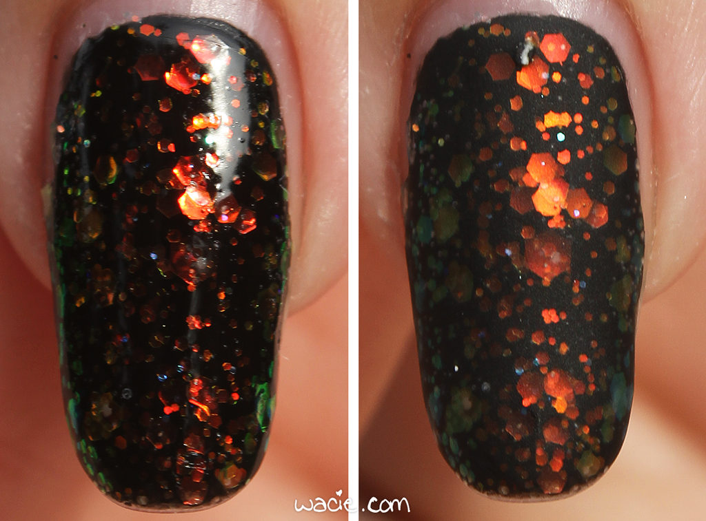
It’s Fall Over Me is a clear-based glitter topper with iridescent shifting glitters of various sizes. The shift is definitely reminiscent of the flakies in Essie’s famous Shine of the Times. Application was easy; the product consistency is wonderful in that it’s not thick enough to be goopy and difficult to use, but it’s not thin enough that it drips off the brush. The glitter delivers very easily, but I definitely wanted more than I got on my first coat, so I used two. In the future, I might try sponging it on to get that heavy glitter coverage without the thickness of multiple coats of lacquer. I used two coats of top coat as well, just to smooth down any glitter texture that was left.
I bought this at the Indie Shop Atlanta, and it had my heart as soon as I saw the bottle. I am such a sucker for these opalescent kinds of glitters, because there’s always something going on with it; it’s the easiest way to give a look dimension and style without getting knee-deep in nail art. It also looks interesting over any color, even white, which is obviously not the ideal undies for this polish, has a unique effect on it.
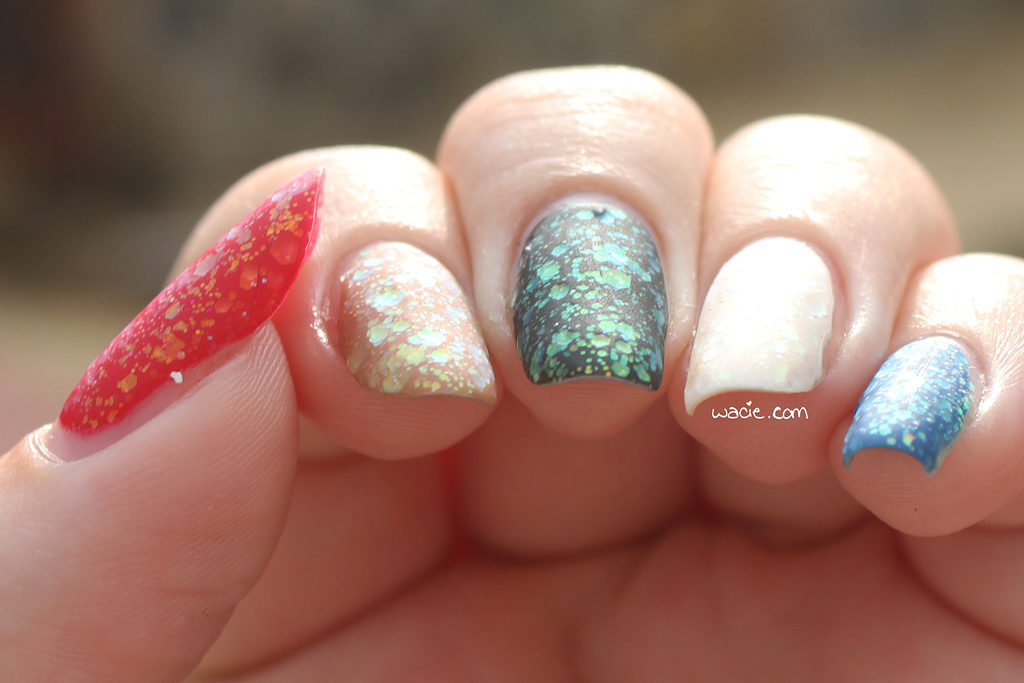
When I was talking to maker Lou at her booth, she told me I had to try it with a matte finish, so I did, and here are the photos of that. I definitely prefer the glossy finish, but I have to admit that the glitter looks pretty cool mattefied. I feel like the matte finish makes the shift a little less dramatic, but it still does happen, and still looks pretty cool.
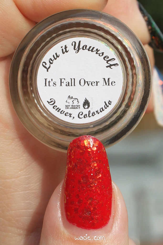
Unlike everything else I’ve shown you from my Indie Shop Atlanta haul, this is a polish you can actually still buy! As of this writing, It’s Fall Over Me is for sale on the Bluebird Lacquer website.
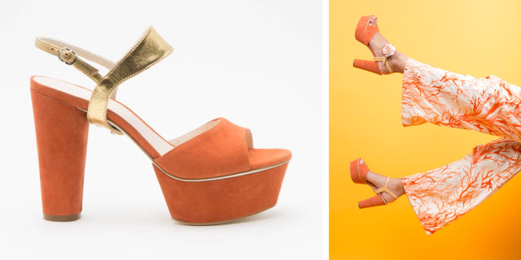
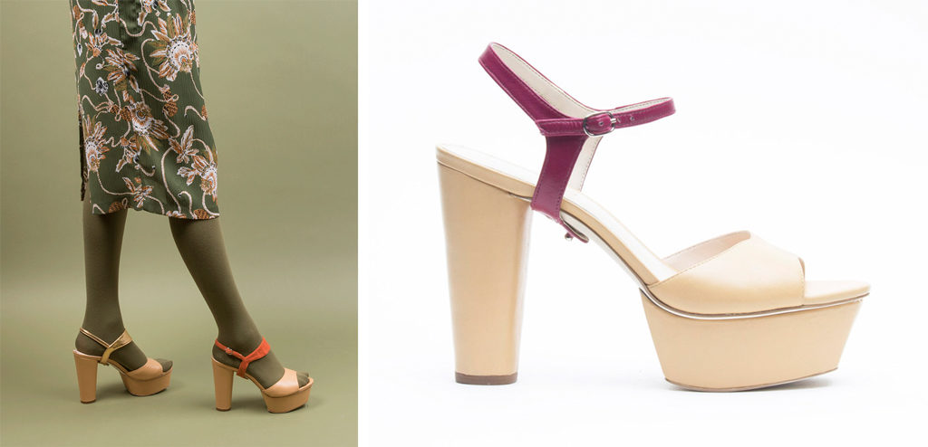
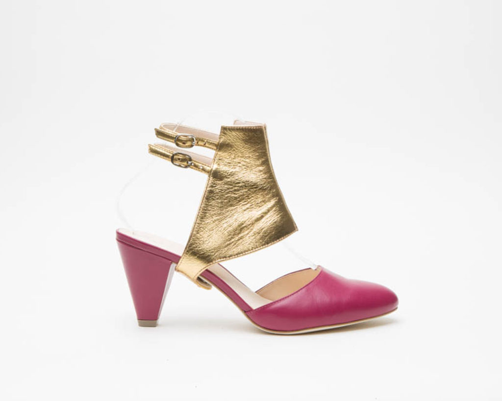
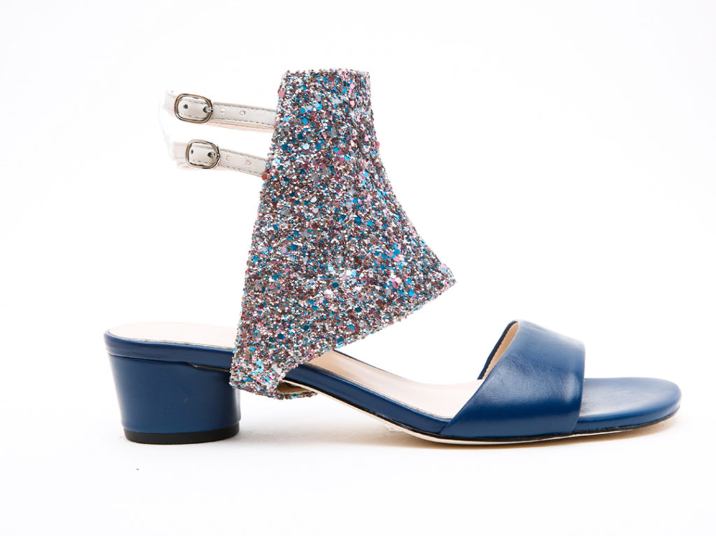
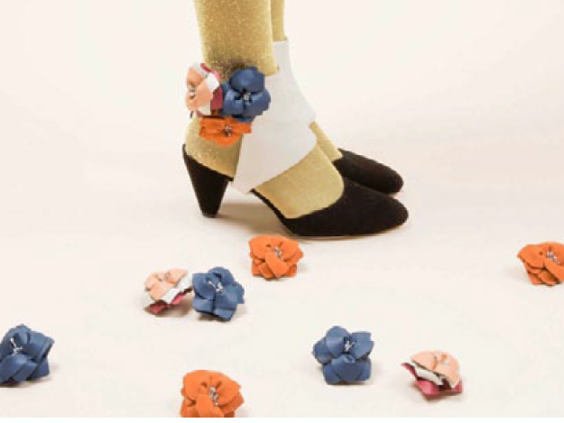
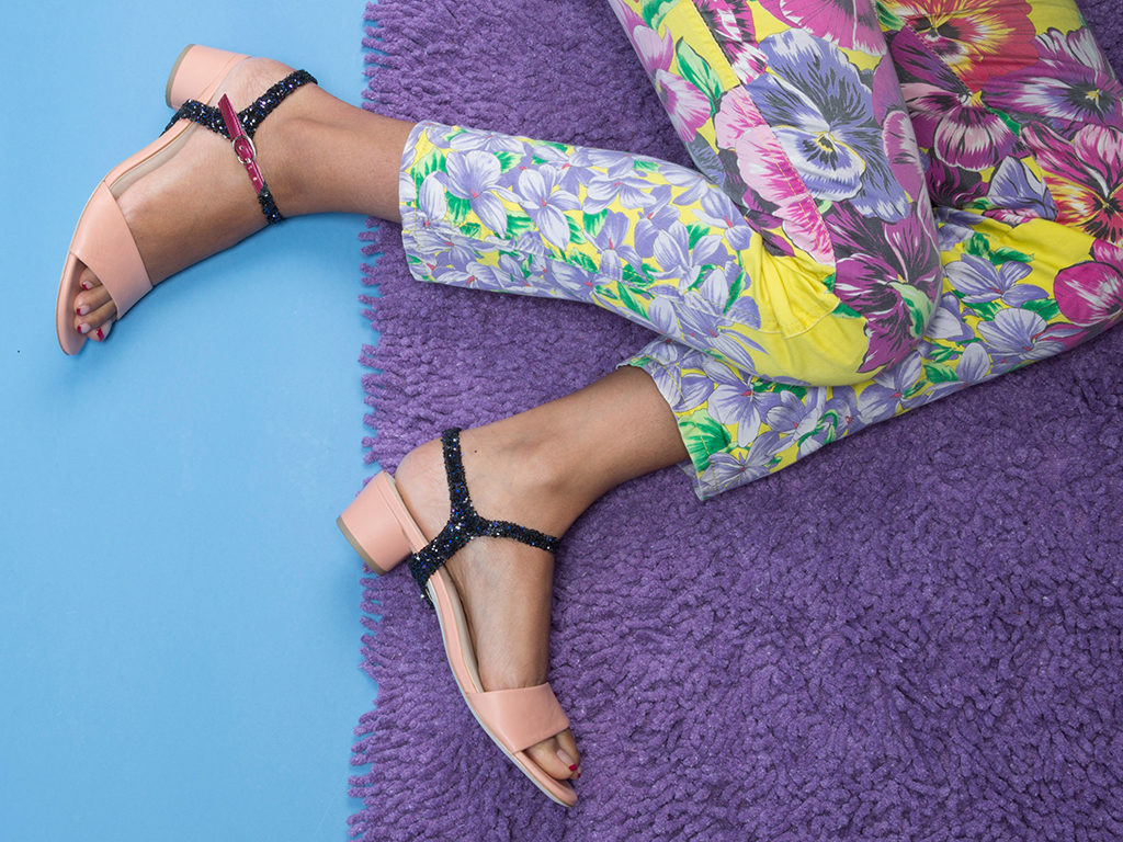
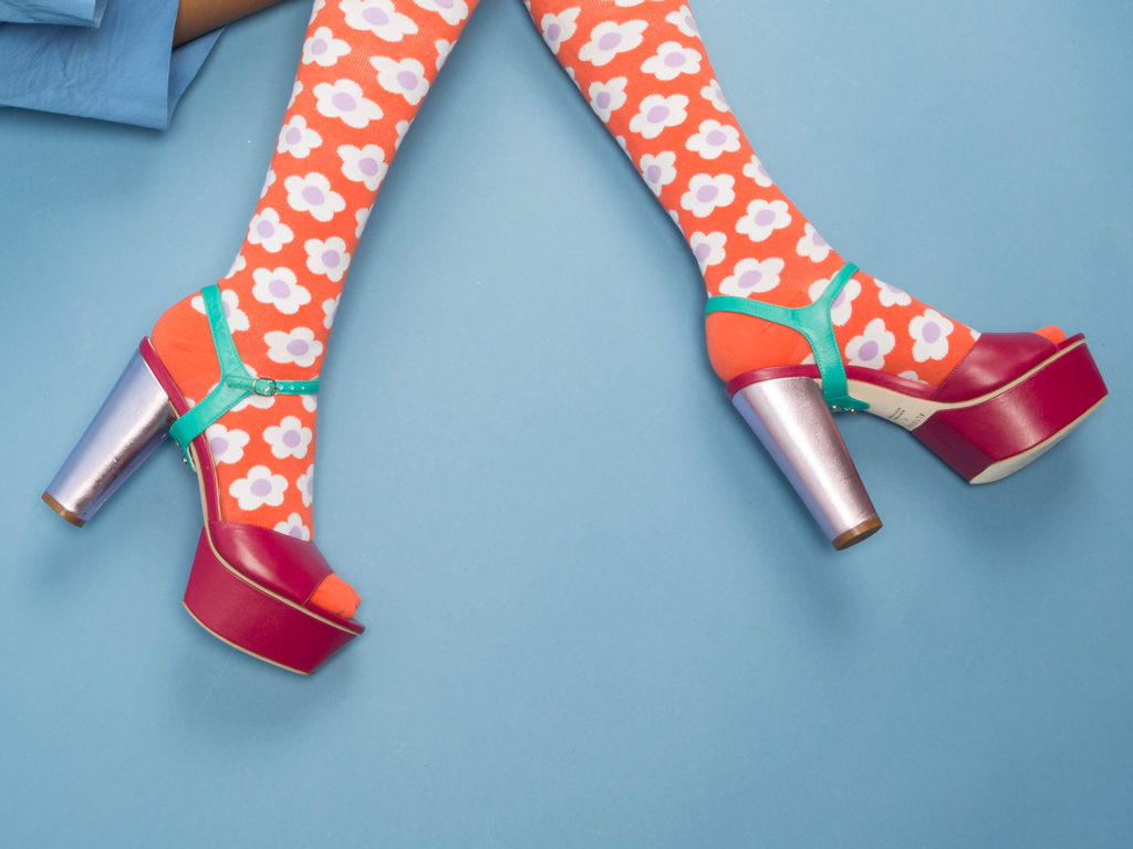
Hello, reader! Today’s post is all about shoes and manicures based on shoes. I got an early look at Alterre‘s 2017 shoe collection, and after seeing how easily the designs and colors lend themselves to negative space manicures, I had to give it a shot.
This post is a sponsored post by Alterre NY and Brandbacker. The opinions stated in this post are my own.
If you’re unfamiliar with Alterre, imagine this: modular sandals. You start with a sandal base, with straps that snap to the bottom sole. Different straps (the look) can be added to the sandal base (the lift) to customize the shoe. All looks work with all lifts and can be used to create a huge combination of different shoes. Imagine the possibilities!
This year’s collection, which doesn’t launch until September, is based on styles from the 1970s. The catalog contains a lot of earth tones and platform shoes, which I’m a huge fan of.
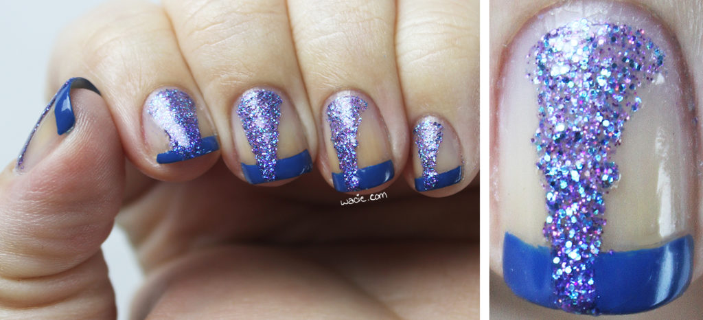
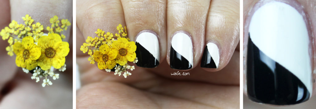
As I mentioned, I saw a manicure for every shoe in the catalog. The modular approach to negative space manicures works as well as it does for shoes.
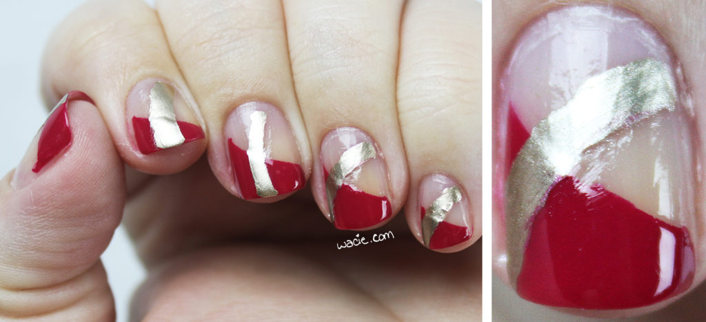
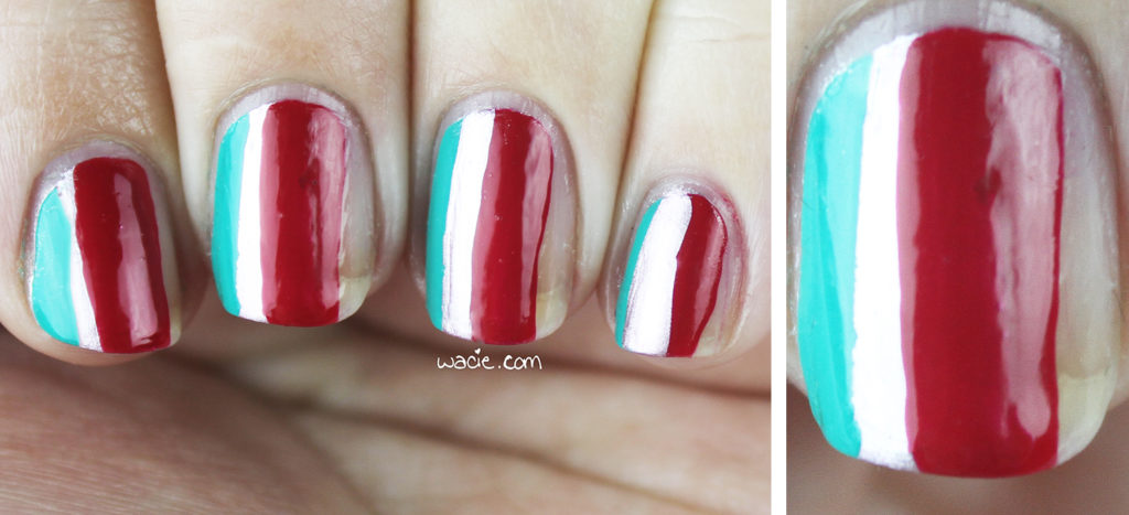
P2’s French Kiss and Essie’s Good As Gold
These looks are completely outside what I usually do for myself. I did a lot of taping and a lot of freehand painting, which I’ve never been completely comfortable with. Some of these looks, I regret to say, aren’t up to my usual standards.
They’re kind of editorial, and maybe that’s the look I wanted all along. Not all of these looks, nail and shoe alike, are suited for everyday life, but they could be with just a few adjustments.
This was directly from the PDF catalog, I didn’t get a hi-res photo of this one.
Sally Hansen’s Black Out, China Glaze’s White on White, dried flowers from Ciaté
e.l.f’s Nude, Blue-Eyed Girl Lacquer’s I Could See Them Too
So, what do you think, reader? I hope you like the shoes and some of the manis. I’ve been thinking of making Nailspiration a regular wacie.com feature, because I see so many things around the house and out into the world that would make fantastic nail art that I never get the chance to try.
This post is a sponsored post by Alterre NY and Brandbacker. The opinions stated in this post are my own. All nail products featured in this post were purchased myself.
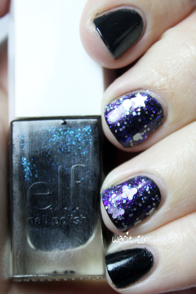
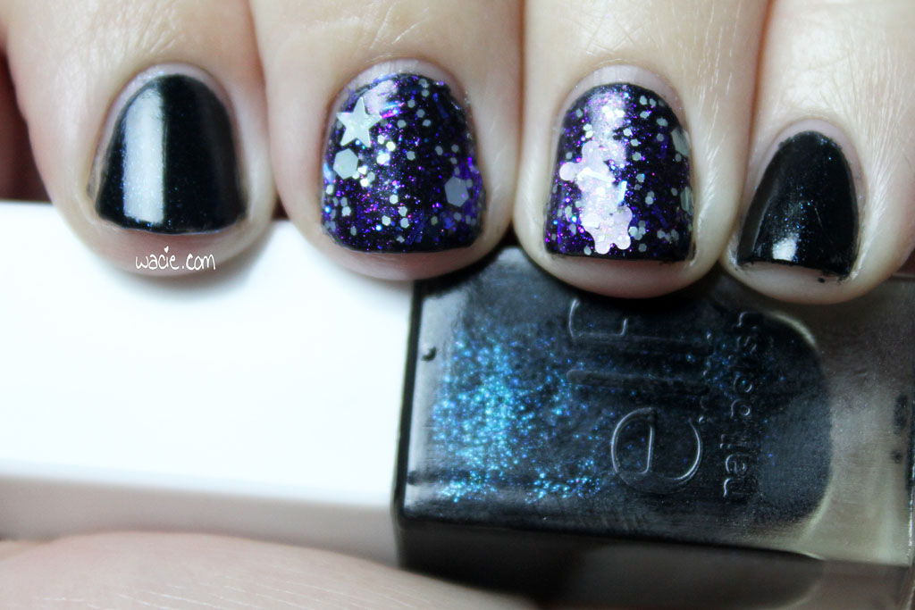
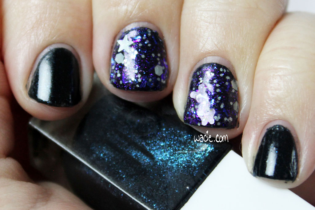
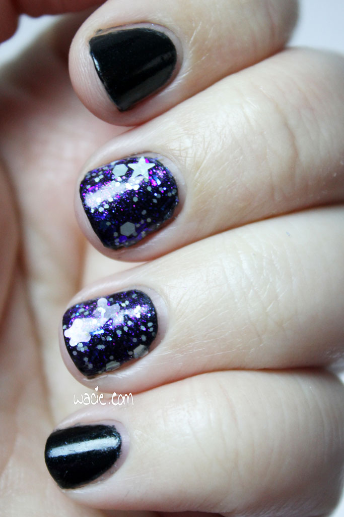
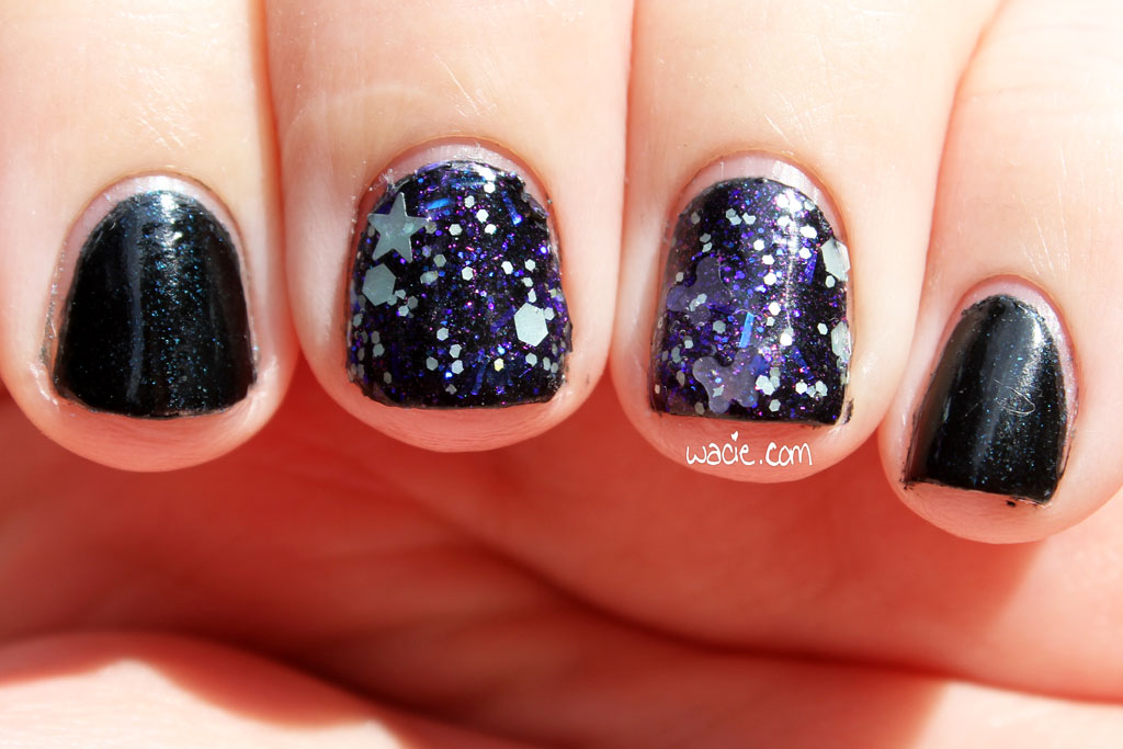
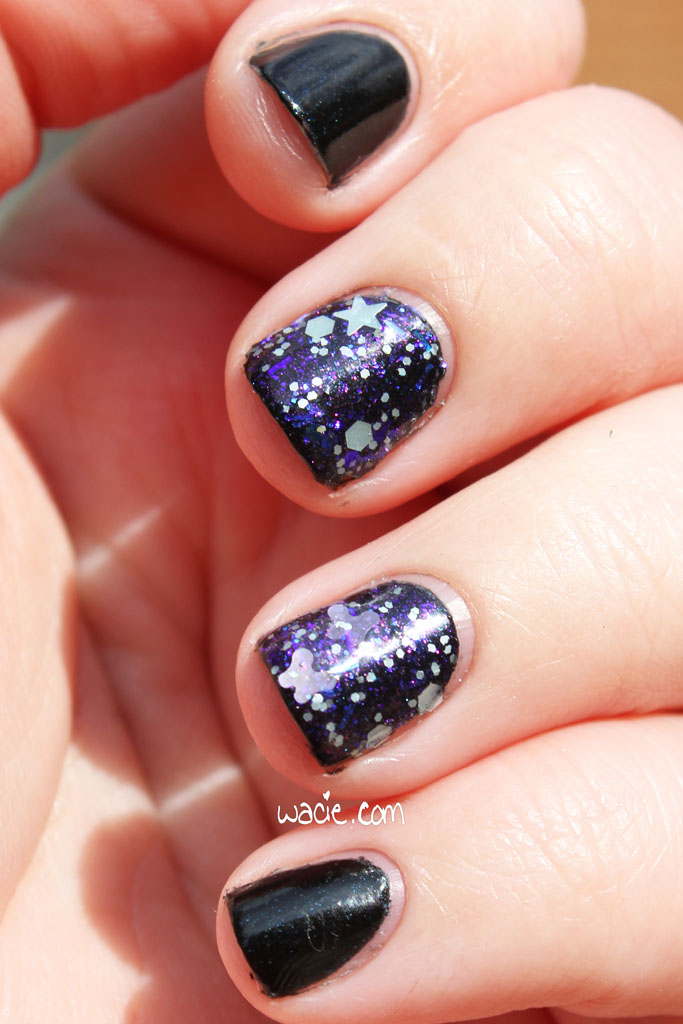
Another Monday, another manicure! I’m excited today because I’m got to use an indie polish I’ve had my eye on forever. It’s just as lovely as I imagined it would be! I’m wearing two coats of e.l.f.’s Sea Escape with one brushed coat of Kunimitsu Nail Potions‘s Beautiful Theory and one coat of Digital Nails‘s Ain’t Nobody Got Time for That top coat.
Sea Escape is a black polish with teal shimmer. The shimmer is pretty weak and doesn’t show up much, even with top coat. It’s gorgeous in the bottle, but on the nail it’s not as obvious. The polish itself applied nicely; I got an opaque first coat, just like the last time I used an e.l.f. polish, so it’s got that going for it, at least. I hate to admit it, but these e.l.f. polishes are growing on me.
Now let me tell you about the real star (pun!) of this manicure. Kunimitsu’s Beautiful Theory is a glitter topper made up mostly of purply iridescent glitters. There are also gray/greenish stars, purple butterflies, and other assorted purple and white hexes and shimmer. It looks absolutely magnificent over this black polish. The glitter brushes on very easily and dries quickly. It’s smooth to the touch after one coat of top coat. I really need to use this more.
I got some sunlight photos. Even in the sun, Sea Escape still looks kind of blah. The turquoise flecks shine a little brighter, but not like it does in the bottle. Beautiful Theory looks about the same; the shimmers and iridescence pop out nicely in any lighting. I really love this mani. The dark colors and the chunky yet still delicate glitter feels really elegant.
Sea Escape was in the e.l.f. Disney Villains collection we talked about a few posts ago. Sinful Colors’s What’s Your Name would be a more accessible dupe, I think. Kunimitsu Nail Potions are available from their etsy shop, though Beautiful Theory doesn’t appear to be in stock at this time.
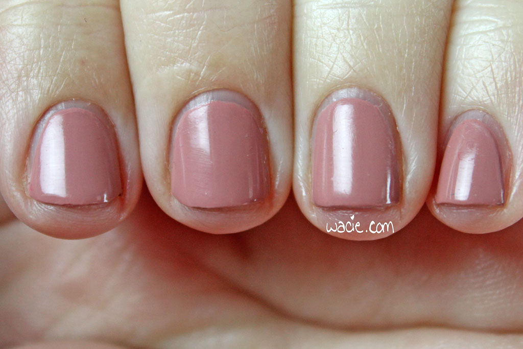
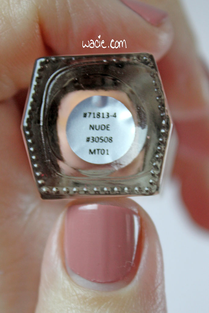
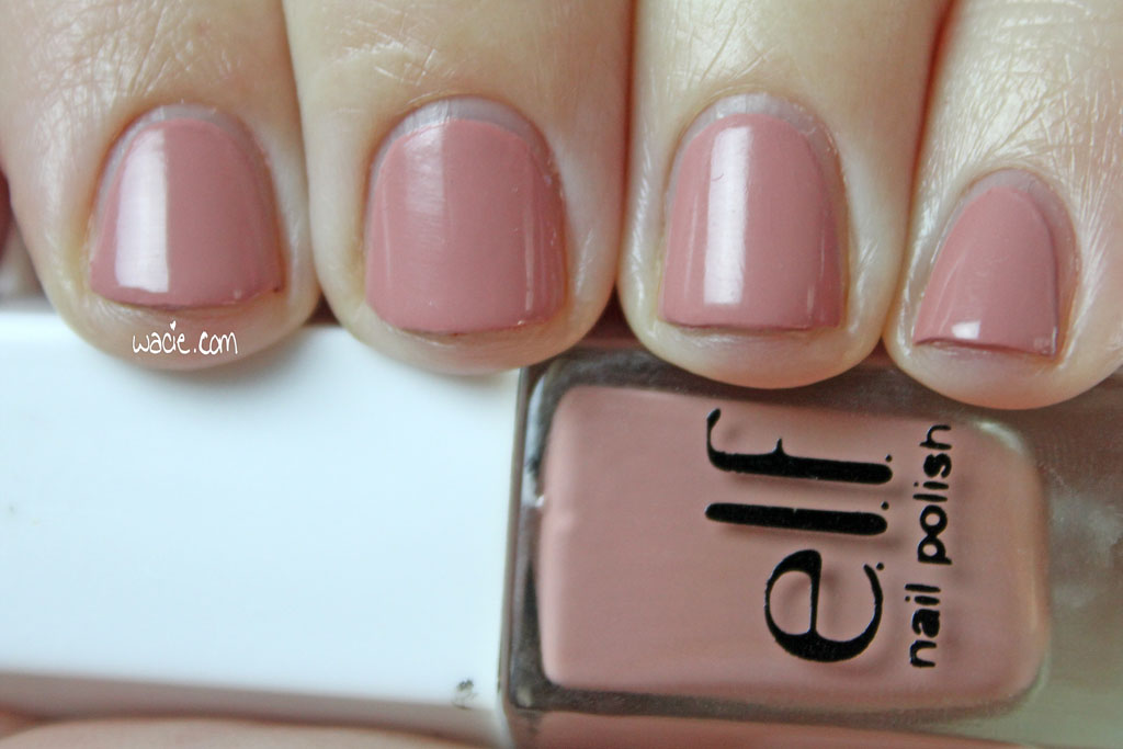
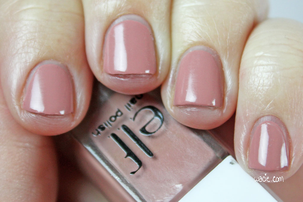
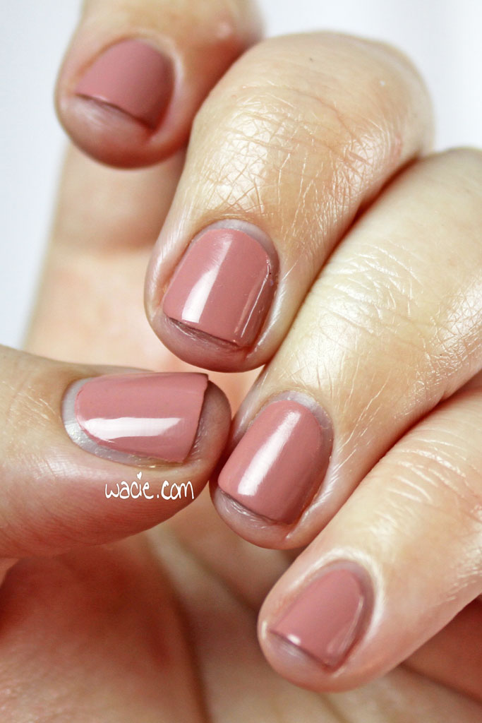
For this Swatch Sunday, I’m wearing nubs! I broke a nail brushing my hair. I’m also wearing e.l.f.’s Nude at three coats with one coat of Digital Nails’s Ain’t Nobody Got Time for That top coat. Mostly though I’m wearing nubs.
Nude is pretty much what it sounds like. It’s a nude creme. The lighting in my house is inconsistent, so I find the color changes based on lighting; in some rooms it’s more of a dusty mauve than a nude, and in others it’s a cool caramel. It’s very well-pigmented; I had perfect opacity in one coat, believe it or not. Drying times were very fast, and Nude dries with a satin finish. Top coat gives it a very dramatic shine.
I’ve heard some pretty bad things about e.l.f.’s polishes, so I’m really surprised by the quality of Nude. I can’t believe that I’d gotten such good coverage in one coat. I can’t believe I didn’t get any streaks or bald spots. I had a fantastic time applying this polish. The formula was a good consistency, and the brush was just the right size for my little nails. I’m really happy with how this swatch went.
Nude came in a Disney Villains-themed set with eleven other polishes. Specifically, this one is part of Cruella de Vil’s mini-set. I’m sensing a pattern. This set was available at Walgreens a couple years ago, but it looks like, as of this publication, there are a few available from independent sellers. Like the Disney Villains Varnish set I talked about last week, it’s probably not worth hunting down unless you really need the Villains packaging. The polishes are nice, but they aren’t that nice.
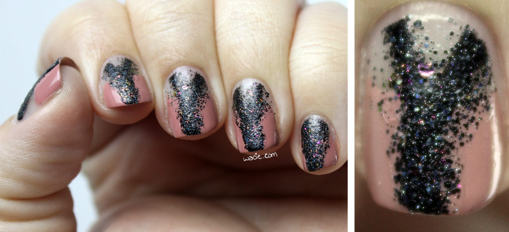
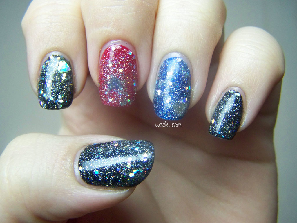
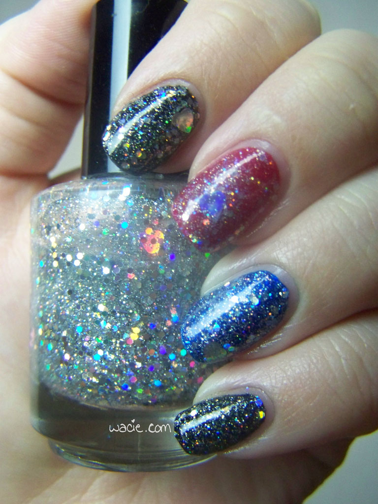
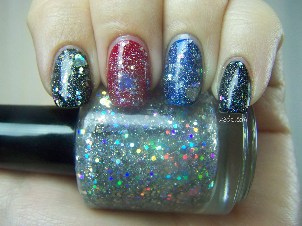
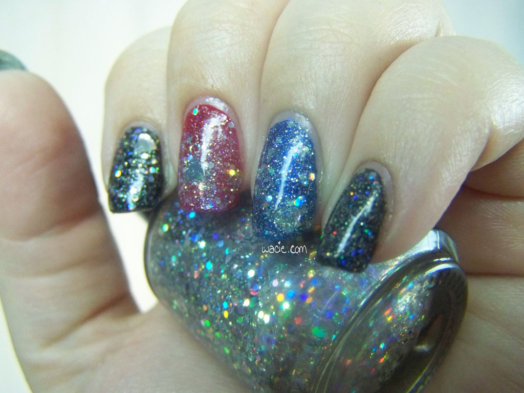
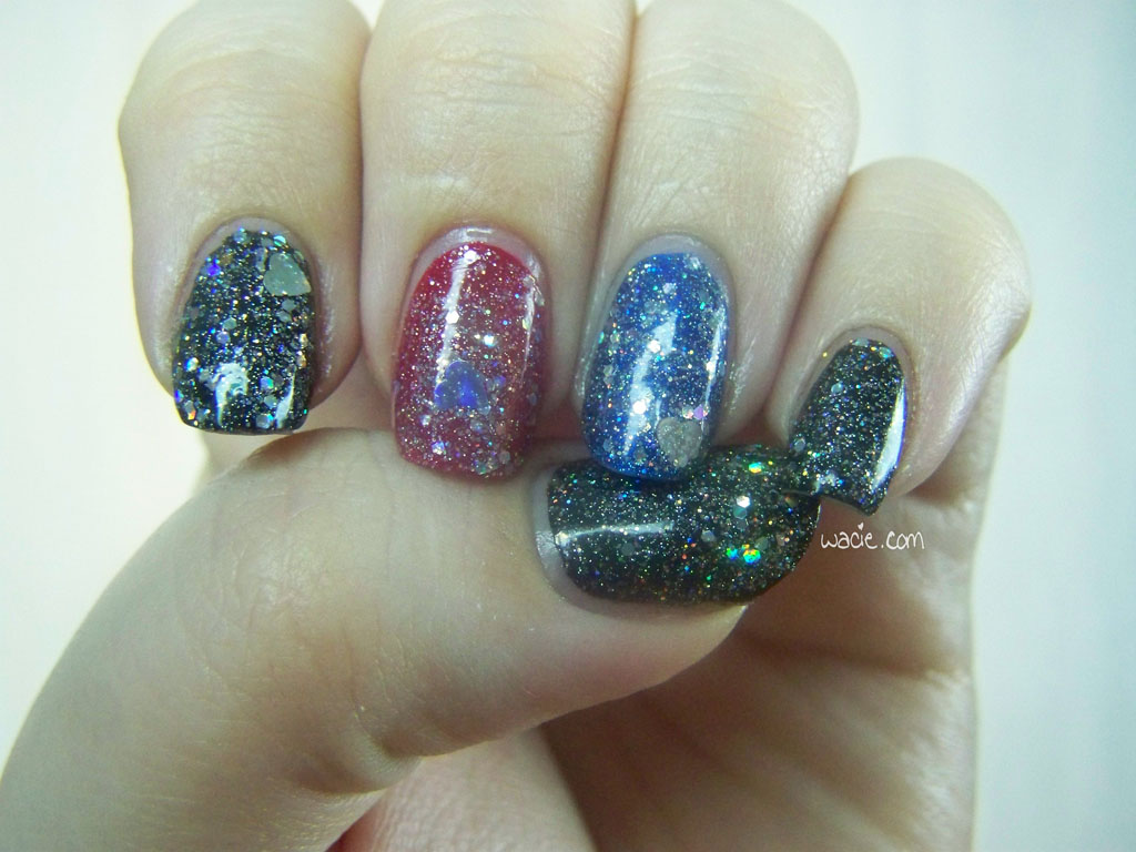
It’s Wednesday, and right on schedule, we’re looking at something new from Wacie Nail Company. This is Dang, a blinding glitter topper, named for the first thing I said after I created it. I’m wearing one coat of it over The New Black’s Black, e.l.f.’s Smokin Hot, and Essie’s Aruba Blue.
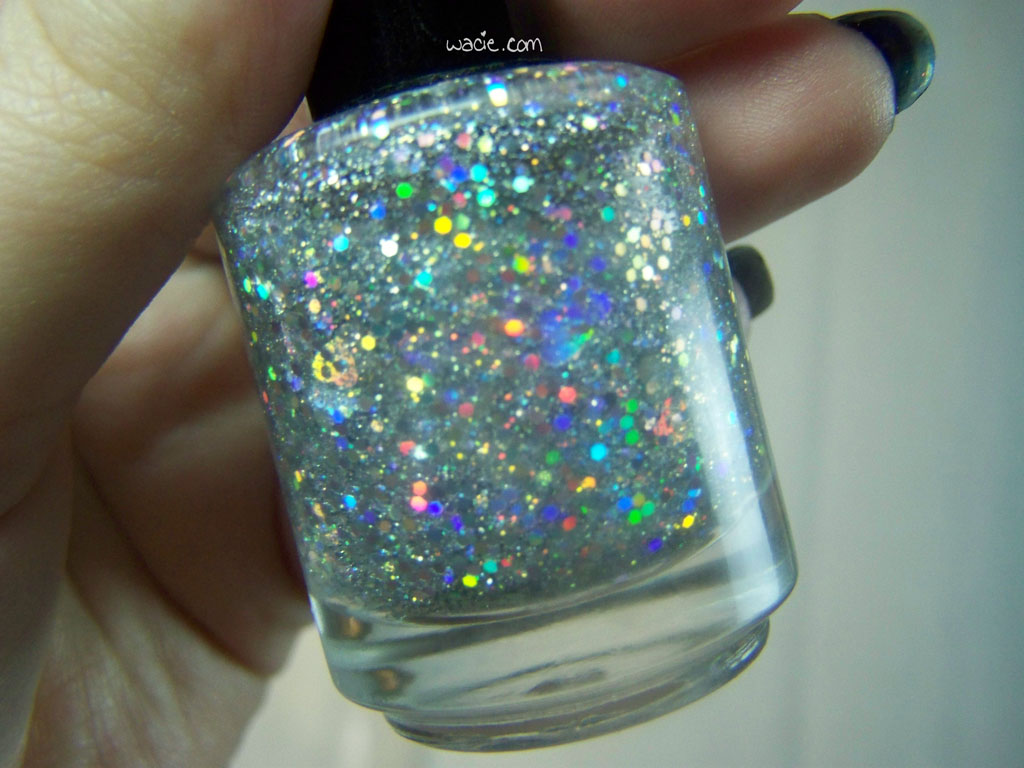
Dang is another happy accident; it’s the result of mixing glitters together without intention. It’s a clear base with various sizes of holo silver hexes and holo silver hearts. Because there’s so much glitter in it, it’s impossible to not get a good glitter payoff. However, the hearts don’t come out very frequently; as you can see, I didn’t get one on every nail. It doesn’t even matter if the hearts are scarce, though. There’s tons of glitter to make up for it.
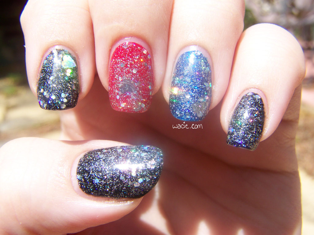
Something I like about this mixture is that it’s sparkly (to the point of blindness in the sunlight), but it’s not trying too hard for it. There’s not a ton of different shapes and colors and craziness jumping out at you for attention. I’m not saying there’s anything wrong with that kind of polish; those kinds of polishes are what drew me to indies in the first place. No, this is a glitter that glitters. It’s like a formal gown for your nails. Like diamond earrings for your nails. They’re your nails, but glitterier. I actually wore this to a red carpet party during awards season. My nails were dressed better than anybody.
Outdoors, shade
Outdoors, sunlight
I admit, I thought Wacie Nail Co. would have launched by now. Other projects I’m involved with are taking priority over my nail polish business, and it might be a while before I have a chance to reclaim all the time and money I’m putting into other things. My time is going to schoolwork and other entrepreneurial things; my money is all going to the vacation I’m taking next month. I’d planned eight polishes for the Wacie Nail Co. first-ever spring line, but as of right now, there are only seven; I haven’t had the time or means to save one from prototype limbo. Hopefully, there will be a launch before summer. If not, the spring line will become the summer line, which actually works out since I don’t have plans for a summer line. Either way, it will be soon. Please continue to watch this space for more Wacie Nail Co. news.