wacie.com Third Year Anniversary Post!

Happy Friday, reader! I don’t typically post on Fridays, but today is a special day: it’s the third anniversary of wacie.com! This is a huge day for us, and I couldn’t be more excited to bring you this post. It’s been quite a ride, and I’m so glad you’ve been a part of it.

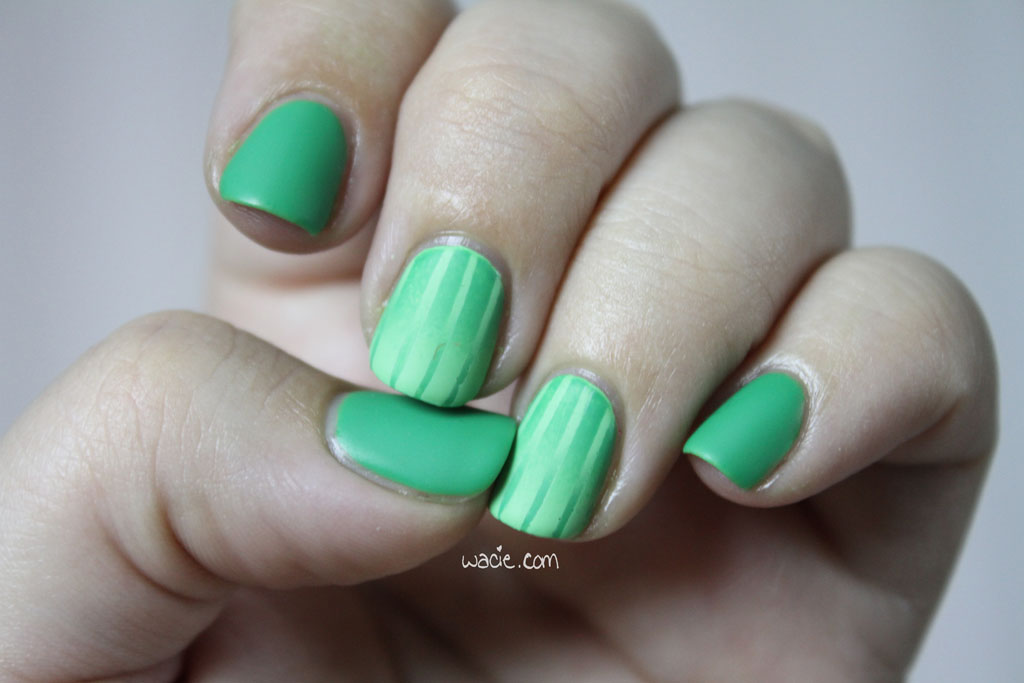
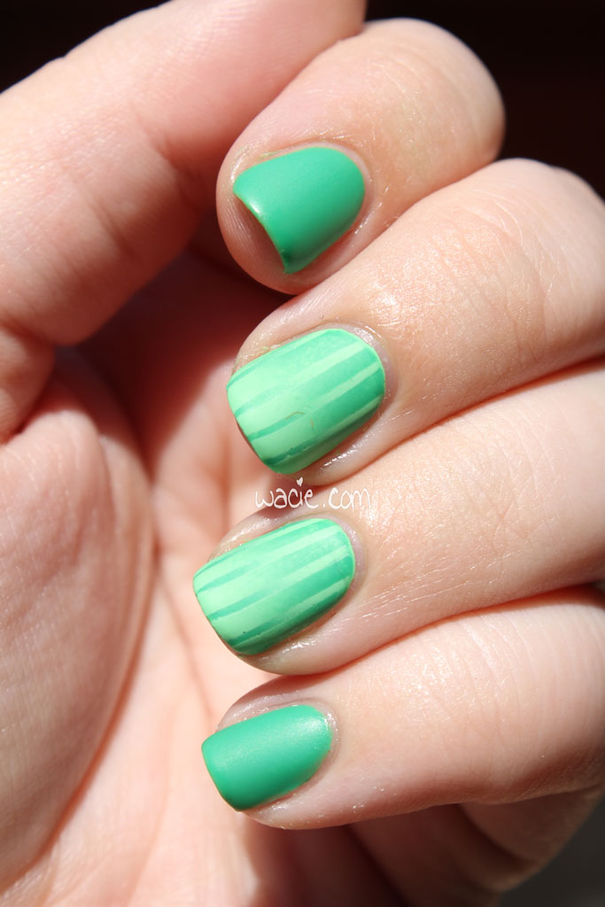
On March 11, 2013, I posted my first-ever Manicure Monday post. I think I’d posted a few posts before that, but as wacie.com became more nail-oriented, I took them down and began to focus on nails exclusively. I’d been experimenting with nail art for a couple of years by the time I started the blog, and actually starting the blog helped me get better at it. My nails look and feel healthier, my application skills have gotten better, and I think the quality of the blog has improved, too. Three years is a lot of time for improvement, after all.

100_1933

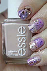
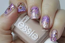
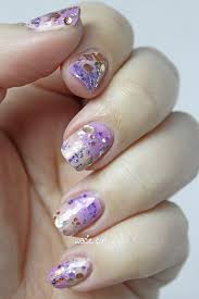
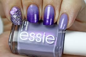
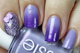
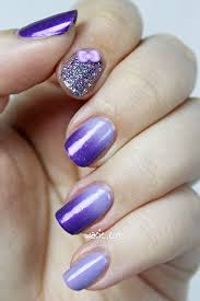
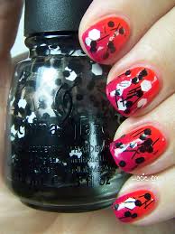
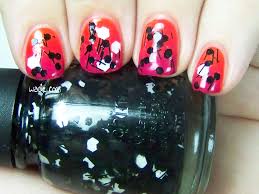
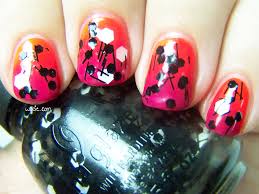
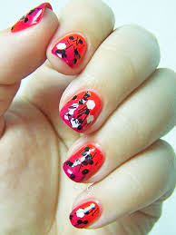
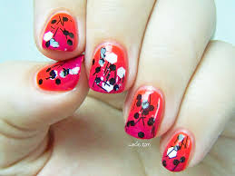
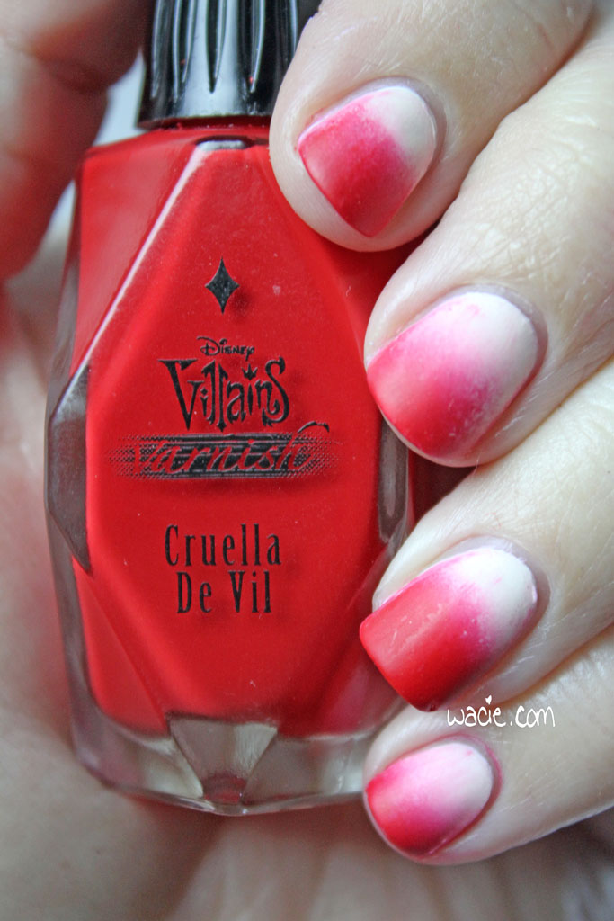
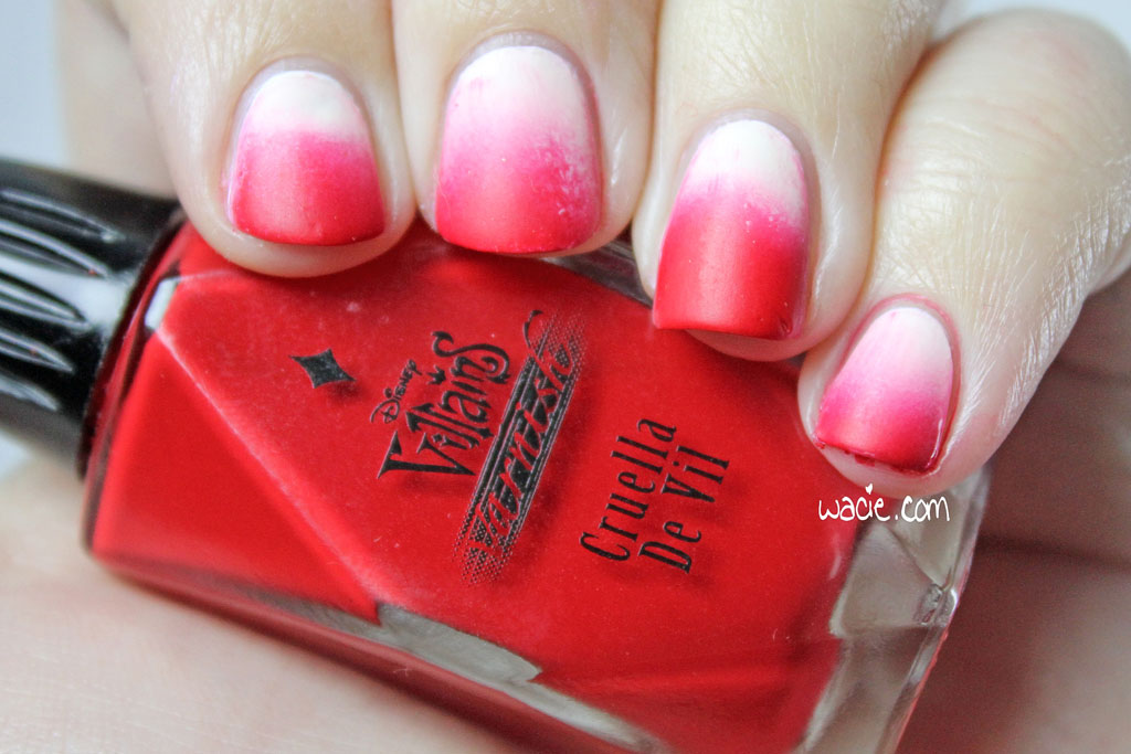
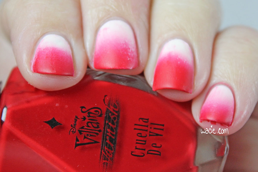
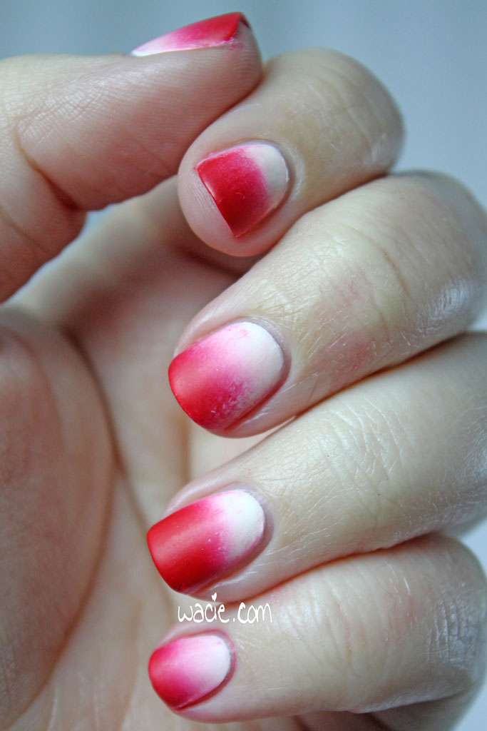
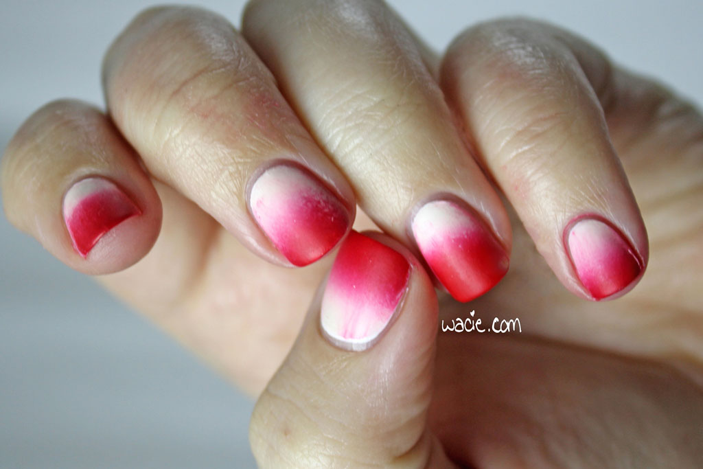
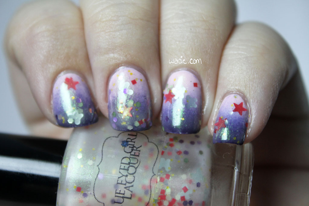
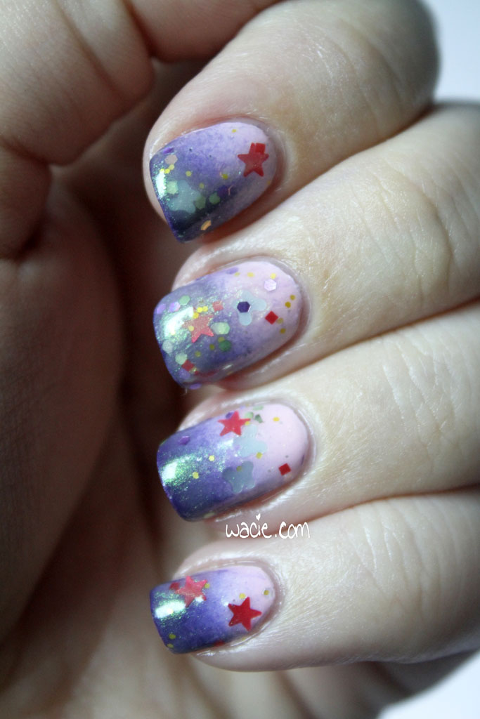
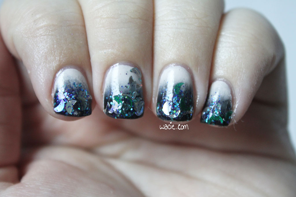
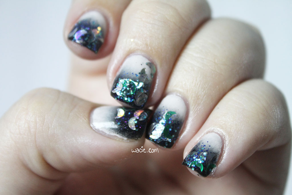
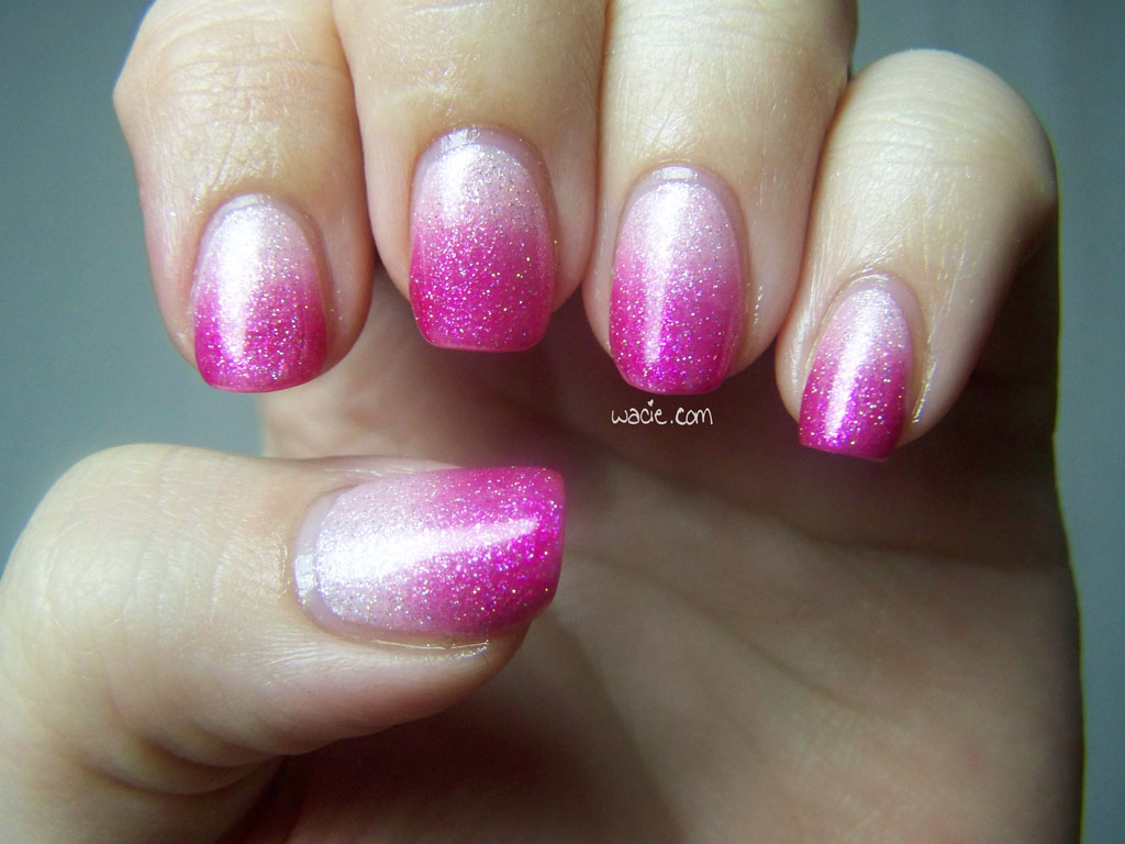
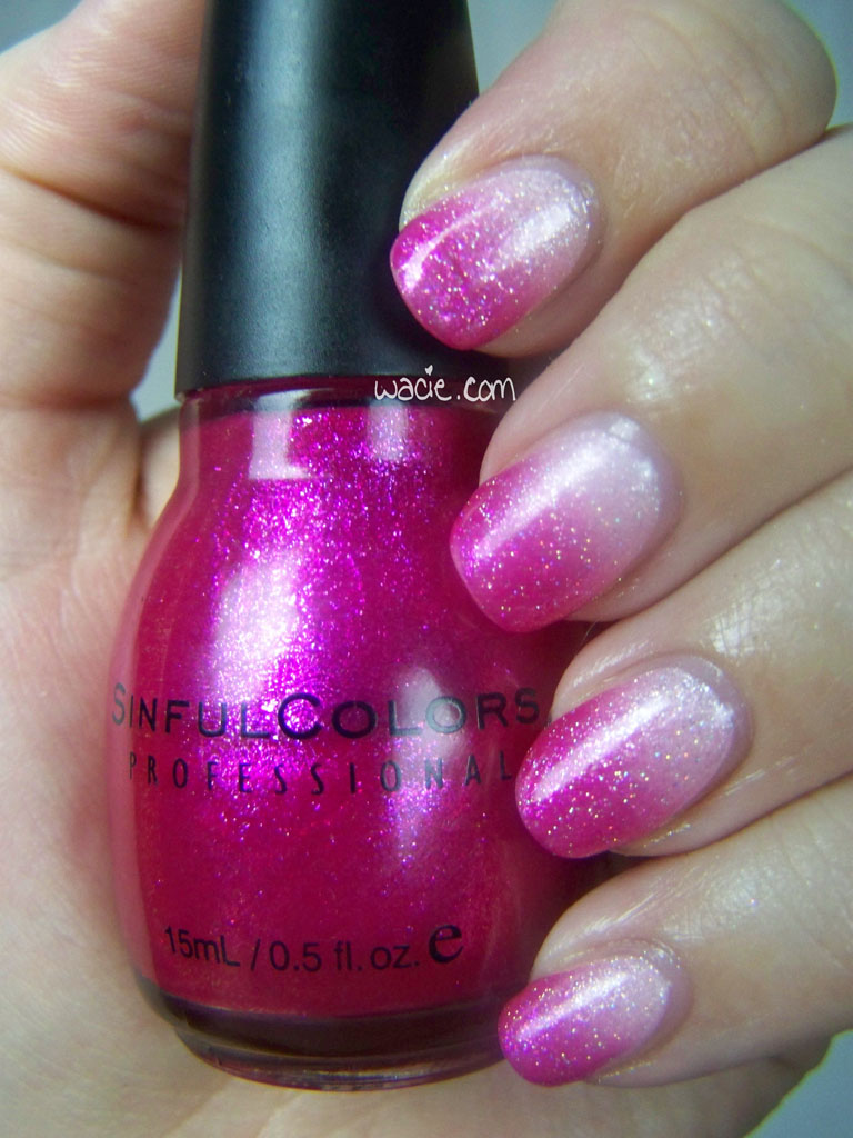
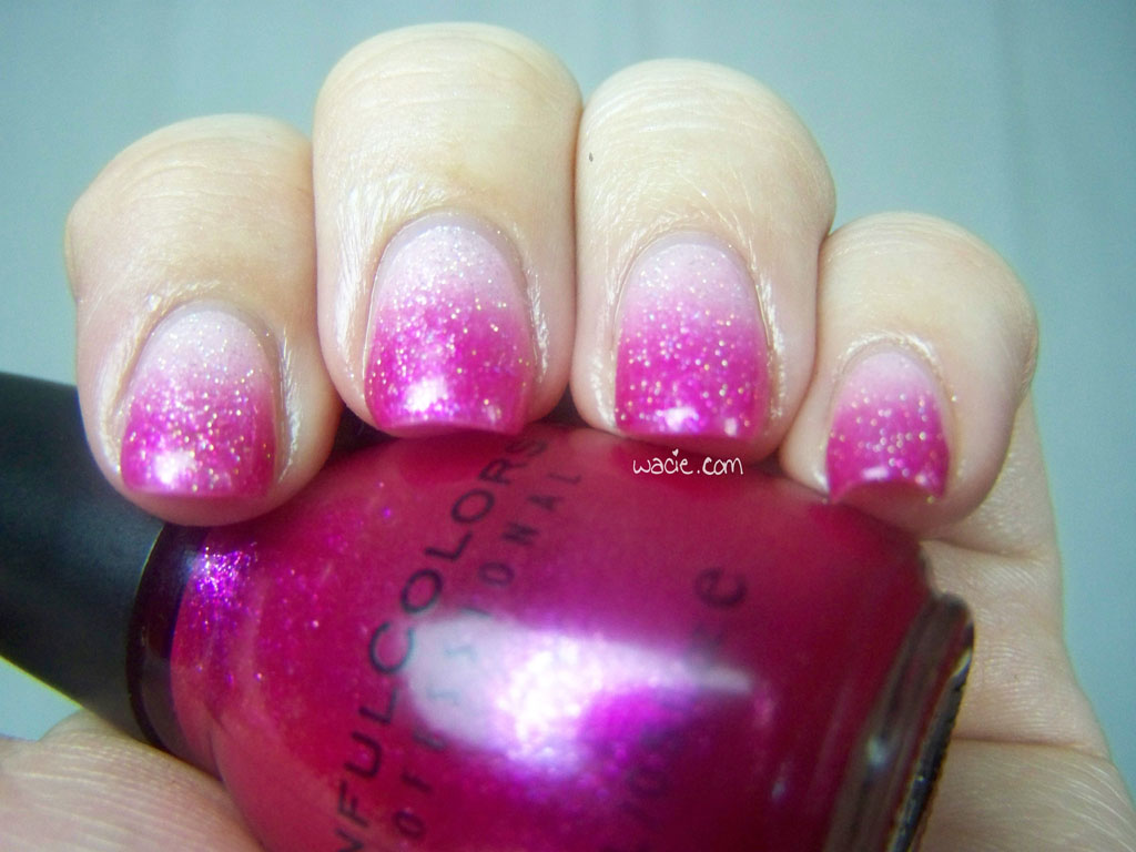
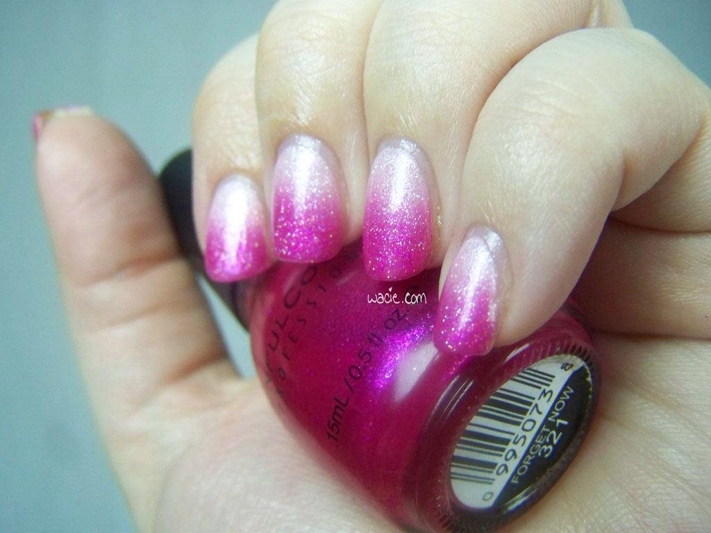
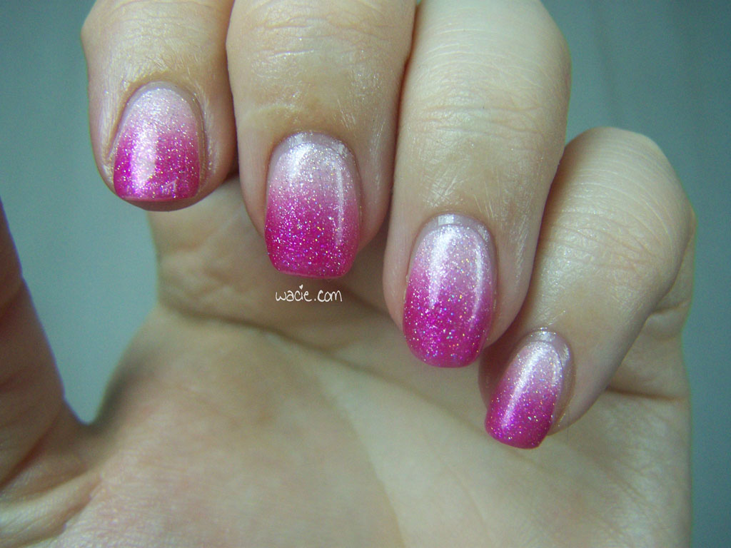
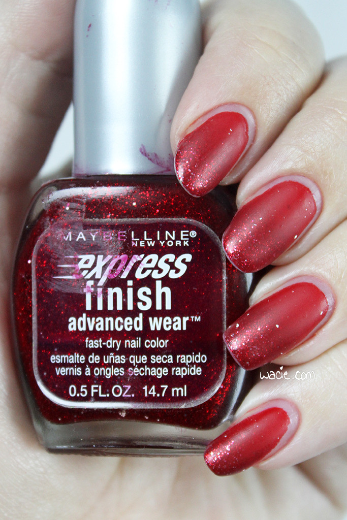
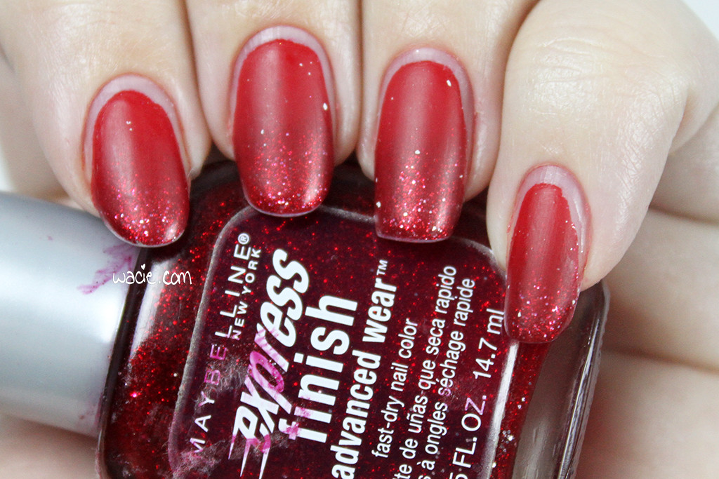
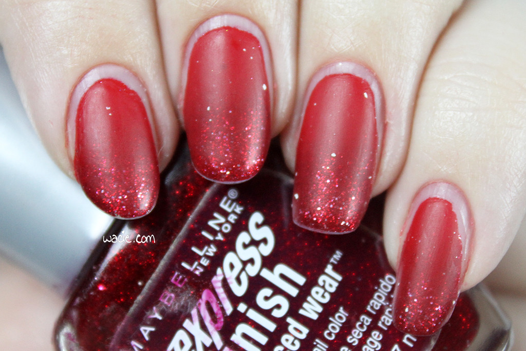
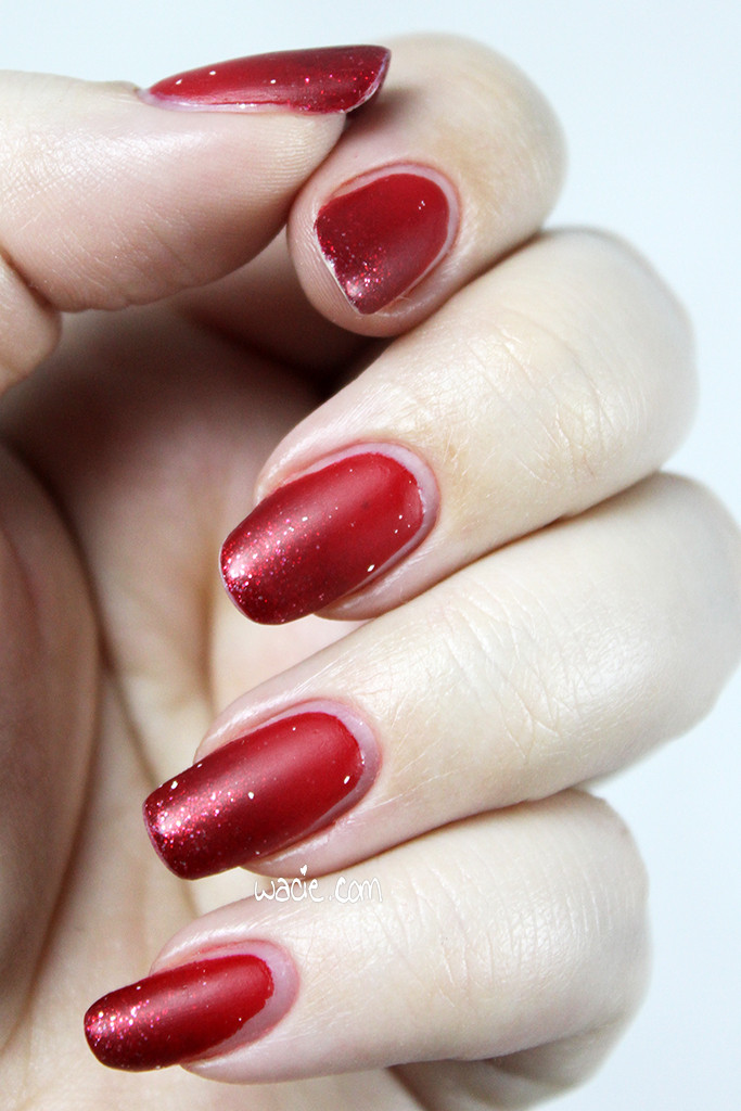
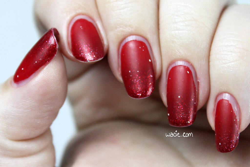
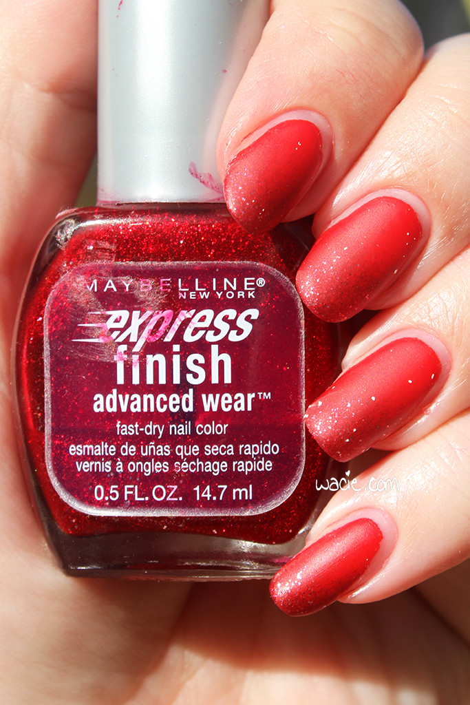
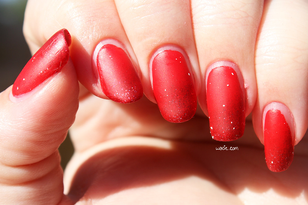
In honor of the anniversary, I’ve decided to recreate the first manicure I ever posted. Just like last time, here’s a gradient done with Disney Villains’s Cruella de Vil with a Maybelline mystery red, along with a coat of Seche Vite top coat and Ciaté’s Mattenificent matte top coat.

IMG_64792

IMG_64892

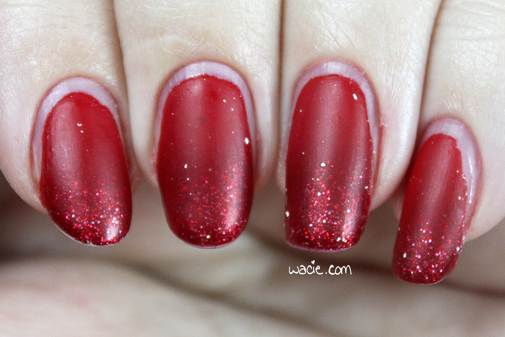
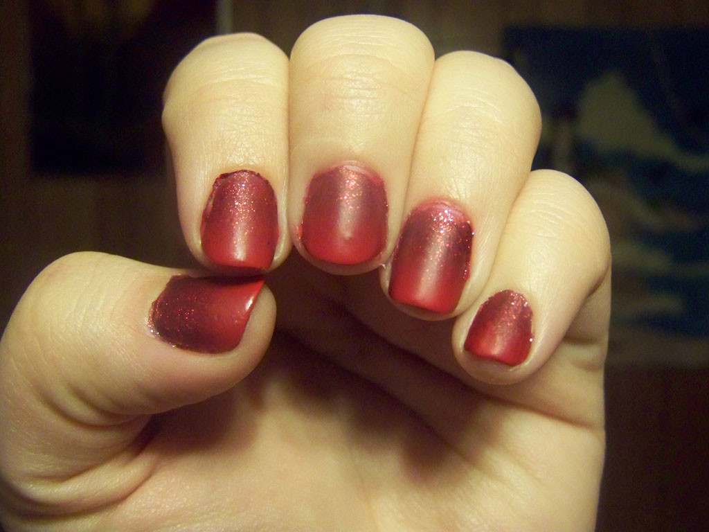
When I go back and read about the early version of this manicure, it sounds like I had a hard time with it; my mystery red was thick as molasses and cleanup was a challenge. I had just as much trouble with it this go-around. I’d thinned the mystery polish — polish thinner is something I’ve discovered since I did that manicure — but I still had trouble sponging it on. I didn’t get the contrast I got last time. I ran out of foam eyeshadow sponges I usually use for gradients and had to use the foundation blending sponges, which not only made my hands look like I’d committed a horrible crime, but made cleanup a huge ordeal. On top of that, because I did the mani from memory before I looked at the old post, I see I got the colors in the wrong order. I’m not even mad about that, because meh, close enough.

IMG_64962

IMG_65002

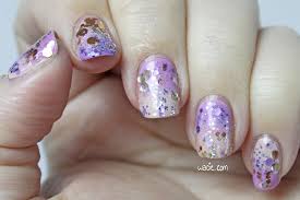
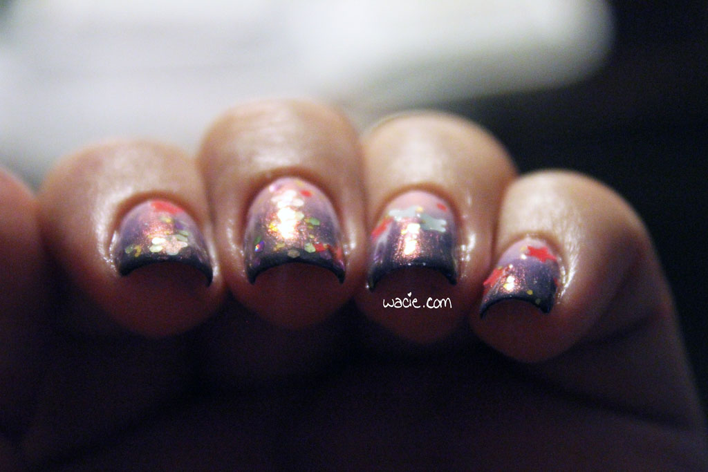
What really gets me is that the matte coat left those white spots on my nails again. The manicure looked great — exactly like the first time should have looked — until I applied the matte top coat. I was so frustrated and upset that I just threw it away. I hate tossing a nearly-full product, but I just can’t let it ruin any more manicures. I thought about redoing them, but decided I’d just leave it, as a sort of humble reminder of where I came from as a blogger. No matter how long I keep this blog, I’ll always have room to improve. Maybe on my fourth anniversary, I’ll finally get it right.

IMG_65062

IMG_65112

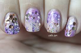
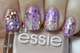
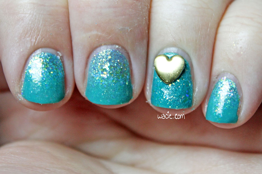
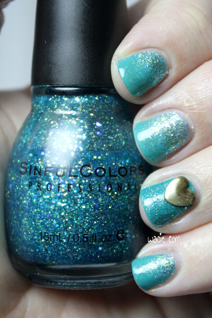
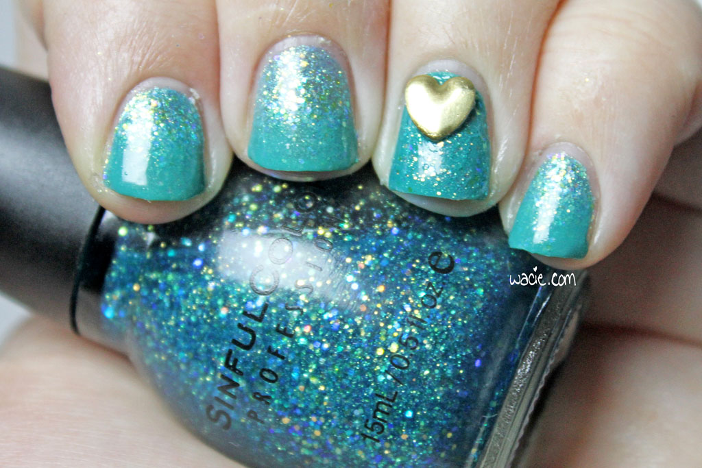
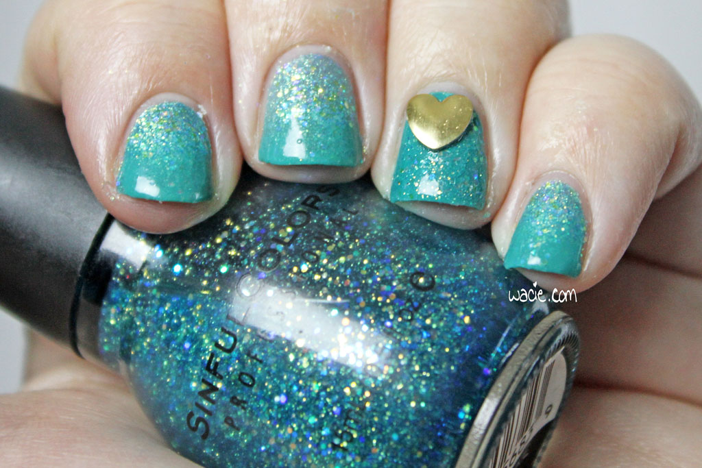
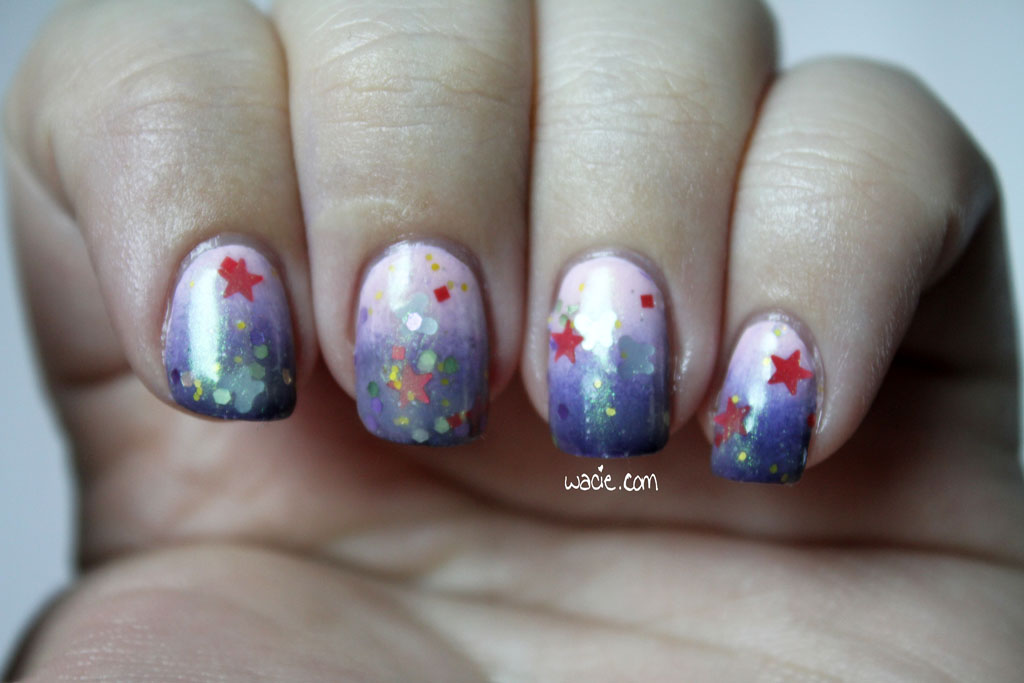
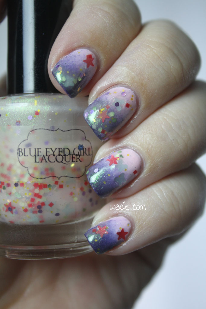
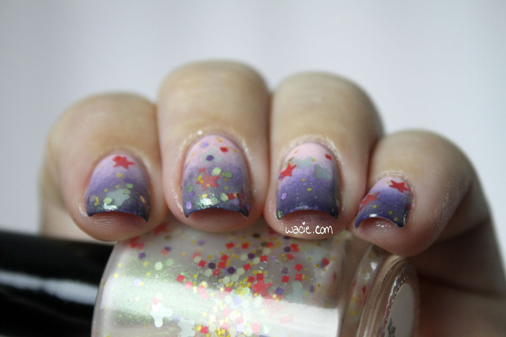
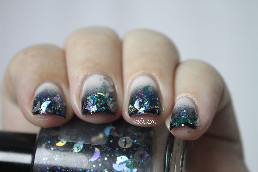
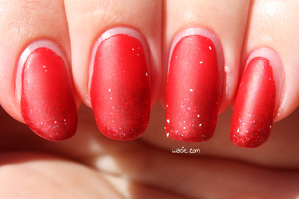
Here are some sunlight photos; it rained the last time I did this mani. In the sun, the glitter is a bit invisible, but still manages to sparkle a bit.

IMG_64442

IMG_64502

IMG_64542


On my past anniversaries, I’ve posted graphs and little data tidbits about the blog and what I’ve covered. I’m not going to do that this year, but I will share a few figures:
I’ve done 216 swatches.
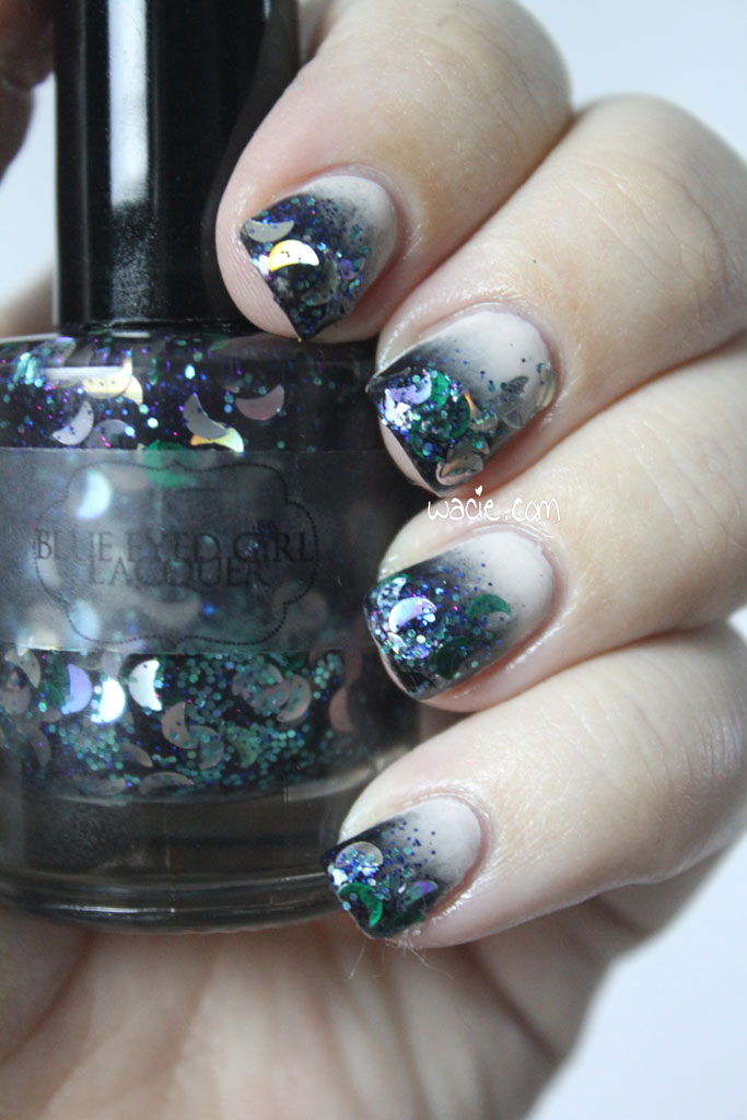
Between swatches and Manicure Monday looks, I’ve worn Blue-Eyed Girl Lacquers 108 times. Essie is my most used mainsteam polish brand at 42.
Blue is my most used color.
I now own more than 1,400 bottles of polish.

Thank you so much for making it this far with me. Thank you so much for making this blog more than a hobby, but a means to cultivate friendships, foster creativity, and strengthen a community where we all can grow together. Thank you so much for being a part of the last three years.

One polish was purchased myself. The other was a gift, not sent for consideration or review.

HPB Presents Elevated Gradient!

Hello, reader! This is a special post for the Hobby Polish Bloggers group on Facebook! Every month, we do themed manis, and January’s theme is the gradient. It doesn’t matter what kind of gradient we do, as long as it’s a gradient; we can make it as complex or as simple as we want. I decided to make mine a challenge and use four previously unused polishes. For this look, I used Sittin’ Pretty and Topless and Barefoot, both from Essie, as the base; I used Kilimanjaro and Salautay, both from Elevation Polish, as the glitter topper. All nails are topped with one coat of Seche Vite top coat.

hpbpeg

hpbpeg2

It’s been a while since I’ve done a two-color gradient, so long, in fact, that I started to wonder whether or not I’d lost my touch. This is probably one of the hardest gradients I’ve ever done. I could not get light purples and nudes — not just these Essie two, I tried OPI as well — and I could just never get them to come together. Either a color would go bald from oversponging, or a color just wouldn’t turn opaque, no matter how much of it I used. It did finally come together, and it was amazing.

hpbpeg3

hpbpeg4

I had to use purple and nude, though, because I had to use Kilimajaro and Salautay. I knew that as soon as I got these polishes that I had to put them together, because they have so many similarities: they both employ the use of round glitters and the color silver. After I finished the base gradient, I made a gradient with the glitters, flipping the colors so that the purple was over the nude and vice versa. Of course, after I sponged it on, they kind of bled into each other, which is actually pretty cool. My index fingernail got a little too much glitter, but aside from that, I totally got the result I wanted and I’m so happy.

hpbpeg5

hpbpeg6

This is the most intensive nail art work I’ve done in a while, so I’m really proud of it! Also, because this is a group effort, there’s an InLinkz widget here with everyone else’s gradient manis, so be sure to have a look at them! They’re just as proud of their work as I am with mine.

Sittin’ Pretty, Topless and Barefoot, and other Essie polishes are sold in most stores; I got mine from Walgreens. Kilimanjaro and Salautay are discontinued by Elevation Polishes, other Elevations are sold in their online shop.

I bought these polishes myself.

Manicure Monday: Violet Gradient with Violet Glitter

Happy Manicure Monday! I don’t feel like this mani is my best work, but I still rather like it. For this look, I used Essie’s She’s Picture Perfect, Revlon’s Amethyst, and Blue-Eyed Girl Lacquer‘s Might Not Recover, all with one coat of Seche Vite top coat.

mmvgwvg

mmvgwvg2

I put She’s Picture Perfect and Amethyst together for their similarities: they’re both shades of purple and they both have a strong pink/purple flash. I thought it would be great to see that pink/purple flash show up in both colors of the gradient, like this unifying shimmer that really pulls everything together. Unfortunately, it’s not easily seen in the gradient, either in photos or in real life. Also, the colors didn’t blend as easily as I expected them to; the deep purple just looks so sponged-on, even after three rounds with the sponge. It’s still pretty, but it’s really not my best work.

mmvgwvg3

mmvgwvg4

I added Might Not Recover as an accent nail at the last minute, and I gotta tell you, I’m stunned. I just can’t believe how much it sparkles. Like it was sparkly in the bottle, but damn. I also chose this polish for its similarities in color, but I like that it stands apart from the rest of the mani while complimenting it. The bling is just a tad bit overwhelming, which means it’s just the right amount (like there’s a such thing as too much). I always have an issue with microglitters still having some texture after I put down top coat, but this one has stayed nice and smooth, and I love it.

mmvgwvg5

mmvgwvg6

In the end, everthing goes together really well, yeah?

I got She’s Picture Perfect from Walgreens and Amethyst from Big Lots, though both brands are sold nationwide. Might Not Recover and other Blue-Eyed Girl Lacquers are available in their shop (which is temporarily closed). The Fimo bow is from Claire’s.

I bought these polishes myself.

Manicure Monday: Neon Sunset Gradient

Happy Monday, reader! I adore today’s manicure because it’s so bright and busy. The gradient you see was done with Color Club’s Wham! Pow! and Sally Hansen’s Magenta Moves; the glitter topper is China Glaze’s Whirled Away. All nails are topped with Seche Vite top coat. I had a ton of fun doing this look today, so I hope you love it!

mmnsg

mmnsg2

Wham! Pow! is one of the best neons I’ve used in recent memory. It was opaque in two coats, dried with a satin finish, and — the best part — did not require a white base for the full effect. It’s almost painful to look at, it’s so bright. This is a seriously fantastic neon and I definitely recommend it to everyone. Magenta Moves, though a bright color, isn’t as neon as Wham! Pow!, so it kind of keeps the gradient from being too loud and creates the smoky-but-still-bright sunset effect.

mmnsg3

mmnsg4

I fell in love with Whirled Away the first time I saw it. This was back when those black and white glitter toppers were at the height of their popluarity; this was the first one I got, probably also the first one I ever used. My favorite thing — simultaneously the best and worst thing about this polish — is that it sets itself apart from the others by using much larger glitters. I love big glitters, cannot lie, etc., but I feel like it makes the polish go faster. I’ve only used it twice, but the bottle is already half empty. It’s so sad. It’s also kind of a pain to apply, because the slice/bar glitters are so long they sometimes hang off the nail like eyelashes, and sometimes it was hard to get the glitters to spread evenly over the nail, but it still looks cool even when it’s a little lopsided.

mmnsg5

mmnsg6

Unrelated: I miss swatching! I noticed today that it’s been two months since my Canon broke; I thought it would only be in the shop a few days and now I have no idea when I’m getting it back. I’m so sad, I really miss wearing all those new polishes! I’m kind of afraid to use things now because I can’t document it as easily. Here’s hoping it’ll come back someday soon.

I bought these polishes myself.

Manicure Monday: Teal Glitter Gradient

I started this Manicure Monday with no real plan. I had a glitter and a bright base color, but I didn’t really know what to do. I thought at first I would use some nail vinyls to create a pattern, but I screwed it up. I tried stamping and blew that, too. I didn’t want to do a gradient because I always do those, but here we are. I used Sinful Colors’s Nail Junkie (how appropriate) and Essie’s Naughty Nautical, as well as two coats of Digital Nails‘s Ain’t Nobody Got Time for That top coat.

IMG_43262

IMG_43302

Naughty Nautical is a teal polish with fine rainbow shimmer. Nail Junkie is a thin teal jelly with many colors of fine iridescent glitters. I paired them together thinking I would just wear Naughty Nautical as a base for Nail Junkie, but I thought that was boring and forced myself to do some nail art. It’s not as intricate and ambitious as I wanted it to be, but I like the look I got. I acheived it by putting down two coats of Nail Junkie, then doing the gradient. It looks like the glitter is sponged over the teal polish, but that’s not the case. I also considered painting another coat of glitter over the gradient, but I decided that what I had was enough. You can also see the nail with the stud has no gradient; it’s only the base color and glitter.

IMG_43392

IMG_43442

I’m pretty happy with it. It’s been a while since I’ve done anything nail-arty and fun. I really want to do more of that instead of just painting glitter over a base. Also, I’m really embarrassed by how dry my hands look in these photos. I put lotion on before I took them, I swear.

IMG_43482

IMG_43532

You can get these polishes wherever Essie and Sinful Colors are sold. Mine are from Walgreens.

I bought this polishes myself.

Manicure Monday: Pottery-Inspired Gradient

For today’s Manicure Monday, I got my sponges out and did a gradient for the first time in months! This particular mani was inspired by a piece of pottery I saw in a museum. This is Sally Hansen’s Hard to Get with Disney’s Villain Varnish in Cruella de Vil, topped with one coat each of Ciate’s Speed Coat Pro top coat and Hard Candy’s Mattely in Love matte coat.

IMG_29952

IMG_30002

Hard to Get is a white creme. It’s my favorite of the white cremes I’ve tried so far, and I use it so often I’m on like my fourth bottle. I actually emptied my current bottle on this manicure, so maybe I’ll pour a little of something out for it. Or maybe I’ll just another bottle. My feelings on Cruella de Vil aren’t so firm. I love the way this polish looks, but I don’t like the formula. It smears when top coat touches it (exhibit A: the thumb smudge), and it stains cuticles (exhibit B: pinky). It is an absolutely gorgeous polish, but sometimes I hate using it.

IMG_30062

IMG_30172

As I mentioned, the gradient was inspired by a piece of pottery. I was in the High Museum of Art in Atlanta, Georgia on my birthday a couple of years ago, and I saw this lovely vase that was a deep red at its curved bottom, then faded to white at its fluted tip. I immediately “I am going to do this on my nails” and took a surreptitious photo with my phone for reference. I’d planned to keep it around and show it on the blog once I finally did the mani, but then I lost my phone in Philadelphia (long story) and the photo is gone. I guess that means I have to go back and take another photo.

IMG_30252

IMG_30312

This is not my best gradient, not by a long shot. It’s pretty tough doing a gradient with a bright color and white, and when you use a smudgy red like this one, it’s even tougher. I was really looking forward to this mani, and I’m disappointed it didn’t turn out so well. I will definitely try this again.

Manicure Monday: Morning Light/Evening Gradient

I love putting glitter over gradients! My Manicure Monday project this week was to take Morning Light from Blue-Eyed Girl Lacquer and use it in a fun new way that really shows how versatile it is. I made a gradient with Essie’s Fiji and No More Film, then put on two coats of Morning Light and one coat of Color Club’s clear coat.

IMG_94542

IMG_94592

I swatched Morning Light way back in January, and I really loved the way it looked over dark polish, but I didn’t want to just wear it over black again, that would be too easy. I went through all of my polishes and after a few misses, chose purple and pink cremes. I wanted a light pink for glitter visibility, but I wanted a darker one to bring out the shimmer. I thought I did pretty well.

IMG_94682

IMG_94742

IMG_94802

I must admit that I’m not too happy with the gradient. I ran out of eyeshadow sponges the other week, so I used one of the hexagonal sponges that came in a China Glaze ombre set. I didn’t really like this method. I didn’t have as much control over the blending and the building of color. I also got polish all over the sides of my fingers and it took forever to clean it up. I will probably not use this method again.

IMG_94982

I’m pleased with this look, though. The green shimmer in Morning Light totally transforms No More Film from a deep plum to something lighter and duskier. Also, I noticed something this week that I didn’t when I swatched it: the green shimmer shifts to red! At certain angles, the green disappears and a warm red shimmer takes its place. So cool!

Manicure Monday on Tuesday: Celestial Gradient

So it’s been a while since I did a manicure like this; I haven’t been into nail art much lately, just doing the accent-nails-with-glitter-is-easy mani. I swatched Blue-Eyed Girl Lacquer‘s Weary Traveller a couple months ago and wanted to wear it in a new way, so I did a glitter gradient thing with it. The colors in my gradient are Sally Hansen’s Black Out and Essie’s Urban Jungle, with Weary Traveller sponged onto the tips.

IMG_89002

IMG_89032

I wasn’t sure how to do this at first; I definitely wanted a look that would show the jelly properties of Weary Traveller, so I thought the best way to do that would be with a nude and black gradient. The first time I tried this, I couldn’t get the jelly sheer enough to show the nude without streaks. I kind of wish that had worked out. I also didn’t get a fantastic gradient since my nails are so short.

IMG_89422

IMG_89182

I used Color Club’s clear coat again this week. So far, it wears well, but it doesn’t smooth glitter out very easily. I don’t want to use more than one coat on a mani like this, since there are already so many layers. I’m also afraid of shrinkage.

IMG_89302

IMG_89362

I should really start doing nail art again. I forgot how cool gradients look.

Manicure Monday: Double Reverse Green on Green Gradient

So for this Manicure Monday, I did some actual nail art instead of phoning it in with glitter. I always feel a little weird when I do a glitterless mani, like my nails are still naked somehow. This week, I did a double reverse gradient with Julep’s Payton and Color Club’s Twiggie. Payton is shown on the non-accent nails with two coats. All nails have a coat of Seche Vite top coat and Hard Candy’s Matte-ly in Love. Photos were taken indoors and outdoors.

IMG_53202

IMG_53312

IMG_53242

So the colors I chose this week go well together, but were still somewhat incongruous. Payton is a gorgeous kelly green creme that went on sheer with the first coat; the second coat even it out, but it was still deliciously shiny, a finish I’d expect from a jelly. Twiggie was a much more solid creme, and was opaque on its first coat. Together, Twiggie is the foundation of the gradient, and I didn’t get the opacity I expected from Payton, and the resulting gradient left me a little underwhelmed. Payton was so sheer that it didn’t cover over Twiggie as well as I thought it would. I will say this, though: I hated putting the matte coat over Payton. It was so shiny and so beautiful on its own that I felt like I was sucking the life of it by mattifying it. I really felt like I did this polish a disservice.

IMG_53402

IMG_53442

If you’re wondering how to do the double reverse gradient, it’s way simpler than it looks. Here’s the tutorial:

1. After you lay down your base colors, do a gradient the same way you usually do. For what it’s worth, I like to use eyeshadow sponge applicators instead of makeup wedges; for me, it’s more precise and makes less of a mess.

2. After your first gradient is dry, put down your striping tape as desired.

3. Do your second gradient, reversing the colors from the first gradient.

4. Peel off the tape, apply your top coat, and you’re done!

IMG_53522

Outdoors, full sun

IMG_53552

This really looked better in my head. I expected a stronger difference between the colors, but the sheerness of Payton didn’t make that possible. I also feel like I’m missing something; maybe I should have done a coat of Fairy Dust or something under Payton, just to add a little extra sparkle. On the plus side, and this was completely unintentional, it reminds me of a soccer field. I have been so caught up in watching the World Cup matches that I’ve been unable to think of much else. Despite the issues I’ve had with the polish compatibility, I love how this turned out.

PS: I have Payton on my toes as well. I love it. It’s like every toe is cosplaying as the toe from The Big Lebowski.

Manicure Monday: Pink Ice Gradient

It’s been a while since I’ve done any kind of nail art, so I did a gradient for Mani Monday. Gradients are my favorite; it’s such a cool look and so little effort. This gradient turned out way better than I expected.

100_45562

My gradient colors are Julep’s Audrey and Sinful Colors’s Forget Now. Both colors have pretty shimmer, but are quite sheer; nail lines are visible under two coats of both. Audrey has a soft silvery shimmer; Forget Now’s shimmer is the same color as the polish, which is enough to give it some shine. I knew these would make a gorgeous gradient because they’re so much alike, and yet so different.

100_45592

100_45682

100_45742

100_45772

100_45862

Then I got carried away. The baby holo glitter here is China Glaze’s Fairy Dust, and it was only supposed to be an accent on a couple of nails. I decided it looked funny on so few nails and just put it on all the rest. It’s even more glitter on top of an already really sparkly manicure, but I think it works. I don’t feel like there’s too much going on; the fine glitter adds something extra to a beautiful gemlike look.

100_45982
Because I couldn’t resist, I added an outdoor photo. This is incredible in the sunlight. I can’t even tell you.