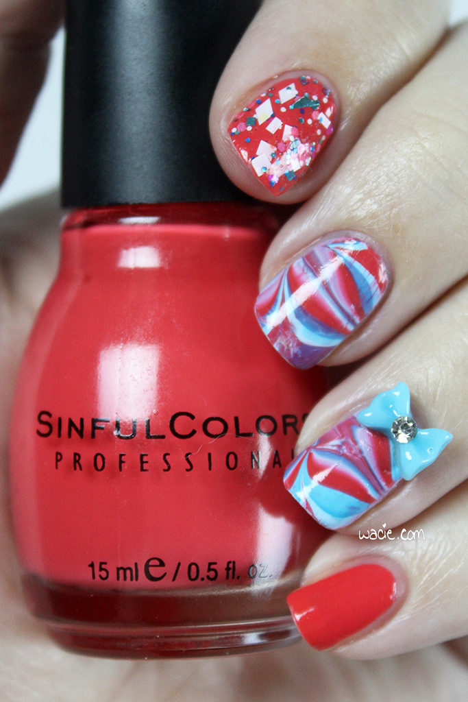
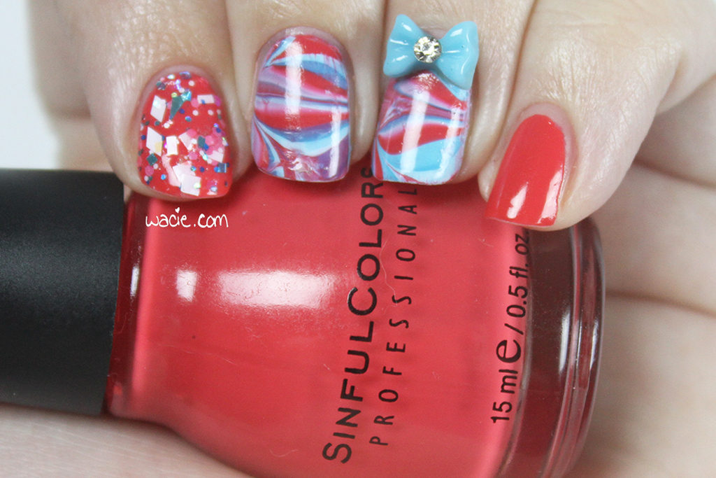
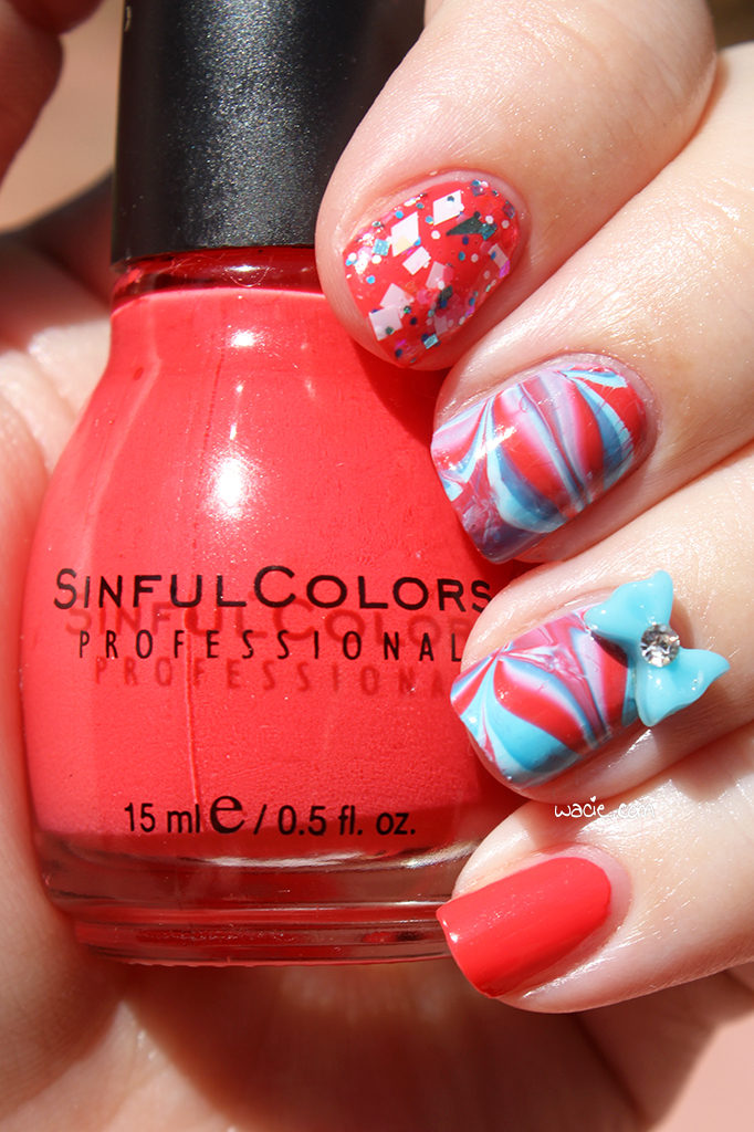
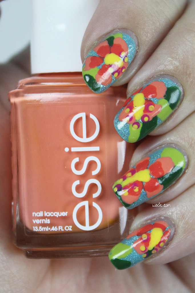
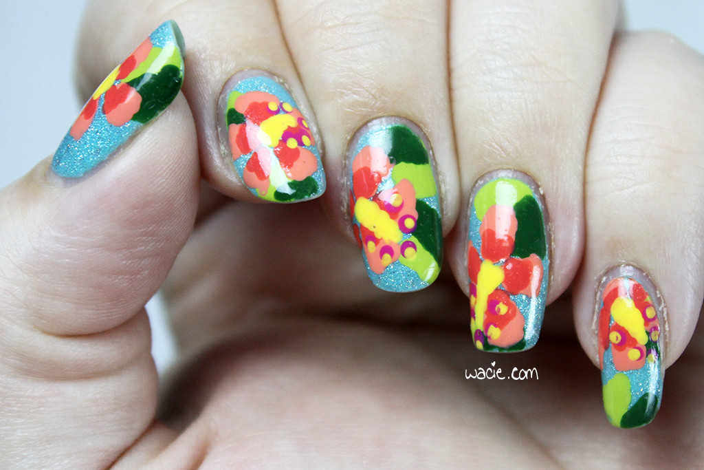
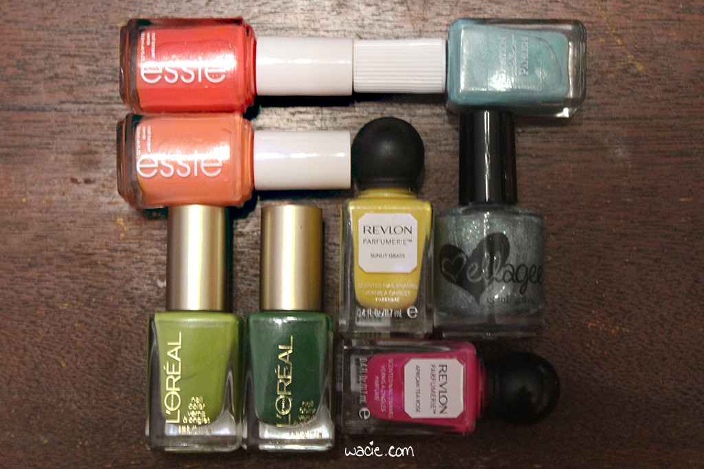
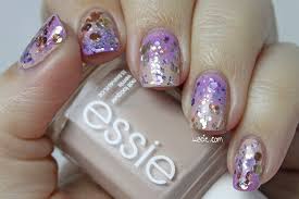
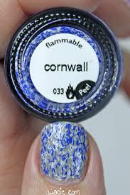
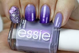
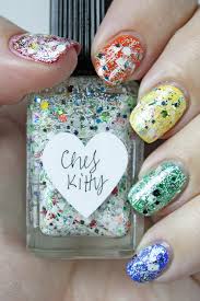
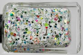
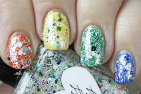
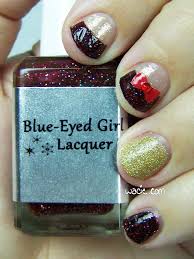
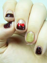
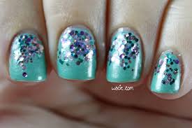
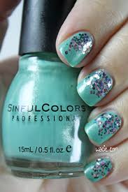
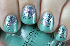
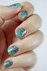
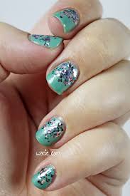
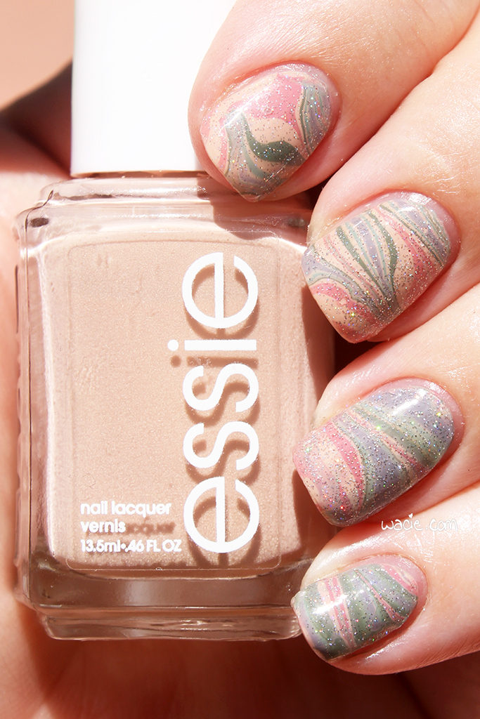
Welcome back, reader! Today’s post is a special Hobby Polish Bloggers link-up post! Every month a theme is selected by the group, and this month’s theme is dusty colors. The look itself is up to the blogger; as long as it adheres to the theme, it can be as simple or elaborate as the blogger wishes. I like to raise the difficulty a bit and use only untried polishes, but this month I couldn’t, because I have very few unused polishes that fit the theme. For this look, I used Essie’s Spin the Bottle, Sew Psyched, and Marathin, Zoya’s Bevin, Ciaté’s Pillow Fight, and China Glaze’s Fairy Dust.
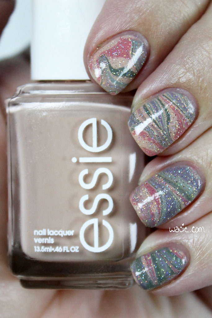
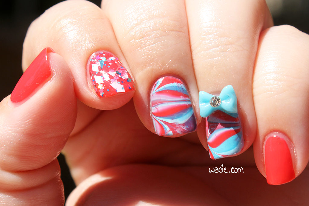
As I mentioned, I don’t have a lot of colors in this dusty family, so I’m using a lot of polishes I’ve used in the past. I think Spin the Bottle and Sew Psyched were unused, but the others were probably only used once, so it’s not really a big deal. It took a lot of digging through the polish looking for the right colors; I have a lot of pastels and a lot of deep colors, but not too many in between. Marathin was actually the first polish that came to mind, and after a little bit of trial and error, I found a great combination, as well as the perfect way to wear them together.
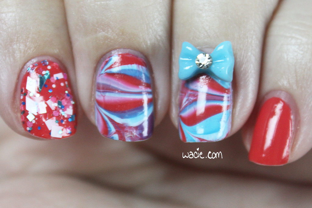
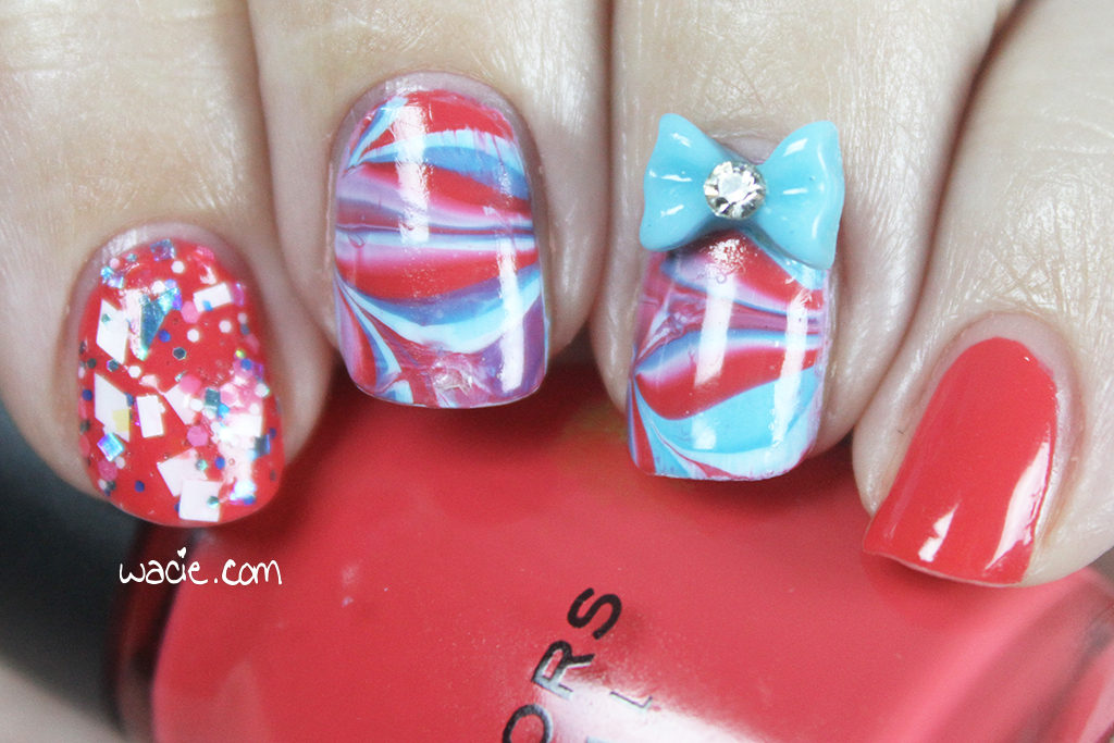
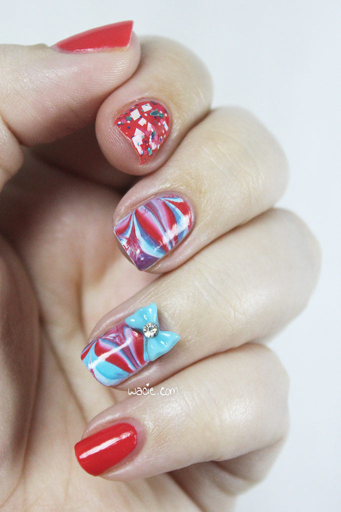
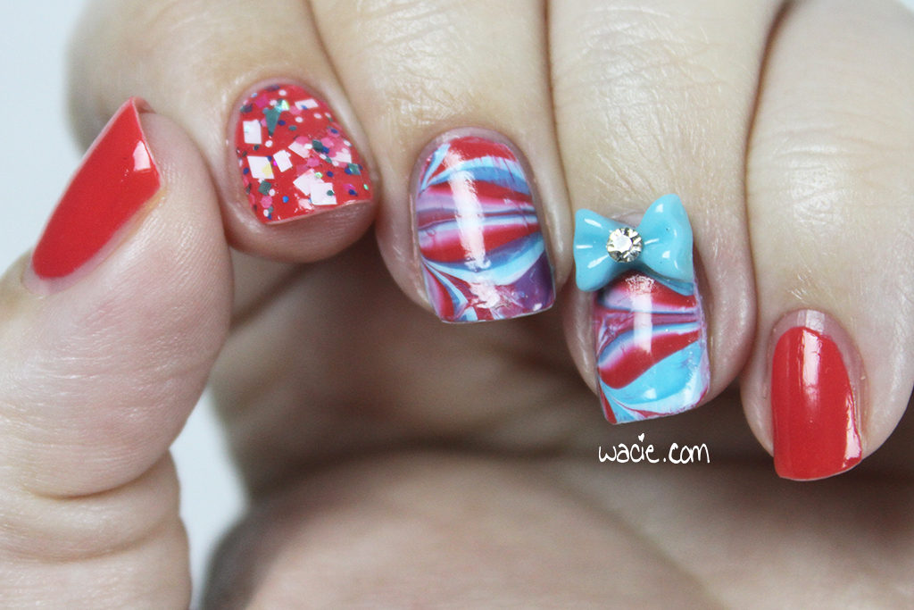
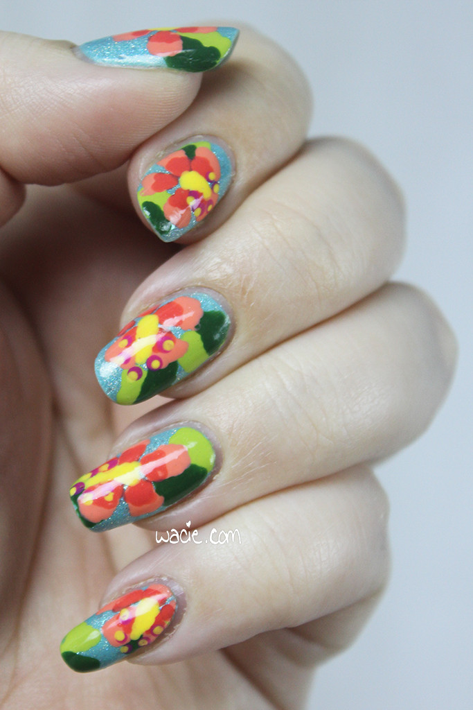
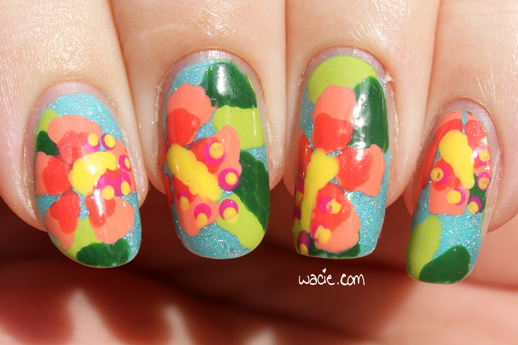
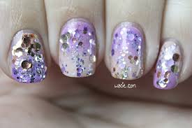
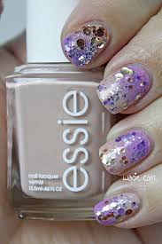
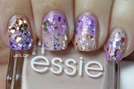
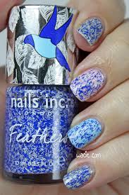
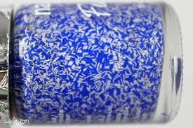
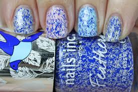
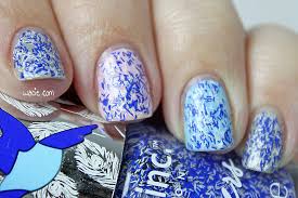
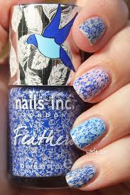
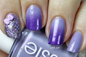
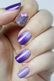
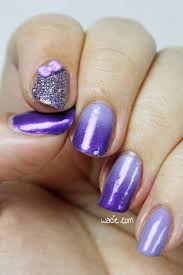
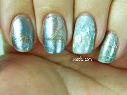
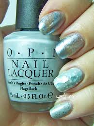
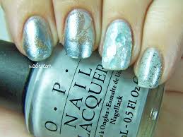
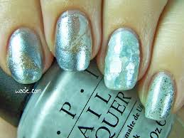
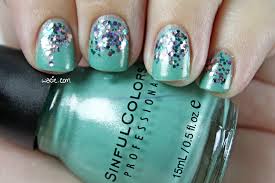
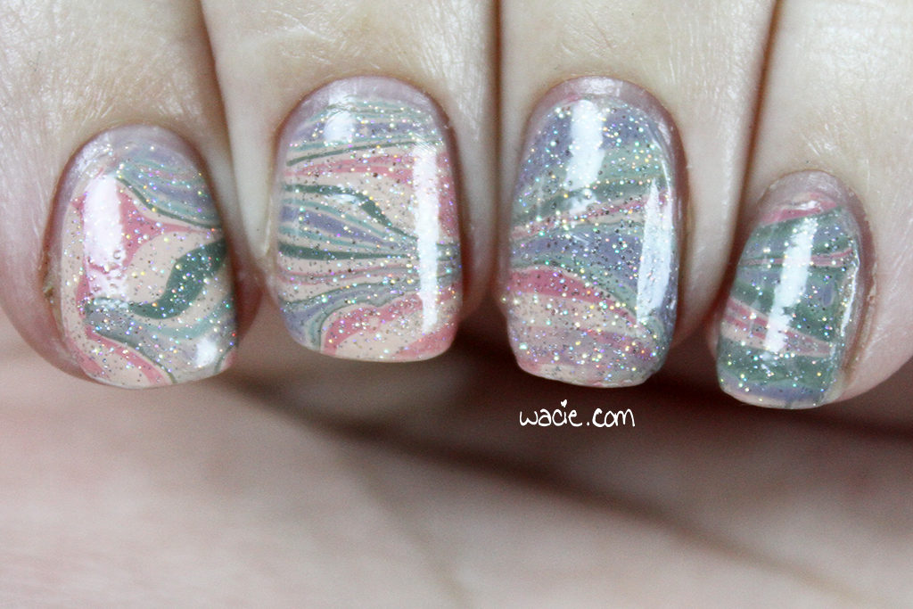
Watermarbling is one of those things I want to do all the time, and yet, I rarely do. I’ve done a few marbled accent nails here and there, but it’s usually as an afterthought; when I’m planning a mani, I usually just pick a glitter topper that pairs well and that’s it. A lot of the time, I’m working with polishes that don’t seem conducive to marbling. I don’t want to use anything with fine glitters or shimmers because it may not spread well, I don’t want to use anything rare, discontinued, or expensive, and I don’t want to use anything with a really unique finish, like a holo. If I’m creating a look around a creme, I’m rarely thinking about other cremes. It’s a shame, because I love cremes; I think the glossy creme finish is the most underrated of them all, and yet I rarely take advantage of them. Even with all these beautiful creme shades and the marbling, I still had to top it with glitter. Fairy Dust counts as a dusty color, right?
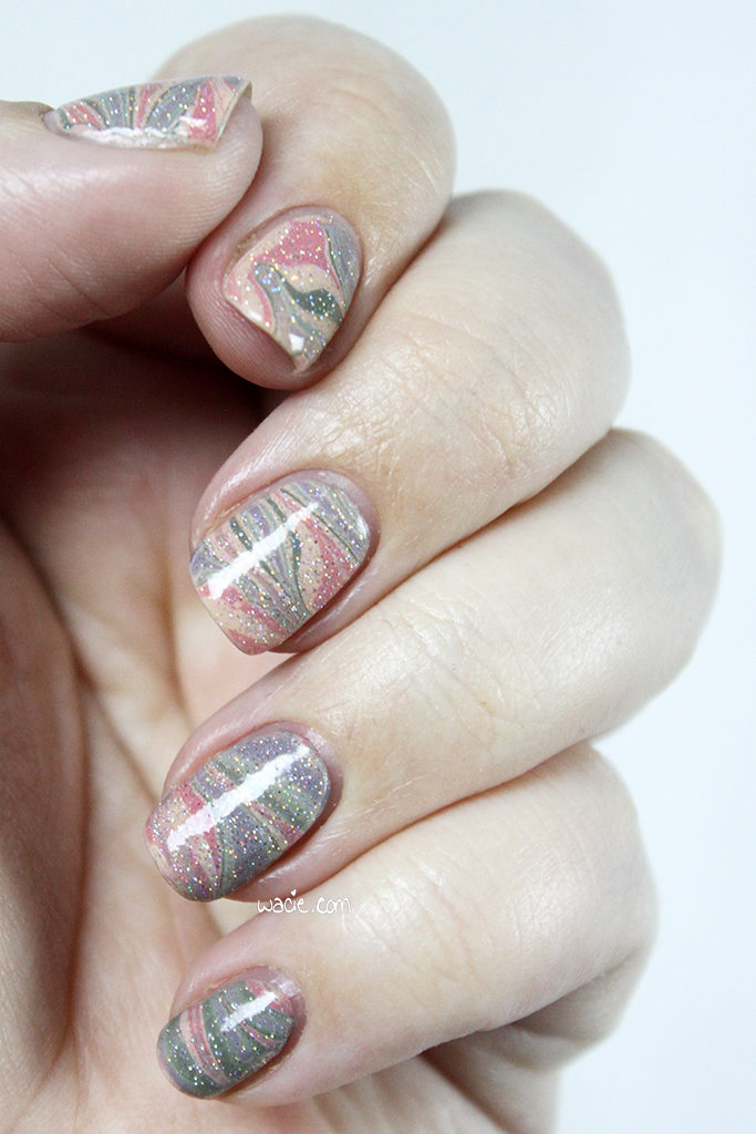
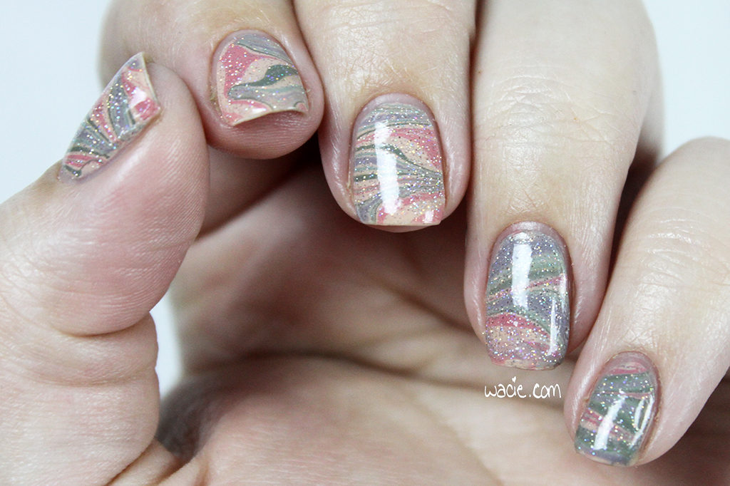
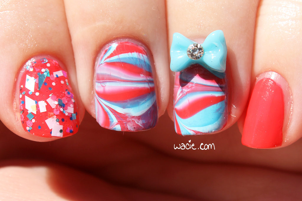
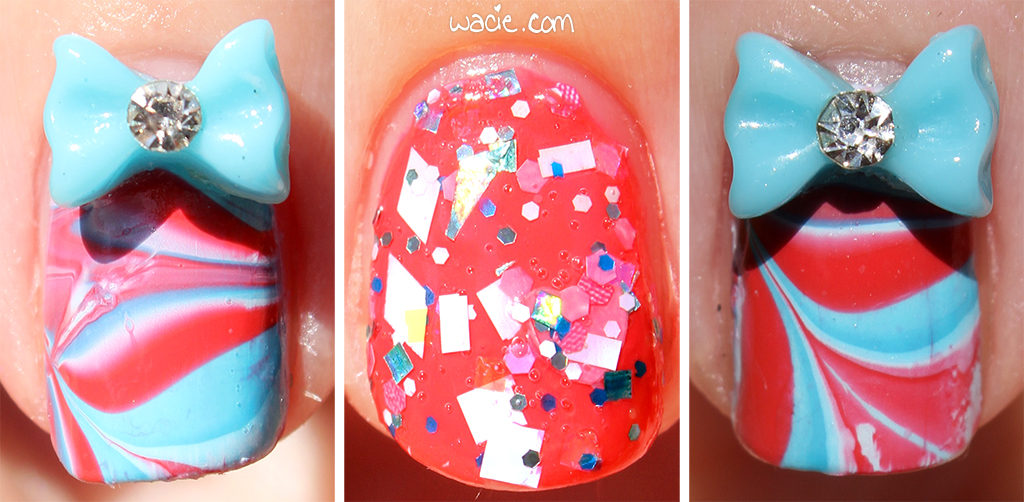
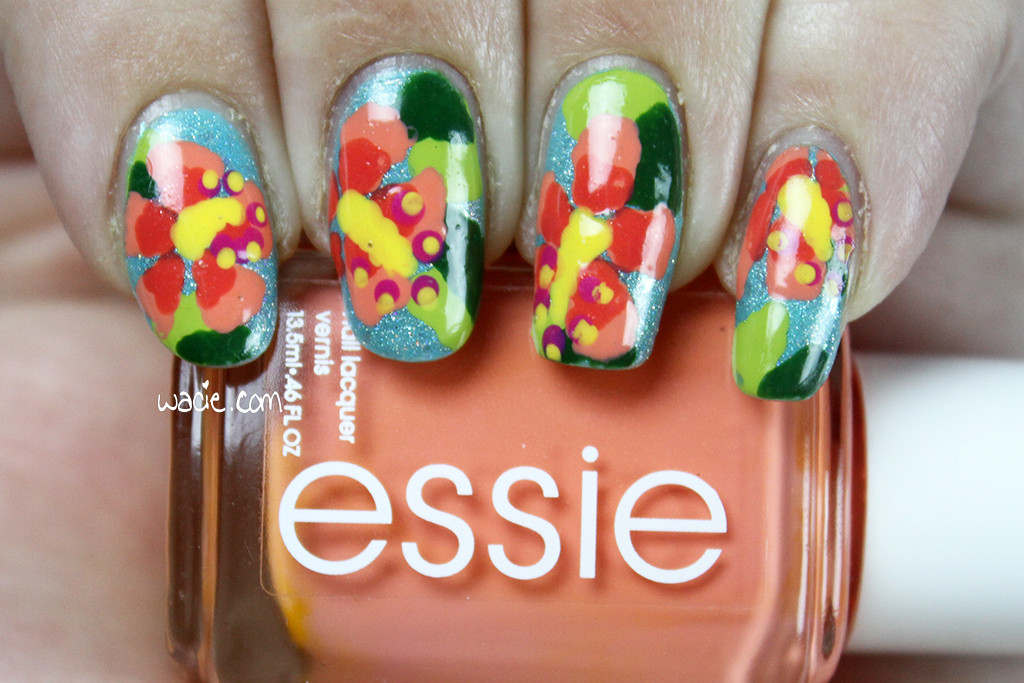
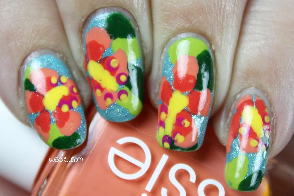
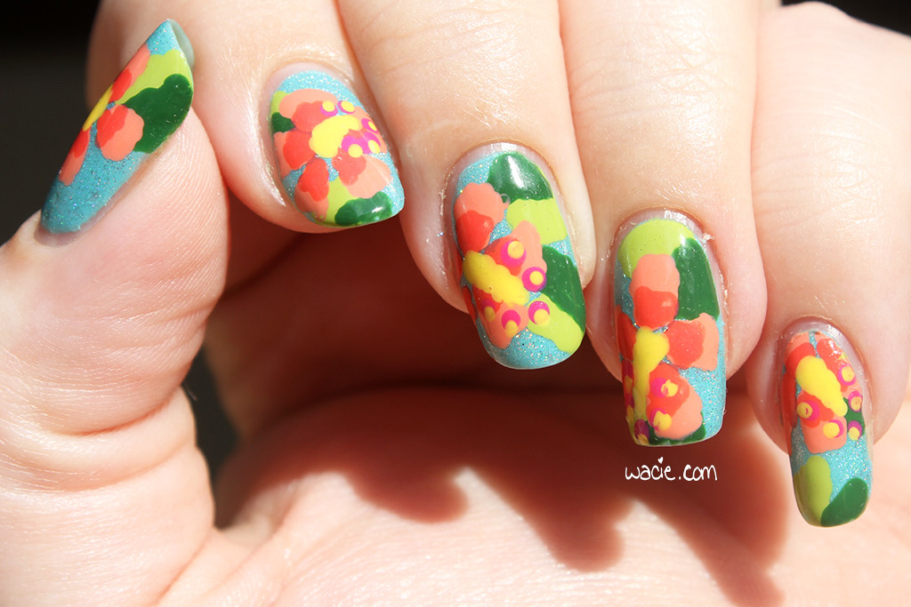
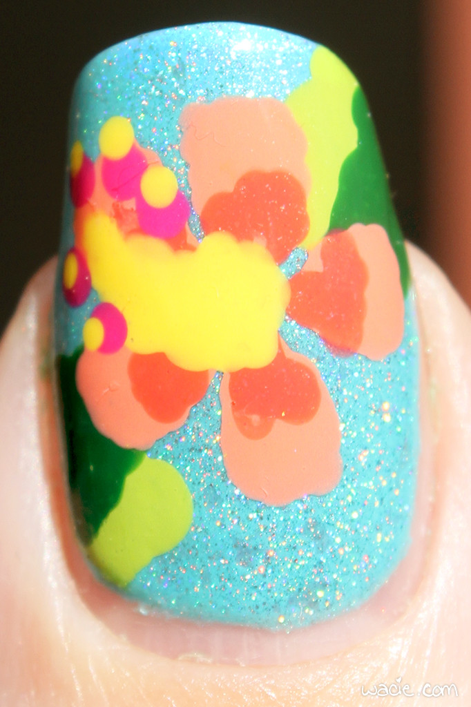
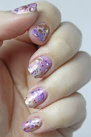
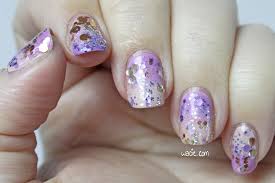
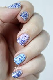
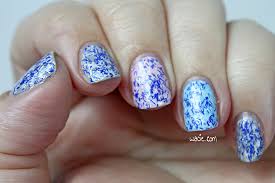
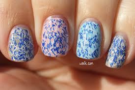
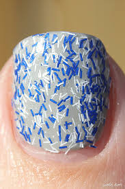
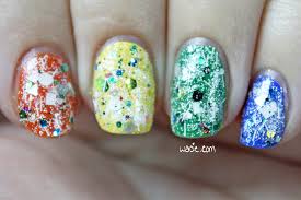
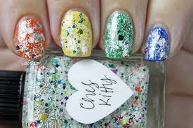
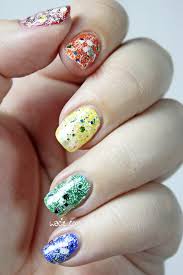
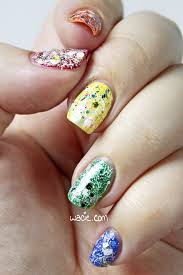
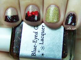
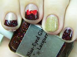
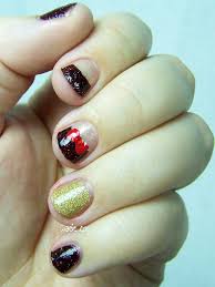
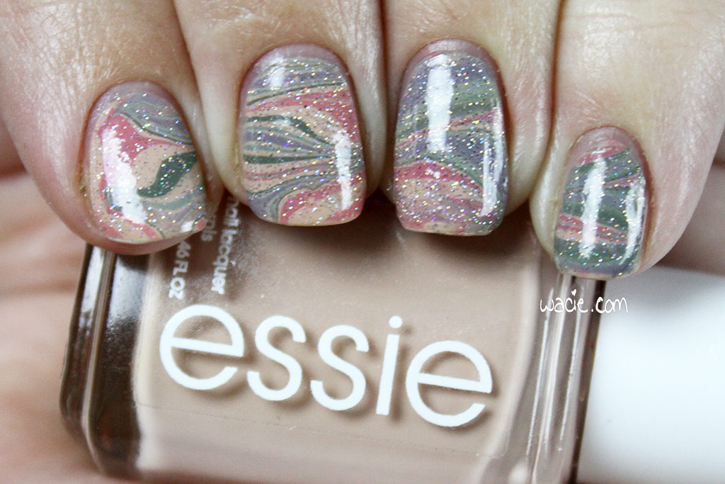
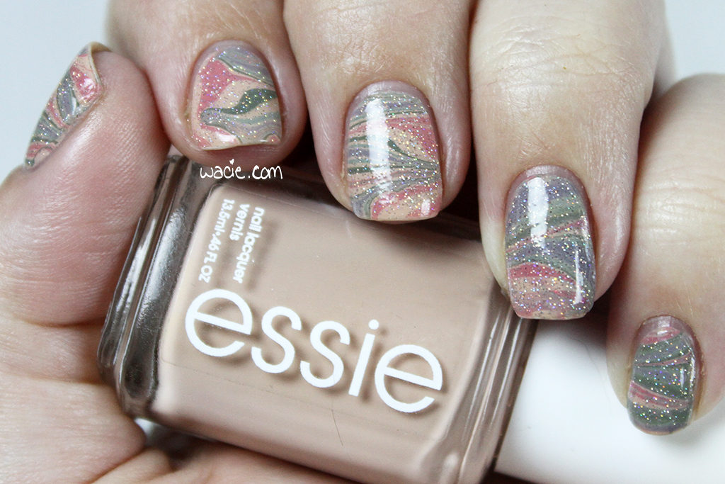
The following photos were taken outdoors in direct sunlight. The colors are a bit washed out here, making the dusty colors look lighter and more pastel. Fairy Dust looks overwhelmed as well. On the plus side, I was able to get macros of all my favorite swirls. My ever-elusive right hand even makes an appearance.
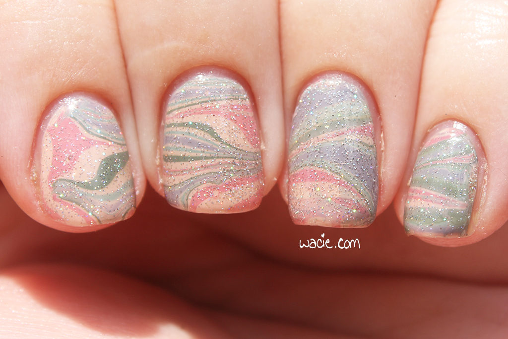
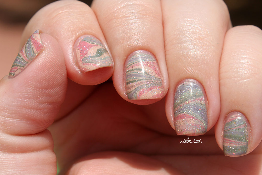
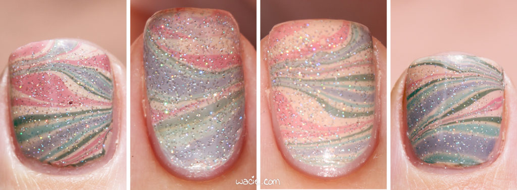
From left to right: Left thumb, left ring finger, left middle finger, right thumb
Essie, Zoya, Ciaté, and China Glaze are all sold in stores nationwide; mine are from Walgreens, Ulta, Sephora, and Sally Beauty Supply respectively.
Also, remember this is a group project, and there are links below to the other dusty manicures done by members of the group. Show them some love, too!
I bought these polishes myself.
 Loading InLinkz ...