Manicure Monday: Strawberry Banana Swirl With Sprinkles

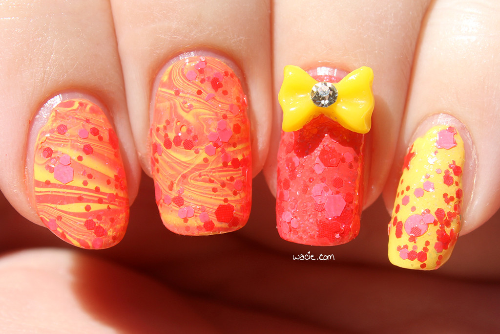
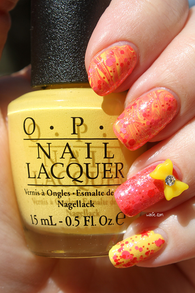
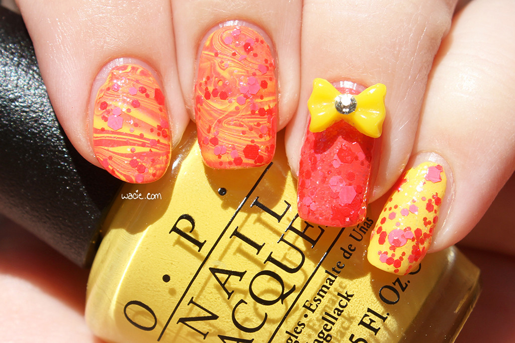
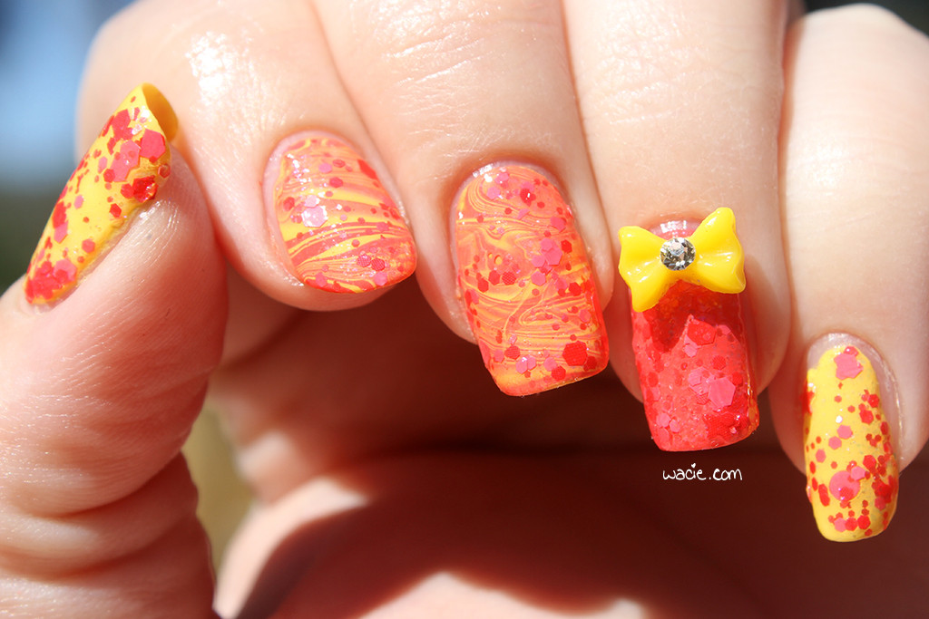
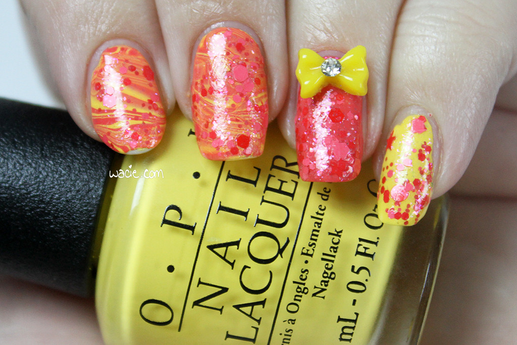
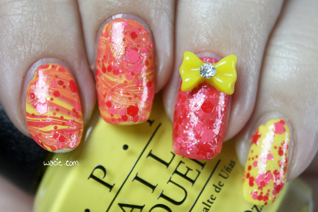
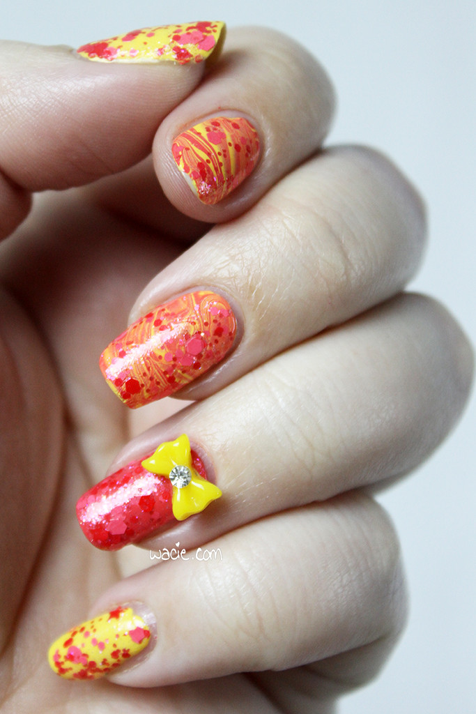
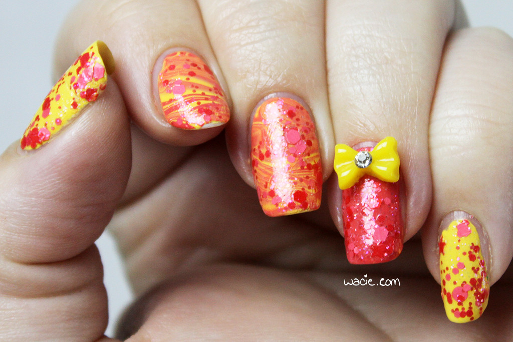
Happy Monday, reader! I did a great time doing today’s manicure, and I hope it shows! For this look, I used OPI’s I Just Can’t Cope-acabana and Live, Love, Carnaval with Blue-Eyed Girl Lacquer‘s Get Too Close to the Flame. All nails are topped with one coat of Gelous. Because of a chip that occurred in the polish between photography sets, I’ll be showing you the daylight photos first. These were taken in direct sunlight outdoors.
IMG_58882

IMG_58992

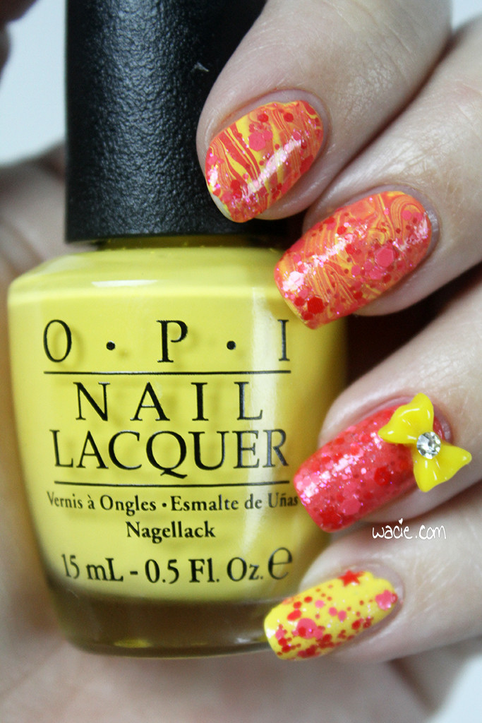
I Just Can’t Cope-acabana has been on this blog a lot lately; I’ve used it as the undies for glitters on at least three different swatches, and I’ve used it so much that it’s starting to show the fill line. Yellow can be hard to work with sometimes, what with the streaking and failure to level itself, and this is no exception, but it’s a really nice color. It’s a pretty neutral yellow and works with just about everything. I love the way it looks here with Live, Love, Carnaval; I didn’t think to pair these two until the last minute, and I like the way they look together. I mean, they should, they came from the same Brazil collection. They set each other off in just the right way, and they both marbled like a dream.
IMG_59012

IMG_58942

So let’s talk about the chip on my index finger. I have no idea what caused it, only that it appeared sometime taking the daylight photos and taking the indoor photos. I’m pretty sure it’s a problem caused by Gelous. I know it’s not really meant to be used as one, but I ran out of Seche Vite and I don’t know when I’ll be able to get another bottle. It’s incredibly frustrating, because it takes a century to dry on its own and I keep smudging it hours after I thought it was dry. I miss Seche Vite so much.
IMG_59092

IMG_59142

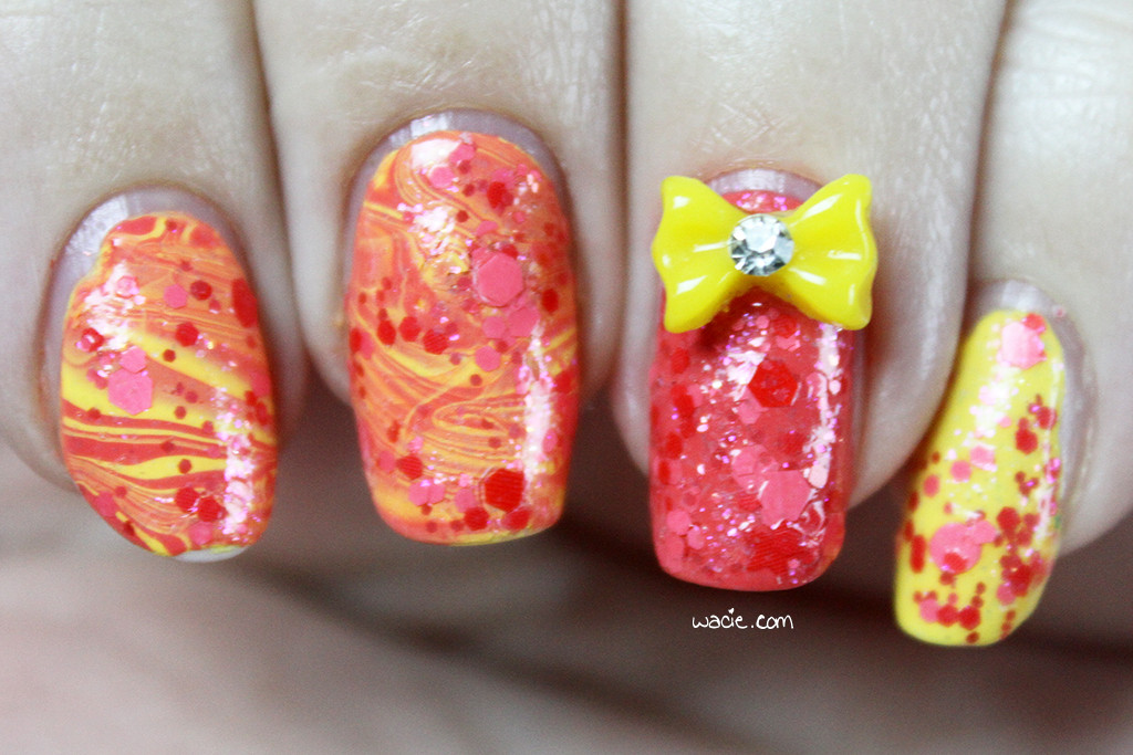
I’ve watermarbled before, but this is the first time I’ve tried the horizontal swirl; usually I stick to the flower or the pinwheel. I don’t think it looks too bad. I think I used too many rings, or maybe I made too many strokes in the polish, but it can be pretty tough to tell the colors in the marble apart; from far away, it just looks orange. I still like it, though.
IMG_59152

IMG_59232

Get Too Close to the Flame works so well with I Just Can’t Cope-acabana that I couldn’t not use it. It was actually the first polish I picked out for this mani, and the ideas about the pink and the watermarble came later. I kind of struggled with how to use the glitter, since I still really wanted to, and I ended up just doing one allover coat with it, even over Live, Love, Carnaval, where there isn’t much constrast and all you see is some shimmer and faint glitter shapes. It’s a fun look, I think. Over the yellow, it’s bright and cheerful, over the pink it’s mysterious, and over the marbling, the word that comes to mind for me is planetary. It reminds me of the swirls around the red spot of Jupiter. It pleases me.
IMG_59292

IMG_59332

I got I Just Can’t Cope-acabana and Live, Love, Carnaval from Sally Beauty Supply. I got Get Too Close to the Flame from the Blue-Eyed Girl Lacquer online shop; it’s been discontinued.
I bought these polishes myself.

Manicure Monday: Confetti Disco

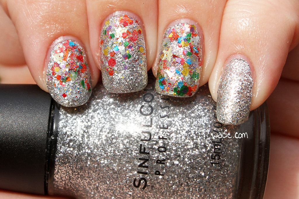
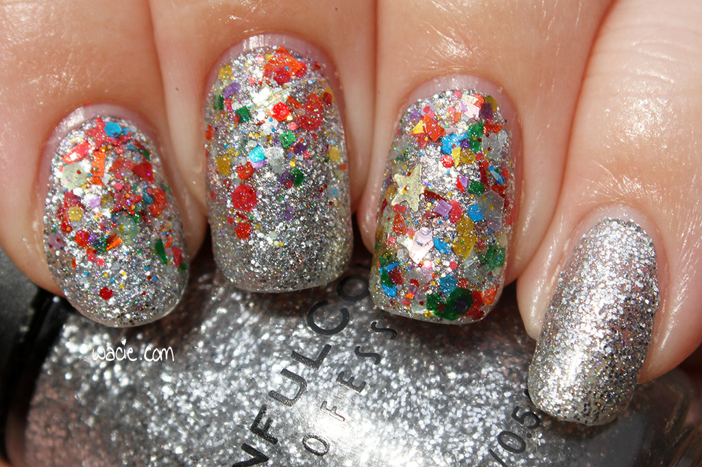
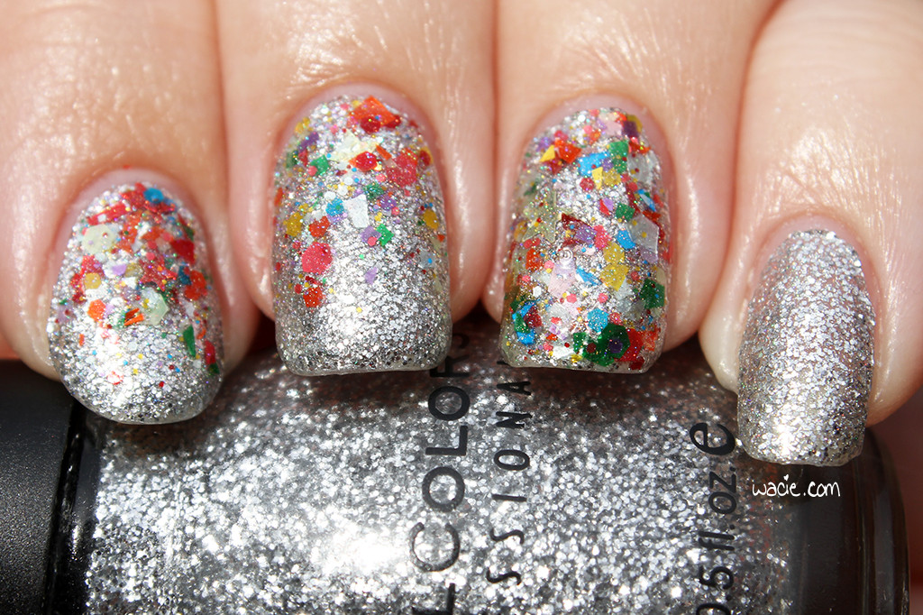
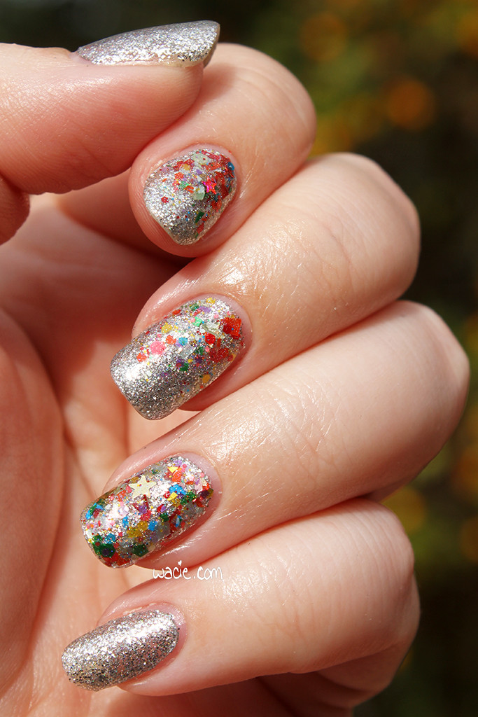
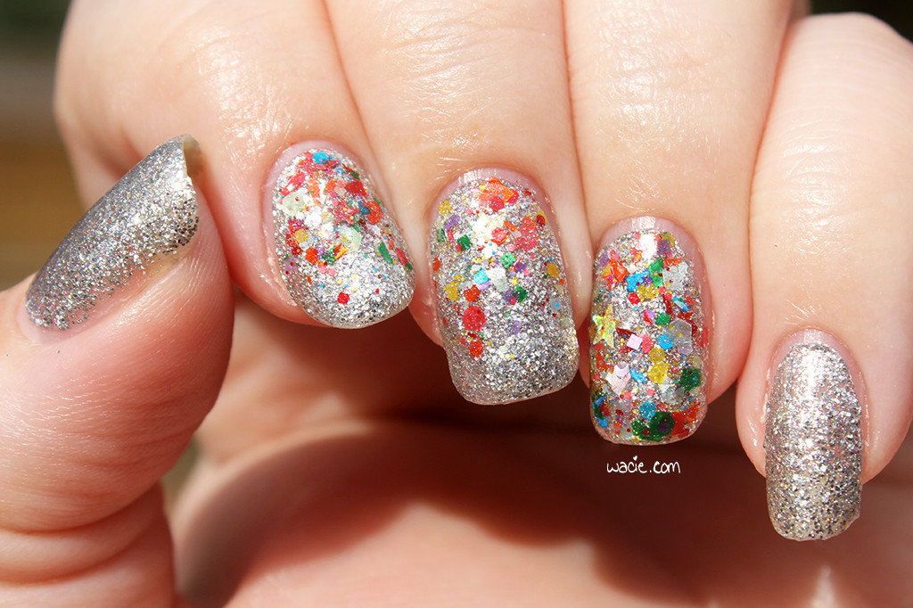
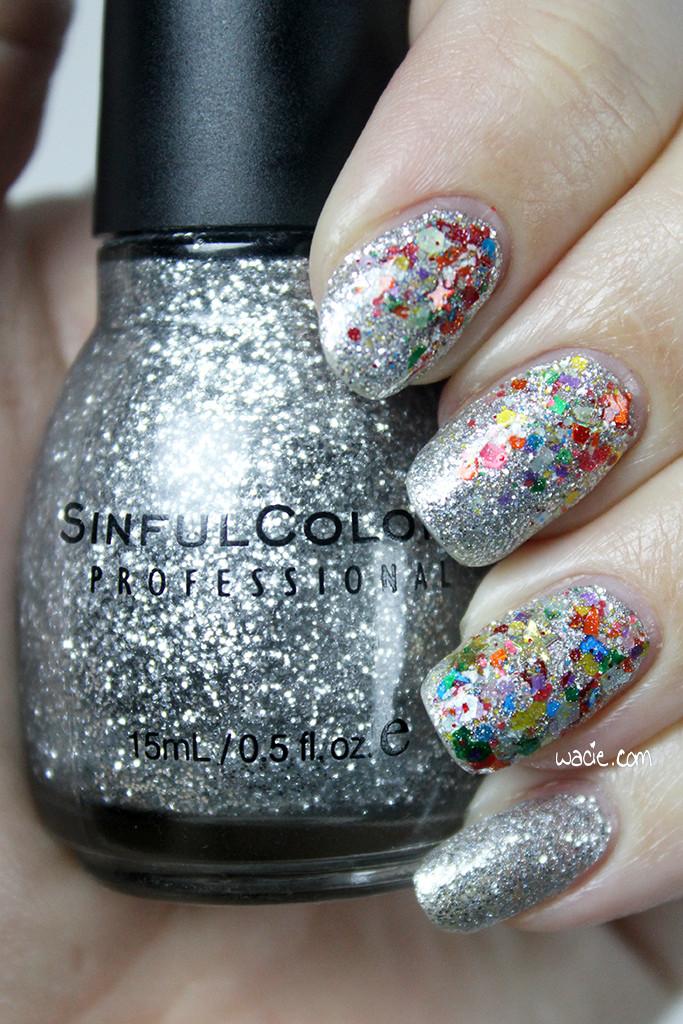
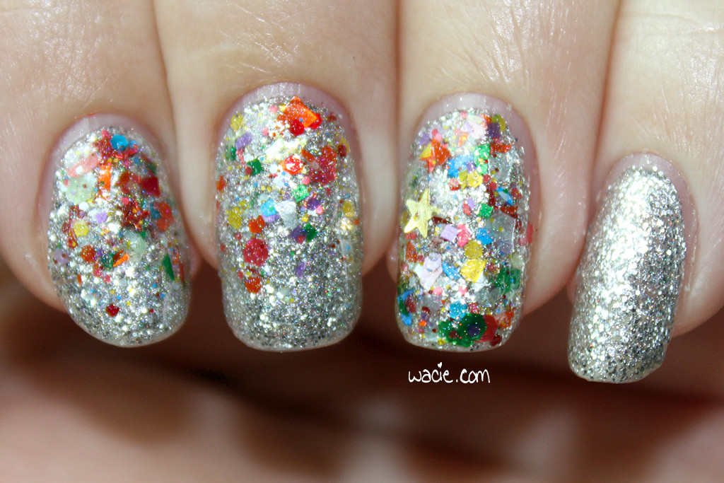
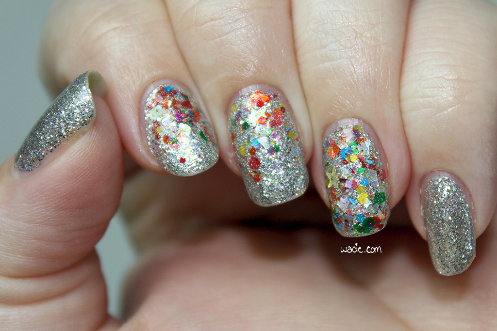
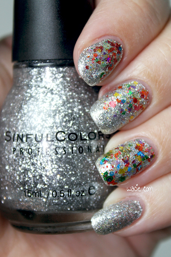
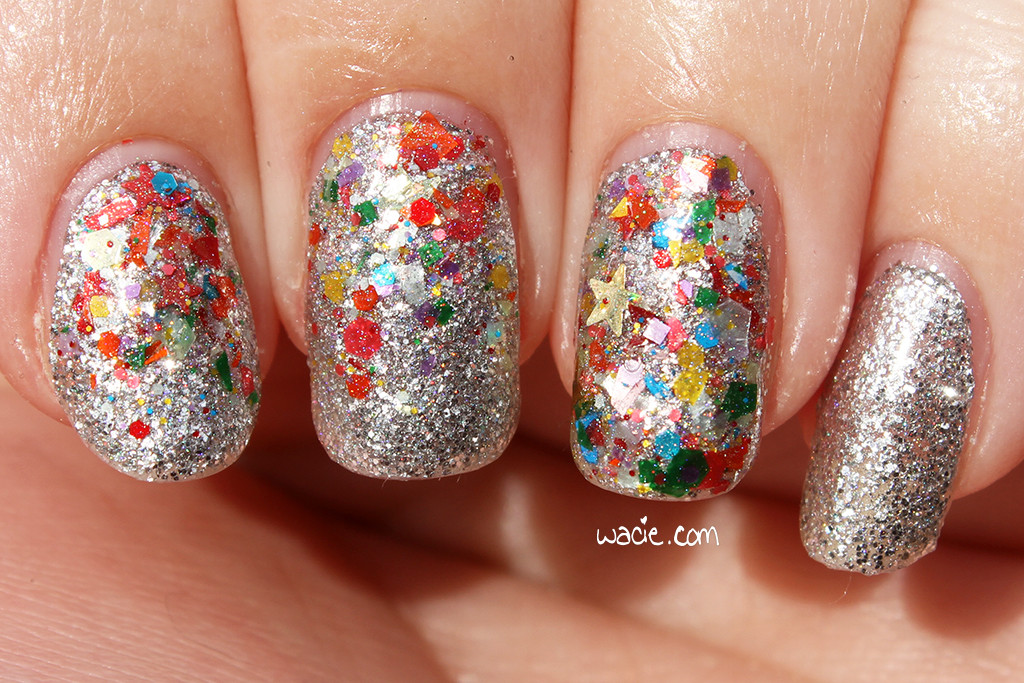
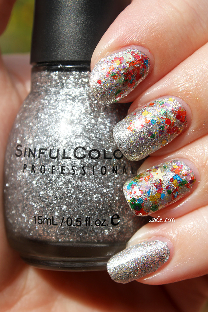
Welcome back to Manicure Monday! Today’s mani is made up entirely of glitter, it’s kind of insane. Also, there’s some Wacie Nail Company restock info coming, so keep reading! For this look, I used Sinful Colors’s Queen of Beauty as the base, Digital Nails‘s Spectraflair top coat over that, and Wacie Nail Company’s Handful of Confetti for the glitter accents. All nails are topped with one coat of Seche Vite top coat. Also, these photos are taken outdoors in partly cloudy conditions.

IMG_54772

IMG_54812

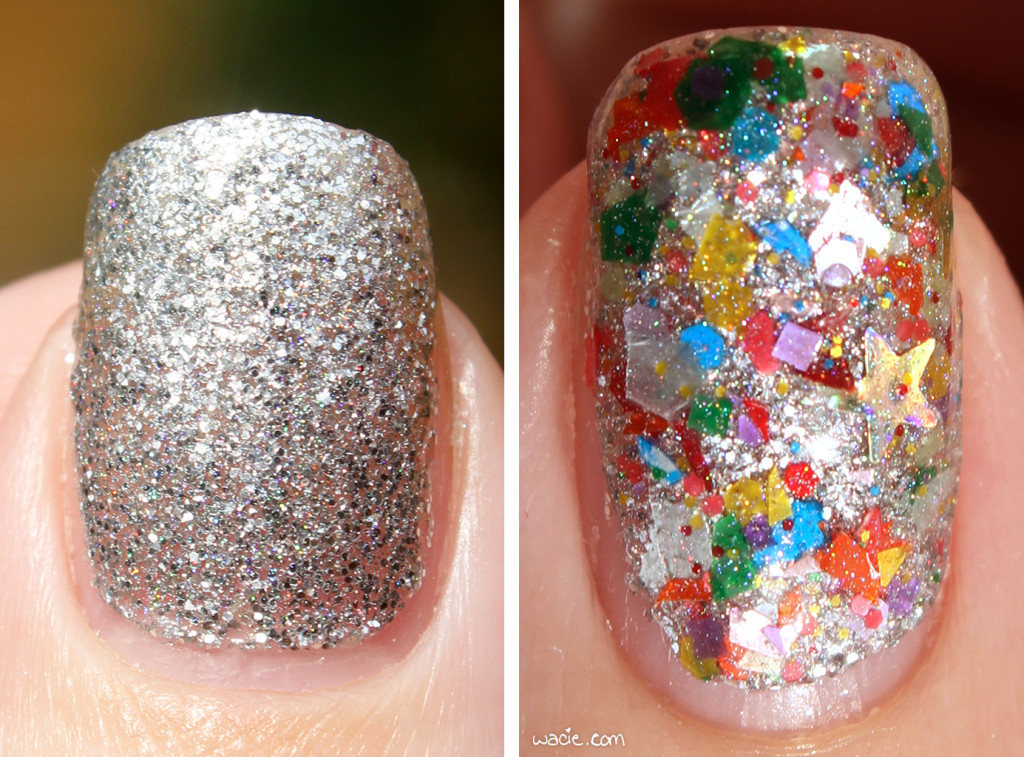
Queen of Beauty is a veteran in my collection; it must have been around 2008 when I bought it. When I started this manicure, I seriously doubted whether I’d have enough to get me through the whole mani. This polish is great because it’s so versatile; I don’t think it was intended to be worn as a full-coverage microglitter polish, because you can see some teeny-tiny gaps in coverage, but it works pretty well as one. It also looks great as a topper, which is how I’ve worn it in the past. Also, it’s shiny. It’s wicked shiny. Light bounces off this like you wouldn’t believe. You can see the glare in some of these photos. It’s the reason a lot of these photos are washed out and blurry. I love it.

IMG_54872

IMG_54902

IMG_54432

I got the Spectraflair top coat out because I wanted to take it just a step further. The chunky rainbow glitter has a slightly holo base, and I thought it would look weird with some of the nail being holographic and some not, so I thought the holo top coat would even it out. As it turned out, it was cloudy and you can barely see the holo effect in either polish. It’s pretty visible in the accent nails, but I think that’s because the accent glitter has Spectraflair in it as well. On the nails without it, you can barely tell. At least I know it’s there. It’s kind of a fun little secret.

IMG_55022

IMG_54602

mmcdmc

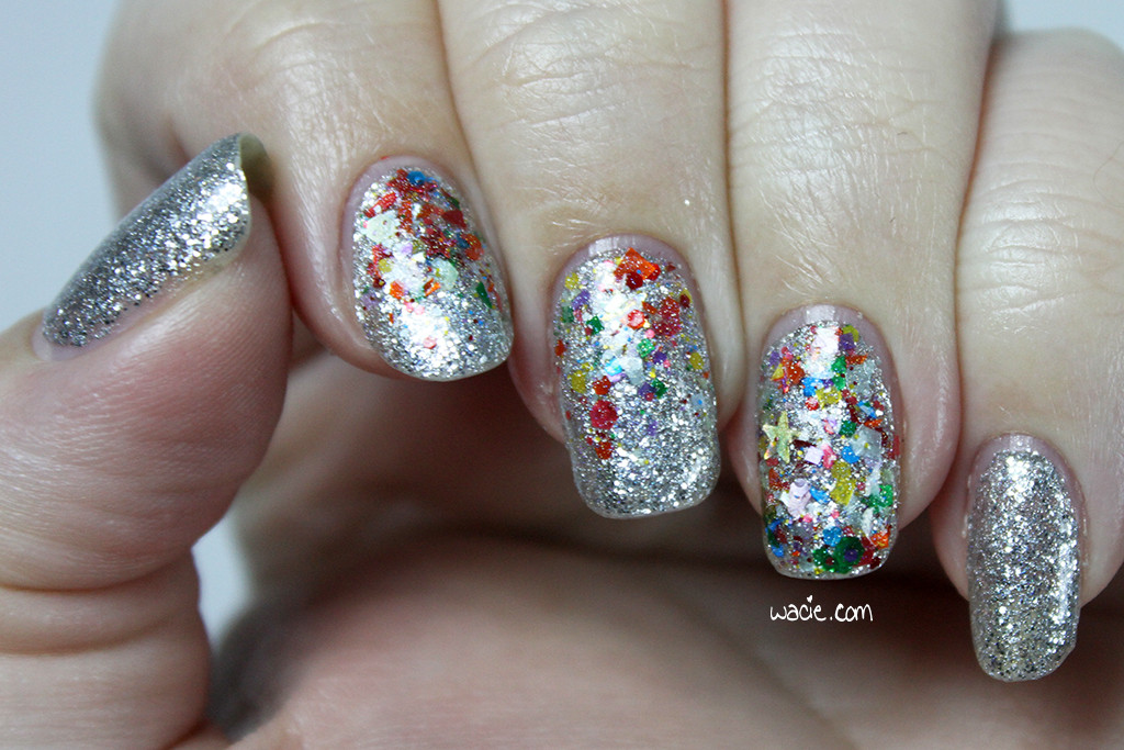
This set of photos were taken indoors in the studio; some with flash, and some without. This mani definitely looked better in the sun, but they always do.

IMG_55172

IMG_55252

Handful of Confetti is making its debut today, and I’m really excited! I don’t want to say too much about it, because I have an entire post dedicated to it I’ll be posting on Wednesday. I love ridiculous glitter toppers, and I know they’re becoming passé in indie polish these days, but I still love them and I want to cling to them forever. I chose it as the accent for this mani because it couldn’t be more different from the base polish; every bit of glitter stands out from it, it adds tons of color, and it’s interesting to look at. I think it’s a pretty fun look.

IMG_55262

IMG_55322

IMG_55392

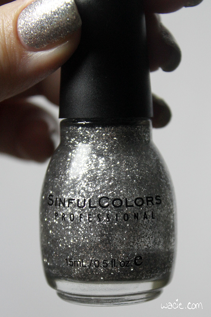
One more photo: here’s a shot of the bottle, just so you can see how empty it is. I haven’t come this close to finishing a bottle (of polish) in years.

IMG_55452

Queen of Beauty and other Sinful Colors are sold nationwide; mine is from Walgreens. Digital Nails polishes, as well as their Spectraflair top coat, are available from their etsy shop. Handful of Confetti will release Wednesday, February 24, at 2 PM EST; watch this space for more information.

I bought two of these polishes myself; I made one.

Manicure Monday: Glitter Secret

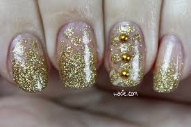
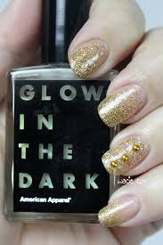
Happy Monday! This week I did some time-intensive nail art — by my standards at least — and I love it. For this look, I used Butter London’s West End Wonderland with American Apparel’s Moon. I wish I did nail art like this every week!

mmgs

mmgs2

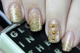
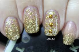
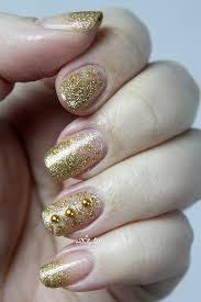
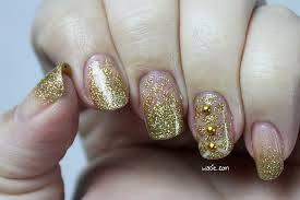
The idea for this mani was to have a negative-space mani with a secret glow-in-the-dark effect. I loved the idea of just having a fun polish paired with “naked” nails, and then having the “negative” parts of the design glow. Obviously, if you look closely, you can tell they’re not totally naked, because Moon has this grainy look in it, but that’s only if you look up close. From a perfectly reasonable distance you wouldn’t be able to tell at all.

mmgs3

mmgs4

This is one of the more intricate designs I’ve ever done, because I rarely do anything with more than two steps. First, I put down a coat of Moon. Next, I did a gradient with Moon and West End Wonderland. I left my thumb and pinky with just the initial gradient. When that was dry, I put strips of striping tape over the gradient in a criss-cross pattern, then sponged West End Wonderland over the entire nail. I finished with Seche Vite top coat. On the accent nail, the one with the studs, I used two coats of Moon and skipped right to the all-over sponging of West End Wonderland. I think it turned out pretty well!

mmgs5

mmgs6

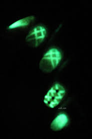
The only thing I would do differently — I do plan to do this again — is to use a polish with greater contast. It’s a little hard to see the negative space because it’s so similar to the glitter polish. I may also consider just using striping tape for greater contrast in the dark, because I did fail to take that into account. You can see in the glow photos where the lines are, but I think it would be cooler if the contrast was higher.

mmgs7

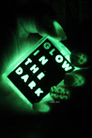
Moon has an amazingly strong glow. If you look closely, you can see the titles of the books on my bookshelf.

mmgs8

Moon has been discontinued by American Apparel. West End Wonderland and other Butter London polishes are available at sephora and Ulta. I got mine in a swap, lucky me! I don’t know where the studs came from.

One of these polishes were purchased by myself. The other was received in a trade.

Swatch Sunday: Octopus Party Nail Lacquer’s Universal Loner

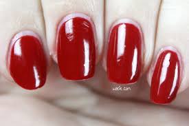
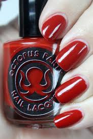
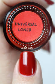
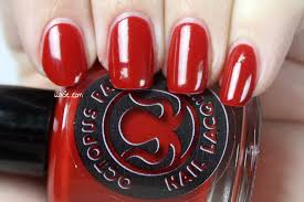
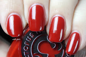
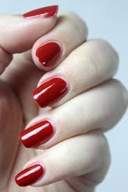
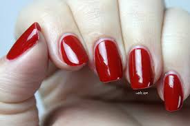
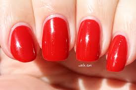
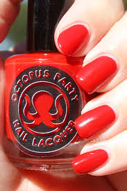
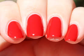
Happy Sunday! It’s Valentine’s Day, so it’s a great day to wear red! This beauty is Octopus Party Nail Lacquer‘s Universal Loner. The name is kind of appropriate, too, isn’t it? I can’t tell. I’m wearing three coats of Universal Loner with one coat of Seche Vite top coat.

ssopnlul

ssopnlul2

ssopnlul3

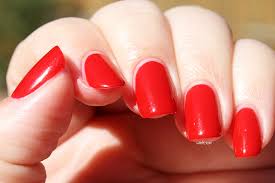
Universal Loner is a true red creme polish; it’s meant to be equally balanced between warm and cool. Like a lot of red cremes, the tone changes in lighting; my outdoor photos leaned more warm, and my indoor photos were cooler. The product consistency is very nice; the polish is a bit sheer on the first coat, but works up to full opacity on the second. It dries quickly and with a glossy finish; I used top coat for extra shine and protection.

ssopnlul4

ssopnlul5

This polish was one of the four indie creme offerings in the inaugural Creme a la Mode box. I love this box because some awesome makers — some of my favorites, even — realized that cremes are an overlooked but necessary part of a great indie manicure. Cremes are common in any polish addict’s kit, but it weirds me out sometimes when I’m still using polishes that might not be five-free or cruelty free or what have you. I know these brands and I know their reputations for quality products, and it puts my mind at ease knowing there’s nothing in this polish that’s going to harm me or be ethically questionable. I have a dozen red cremes, but I trust this one.

ssopnlul6

ssopnlul7

Here’s the outdoor shots, where it looks way more tomato than cherry. I still love it. The shine kills me. It’s my favorite thing.

ssopnlul8

ssopnlul9

ssopnlul10

ssopnlul11

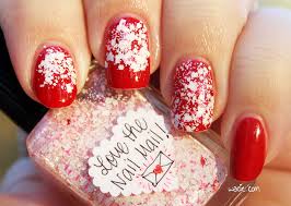
And because it’s Valentine’s Day, I used it as a base for a quick-and-dirty Valentine’s mani. The glitter here is Lynnderella‘s Love the Nail Mail. Nail polish is totally my valentine this year.

ssopnlul12

Universal Loner is out of stock; other Octopus Party Nail Lacquers are available in their etsy shop.

I bought this polish myself.

Manicure Monday: Pink Spring Mystery

Welcome back, reader! Happy Monday! Today’s manicure was done with a chunky springtime glitter and a mystery polish. Spring is springing in Florida, and I get closer with every pastel polish I wear. For this look, I used Model City Polish‘s Breath of Spring and a Sally Hansen mystery pink, as well as a coat of Seche vite top coat.

mmpsm

mmpsm2

Next to knowing that the mystery polish is from Sally Hansen, I know absolutely nothing about it. This is one of my older polishes, a leftover from when I had a terrible habit of peeling the labels off of things. I really did a number on this one; I’ve stripped it of anything identifiable. I also remember buying this polish to match a pair of glasses I was wearing at the time. Despite everything, I actually really like this polish, and it’s a shame I can’t tell you anything about it, because I almost want to recommend it. The product consistency is on the thin side, and it took three coats to reach full opacity, and it took ages to dry… Maybe I don’t want to recommend it after all. It had the most gorgeous shine after it dried, though. I feel like that’s not very common. Though it was fiddly to apply, it didn’t need top coat at all, and I was really impressed. It’s kind of a shame I covered so much of it up.
mmpsm3

mmpsm4

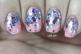
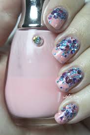
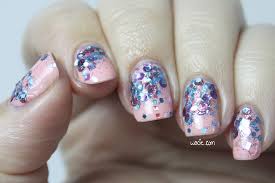
Breath of Spring kind of took over this mani. I wanted just a small but concentrated bit of glitter at the base of each nail, but because of the variety of shapes and colors of glitter, it looked uneven, and by the time I got the look I wanted, it took up half the nail. I think it’s still a cool look; the glitter comes in bright but seasonal colors, and there’s just a hint of holographic goodness in the base. It’s a beautiful topper that would look fantastic over anything. I really enjoy this combination.

mmpsm5

mmpsm6

Breath of Spring has been discontinued by Model City; other Model City Polishes can be found in theiretsy shop. Sally Hansen, and maybe even this polish, can be found in stores nationwide.

I bought these polishes myself.

HPB Presents Elevated Gradient!

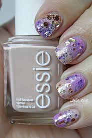
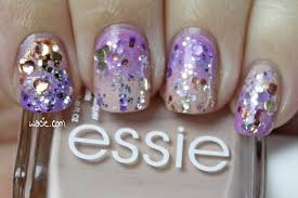
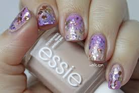
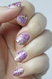
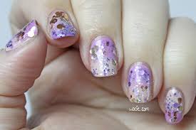
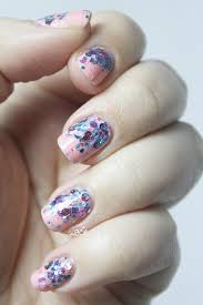
Hello, reader! This is a special post for the Hobby Polish Bloggers group on Facebook! Every month, we do themed manis, and January’s theme is the gradient. It doesn’t matter what kind of gradient we do, as long as it’s a gradient; we can make it as complex or as simple as we want. I decided to make mine a challenge and use four previously unused polishes. For this look, I used Sittin’ Pretty and Topless and Barefoot, both from Essie, as the base; I used Kilimanjaro and Salautay, both from Elevation Polish, as the glitter topper. All nails are topped with one coat of Seche Vite top coat.

hpbpeg

hpbpeg2

It’s been a while since I’ve done a two-color gradient, so long, in fact, that I started to wonder whether or not I’d lost my touch. This is probably one of the hardest gradients I’ve ever done. I could not get light purples and nudes — not just these Essie two, I tried OPI as well — and I could just never get them to come together. Either a color would go bald from oversponging, or a color just wouldn’t turn opaque, no matter how much of it I used. It did finally come together, and it was amazing.
hpbpeg3

hpbpeg4

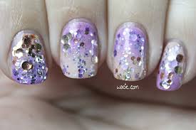
I had to use purple and nude, though, because I had to use Kilimajaro and Salautay. I knew that as soon as I got these polishes that I had to put them together, because they have so many similarities: they both employ the use of round glitters and the color silver. After I finished the base gradient, I made a gradient with the glitters, flipping the colors so that the purple was over the nude and vice versa. Of course, after I sponged it on, they kind of bled into each other, which is actually pretty cool. My index fingernail got a little too much glitter, but aside from that, I totally got the result I wanted and I’m so happy.

hpbpeg5

hpbpeg6

This is the most intensive nail art work I’ve done in a while, so I’m really proud of it! Also, because this is a group effort, there’s an InLinkz widget here with everyone else’s gradient manis, so be sure to have a look at them! They’re just as proud of their work as I am with mine.

Sittin’ Pretty, Topless and Barefoot, and other Essie polishes are sold in most stores; I got mine from Walgreens. Kilimanjaro and Salautay are discontinued by Elevation Polishes, other Elevations are sold in their online shop.

I bought these polishes myself.

Manicure Tuesday Morning: Winterland Hottie

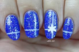
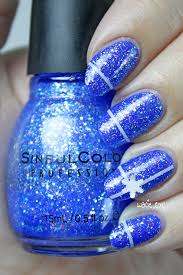
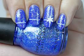
Happy Monday! My post is late tonight because I just got back from a Christmas party, where these wintry nails were a huge hit. I know I said I never do seasonal nails, but I had the opportunity today and I took it. For this look, I’m wearing Indigo Bananas‘s Klein Trink Wasser as my base and Sinful Colors’s Hottie on top. All nails are topped with Seche Vite top coat.

mmwh

mmwh2

So last week I talked a bit about drugstore glitters as a gateway drug; back in the ’90s, Sinful Colors was where it was at. I don’t know if you remember, but Walgreens used to sell it, and they came in indie-style bottles, the barrel ones with the black caps. My mother felt uncomfortable buying something “sinful”. I wanted every color. It’s fun how some things never change; I love these glitter polishes as much as I did when I was younger. The polishes haven’t changed much, either; they’re the same iridescent glitter mixes they always have been. There’s something really nice about that. It might be the same glitter, but it’s a ton of fun finding new and grown-up ways to wear it.

mmwh3

mmwh4

I love that indie cremes are becoming a thing. That’s not to say Klein Trink Wasser is a new polish; I actually bought it last year, and this is the first time I’m wearing it. I just mean that, even with a seemingly basic color like this one, you’d think that there’d be no more creme colors left without mass market dupes. As surprising as it seems, I don’t have anything like this polish in my collection. All my dark blue cremes are really dark, and all my dark blues are shimmery or glittery. It took me a long time to find a creme in this particular shade. Anyway, I think that the indie creme trend is amazing. Between the Creme a la Mode box and the Pipe Dream neons and brights, there are a ton of exciting cremes without mass market dupes. It’s really cool.

mmwh5

mmwh6

I’m not sure I’ve ever worn striping tape on its own on the blog; usually I just use it like a vinyl strip. I’ve definitely never worn loose glitter, and that’s fun, too. The snowflakes were bigger than I wanted and they’ve been getting snagged on things. It also feels a little weird wearing snowflakes on my nails when I’m wearing a tube top and shorts. One more thing: I made a scented top coat to wear with this mani. I had a little vial of winter gardenia fragrance oil, so I made a top coat with it because it seemed appropriate. I’ll have these listed in the shop soon, along with a new Wacie Nail Co. collection.

Klein Trink Wasser and other Indigo Bananas polishes are sold on their website. Hottie and Sinful Colors are sold in stores nationwide.

I bought these polishes myself.

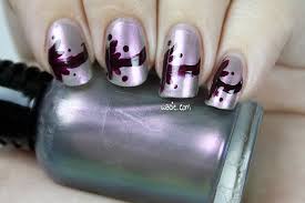
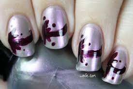
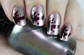
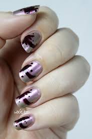
Manicure Monday: Freehand Grey

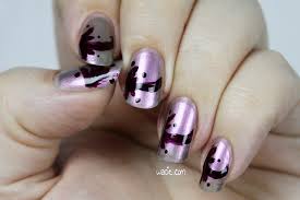
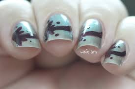
Welcome back to Manicure Monday! As you noticed, I took the holiday weekend off from swatching, so we have some nail art to check out this week. My base color is Wet ‘n Wild’s Gray’s Anatomy, and my freehand painting was done with a striping brush and OPI’s We’ll Always Have Paris. All nails are topped with one coat of Seche Vite top coat.

mmfg

mmfg2

I’ll just get this out of the way: I don’t know how I feel about the freehand. I’m a little embarrassed that I still suck at hand-painting, but in a way, it’s sort of charming. I wanted something simple but uniform, but it’s a bit irregular. It doesn’t look as irregular in real life as it does in photos, so I feel a little weird about that. I never do this stuff, so it’s really no wonder it’s not perfect. Maybe it’s okay that it’s not perfect. It looks arty-crafty and like it was done by a real person.

mmfg3

mmfg4

mmfg5

We’ll Always Have Paris lends a lot to the DIY mani look. These burgundy/wine polishes are always a little translucent, and I guess that’s why there’s a lot of unevenness. I just wanted a dark color, something that was as severe as black, that would complement the color shift in the base polish. I think this one worked pretty well.

mmfg6

mmfg7

mmfg8

The shift in Gray’s Anatomy is the focus of this polish, as it should be. You can totally see past the wonky freehand painting and really enjoy the colors. The writing on the label wore off a long time ago, but I almost forgot this is a Wet ‘n Wild Polish. I paid two dollars for it at the most. Not bad for two dollars!

I bought these polishes myself.

Manicure Monday: Violet Gradient with Violet Glitter

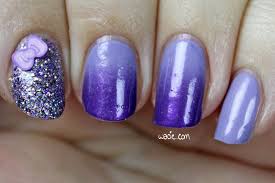
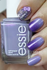
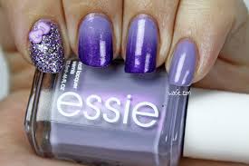
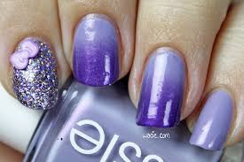
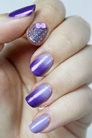
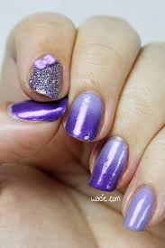
Happy Manicure Monday! I don’t feel like this mani is my best work, but I still rather like it. For this look, I used Essie’s She’s Picture Perfect, Revlon’s Amethyst, and Blue-Eyed Girl Lacquer‘s Might Not Recover, all with one coat of Seche Vite top coat.

mmvgwvg

mmvgwvg2

I put She’s Picture Perfect and Amethyst together for their similarities: they’re both shades of purple and they both have a strong pink/purple flash. I thought it would be great to see that pink/purple flash show up in both colors of the gradient, like this unifying shimmer that really pulls everything together. Unfortunately, it’s not easily seen in the gradient, either in photos or in real life. Also, the colors didn’t blend as easily as I expected them to; the deep purple just looks so sponged-on, even after three rounds with the sponge. It’s still pretty, but it’s really not my best work.

mmvgwvg3

mmvgwvg4

I added Might Not Recover as an accent nail at the last minute, and I gotta tell you, I’m stunned. I just can’t believe how much it sparkles. Like it was sparkly in the bottle, but damn. I also chose this polish for its similarities in color, but I like that it stands apart from the rest of the mani while complimenting it. The bling is just a tad bit overwhelming, which means it’s just the right amount (like there’s a such thing as too much). I always have an issue with microglitters still having some texture after I put down top coat, but this one has stayed nice and smooth, and I love it.

mmvgwvg5

mmvgwvg6

In the end, everthing goes together really well, yeah?

I got She’s Picture Perfect from Walgreens and Amethyst from Big Lots, though both brands are sold nationwide. Might Not Recover and other Blue-Eyed Girl Lacquers are available in their shop (which is temporarily closed). The Fimo bow is from Claire’s.

I bought these polishes myself.

Manicure Monday: Neon Sunset Gradient

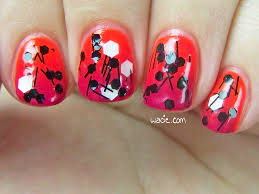
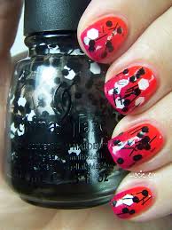
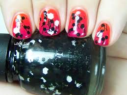
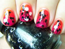
Happy Monday, reader! I adore today’s manicure because it’s so bright and busy. The gradient you see was done with Color Club’s Wham! Pow! and Sally Hansen’s Magenta Moves; the glitter topper is China Glaze’s Whirled Away. All nails are topped with Seche Vite top coat. I had a ton of fun doing this look today, so I hope you love it!

mmnsg

mmnsg2

Wham! Pow! is one of the best neons I’ve used in recent memory. It was opaque in two coats, dried with a satin finish, and — the best part — did not require a white base for the full effect. It’s almost painful to look at, it’s so bright. This is a seriously fantastic neon and I definitely recommend it to everyone. Magenta Moves, though a bright color, isn’t as neon as Wham! Pow!, so it kind of keeps the gradient from being too loud and creates the smoky-but-still-bright sunset effect.

mmnsg3

mmnsg4

I fell in love with Whirled Away the first time I saw it. This was back when those black and white glitter toppers were at the height of their popluarity; this was the first one I got, probably also the first one I ever used. My favorite thing — simultaneously the best and worst thing about this polish — is that it sets itself apart from the others by using much larger glitters. I love big glitters, cannot lie, etc., but I feel like it makes the polish go faster. I’ve only used it twice, but the bottle is already half empty. It’s so sad. It’s also kind of a pain to apply, because the slice/bar glitters are so long they sometimes hang off the nail like eyelashes, and sometimes it was hard to get the glitters to spread evenly over the nail, but it still looks cool even when it’s a little lopsided.

mmnsg5

mmnsg6

Unrelated: I miss swatching! I noticed today that it’s been two months since my Canon broke; I thought it would only be in the shop a few days and now I have no idea when I’m getting it back. I’m so sad, I really miss wearing all those new polishes! I’m kind of afraid to use things now because I can’t document it as easily. Here’s hoping it’ll come back someday soon.

I bought these polishes myself.