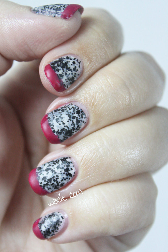
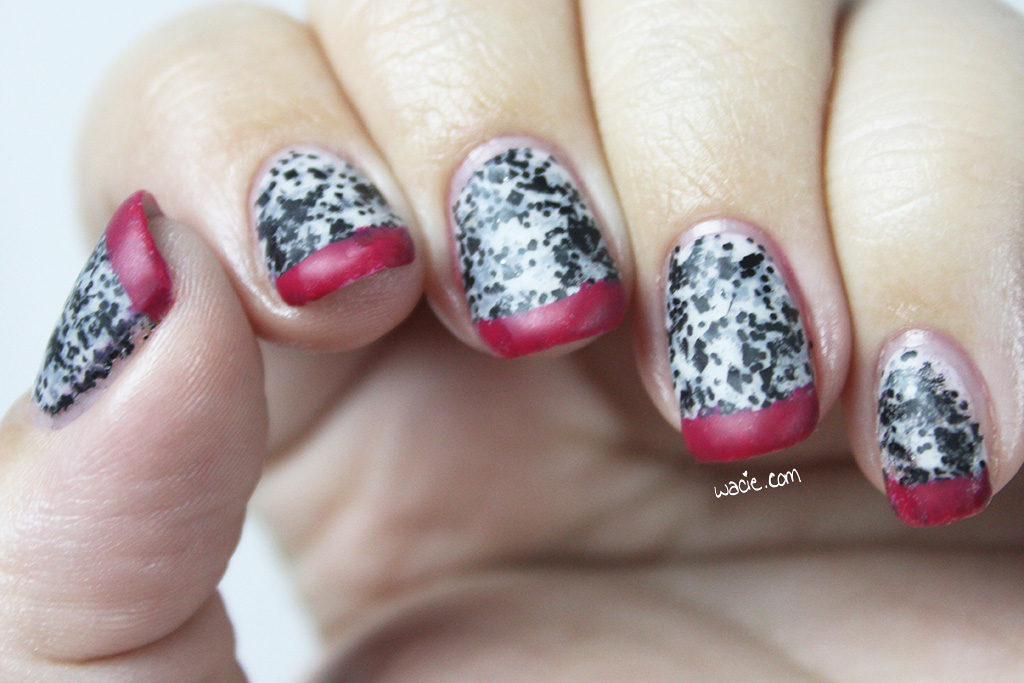
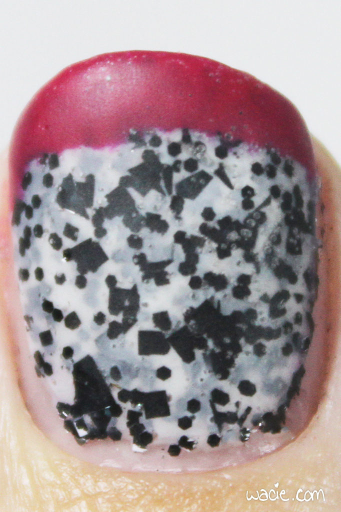
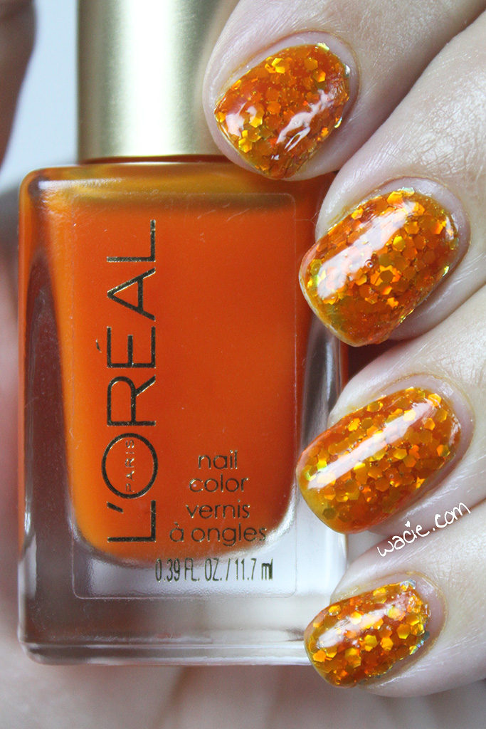
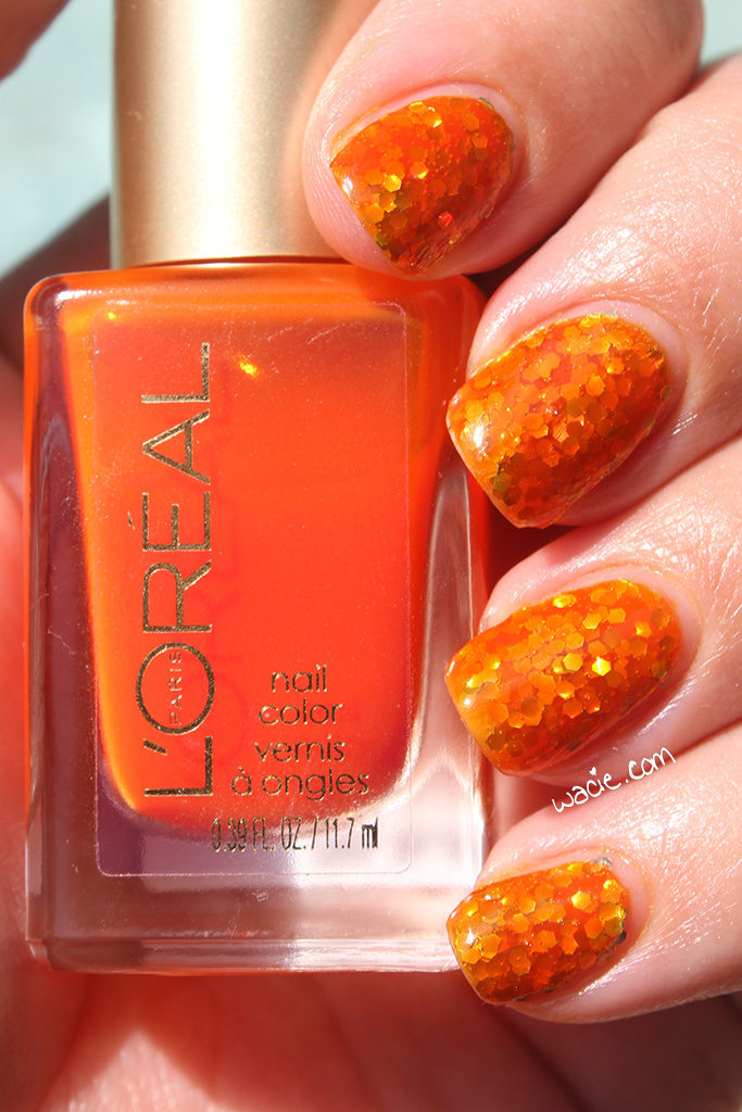
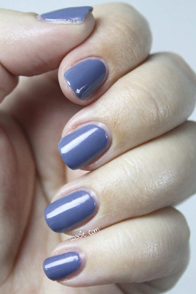
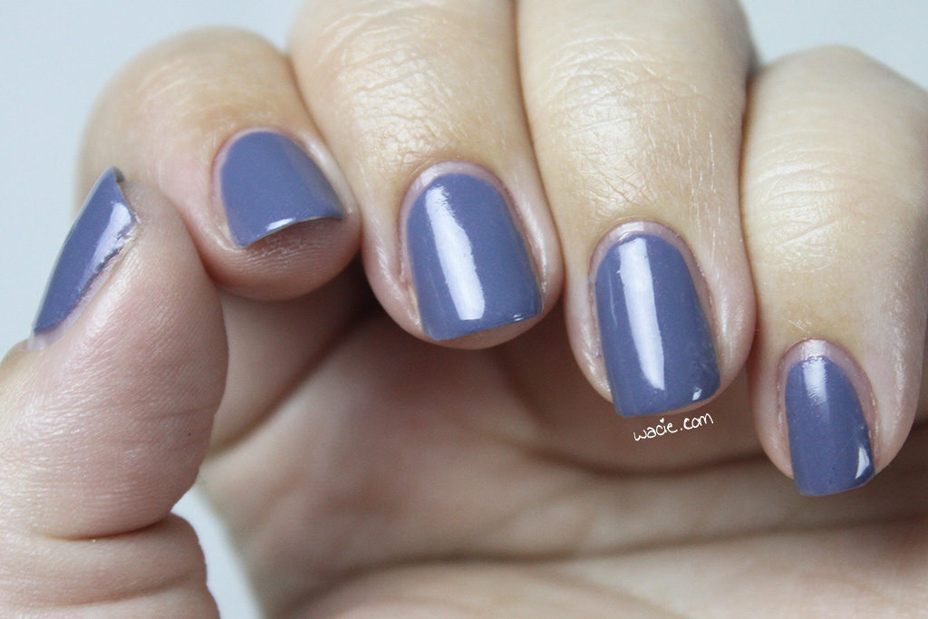
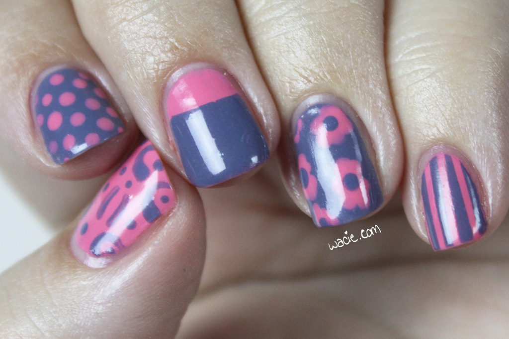
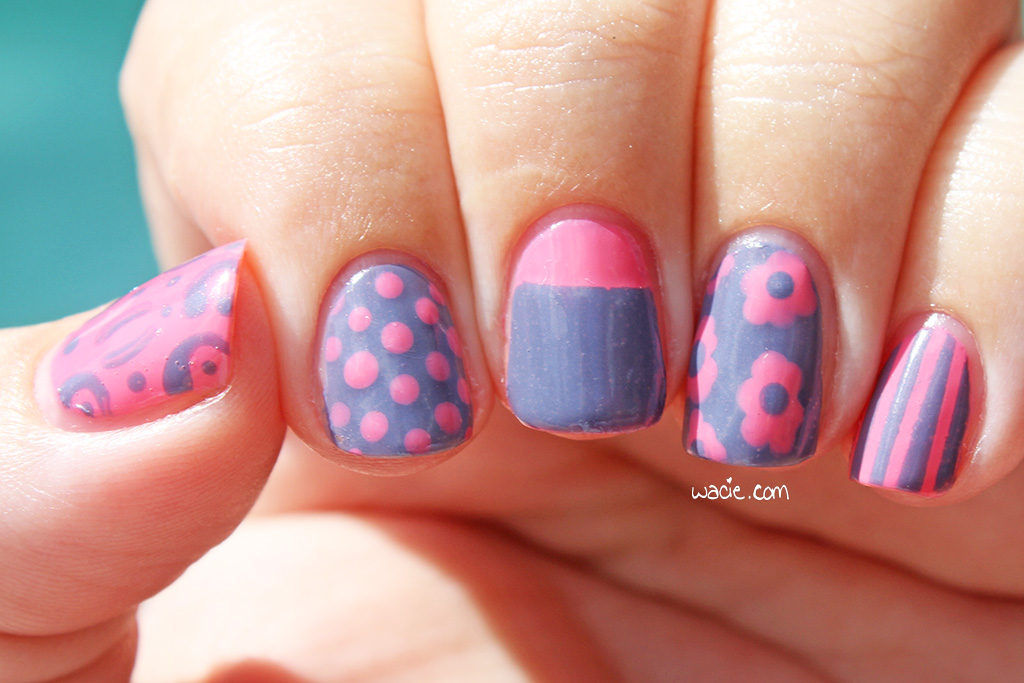
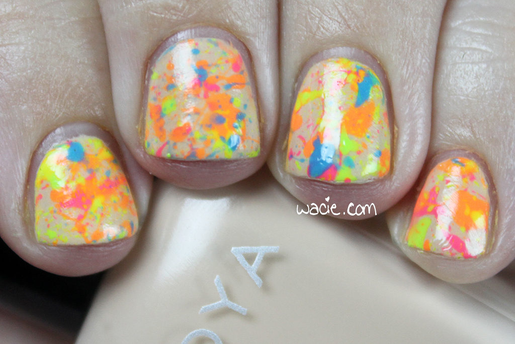
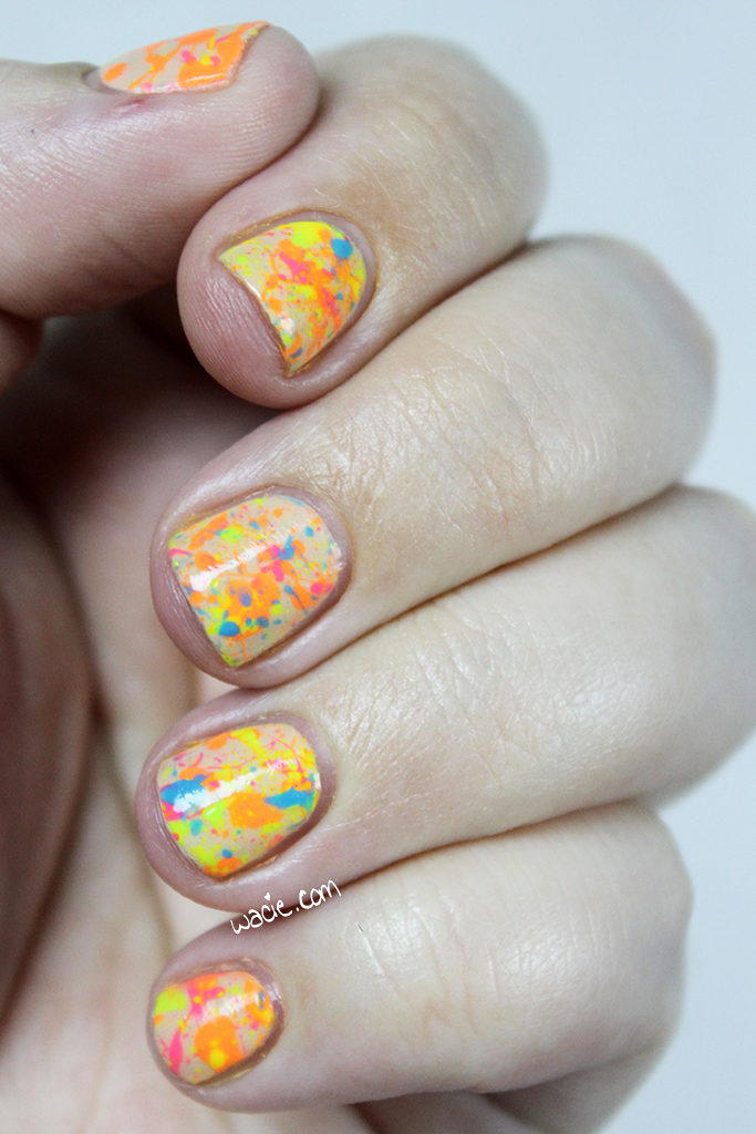
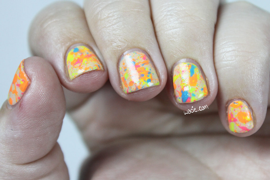
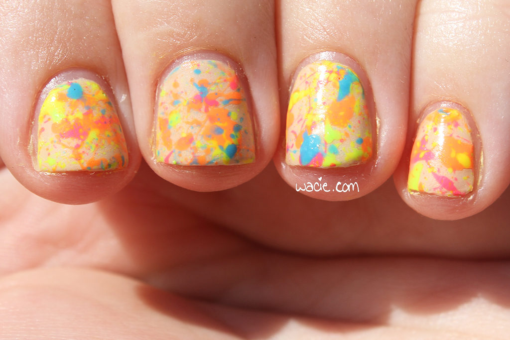
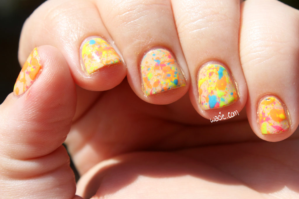
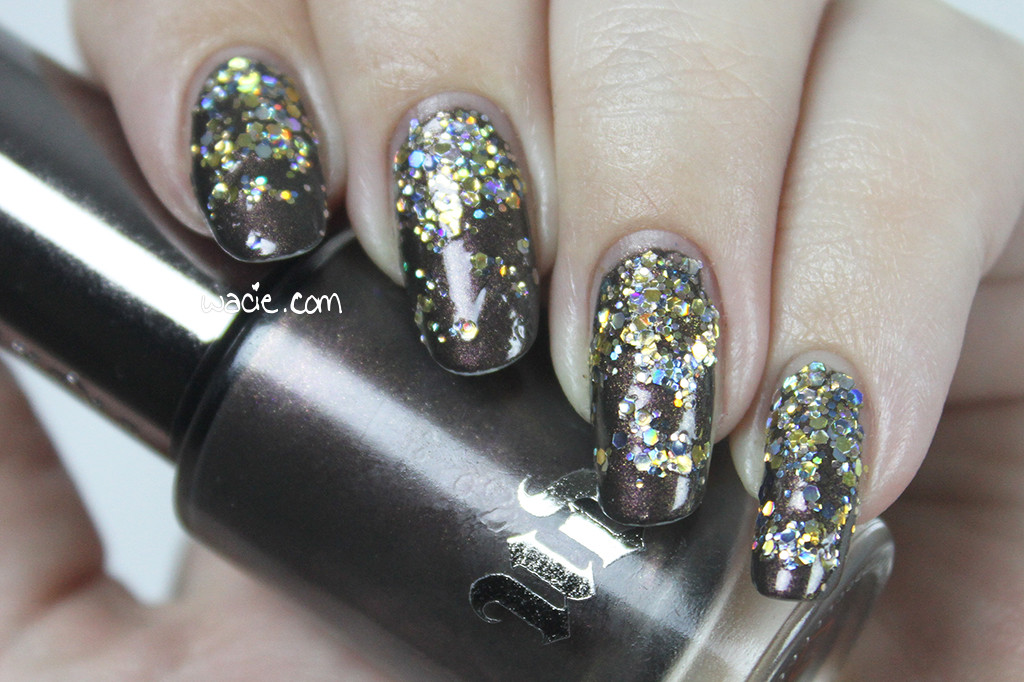
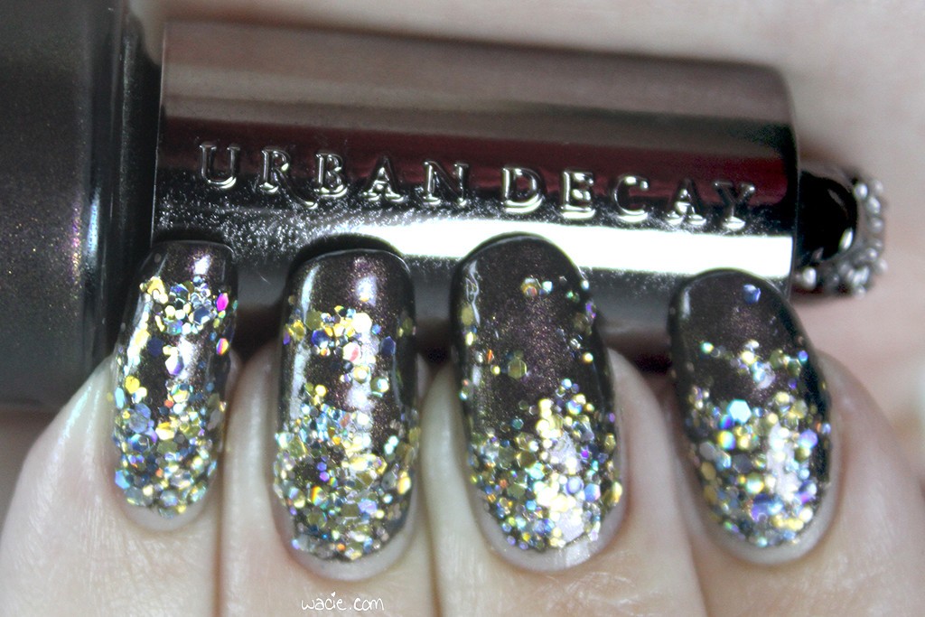
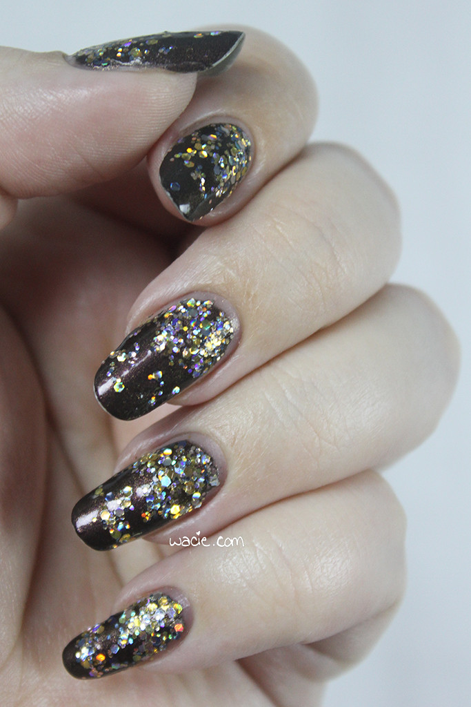
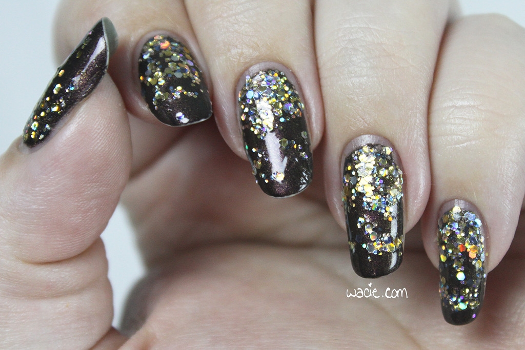
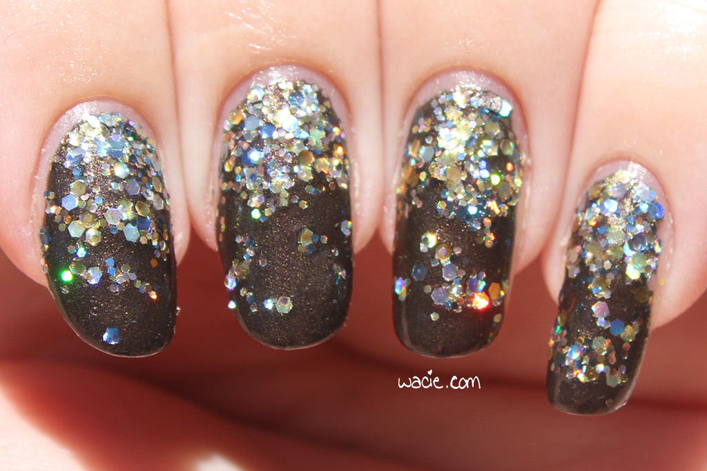
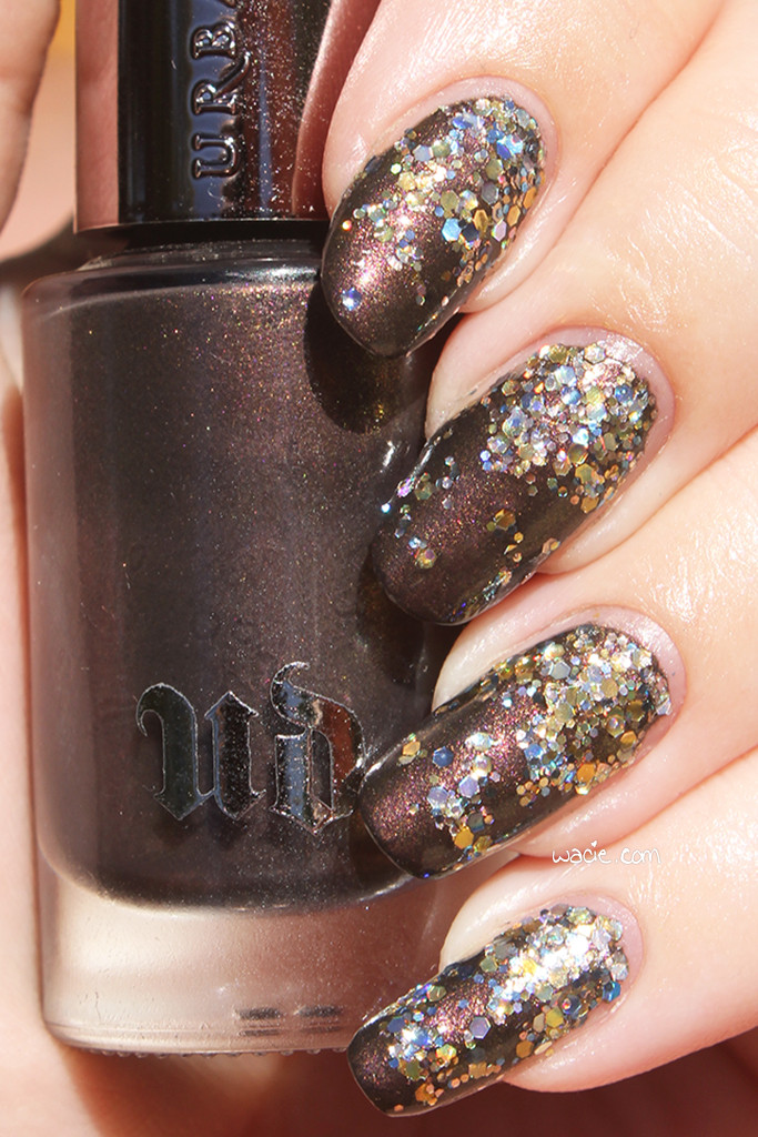
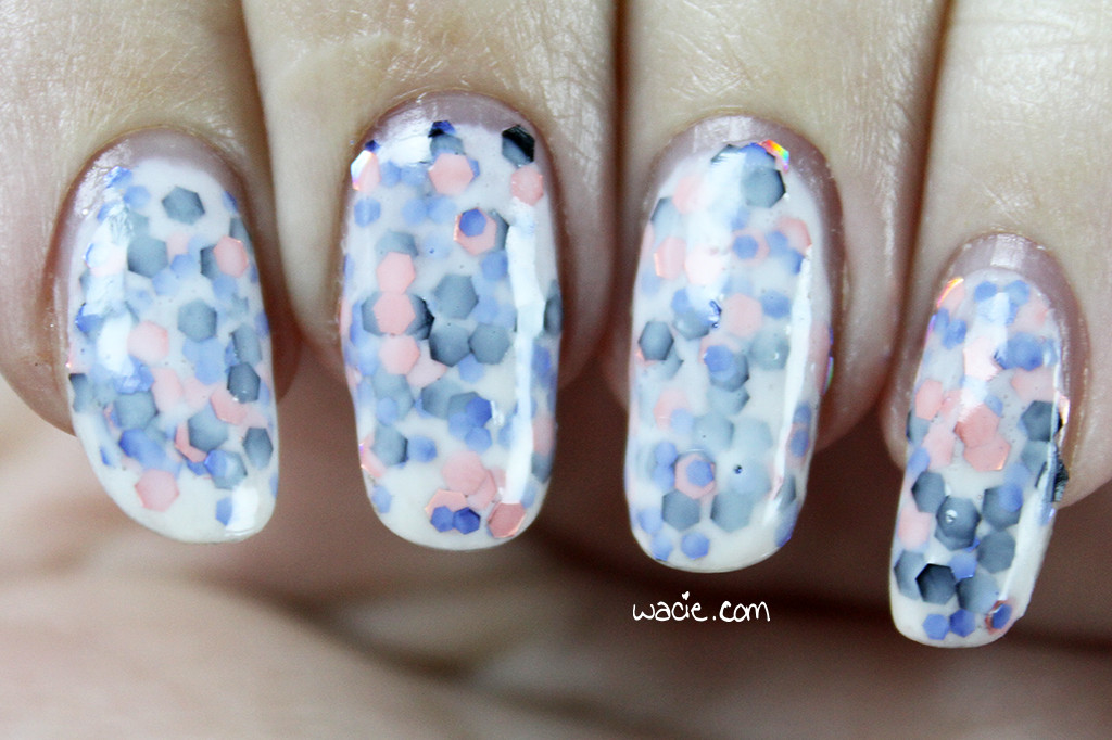
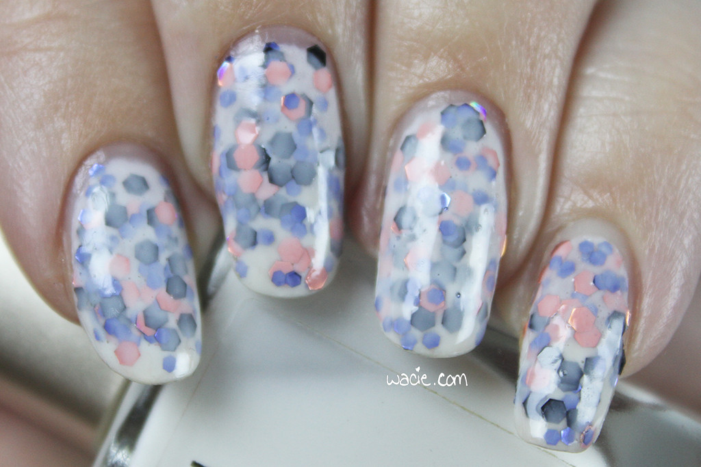
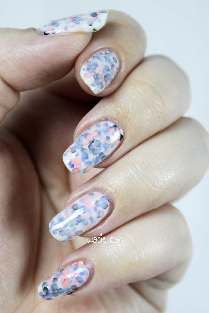
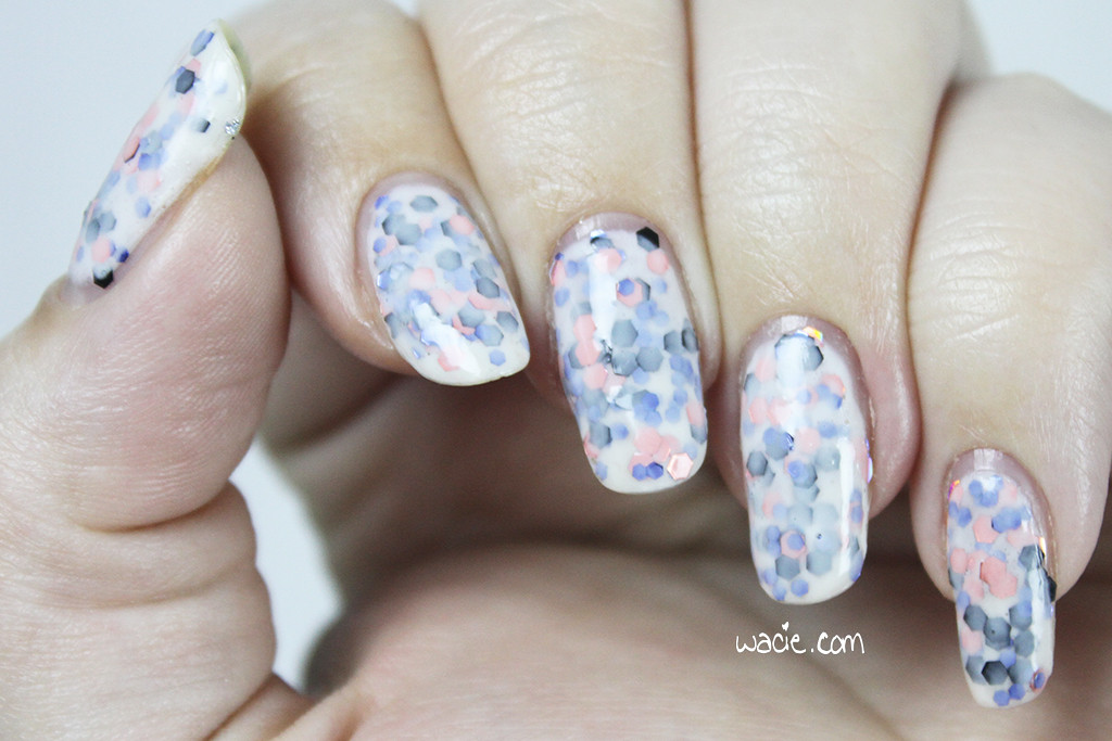
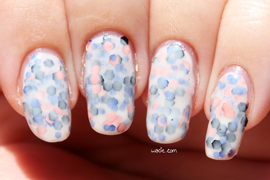
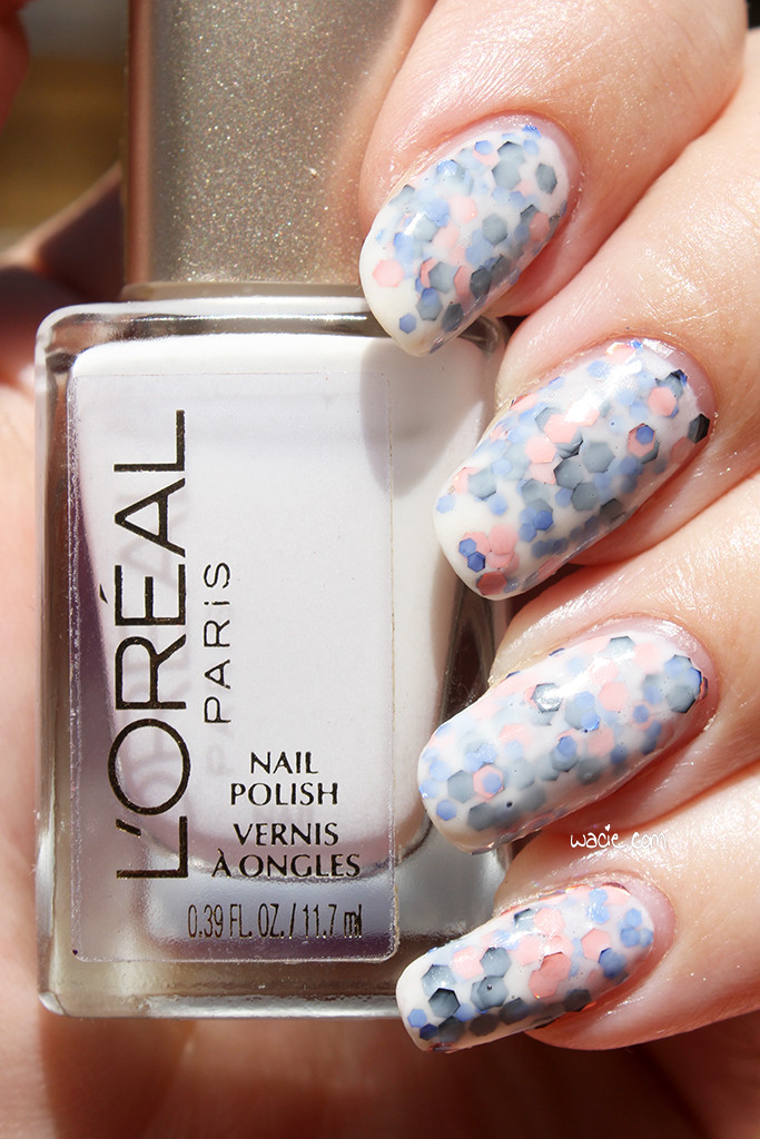
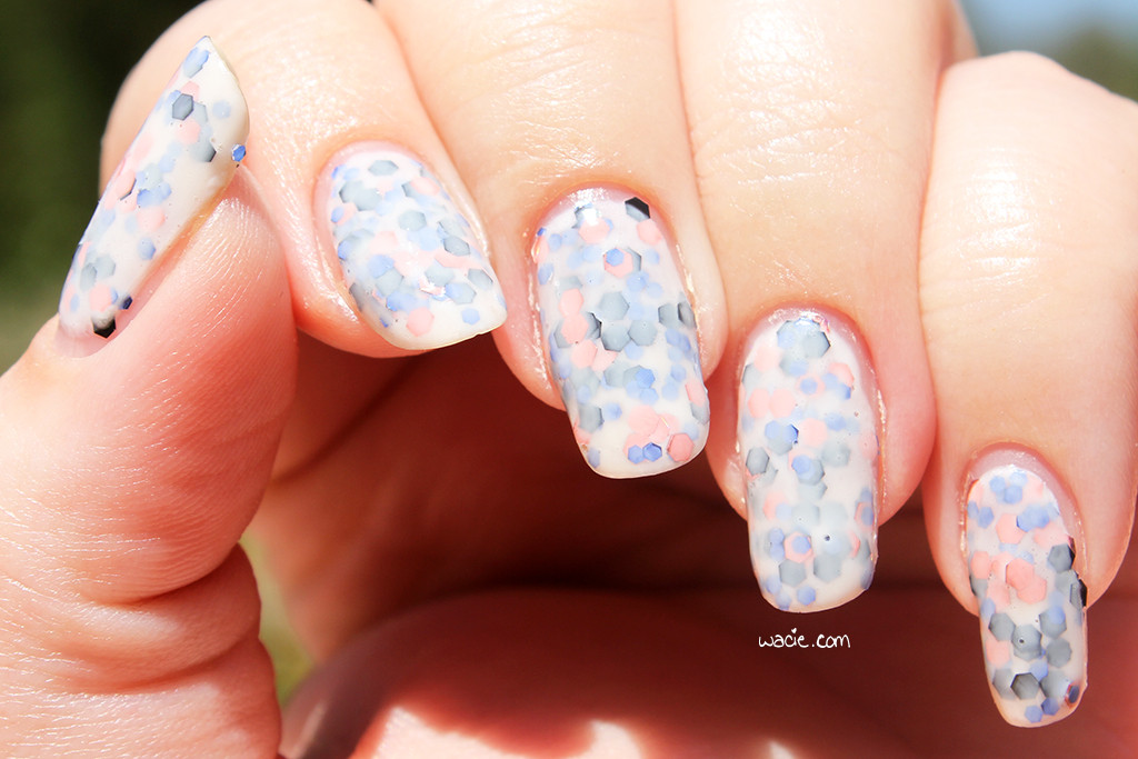
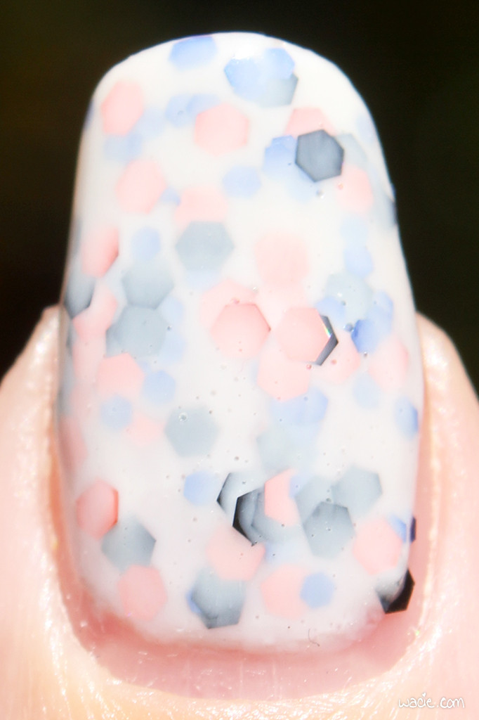
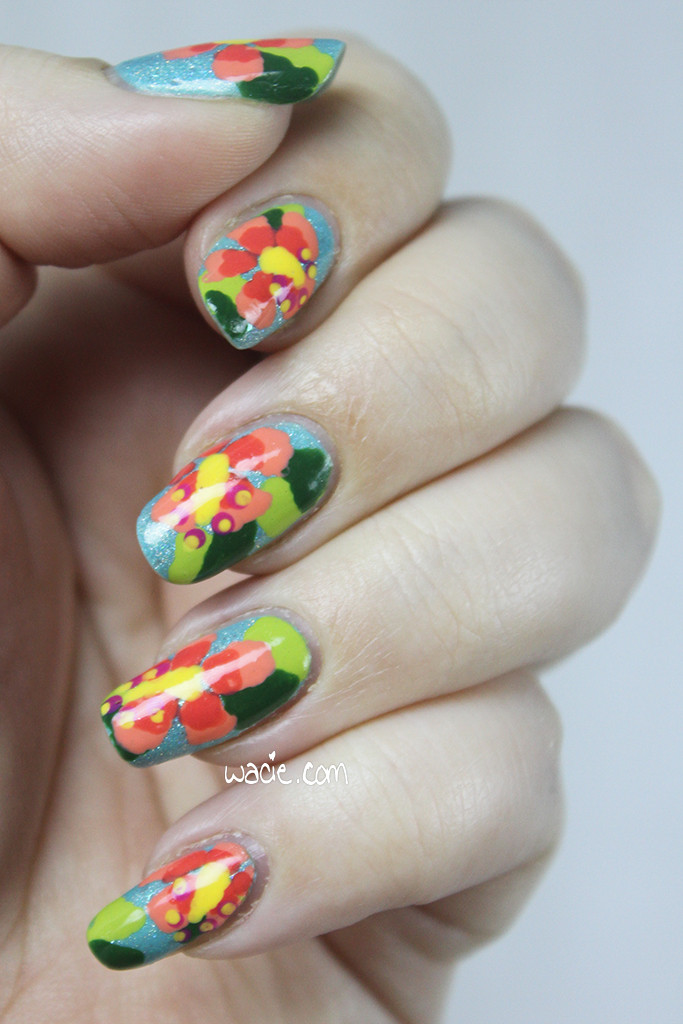
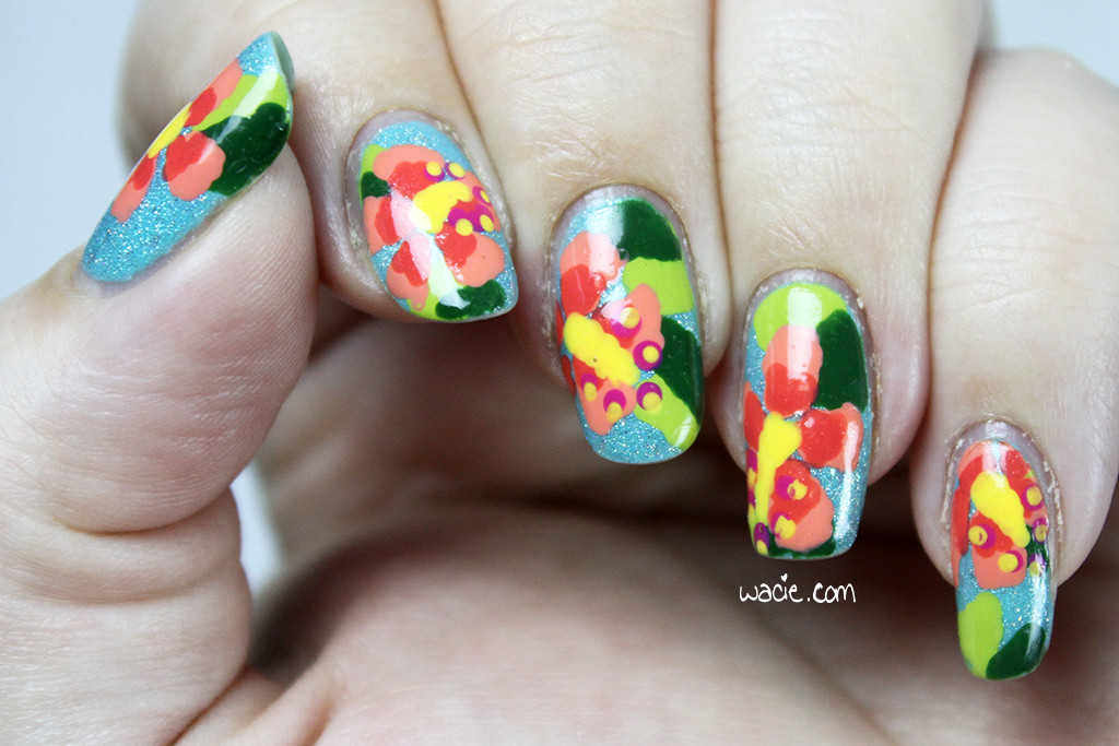
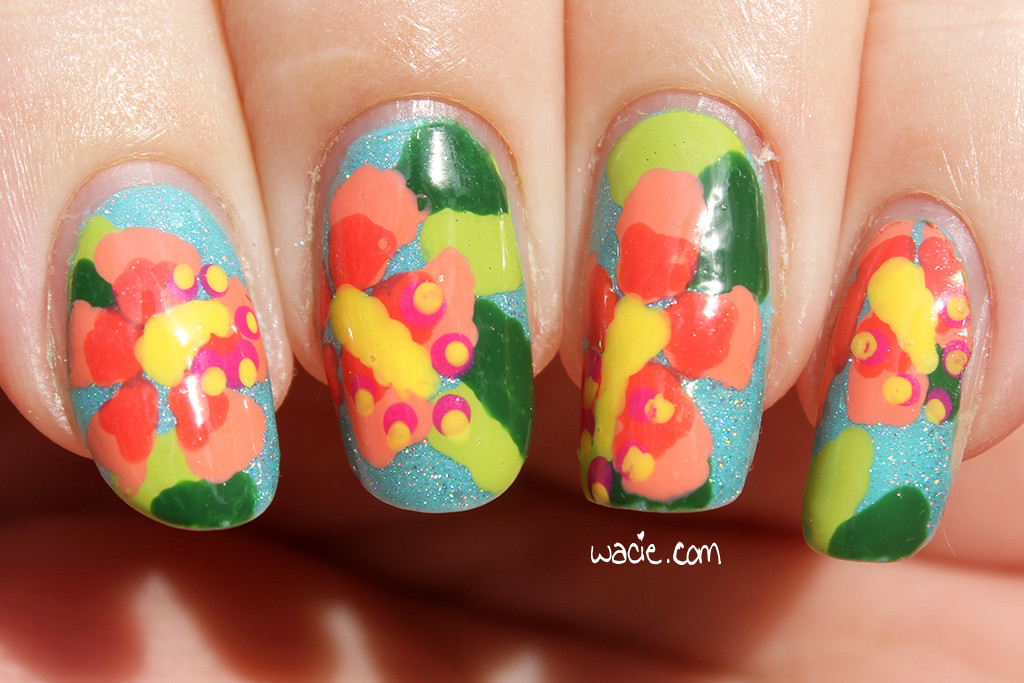
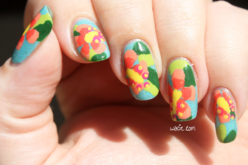
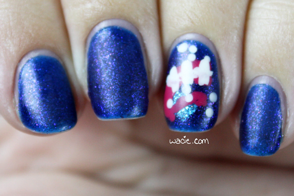
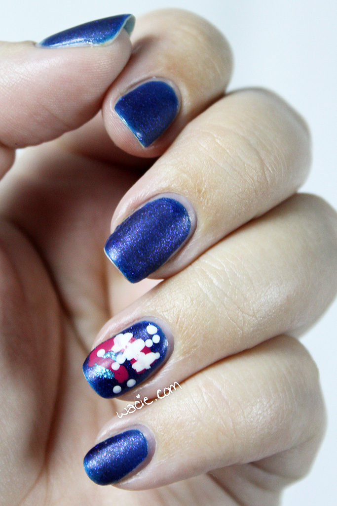
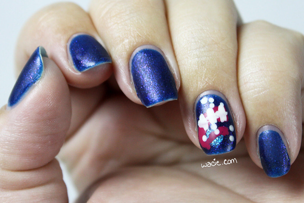
Welcome to the Hobby Polish Bloggers link-up for the month of July! Each month, this Facebook group chooses a mani theme; it’s up to the participant to decide how simple or elaborate their mani will be. Anything goes as long as it adheres to the theme! July’s theme is space, and I decided to take my mani in a different direction; I attempted to recreate NASA’s Project Orion insignia in mani form. For this look, I used Monster Polish‘s I was Hoping for Minimalism, but I Think I Came Out With Magician as the base, and the logo was done with Blue-Eyed Girl Lacquer‘s Terrific Twos (the planet), Sally Hansen’s Magenta Moves (the whoosh), and China Glaze’s White on White (the stars). All nails were finished with Seche Vite top coat and Essie’s Matte About You matte coat.
![]()
It’s probably no secret that I’m a big spaceflight nerd. I follow rocket launches, planetary science updates, and ISS experiments almost as closely as I follow indie polish releases. When Orion was launched for its first experimental flight test in December 2014, you better believe I was watching it online. It was delayed a few times due to weather violations, and once because there was a boat in the launch zone. I didn’t trust myself to not sleep through it, so I just stayed up for three days. It was really the most exciting thing I’d been since Curiosity landed on Mars.
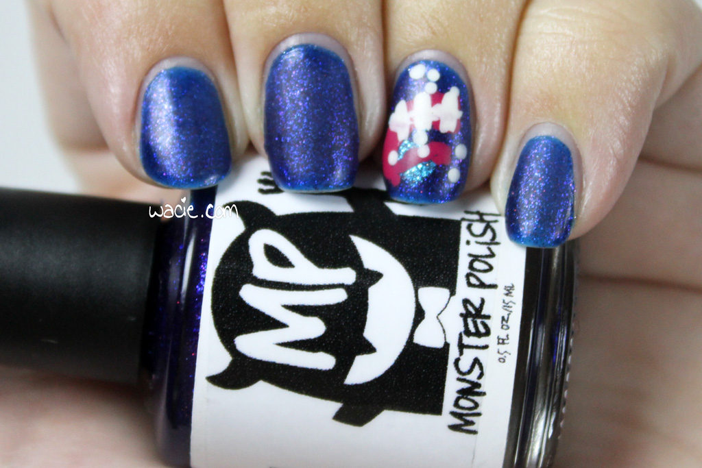
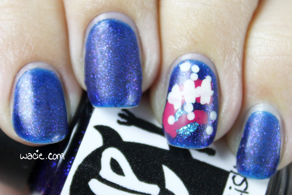
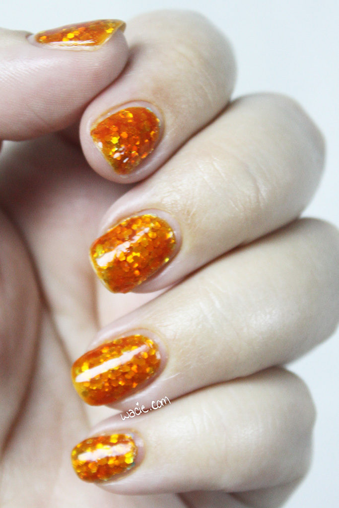
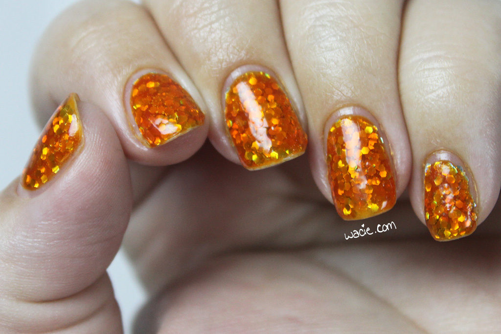
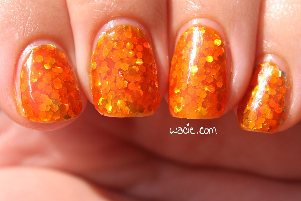
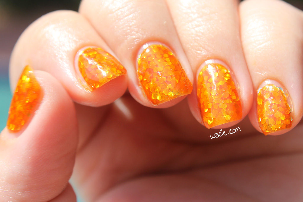
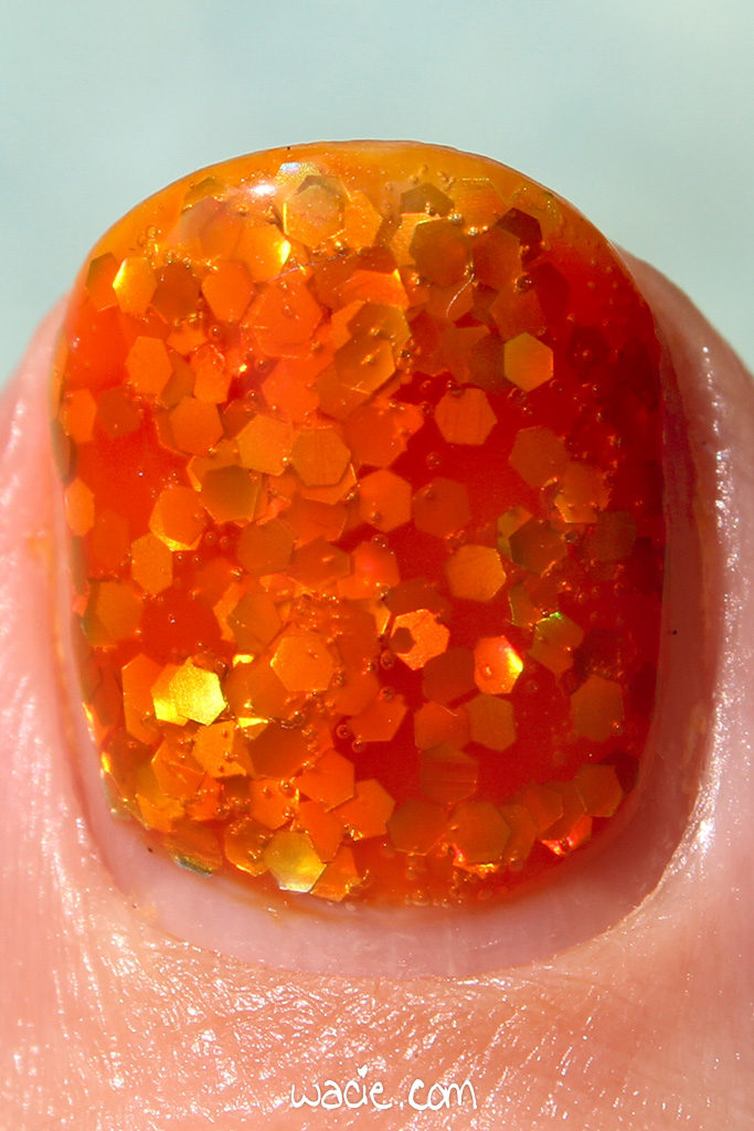
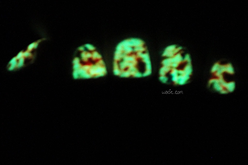
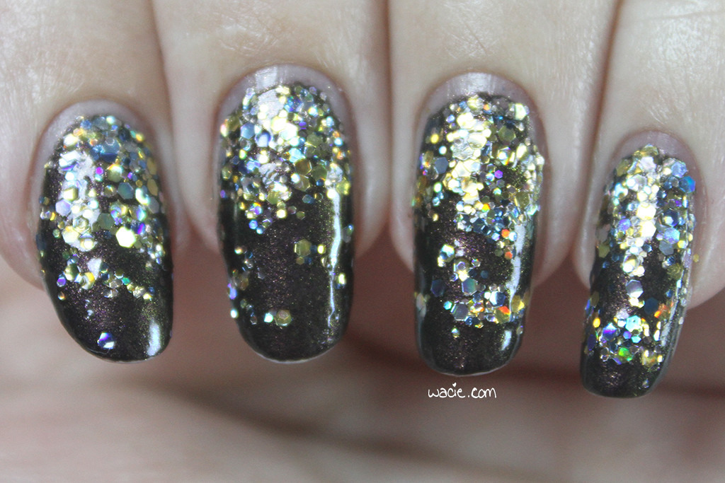
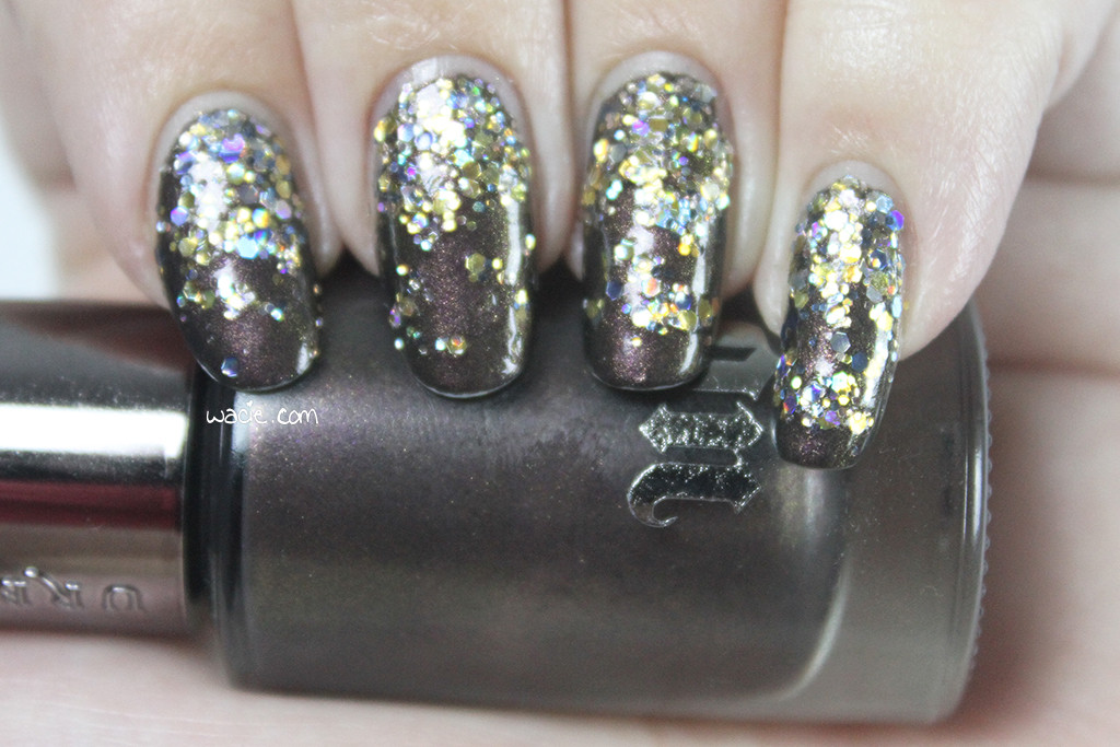
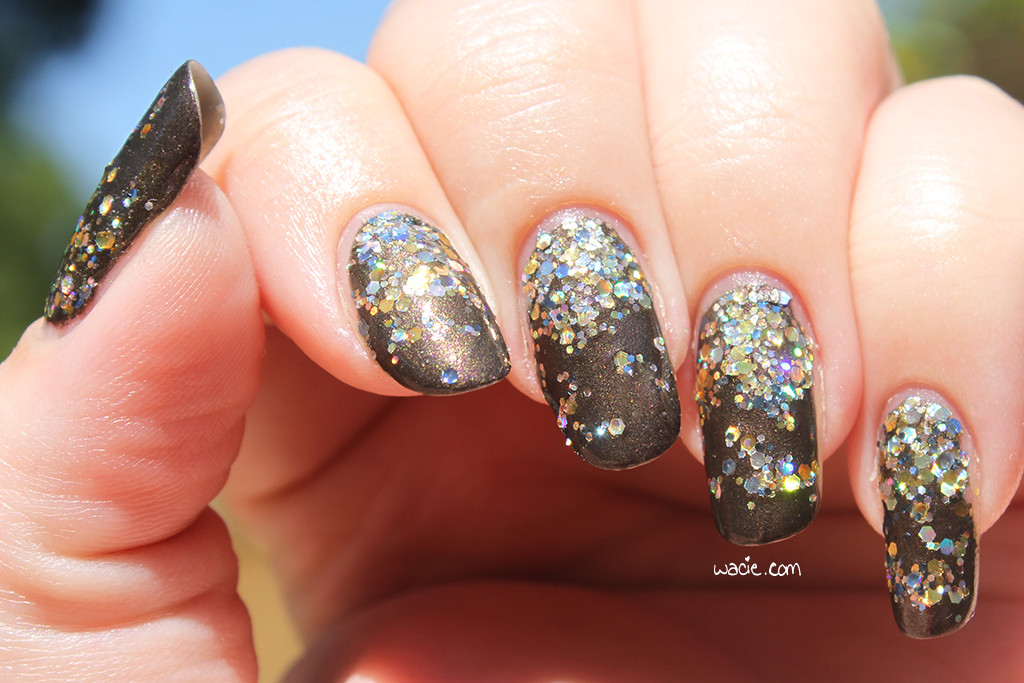
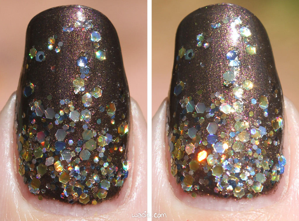
My interpretation of the logo is a little sloppy, but I think it’s recognizable at the very least. I think the logo is actually pretty clever; the Orion constellation is hidden inside it. My nail wasn’t quite big enough for the whole design, so it’s a little cramped. The Monster Polish I used as the base is the perfect spaceflight blue. I love that the planet depicted is now a mound of glitter. I’m happy, overall, with how it turned out.
Part of the reason I did this mani was to raise awareness of what’s going in modern spaceflight. It’s disappointing to me that more people either don’t know about or aren’t interested in the gains we’ve made in the past few years. There’s so much happening now: science is done on the ISS every day, SpaceX is continually innovating, and missions to Mars — likely on the Orion spacecraft — will be inevitable. This is like near-Disneyland levels of excitement to me.
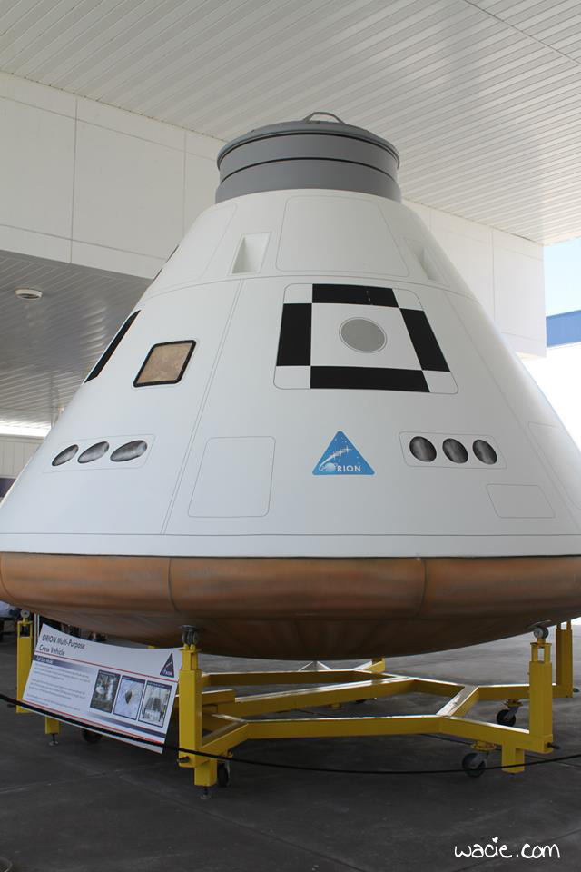
This is an Orion model at Kennedy Space Center. It was a little more convincing in person.
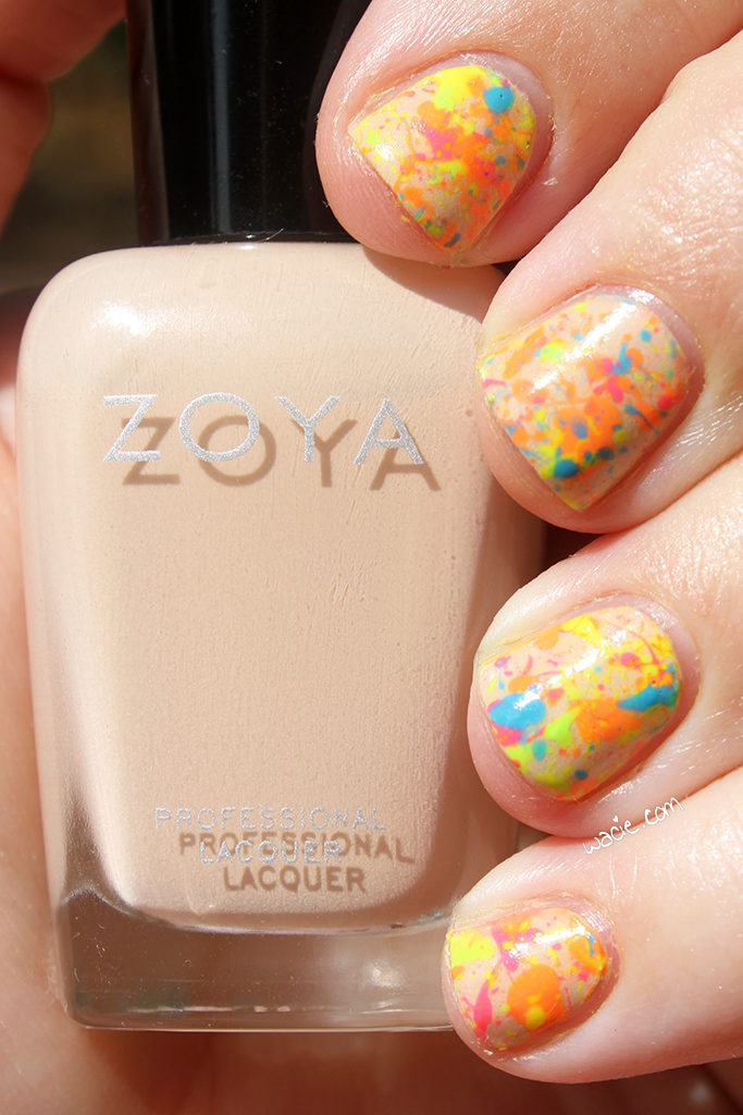
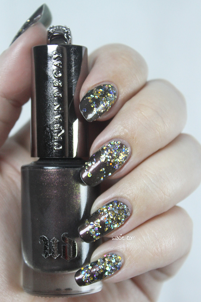
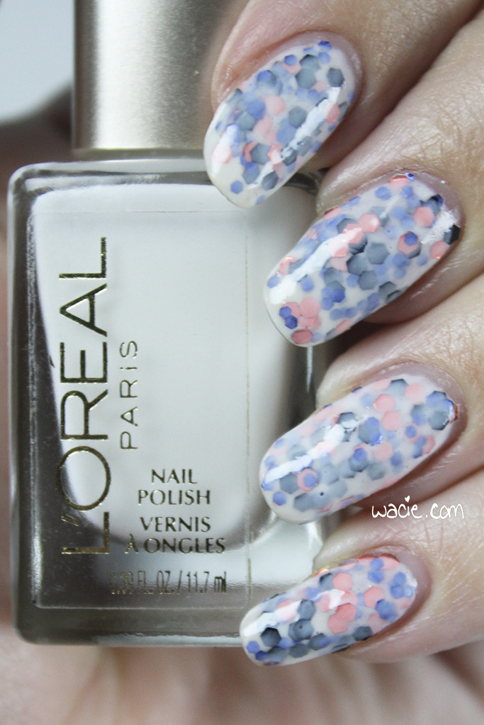
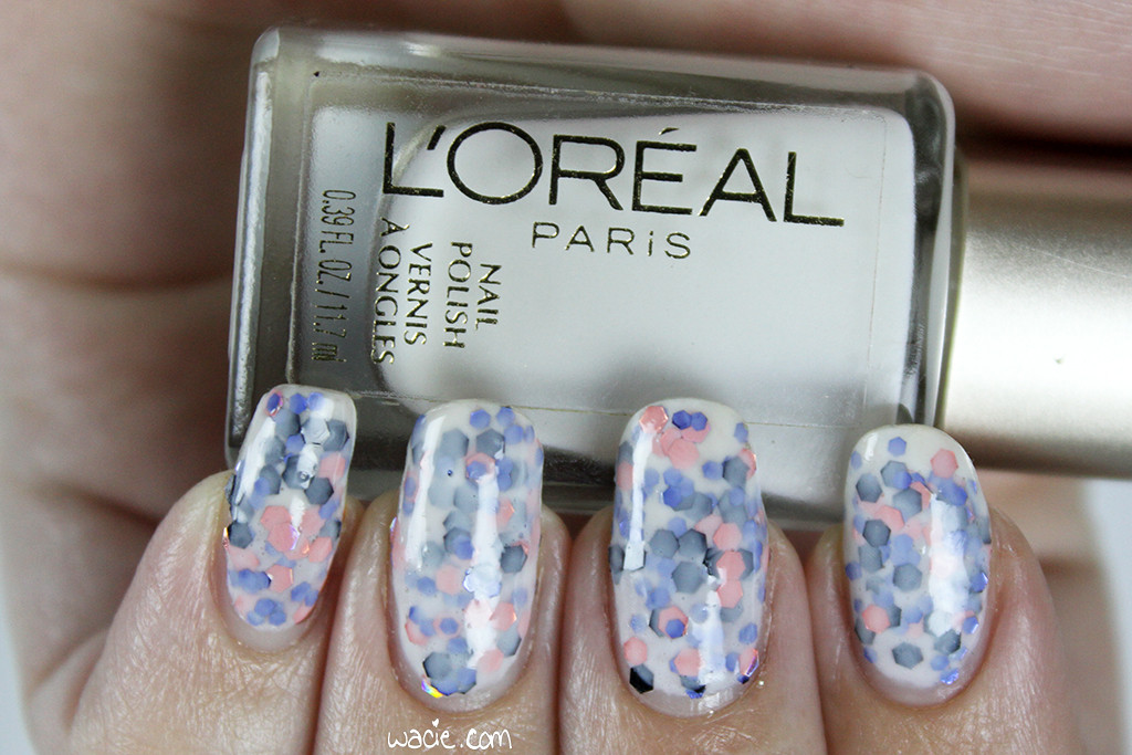
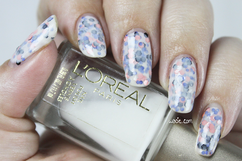
I was Hoping for Minimalism, but I Think I Came Out With Magician and other Monster Polishes are available in their online shop. Terrific Twos was a BEGL limited edition and has since sold out; other Blue-Eyed Girl Lacquers are for sale in their online shop. Sally Hansen and China Glaze are available in stores nationwide.
I bought these polishes myself.
 Loading InLinkz ...