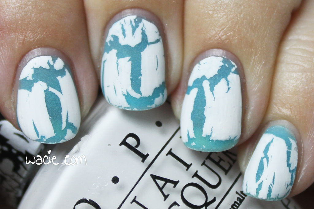
Manicure Monday: Inky Opal

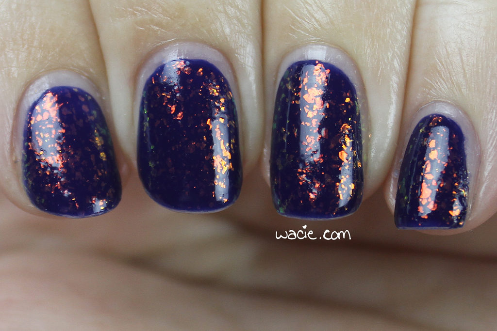
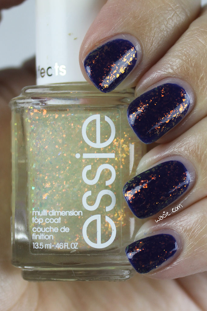
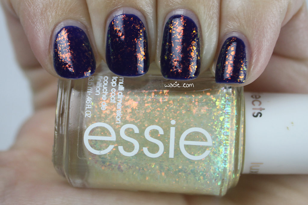
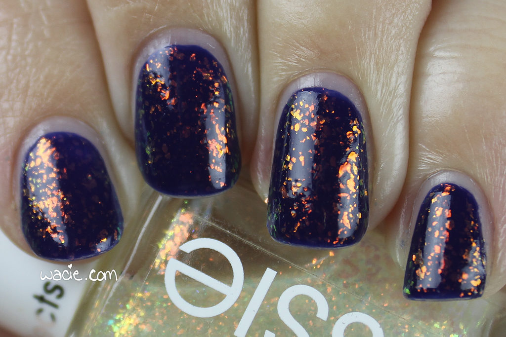
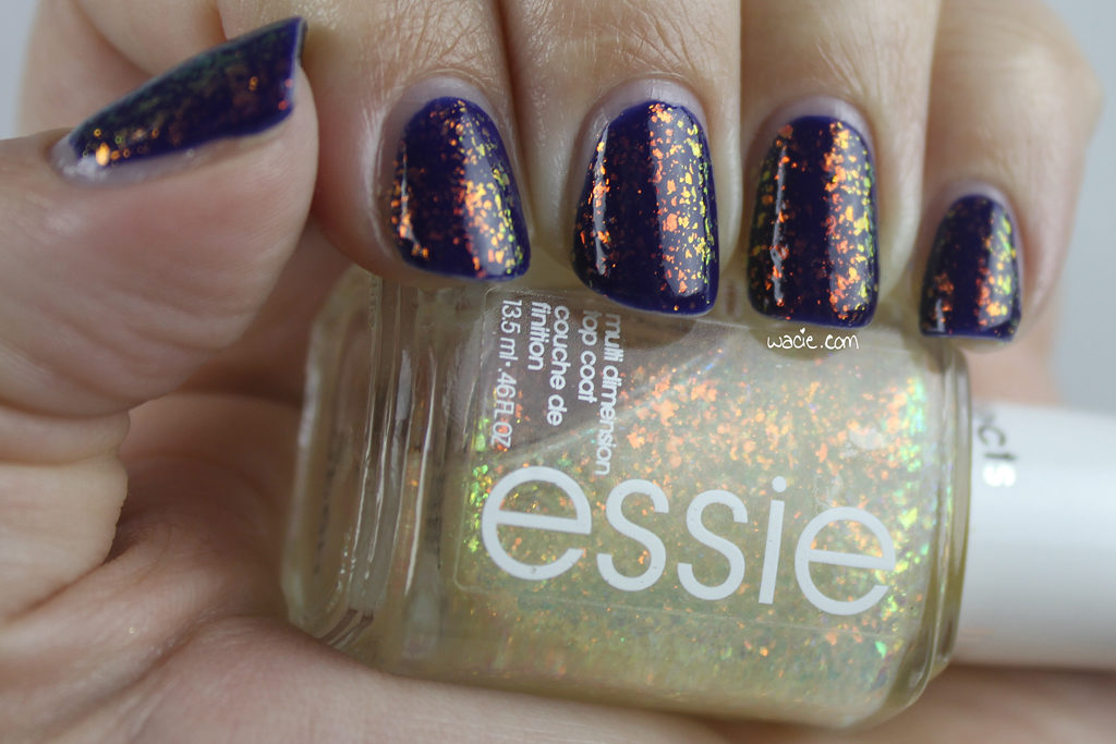
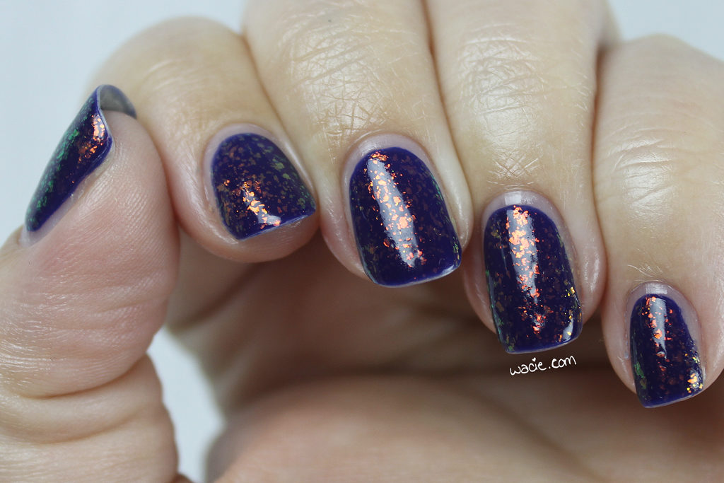
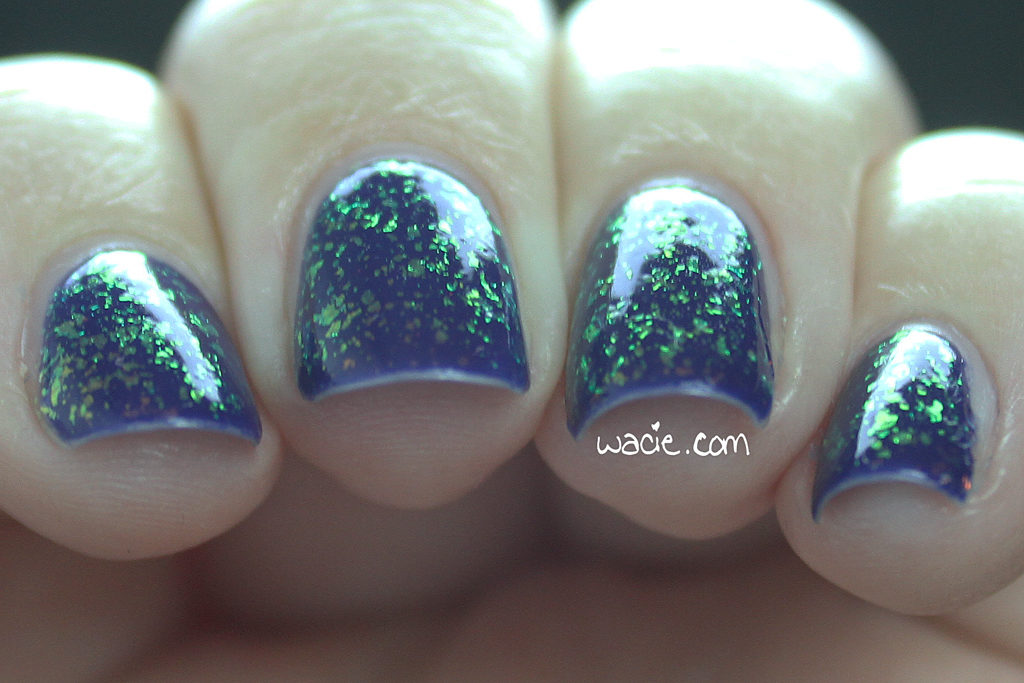
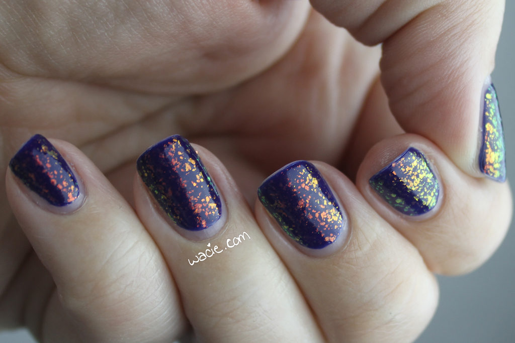
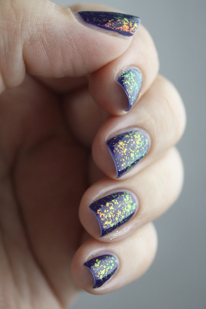
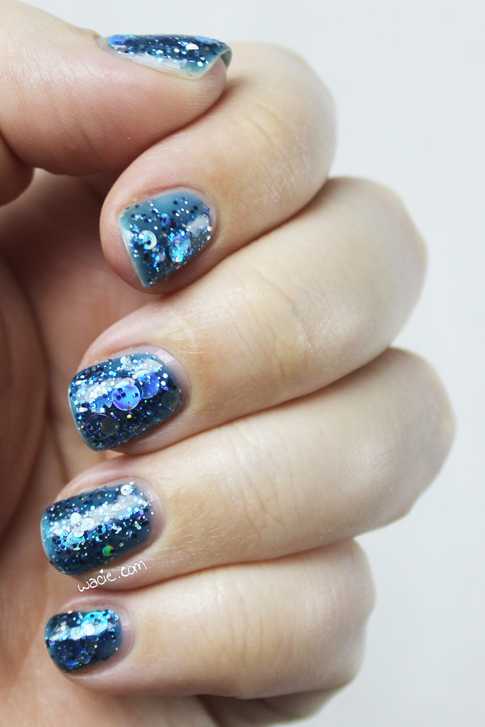
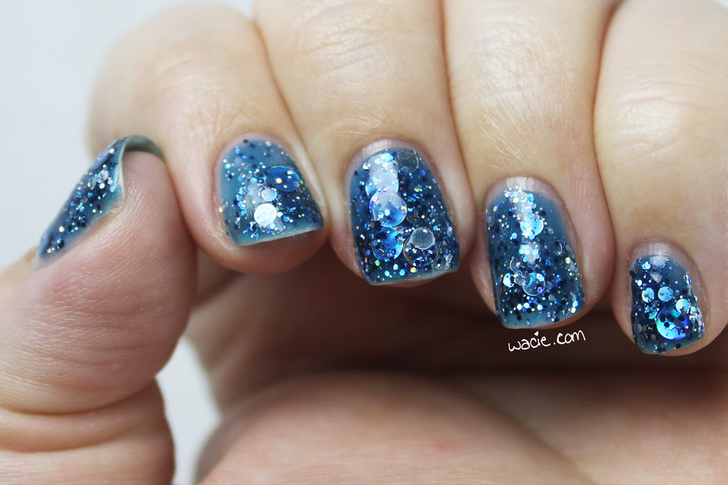
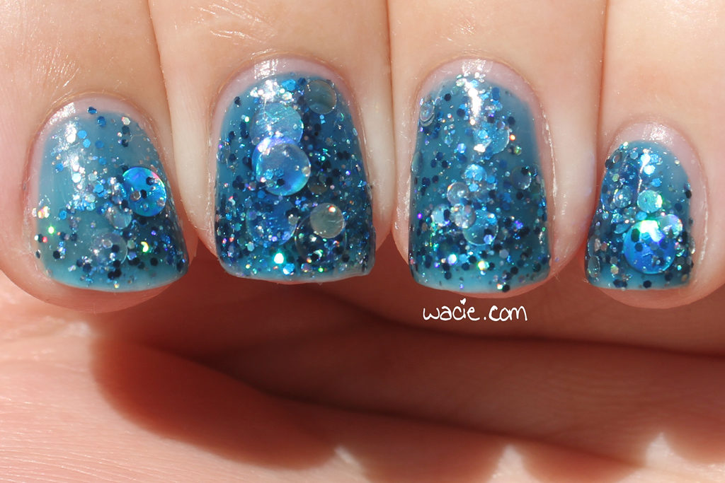
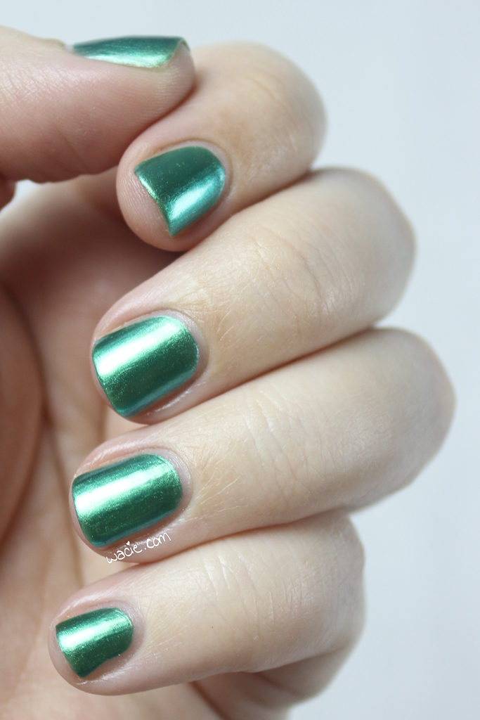
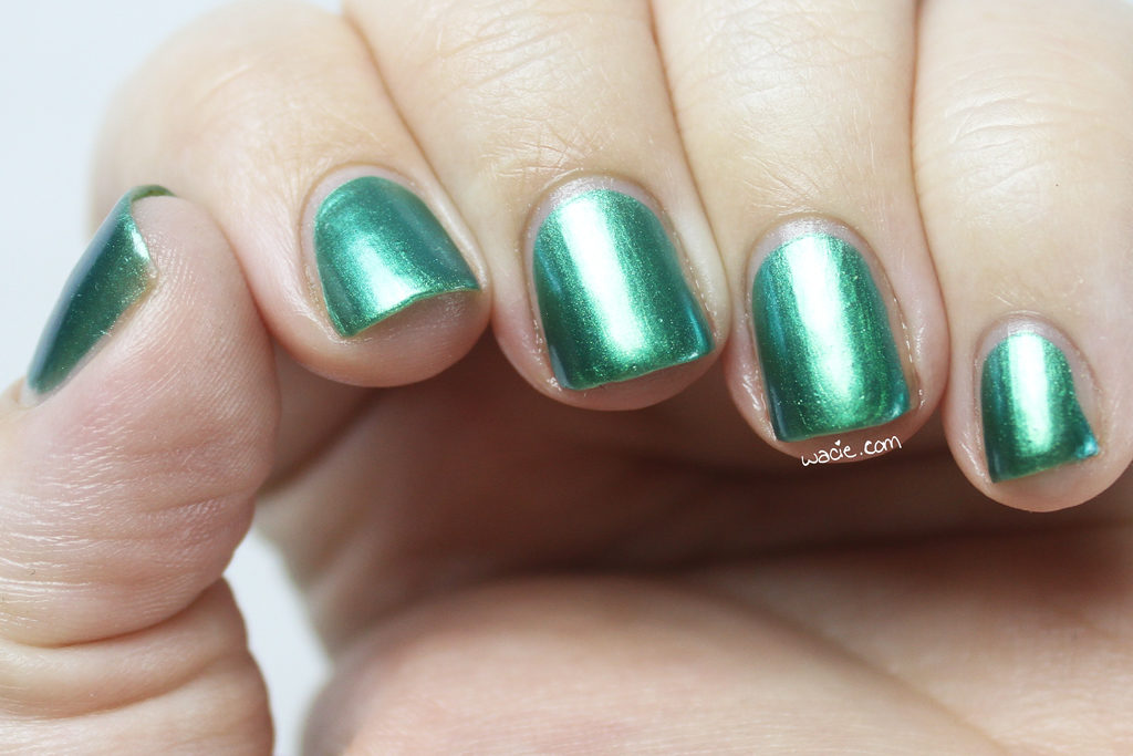
Hello! I feel like today’s mani is a special occasion because I’m using Essie’s Shine of the Times. Remember when this was the polish every nail addict needed but couldn’t find? I remember checking every drugstore in town when I heard it existed, and then I had to resort to buying one on Amazon. About a year after that, I did find two in the wild, hidden away in a Walgreens sale bin. It was the greatest day. For this look, I used Shine of the Times over Julep’s Char.

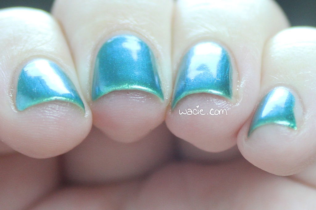
Char is the best undies for shine of the Times. It’s dark enough for the fiery flakies to look their best, but has just a hint of color. I love Shine of the Times over black, but it’s kind of basic. I love substituting a dark gray, blue, green, or plum for black. It feels a little more sophisticated. Plus, when it’s over dark blue, it kind of looks like unicorn pee.

I don’t think there’s a polish that Shine of the Times couldn’t make better, though. Honestly, I chose Char at random. I was totally prepared to layer it over any creme I plucked from the drawer, but now I can’t imagine a better combination.

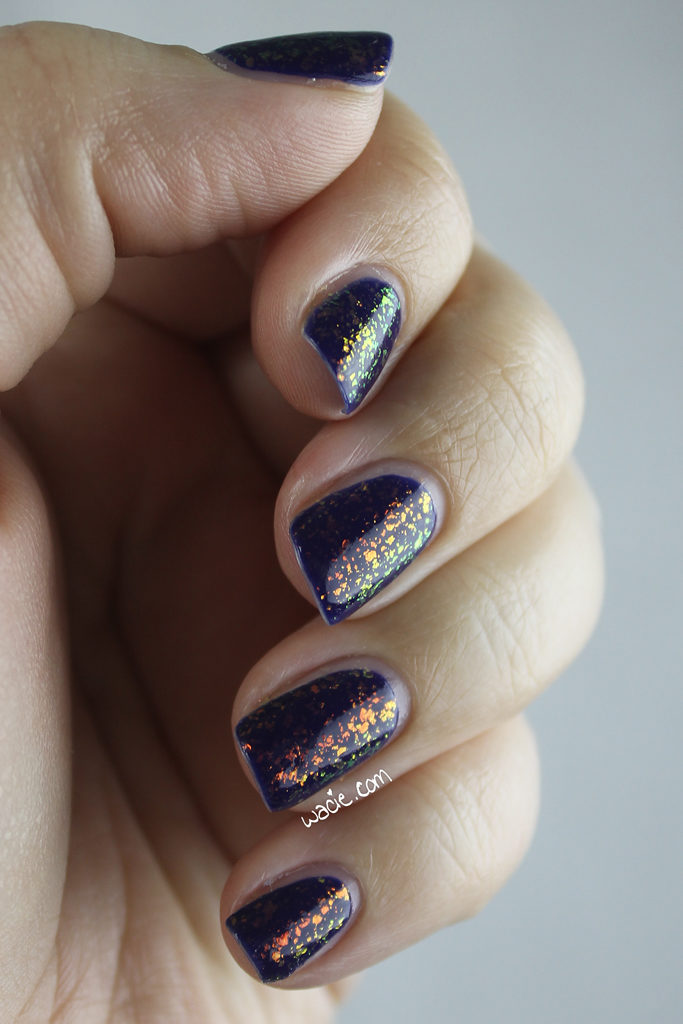
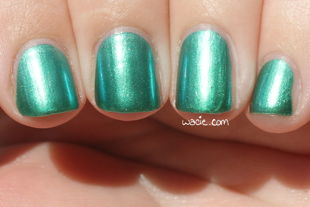
Unfortunately, I didn’t get any sunlight shots of this thanks to the impending winter storm, or for those of us in Florida, rain. I think I captured the shift pretty well, though, and my flakies came out sharp. I never get studio photos this good.

Shine of the Times, as you may know, was discontinued by Essie. Char may also be discontinued; it’s out of stock on julep.com.

I bought these polishes myself.

Nailspiration: Alterre NY’s Resort/Winter 2017 Collection

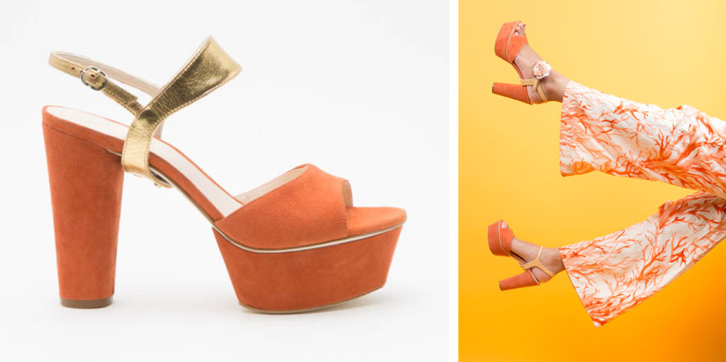
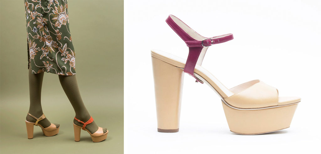
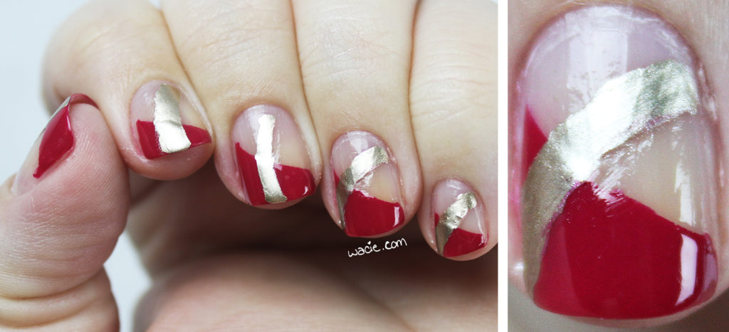
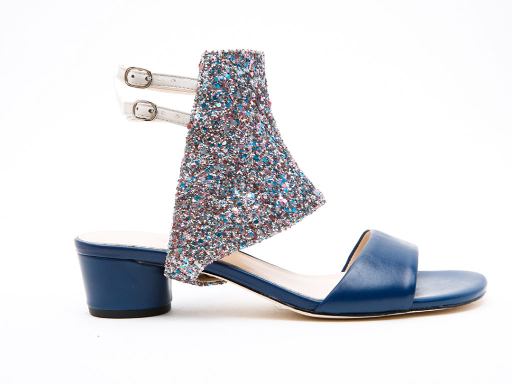
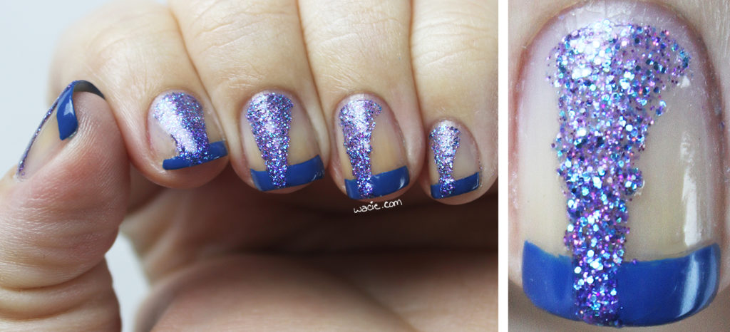
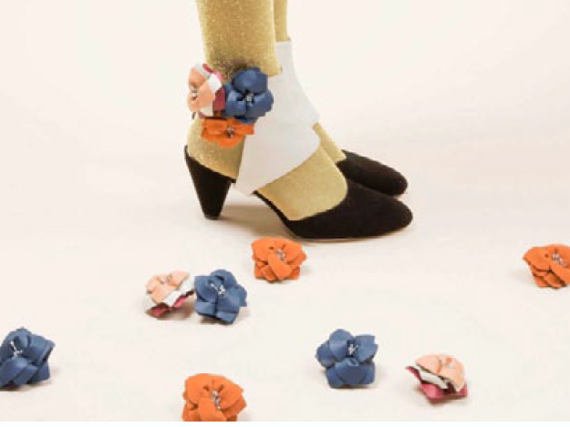
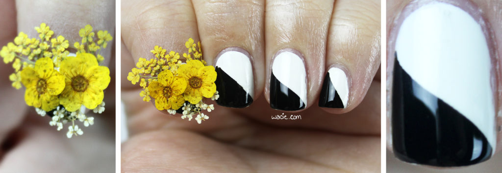
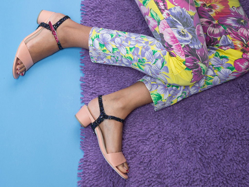
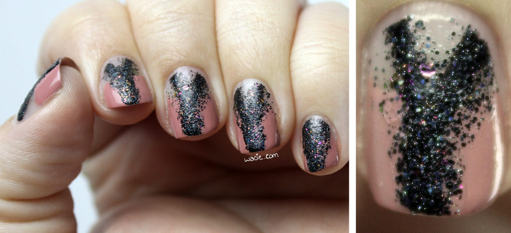
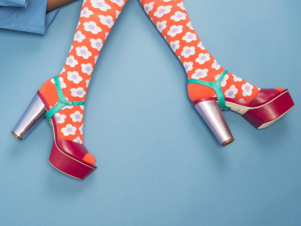
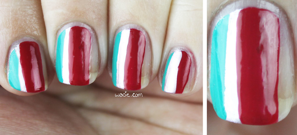
Hello, reader! Today’s post is all about shoes and manicures based on shoes. I got an early look at Alterre‘s 2017 shoe collection, and after seeing how easily the designs and colors lend themselves to negative space manicures, I had to give it a shot.

This post is a sponsored post by Alterre NY and Brandbacker. The opinions stated in this post are my own.

If you’re unfamiliar with Alterre, imagine this: modular sandals. You start with a sandal base, with straps that snap to the bottom sole. Different straps (the look) can be added to the sandal base (the lift) to customize the shoe. All looks work with all lifts and can be used to create a huge combination of different shoes. Imagine the possibilities!

This year’s collection, which doesn’t launch until September, is based on styles from the 1970s. The catalog contains a lot of earth tones and platform shoes, which I’m a huge fan of.

As I mentioned, I saw a manicure for every shoe in the catalog. The modular approach to negative space manicures works as well as it does for shoes.

P2’s French Kiss and Essie’s Good As Gold

These looks are completely outside what I usually do for myself. I did a lot of taping and a lot of freehand painting, which I’ve never been completely comfortable with. Some of these looks, I regret to say, aren’t up to my usual standards.

Blue-Eyed Girl Lacquer‘s Lighthouse on the Lake and Siren’s Quarter-Life Crisis

They’re kind of editorial, and maybe that’s the look I wanted all along. Not all of these looks, nail and shoe alike, are suited for everyday life, but they could be with just a few adjustments.

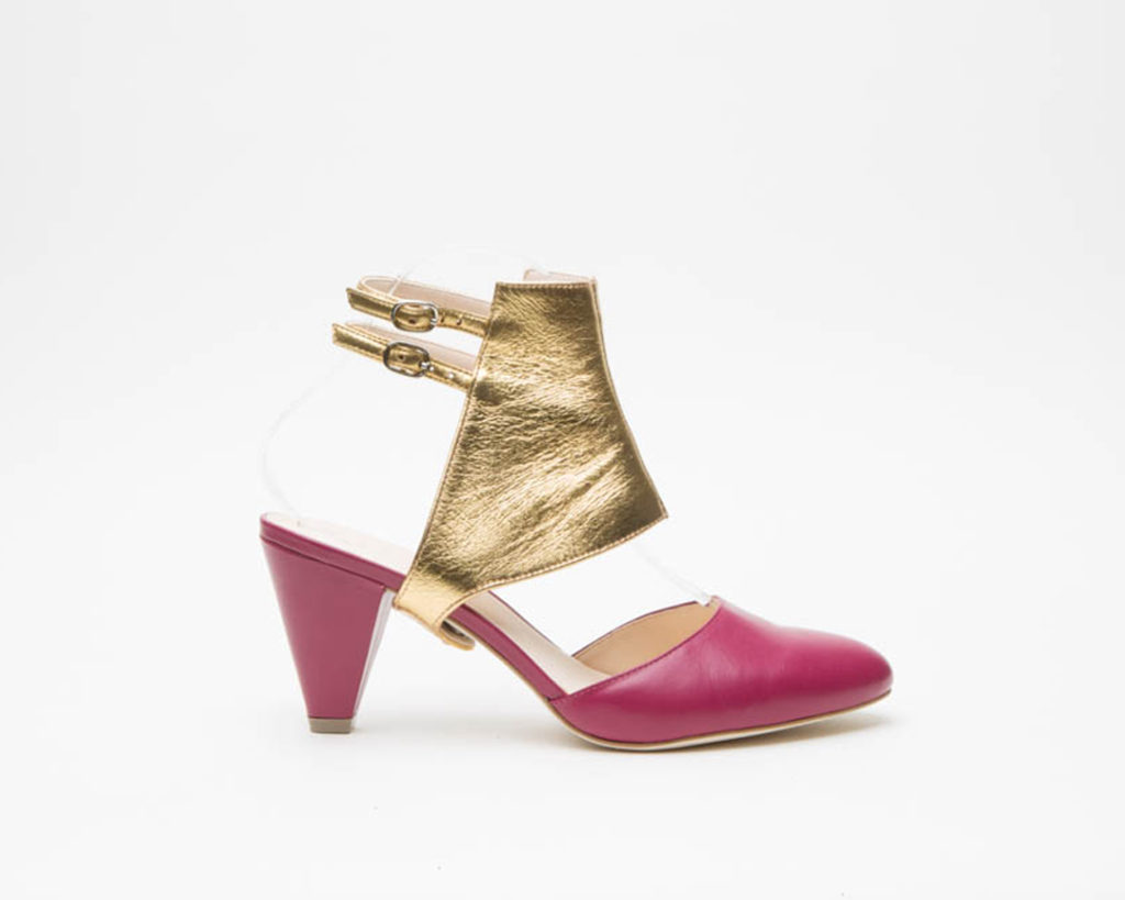
This was directly from the PDF catalog, I didn’t get a hi-res photo of this one.

Sally Hansen’s Black Out, China Glaze’s White on White, dried flowers from Ciaté

e.l.f’s Nude, Blue-Eyed Girl Lacquer’s I Could See Them Too

P2’s Artful, Essie’s Nothing Else Metals, OPI’s Dutch Tulips

So, what do you think, reader? I hope you like the shoes and some of the manis. I’ve been thinking of making Nailspiration a regular wacie.com feature, because I see so many things around the house and out into the world that would make fantastic nail art that I never get the chance to try.


This post is a sponsored post by Alterre NY and Brandbacker. The opinions stated in this post are my own.
All nail products featured in this post were purchased myself.

Manicure Monday: Accidental Mid-Mod

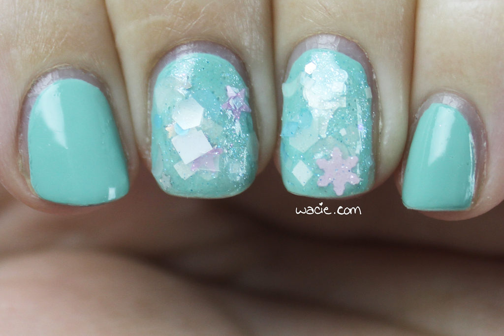
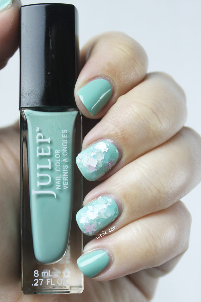
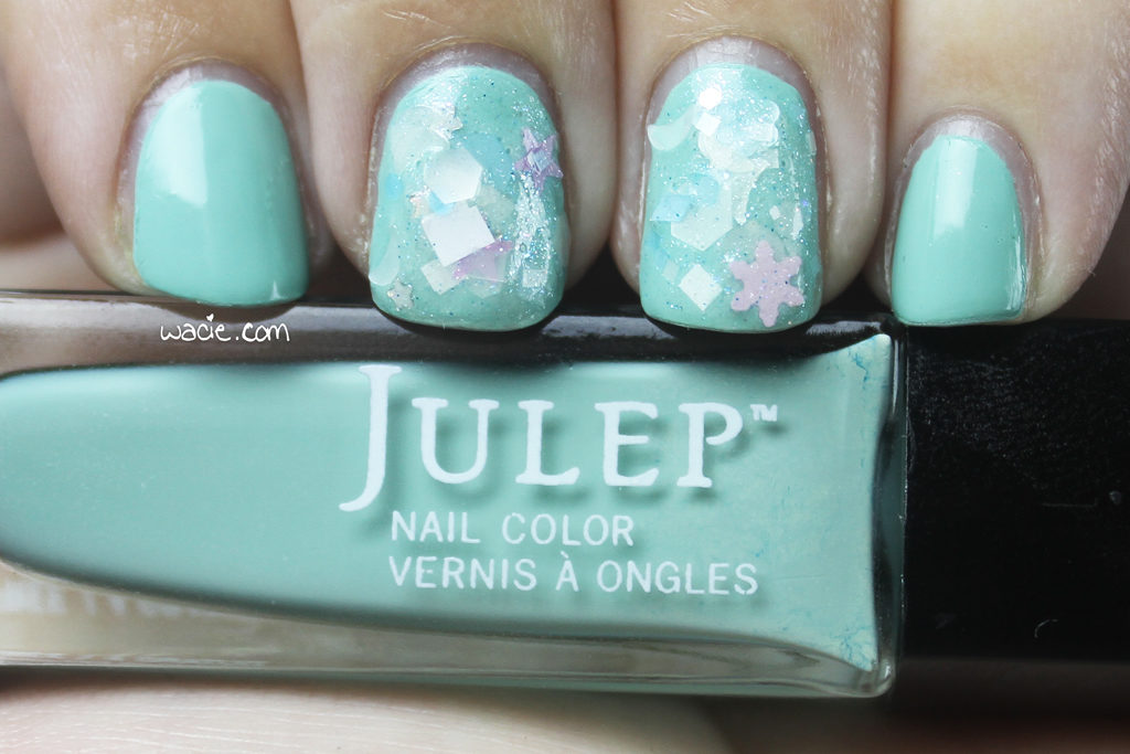
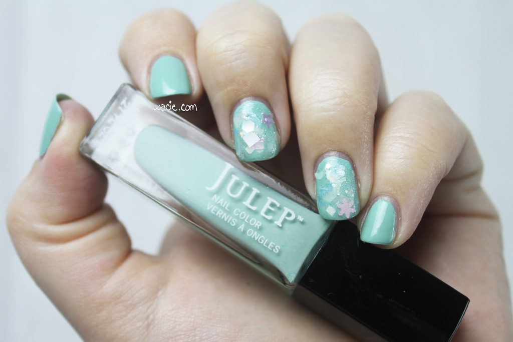
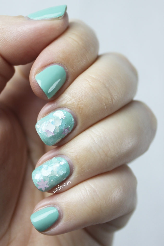
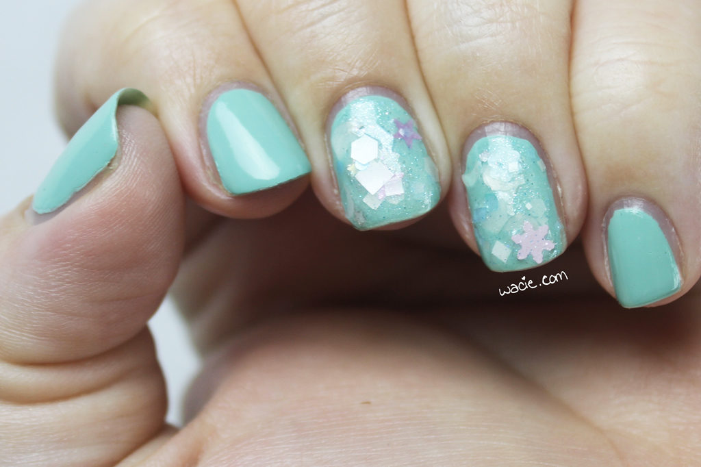
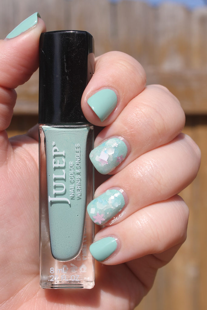
Hey, reader! Happy Monday! Today’s mani reminds me a lot of an older one, where some glitter on just a couple nails was a fashion statement. Man, accent nails seem so quaint now. For this look, I used Julep’s Dianna and Lynnderella‘s Seven Swans Swimming.

It’s been a long time since I’ve worn a creme unfettered like this, and I have to admit, I really like it. Cremes are so underrated. I used to pass over them so often, but when you really think about it, they’re the perfect finish; they’re color and shine and nothing else. This shade in particular, Dianna, has been a ton of fun to wear so far; it’s that perfect midcentury modern robin egg blue. Like I said, underrated.

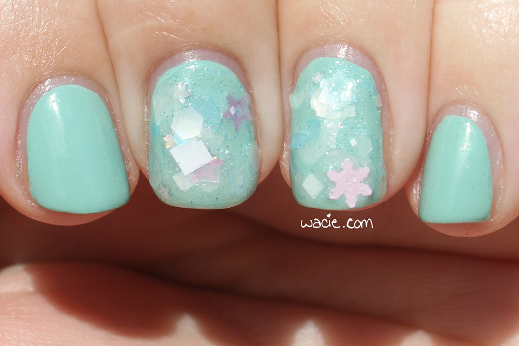
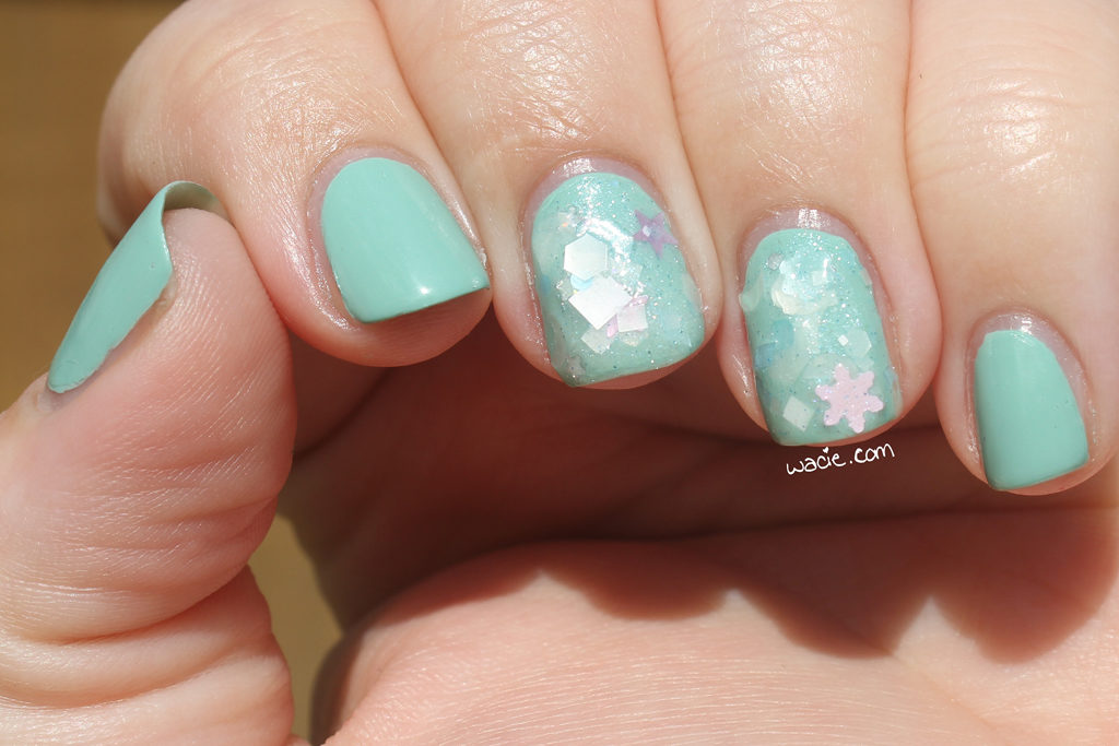
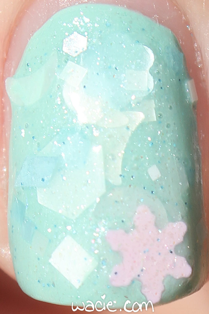
I chose Seven Swans Swimming for my accent because the shimmery blue base it’s in was about the same color as Dianna, and some of the glitters are, too. The glitter mix is fantastic in this polish; pink and white are the perfect companions to robin egg blue, and the shapes add a lot of variety. I know the snowflake doesn’t quite belong there — tomorrow’s high temperature is 83 degrees F — but it’s cute. It’s kind of mid-mod, too, now that I look at it. It could be a classic winter in Florida mani as well — winter motifs in summer colors — that’s mid-mod too, isn’t it?

The following photos were taken in direct sunlight. The fine shimmer in Seven Swans Swimming gets washed out, but you can see the glitter in greater detail. You can also see the shine of Dianna in all its glory.

Seven Swans Swimming is available from Lynnderella.com. Julep is sold in stores.

I bought these polishes myself.

Swatch Sunday: Different Dimension’s Da Ba Dee

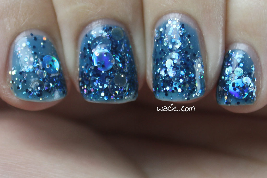
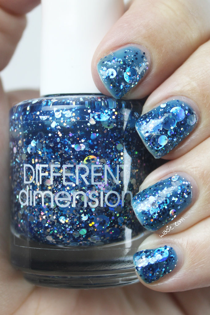
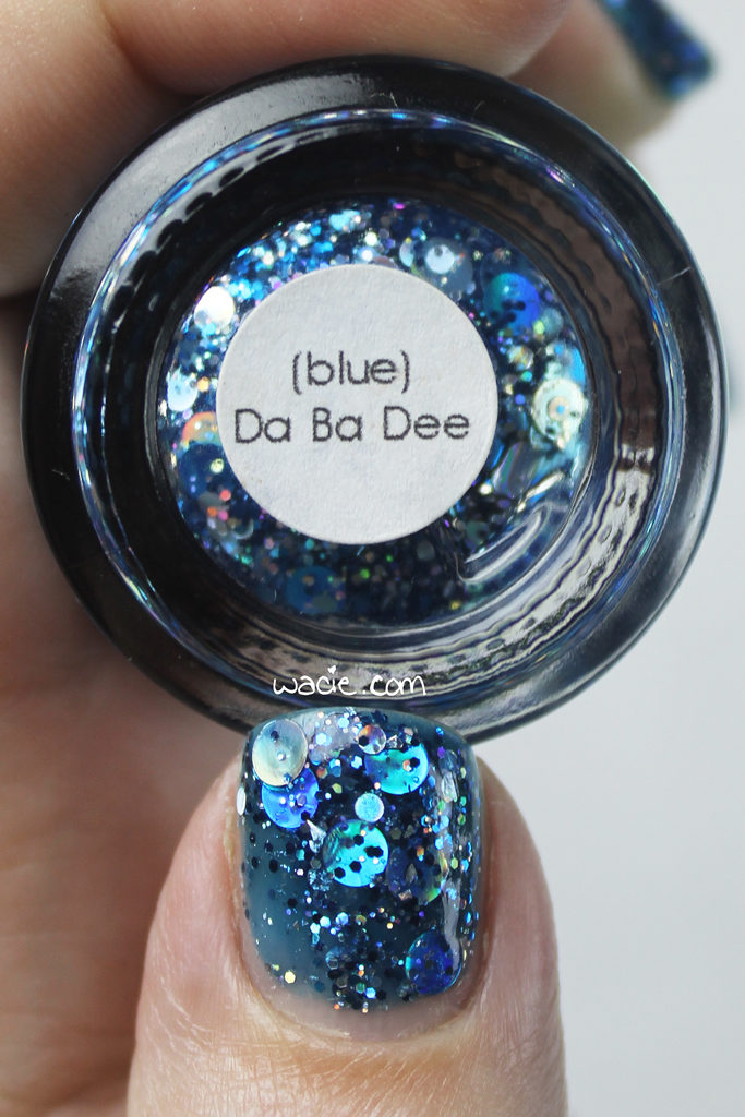
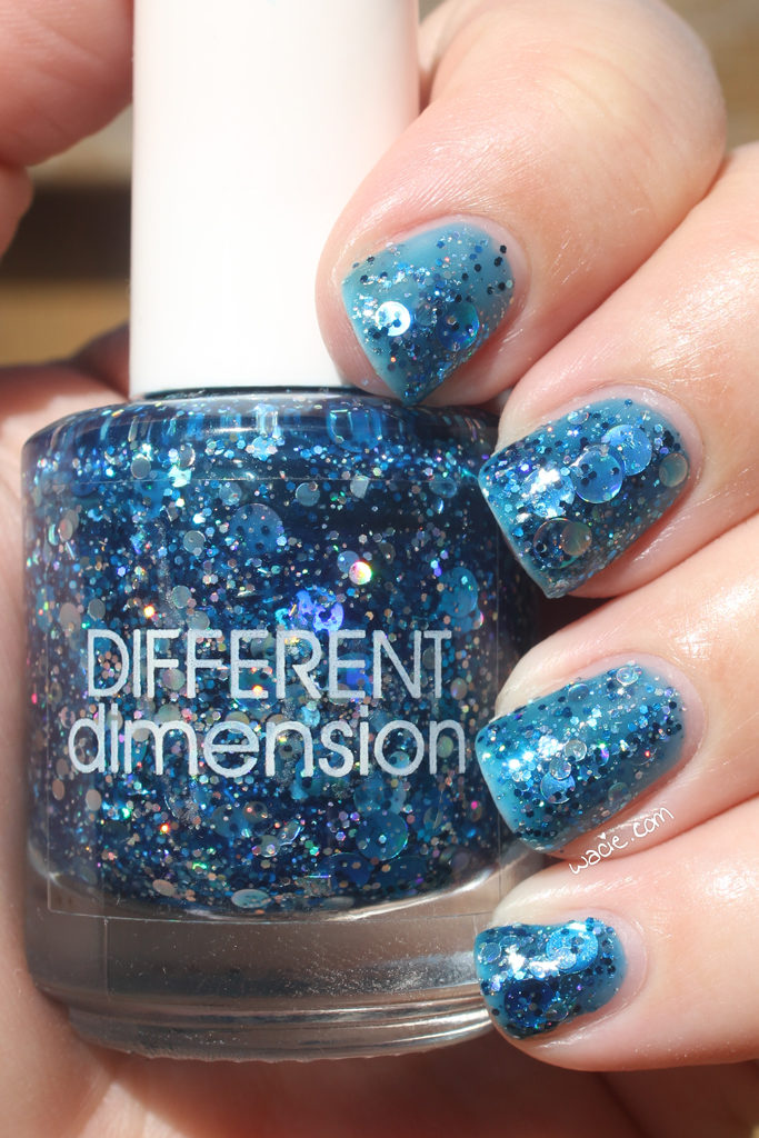
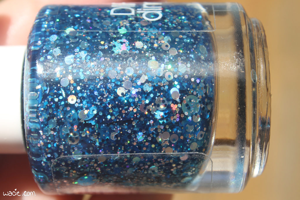
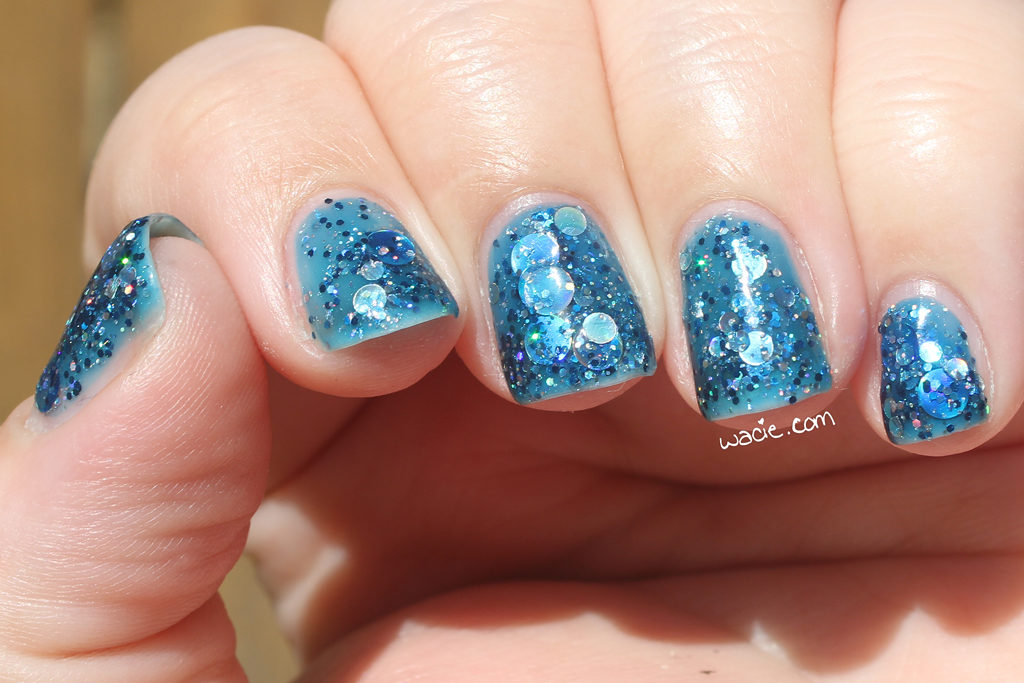
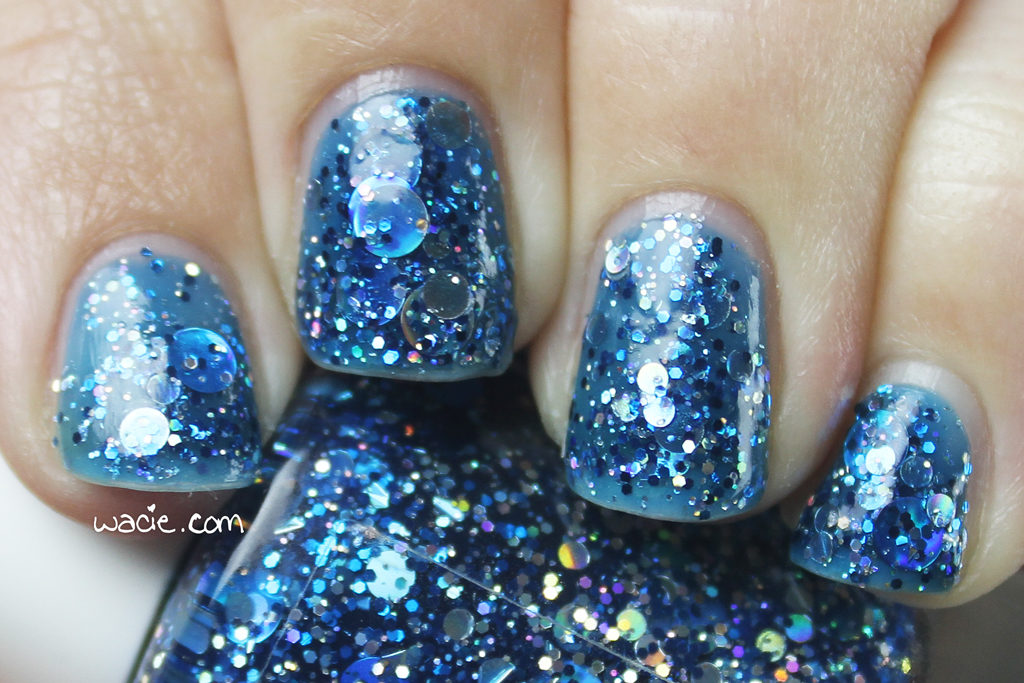
Hello, reader! Welcome back to Swatch Sunday! I love today’s polish. It was one of my first-ever indies, and one of my first Different Dimension polishes (the other was Orion Nebula). Huge round glitters are still cool, right? This is Da Ba Dee; I’m wearing three coats with one coat of Seche Vive.

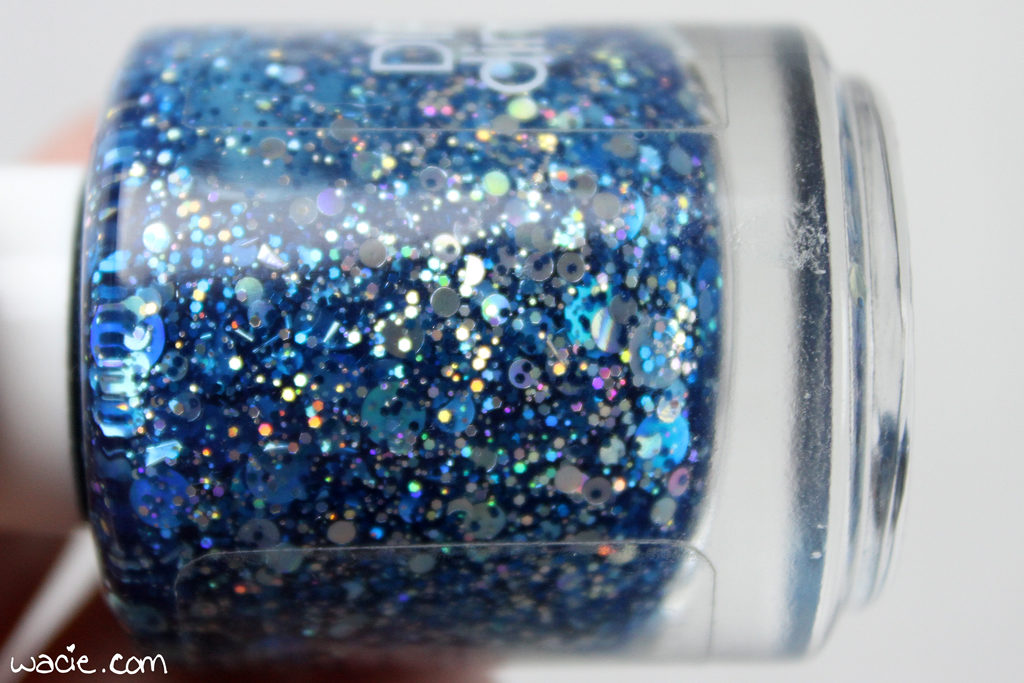
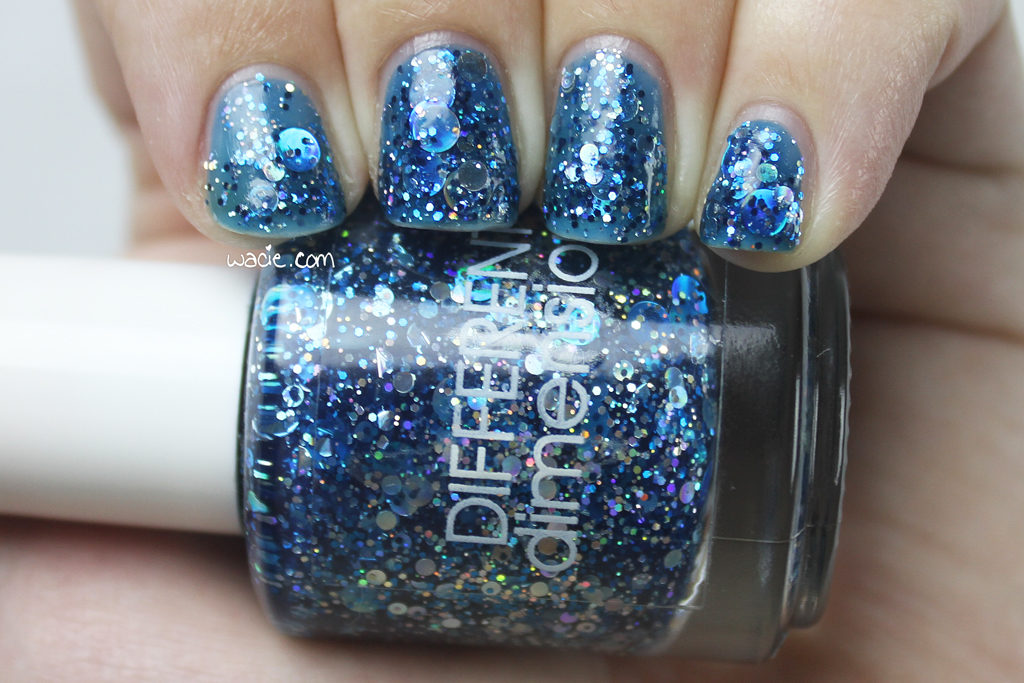
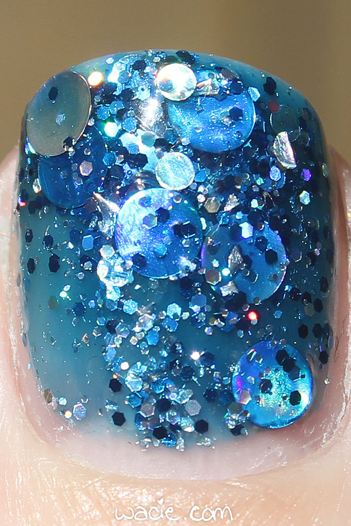
Da Ba Dee is a blue jelly with a variety of silver and blue holo glitters, the most prominent of which are the big round ones. Application was easy; the product consistency is on the thick side due to the glitter, but it still brushed on well. The larger glitters came out evenly; I didn’t have to fish around for them much. The drying time was a little slow, but I suppose that’s due to the thickness. I used top coat to speed up the drying time, as well as add extra shine and smoothness.

I love this polish. There’s so much in it. There’s not a lot of variety in the glitter, but that means there’s nothing unnecessary in it, too. It’s blue and silver and that’s all it needs to be. The blue jelly is deep, but not so deep it obscures the darker colors. This polish is a winner.

The jelly looks lighter in the sunlight, and you can see every bit of glitter. The following photos were taken in direct sunlight outdoors.

Da Ba Dee isn’t in stock on the Different Dimension website, but there you can find other beauties.

I bought this polish myself.

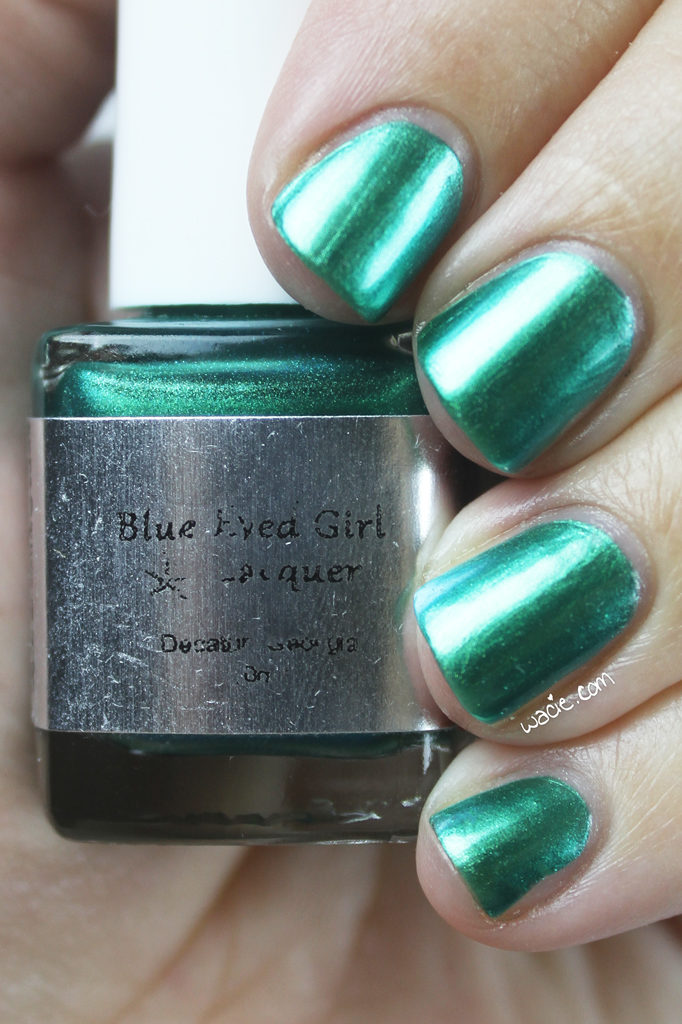
Swatch Saturday: Blue-Eyed Girl Lacquer’s Luck o’ the Siren

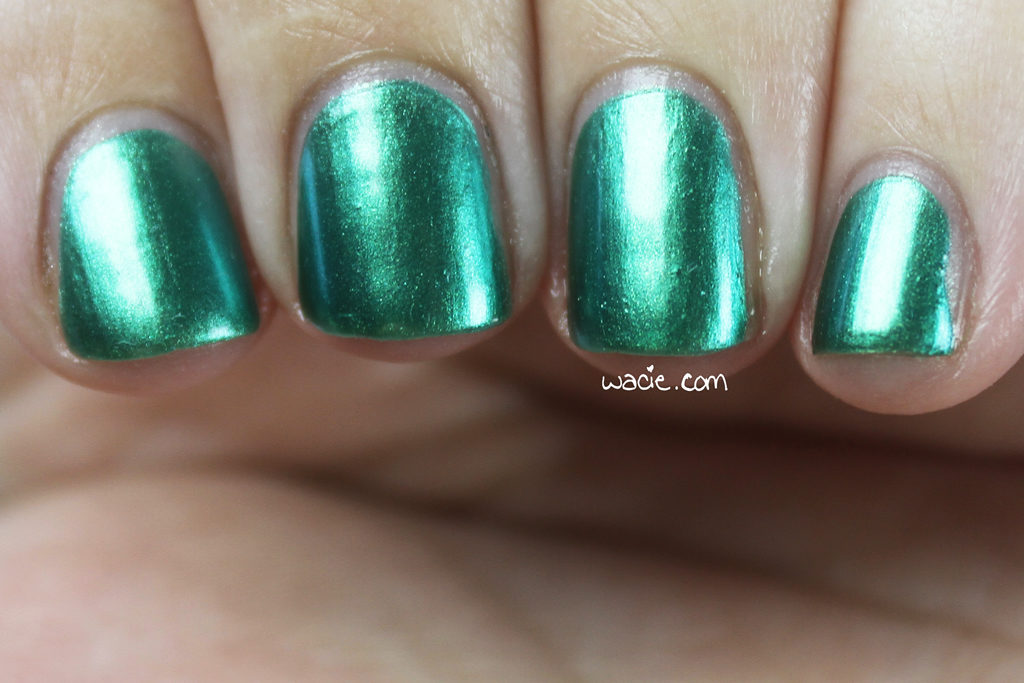
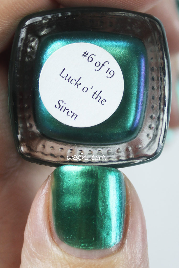
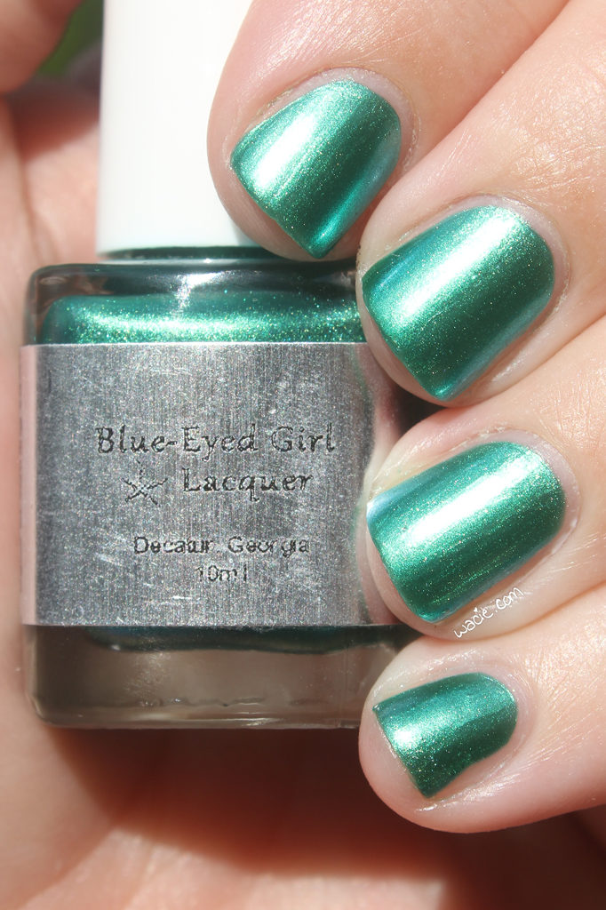
Happy Saturday, reader! I have a Blue-Eyed Girl Lacquer Siren to show you today! This was a special holiday Siren made for St. Patrick’s Day 2015. This polish actually came in a duo; we’ll be seeing the companion polish to this one next week. This is Luck o’ the Siren; I’m wearing three coats with one coat of Seche Vive top coat.

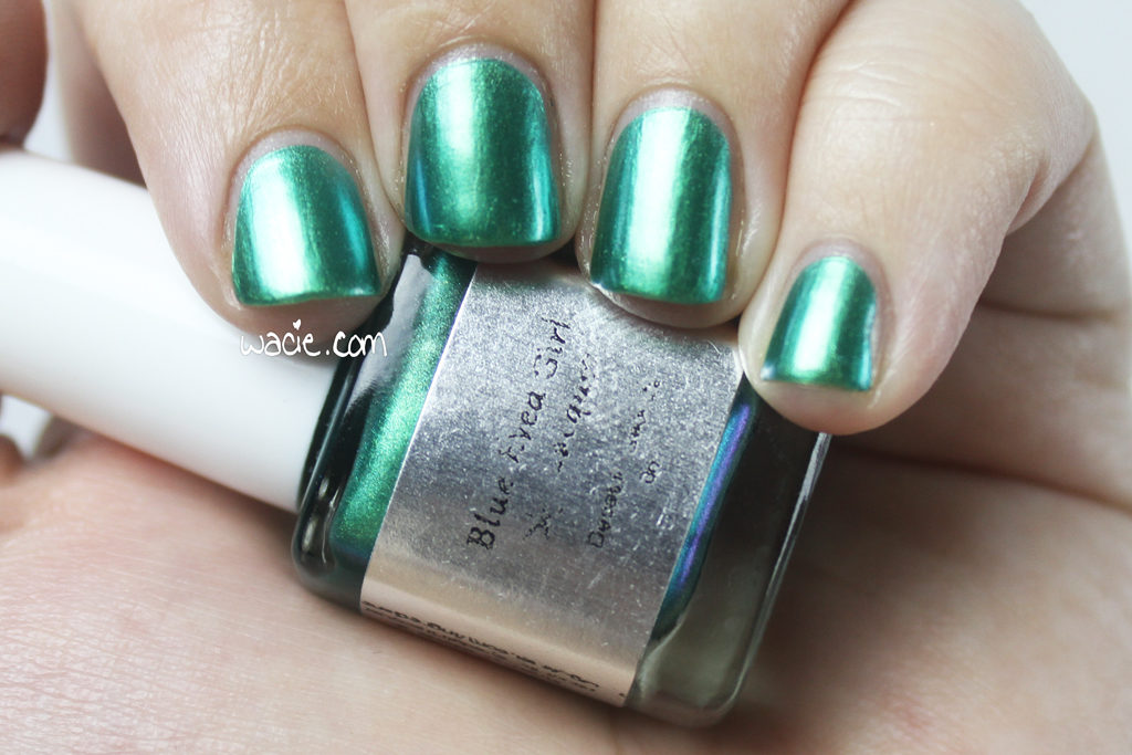
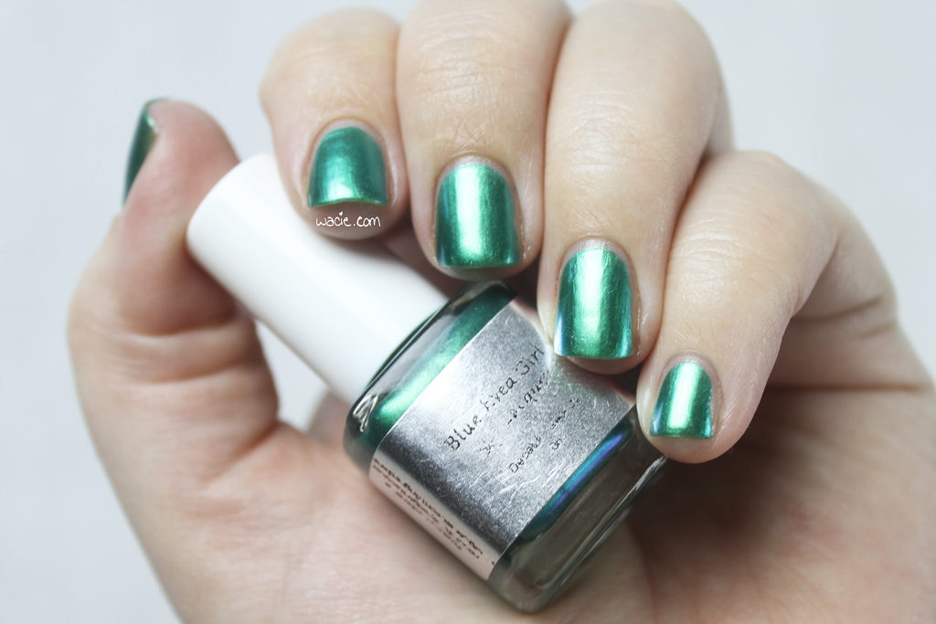
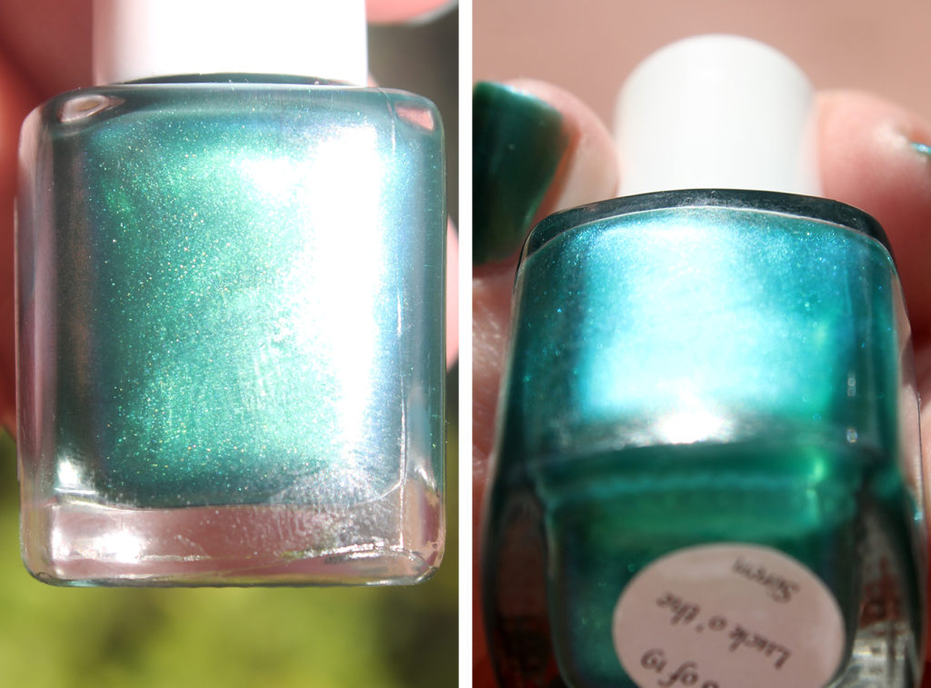
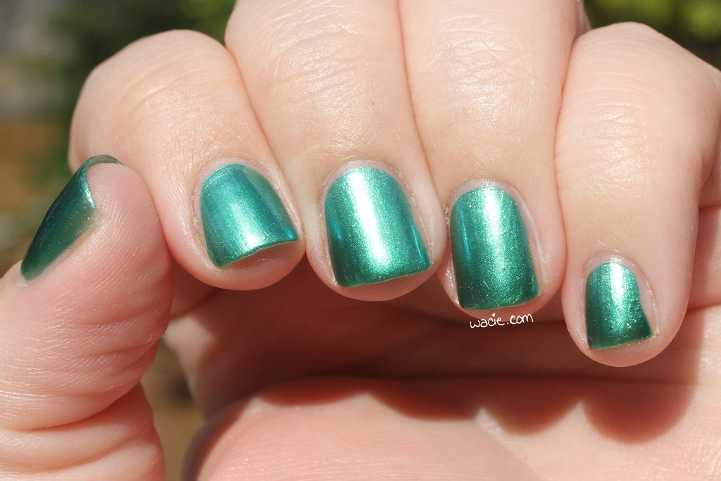
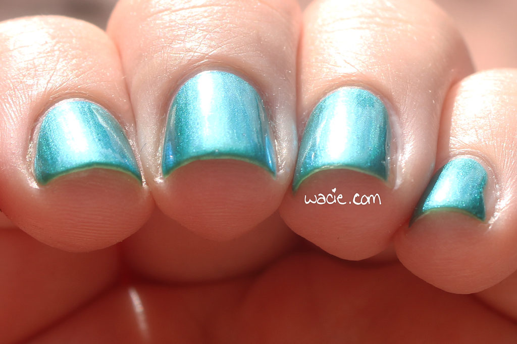
Luck o’ the Siren is a frosty emerald green polish with a blue shift. Application is good; since the polish is so shimmery, I got some brush-strokes in the final look, but I don’t consider that a huge issue. The product consistency was easy to work with; I had full coverage in two coats. The shift in this polish is easy to see but difficult to photograph; it turns a very bright and icy turquoise when facing the light. The product dried quickly and with a glossy finish.

I didn’t think much of this polish when I first got it. It looks like a standard mainstream green polish in the bottle. Once I had it on my nails, though, it stopped being boring. The shift in this polish is unexpected and unadulterated; there’s no holo or glitter to get in its way. It’s gorgeous.

It looks great in the sunlight, too! The emerald is warmer and richer out here than in the studio, and the blue shift is pretty vivid. I love this polish.

Luck o’ the Siren was a limited edition that has since sold out; her duo counterpart, Siren’s Lucky Shamrock, is still available in the BEGL shop.

I bought this polish myself.

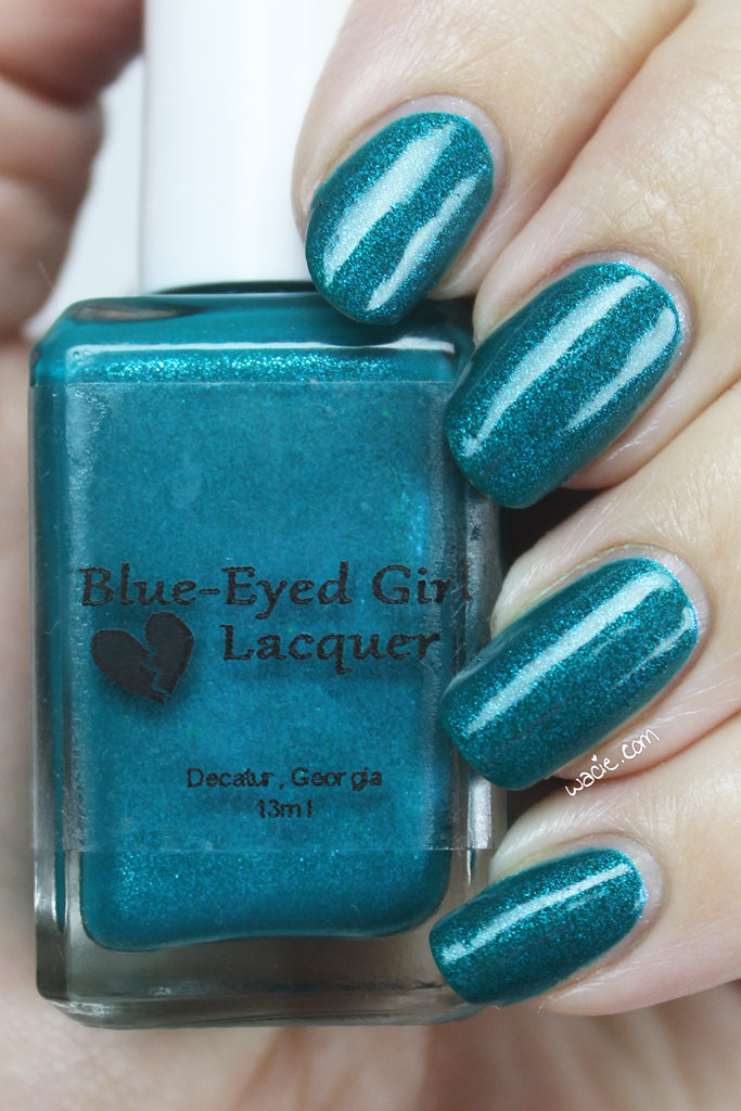
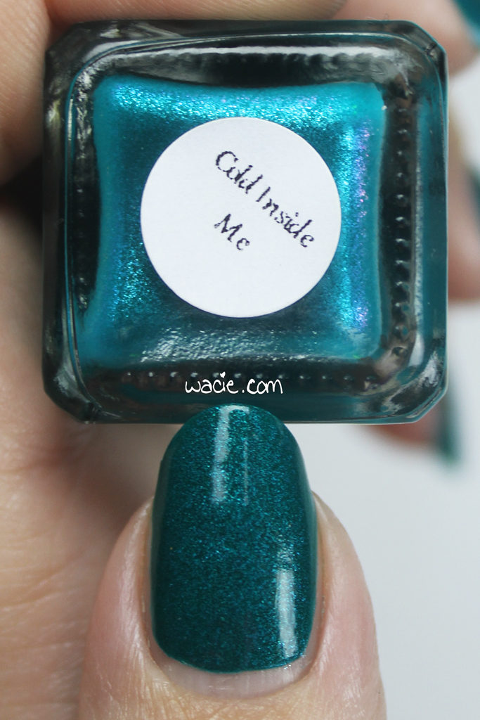
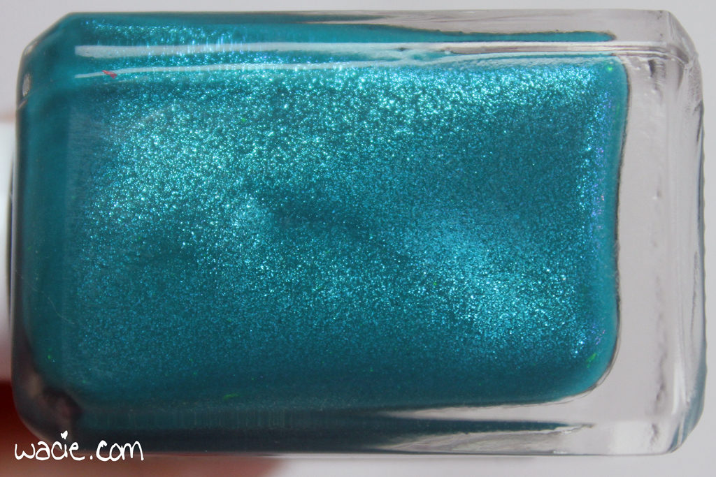
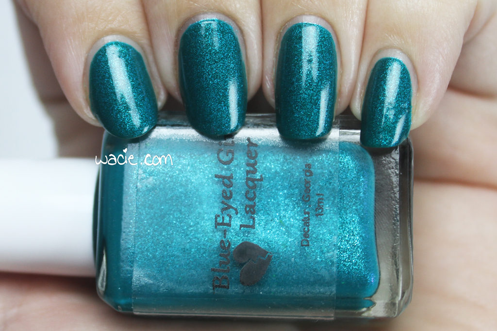
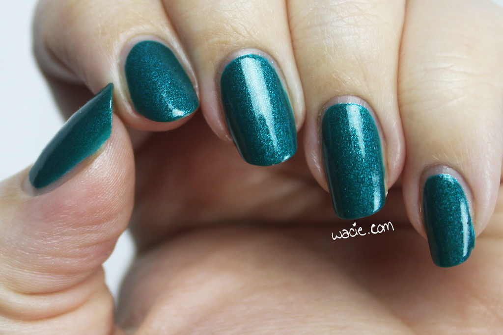
Swatch Saturday: Blue-Eyed Girl Lacquer’s Cold Inside Me

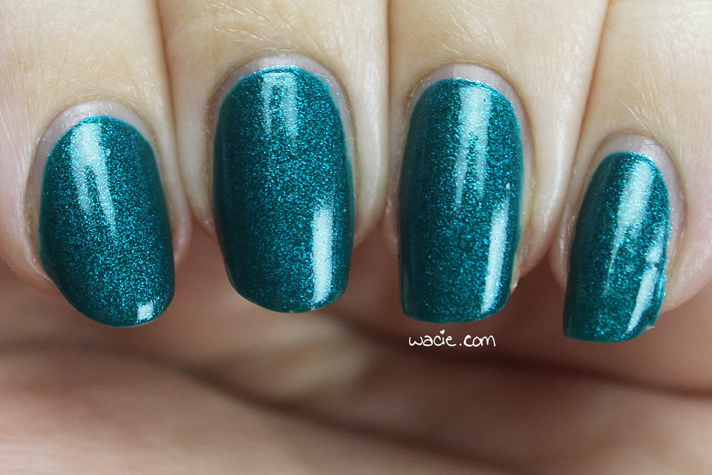
Welcome back to Swatch Saturday! Last week, we took a break from Blue-Eyed Girl Lacquer‘s Crooked Hearts collection to have a look at a limited edition Siren. We’re jumping back in with another shimmery beauty, Cold Inside Me. I’m wearing three coats of Cold Inside Me with one coat of Dream Polish‘s Gem Glam top coat in the Melon Baller scent.

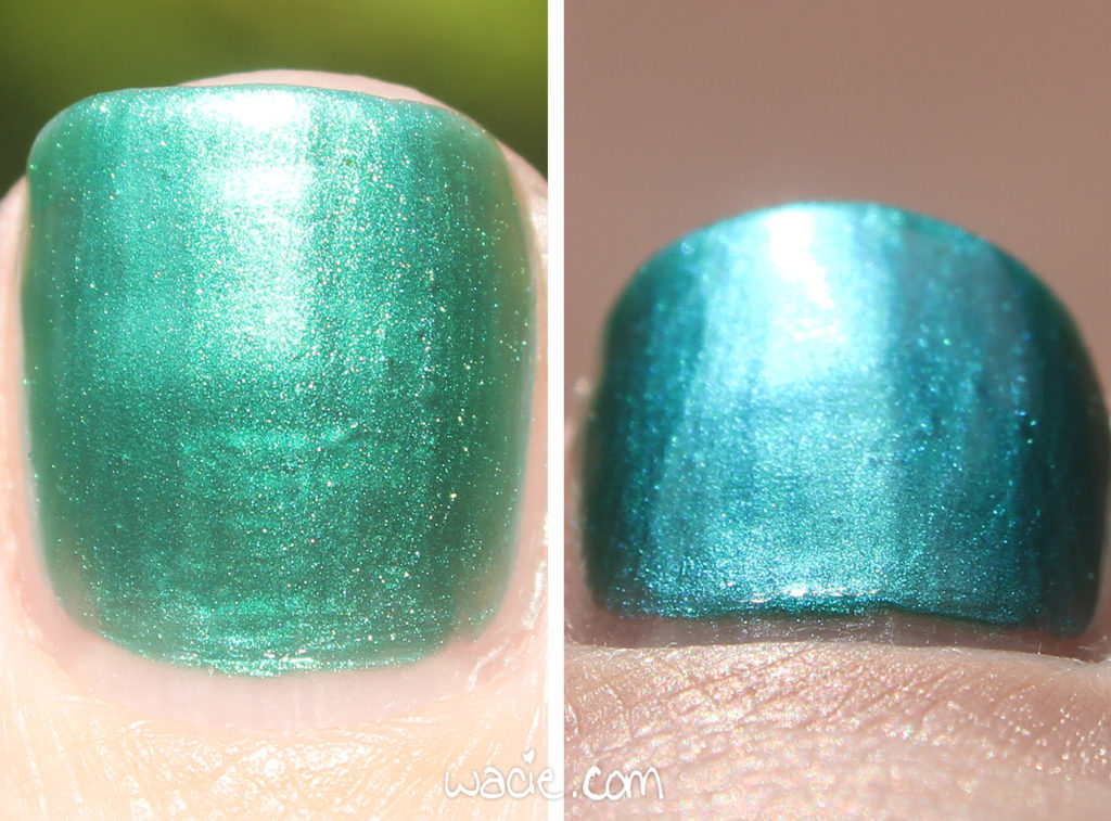
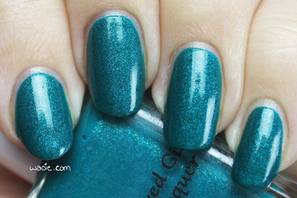
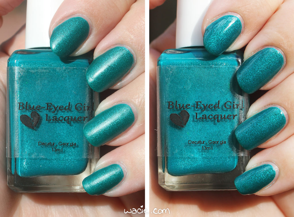
Cold Inside Me is a teal polish with blue-to-purple shifting flecks. I didn’t realize the flecks were shifters until I was processing these photos, so none of my photos capture it. I do apologize. As it is shown here, however, was what it looked like most often on my nails, so I do feel that it is represented accurately. Application was good; the first coat was nearly opaque, just a slight hint of translucence without streaking or gaps in coverage. The second coat evened it out very well. The consistency is very smooth and easy to work with. It dries quickly and with an interesting satin finish; I have photos of it in the sunlight set toward the end of this post.

How gorgeous is this, seriously? The base color itself is already very cool, but then the glass-fleck shimmers come in and make the whole thing sparkly and shimmery and BEGLesque. I love it.

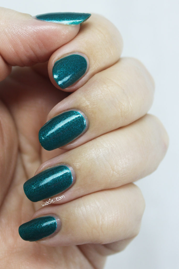
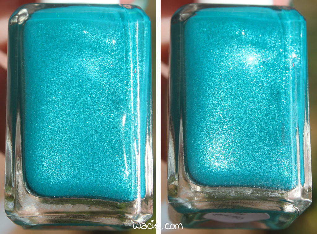
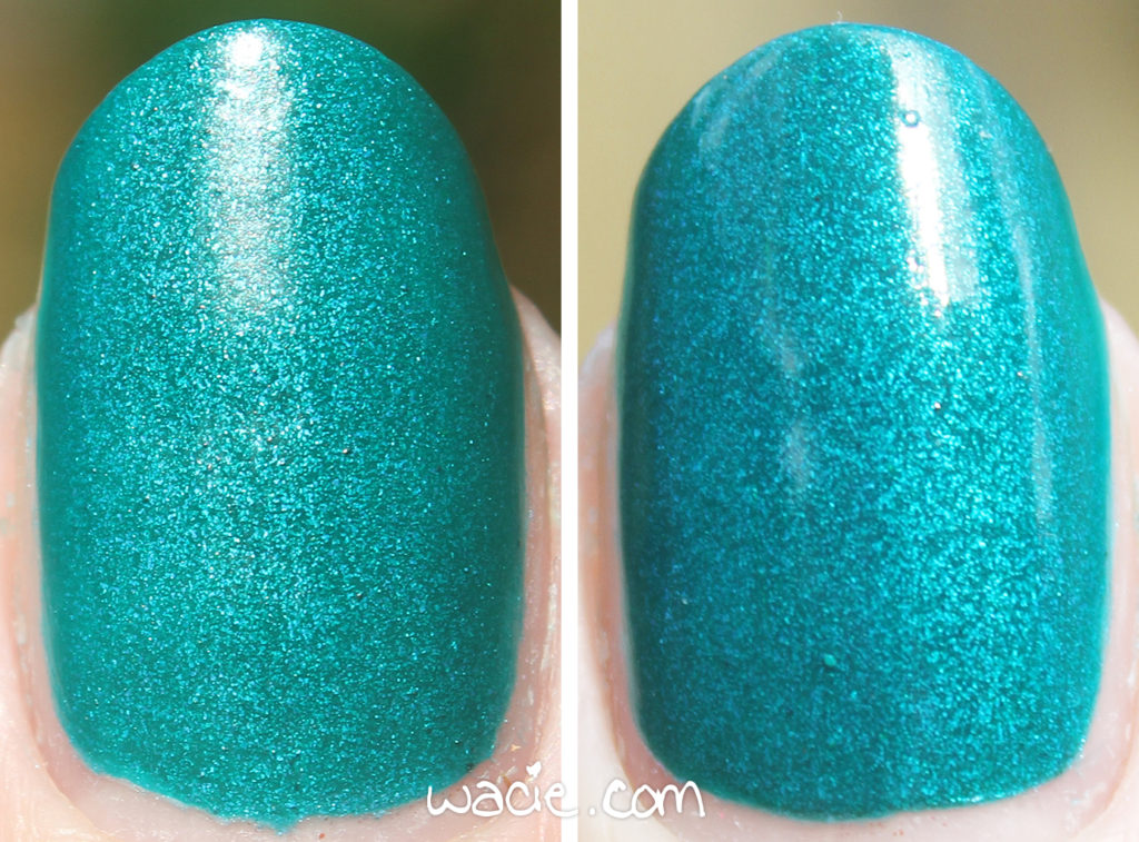
The following photos were taken outdoors in direct sunlight, but you’ll notice these photos are also comparisons; the photos on the left are at two coats and without top coat, while on the right it’s at three coats and top coat. I prefer the glossiness of the top coat, but the satin finish is pretty enough that I had to photograph it.

Cold Inside Me and other Blue-Eyed Girl Lacquers are available from their online shop.

I bought this polish myself.

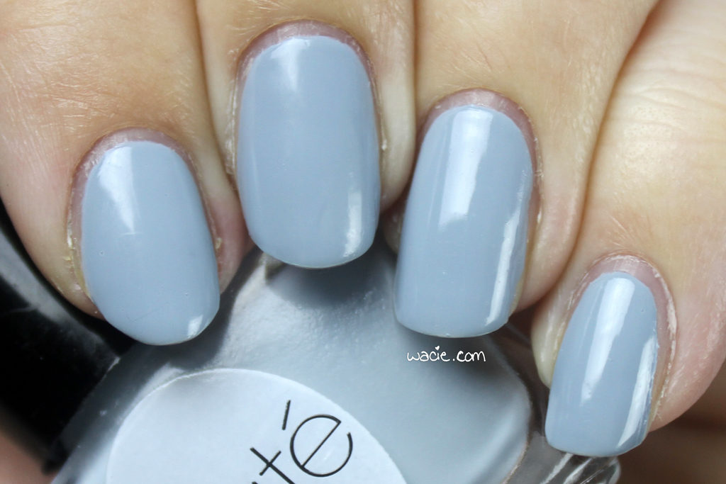
Swatch Sunday: Ciaté’s Chinchilla

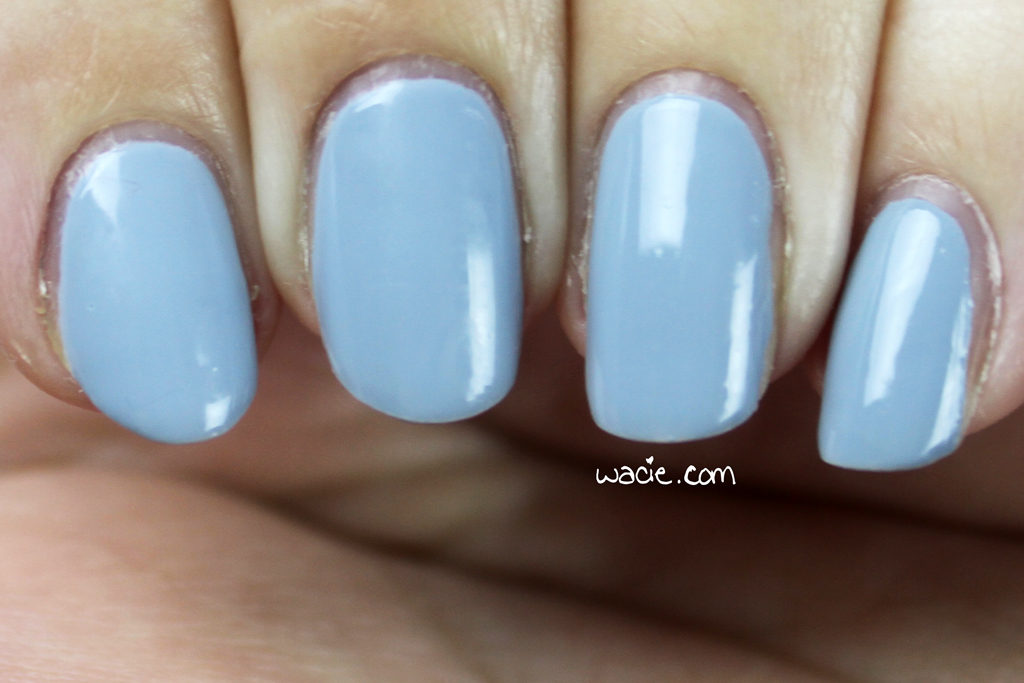
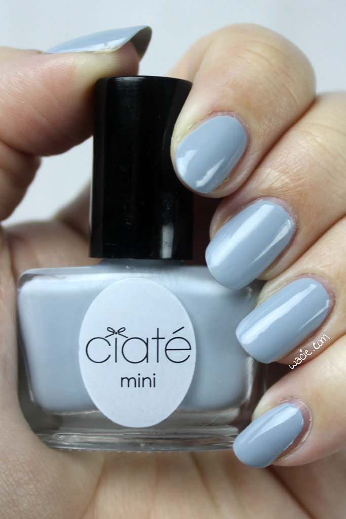
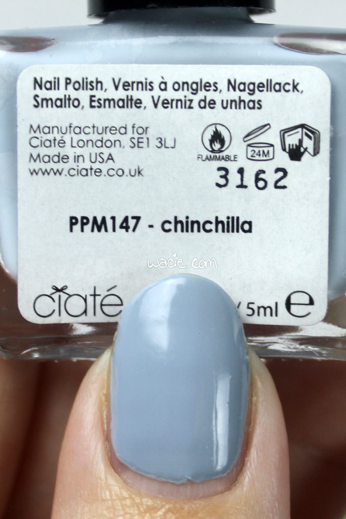
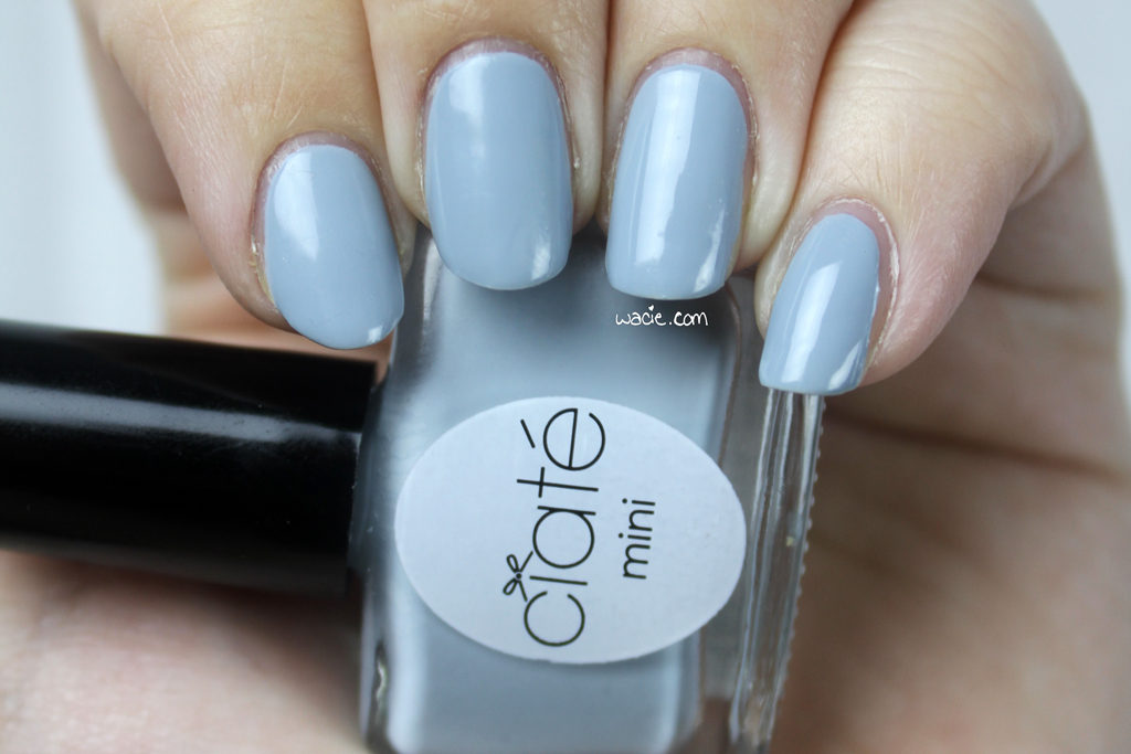
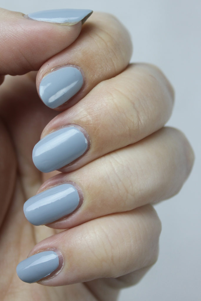
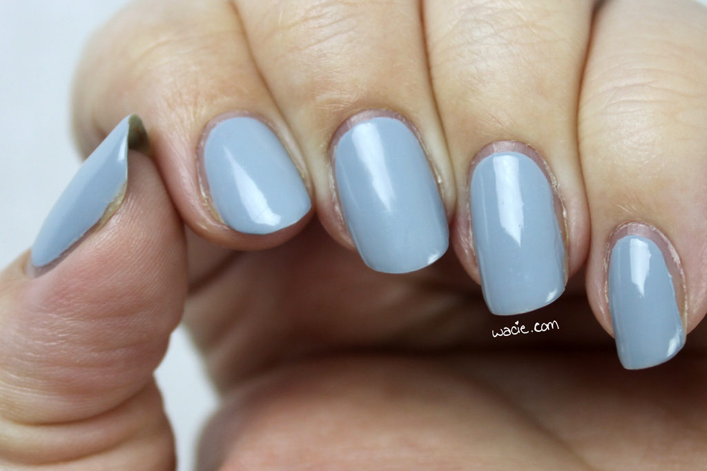
Swatch Sunday is here again! Today’s polish is Ciaté’s Chinchilla. It’s the cutest blue I’ve used in a while. I’m wearing three coats with one coat of Seche Vite.

Chinchilla is a dusty blue creme. My bottle had some separation, and I had some difficulty getting it back together; when I shake the bottle, I don’t hear the agitator balls, which makes me think there aren’t any in there. I had to add my own. Good thing I had them just laying around, right? Once I got it back together, though, the product consistency was good. My first coat of Chinchilla was streaky, as you might imagine, but it evened out by the second. It dried quickly and with a glossy finish. I used top coat for extra shine and protection.

These tiny bottles are a pain to pose with.

I really like this shade, and I feel like it’s a unique one in my collection. It’s the perfect dusty blue; every blue I have is bright or deep and there aren’t many in between. It would be a great base for nail art; in fact, I think I got this in a Ciaté set that came with caviar beads or dried flowers or something.

Chinchilla looks like it’s discontinued by Ciaté; other Ciaté polishes are available on their website and at Sephora.

I bought this polish myself.

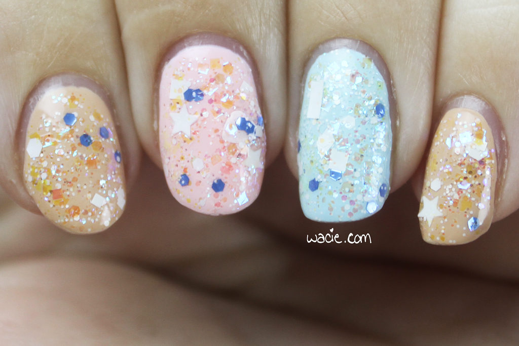
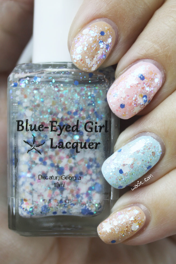
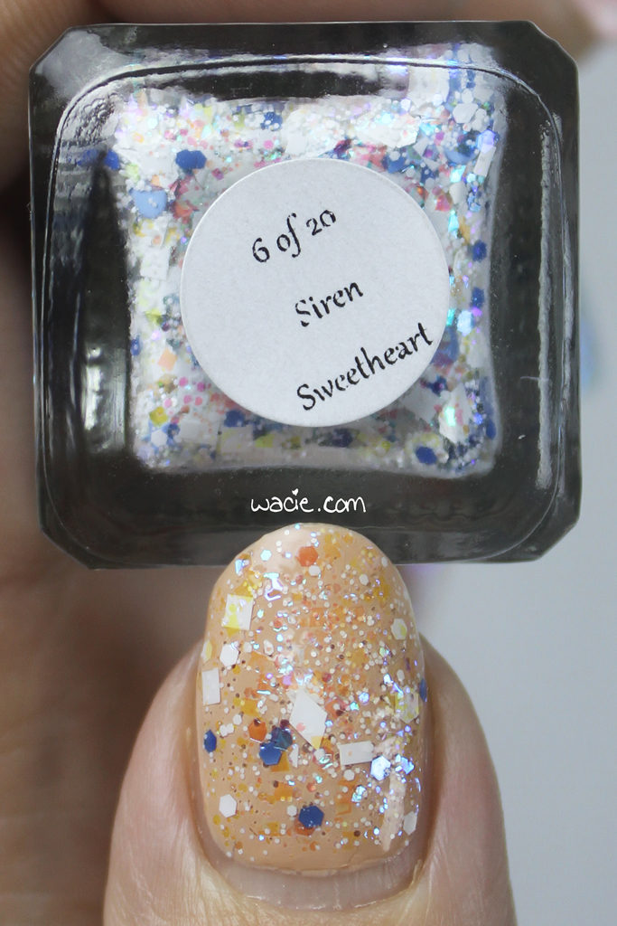
Swatch Saturday: Blue-Eyed Girl Lacquer’s Siren Sweetheart

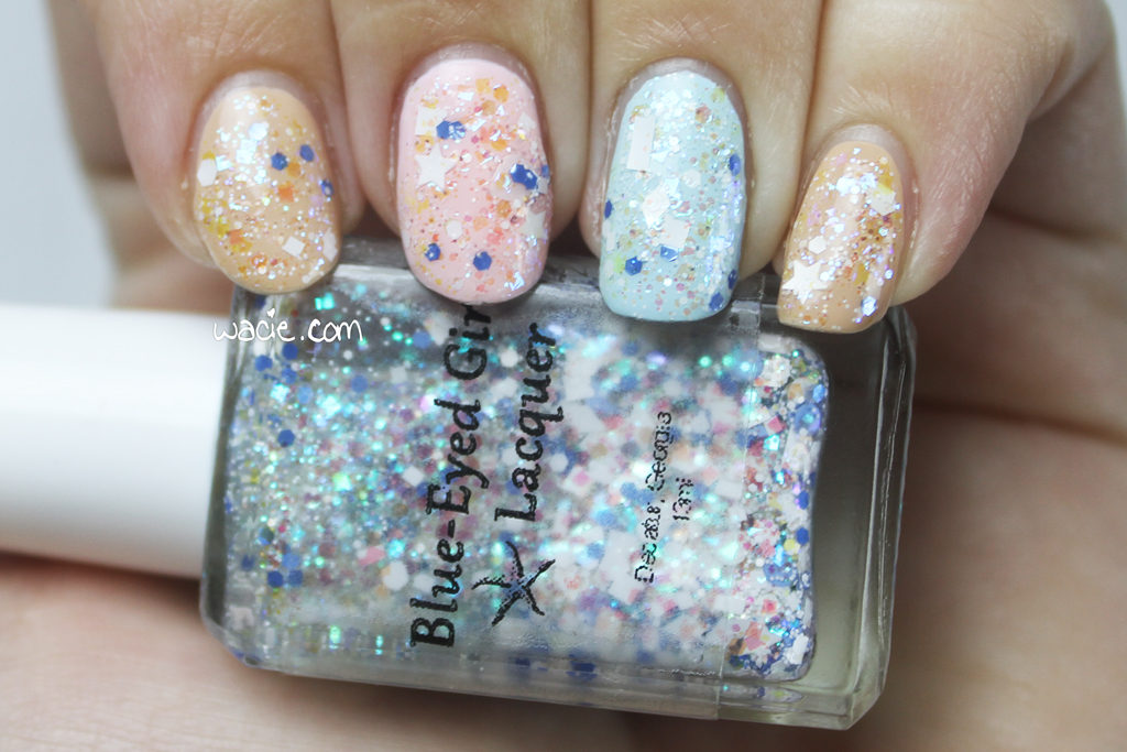
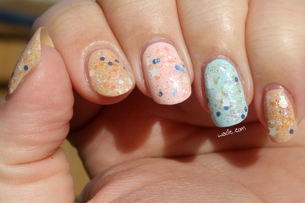
Hello, reader! Swatch Saturday is going strong in 2017! Today’s polish is Blue-Eyed Girl Lacquer‘s Siren Sweetheart; I’m wearing one brushed coat over Zoya’s Chantal and Essie’s Fiji and Mint Candy Apple.

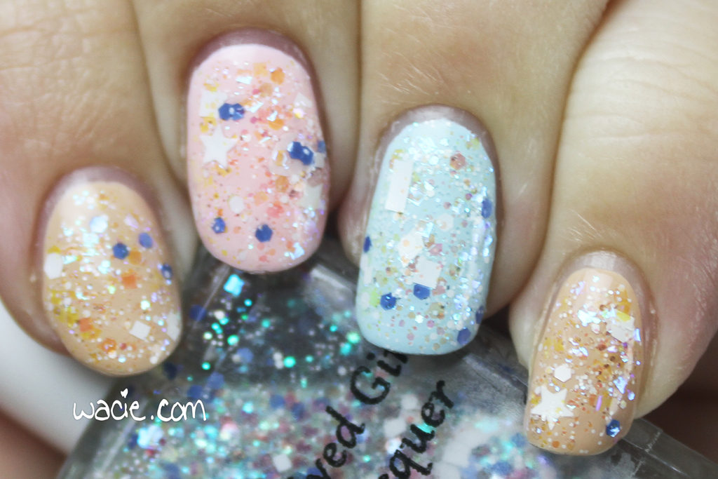
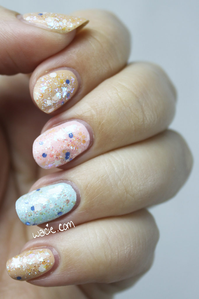
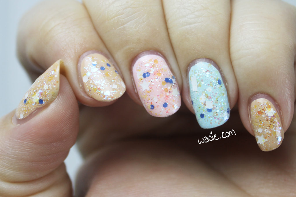
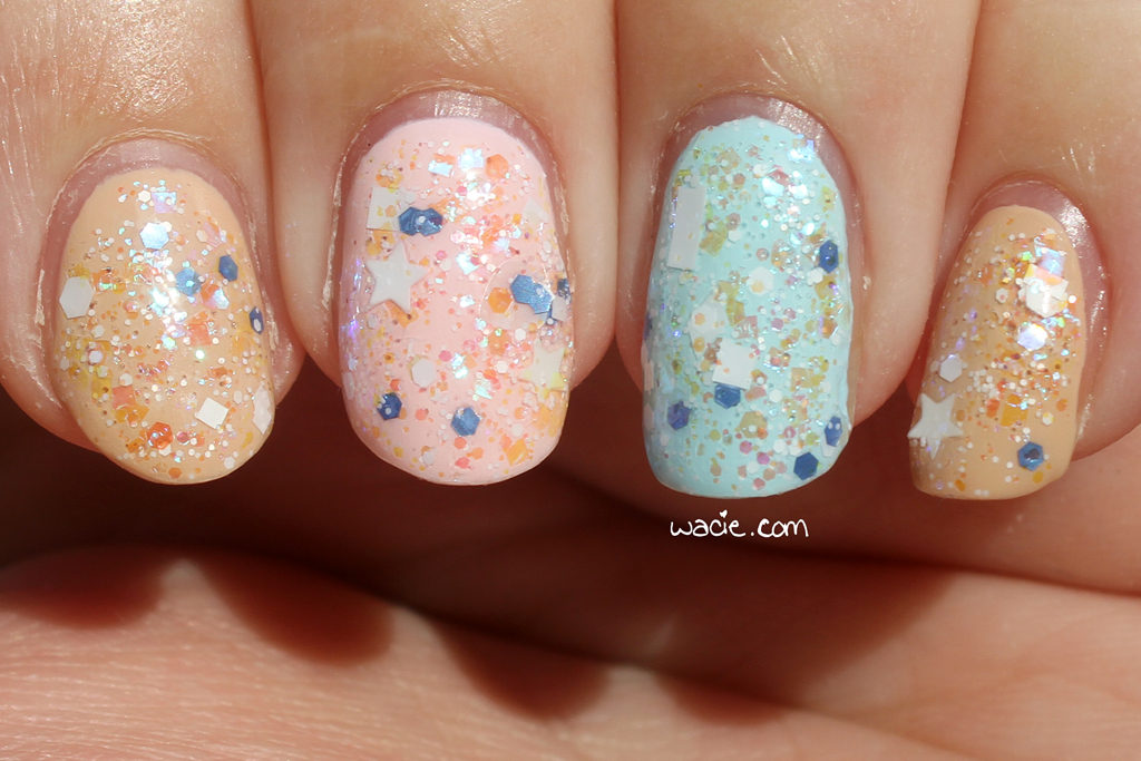
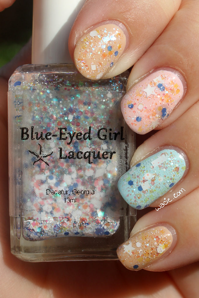
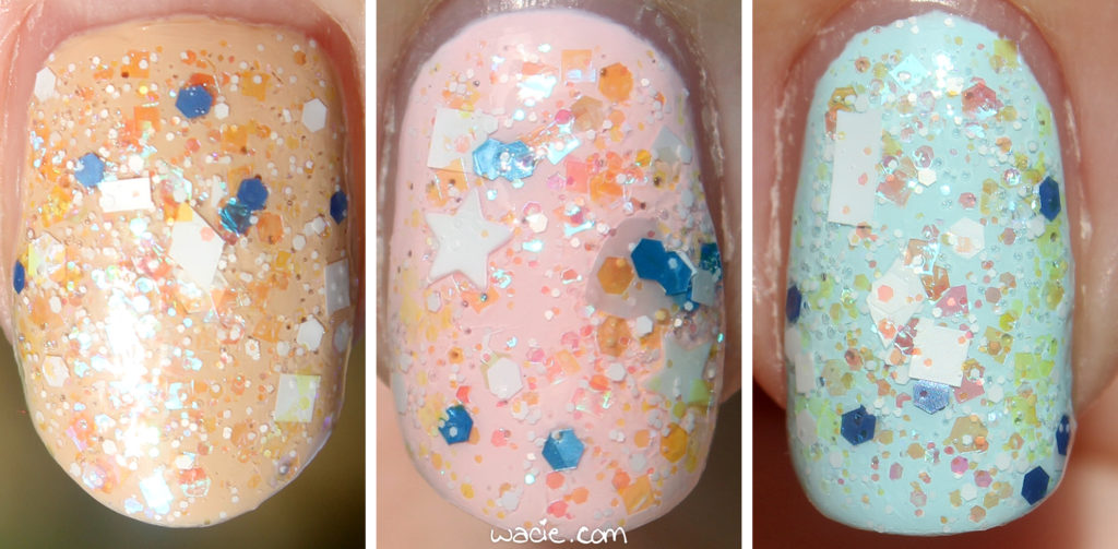
Siren Sweetheart is a clear-based glitter topper with iridescent hex and square glitters and denim blue hexes in a mainly-white glitter mix that includes rectangles, stars, hearts, diamonds, and squares. Application was okay; the consistency was pretty thick, which is not unexpected, seeing how much glitter is in the bottle. The glitter is very dense, so I got tons on the brush and didn’t have to fish for the larger shapes. The polish dried quickly with some texture; I used top coat for smoothness.

The white glitter topper is one of my favorite mixes, because it can be worn over anything. I only swatched it over pastels here, but you could put this over any creme and have an interesting look. The iridescent glitters shift colors based on the lighting, so there’s some color in the polish, the white glitters add texture and fun, and the blue glitters break it all up. I am having a ton of fun wearing this.

These photos were taken outdoors in direct sunlight. In the sun, the iridescent glitters look a little washed out, but out here, you can see just how much glitter is on each nail. The studio photos seem a little deceptive by comparison.

Siren Sweetheart was a numbered limited edition that has since sold out. Other Blue-Eyed Girl Lacquers are sold in their online shop.

I bought these polishes myself.

A Look Back at 2016

Hello reader! Now that 2016 is behind us, I wanted to look back on some of my blog highlights and share my favorite nail art looks, and maybe share some of my 2017 blogging goals with you. I guess I could have waited to do this on my blog-versary in March, but it feels more appropriate to do it now.

January: Elevated Gradient

February: Neon Satisfaction

You’ll notice these photos are tiny. Why? Because in March, The Great wacie.com Server Crash of 2016 happened! My webhost had a hardware failure, and for whatever reason, several months of posts were lost and had to be pieced back together with images and text cached by Google. It was an extremely frustrating and embarrassing time for me.

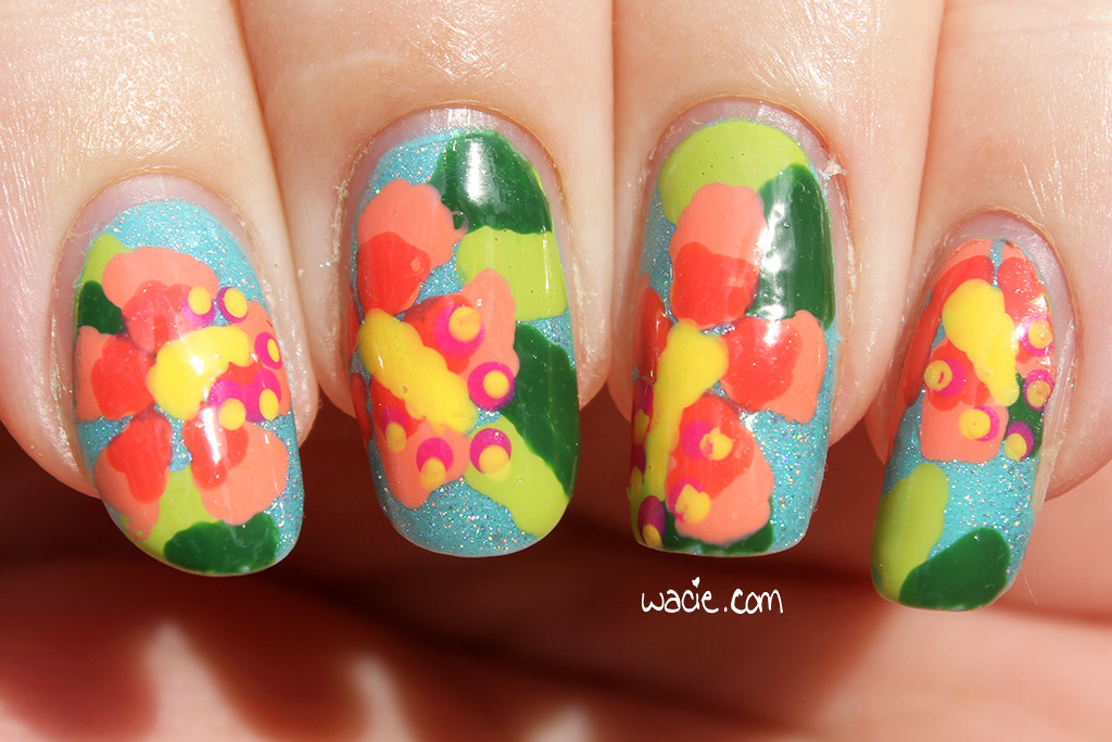
March: Spring Hibiscus

I miss these long nails.

This is probably my favorite look of the year.

Third Anniversary Do-Over

I mentioned earlier that my blog’s anniversary is in March. For last year’s anniversary, I recreated the first-ever mani I posted on my blog. I don’t know yet what I’ll do for my fourth year, but it’ll probably be awesome.

April: Dusty Watermarble

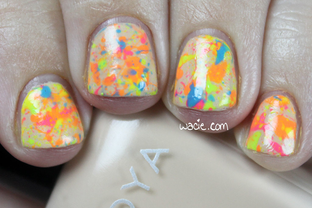
May: Neon Splatter

I went to Hawaii in May. As a result, this is my least active month on the blog for the year.

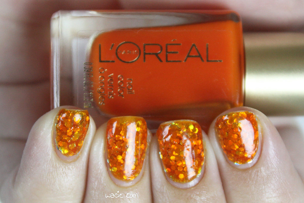
June: Orange Jello Sandwich

My first Empties Roundup post was also in June.

July: Beyond

August: Ombre Hearts

September: Popples

October: Stripey Blue Frosting

This was a look I did to celebrate my birthday.

November: Ruby Opal

December: White Snow Blue Lava

So there’s my year! This was probably the busiest year for the blog, since I broadened my sujects quite a lot. I did tons of swatches and nail art, but I also ventured into product reviews and makeup talk. I don’t think this will ever become a full lifestyle or beauty blog, but I’m definitely having fun with it in this format. I’m kind of excited to see what it’ll evolve into in 2017. Here are a few beauty goals I have in mind, though.

1. Write more
I wrote 175 posts in 2016, averaging about 14 per month. It doesn’t sound like much to me, like I did way more work than that, especially when it started to feel stressful. That said, I’d like to do at least one more post every week.

1b. Write on my other blog more
I have a second blog that I want to start posting to more. It’s been so long since I’ve bothered with it that I don’t even remember the login credentials. I still want a place to talk about myself and my life, a place to seem like I have a life away from my nails.

2. Build a real skincare routine
I still feel insecure about my skin. I’m frustrated that I’m 31 and I still get acne. I want to take every preventative measure I can against wrinkles and anti-aging. I also want to try a 10-step Asian beauty routine. If you’re over 30 with oily skin and hormonal acne, I want your recommendations.

3. Stop competing
I know one of the big rules of blogging is not to compare your success with others’, but I feel so competitive about it. At the risk of sounding whiny, I always look at other bloggers who’ve been working on their blogs for about as long as I have, and watching their blogs grow faster than mine is kind of frustrating. I don’t want to feel like that anymore.

4. Do more real nail art
I love glitter toppers and I think I use at least one every week, but sometimes it feels lazy. I want to go back to the basics: watermarbling, gradients, dotting. I love my glitters, but it’s starting to feel like a cop-out.

I think that’s it! Anyway, I think 2017 is going to be an exciting year, and I’m looking forward to the good times, the challenges, and the time we spend together. Thanks for reading!

Project Pan, Fall 2016: Rose Quartz + Serenity-Inspired — Conclusion

Hi Reader! You might remember that I started a twelve-week beauty challenge where I committed to a handful of products for the whole twelve weeks. I called it a Project Pan, but since I’m not using them until I hit pan or use them up, it’s not the most accurate name for it. I did, however, completely my twelve-week obligation to them, so I’m doing one last update post to talk about what I did use up or hit pan on before I move onto the Winter 2016 challenge. For detailed product information and swatches, please see my first post for this challenge.
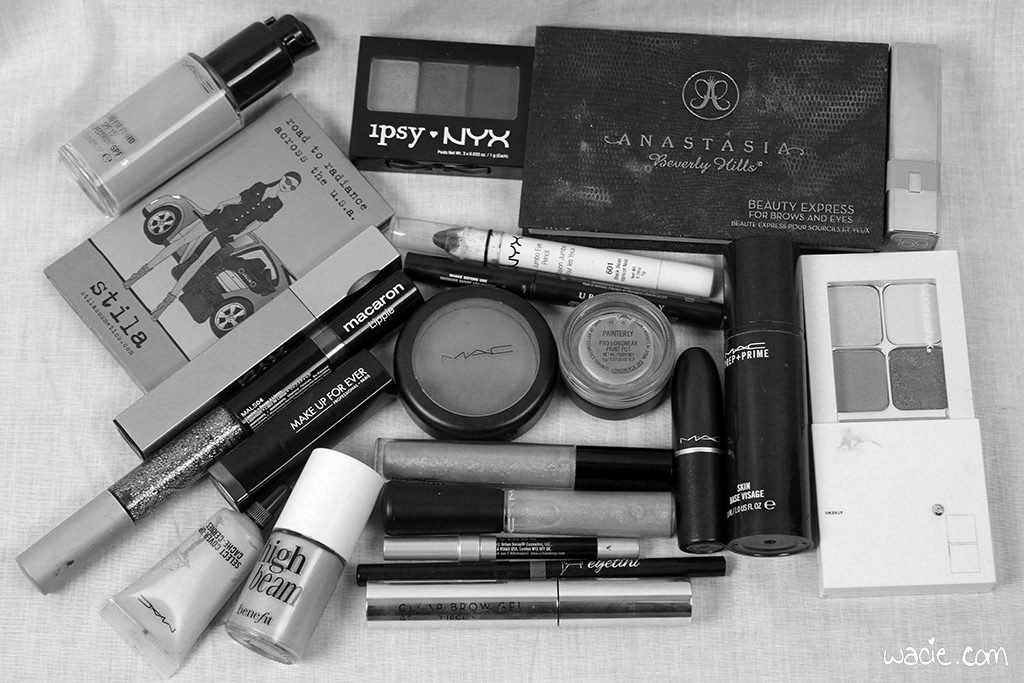
The sun has set.

As I mentioned in my first post, the products I chose were based loosely on Pantone’s Colors of the Year for 2016, with some black thrown in for fun. I had a blast with these looks. I left the house with black or blue lipstick on for the first time since middle school. I felt edgy, fashion-forward, and bold. I forgot what I looked like without crazy raccoon eyes. I’m a little sad I’m putting all this stuff away, but I made some progress with these products, and I’m sure they’ll come out of the drawer again someday. For now, I’m happy to be moving on to new things.

Empties: 4
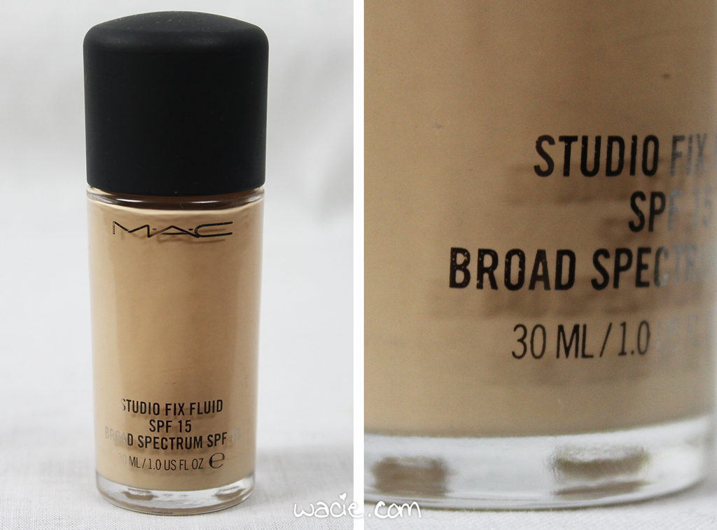
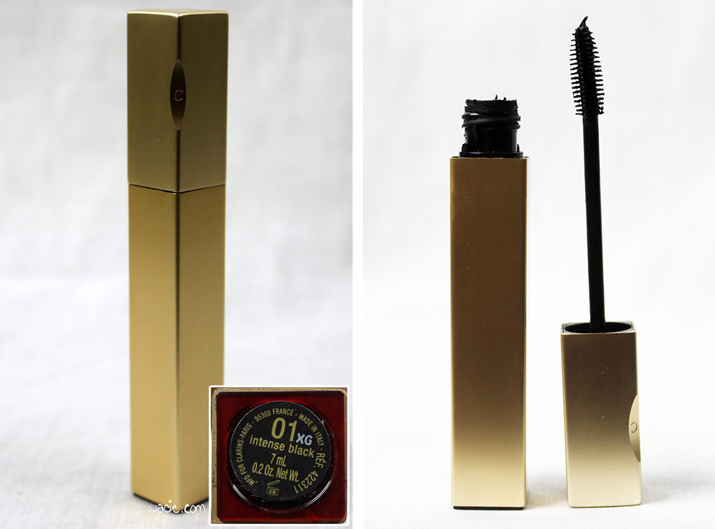
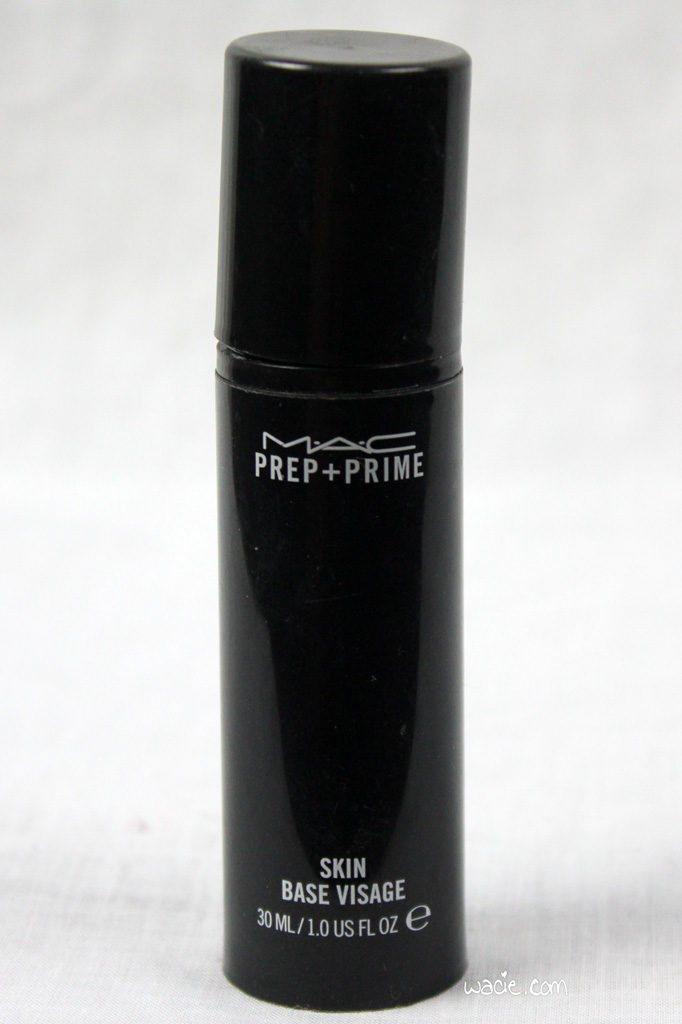
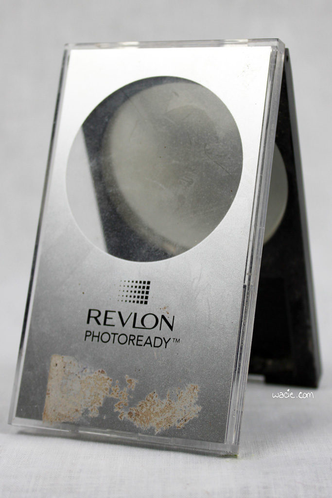
Let me talk first about the things I used up. I didn’t use up any products unique to the challenge, but instead used up some essential products and replaced them. I wrote about the MAC primer and foundations I used up in previous Empties Roundups. I also finally decided it was time to part with the Clarins mascara. I finished my MAC foundation up and went for NARS, I used up a Revlon powder and went back to MAC Studio Fix powder, I used up the MAC primer and went back to Smashbox, and I tossed an old mascara. That’s four empties.
Pans: 3
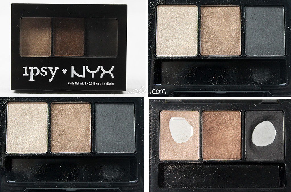
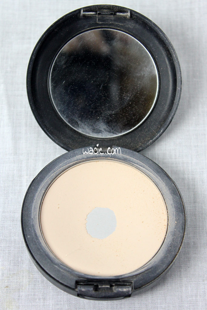
Honestly, I’m surprised I hit pan on anything. I hit three, though, and I’m pretty proud of myself! Have a look at that NYX eyeshadow trio. The champagne and matte black were my workhorse shadows for this look, so I guess I shouldn’t be surprised I hit pan on those. It’s just that I’ve used some shadows for years and I still have yet to pan those, but I can pan these in twelve weeks. Maybe they’re small pans. I’m happy I panned the compact, because that’s a thing I’ve had for years. It’s nice to see progress made!
Notable Mentions
Lipglosses
I didn’t think I used up so much of the glosses, and I almost feel a little bad about it. These are two great colors that I should really think about wearing on their own someday.
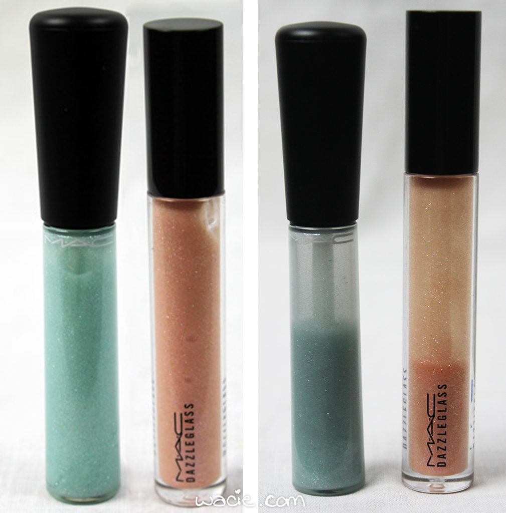
The quality is low on these before photos because, foolishly, I didn’t keep the originals, only the edited versions.

Highlighter
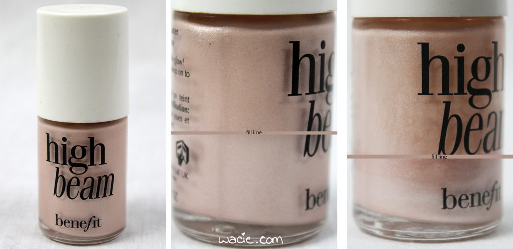
Check out the fill lines on the High Beam! I’m surprised I used that much of it. A dab here and there really makes a difference!
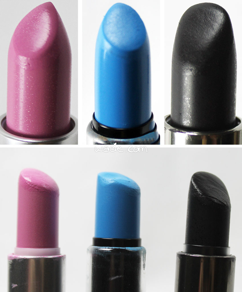
Lipsticks
I didn’t put too much of a dent on Saint Germain, but Blue Velvet and MUFE #50 are visibly used. Blue Velvet looks the most worn-down. It seems like every time I went out, I had the blue lip on, and I feel like maybe I did use it more than the others because I was always touching it up. Obviously, when your attention is divided over three lipsticks, you’re not going to wear them down as mucha as if you’d only focused on one. You’ll also remember I had a fourth lipstick in the main post, but since I only used it once (when I saw family), I didn’t include it in the final post.
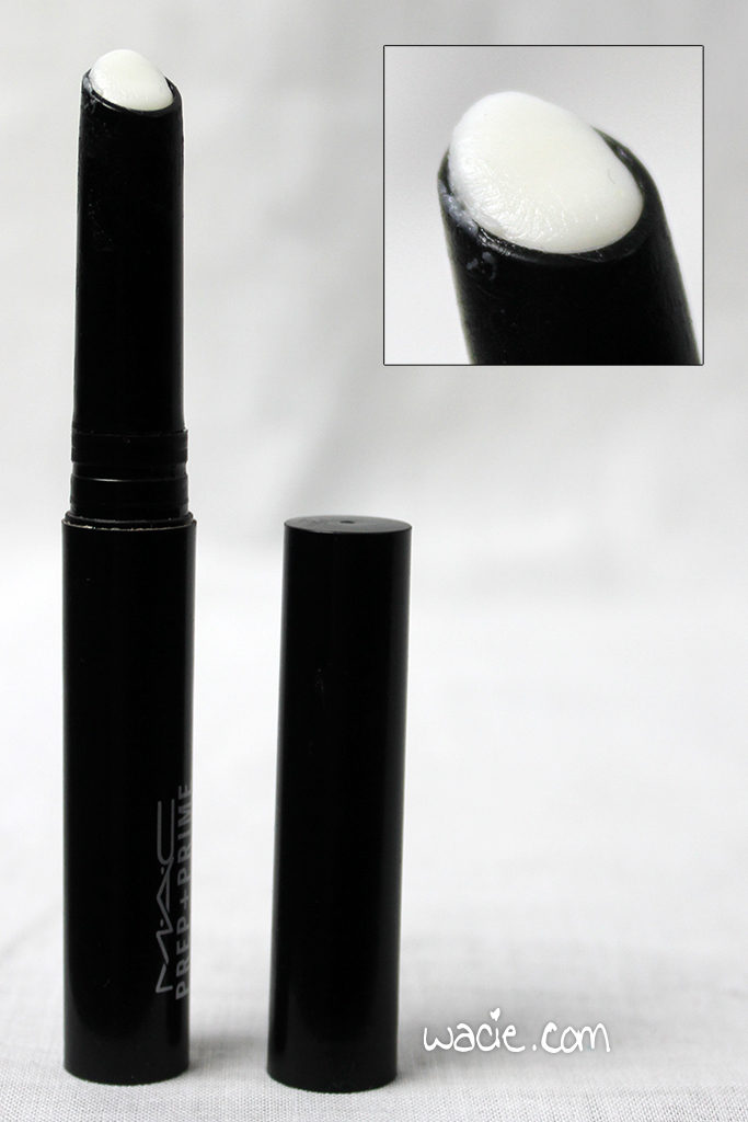
Lip Primer
Here’s my MAC Prep + Prime Lip, turned all the way up. Yeah, I’ve got to dig in there with the brush now to get to the product. It’ll be time to replace it soon!
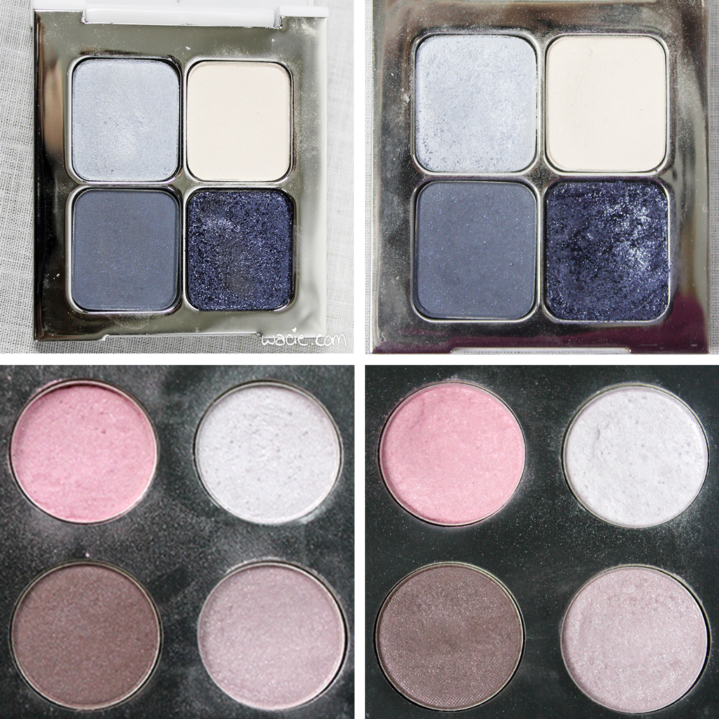
The other eyeshadows
I don’t really want to include these, but I made the graphic, so I have to include it. Compared to the NYX shadows, I didn’t really use these at all, and so there’s practically no difference between the befores and afters. No surprise there. I really did think I was going these more when I started.
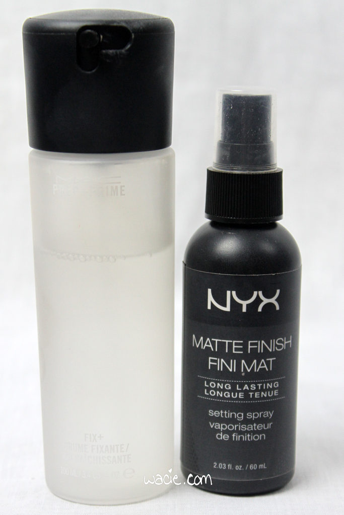
Facial sprays
While the MAC Fix+ is a relatively new purchase, so it’s not as used-up as the NYX Setting Spray is. You can see the fill line through the clear bottle. The NYX spray, while I can’t tell how full it is, it feels pretty light and, when shaken, it doesn’t sound like much is in there. It’ll be time to replace that soon, too!
I only included the products that show visible use or wear. There were a lot of things I included in the look that weren’t used-looking enough to warrant sharing. Some of the products in this look were being used for the first time and didn’t really show signs of wear. Some of them were only applied once, like blush and eyeliner, and don’t show much use. Some of them, like the Eyetini and Heavy Metal liners, were used all of twice. The most often used products were the ones with the most drastic signs of use, and that’s what I included.
And there you have it, twelve weeks of weird blue lips and raccoon eyes is over! Stay tuned for the Winter 2016 Project Pan!

I bought these products myself.